A Bold but Balanced First Home
In designing this young couple’s first home in Singapore, Tunisha Kapadia of studio nátu worked to establish a balance between the bold and the minimalist in a modern and functional apartment. Here Kapadia tells us more about the project
Design Anthology: How did you first meet the client?
Tunisha Kapadia: The client happens to be a friend of mine who recently purchased a house. He wanted a sounding board, someone who could give design advice and help him navigate the plethora of alternatives available to homeowners. It turned out that his aesthetic sense was aligned with our design philosophy, so that’s how we began working on the project.
Can you tell us about them and their lifestyle?
My client is a ‘third culture kid’ — his parents are Indian, but he grew up in Japan and spent a good chunk of his formative years in the United States. He recently got married and his wife moved from Tokyo to Singapore. Both are in their mid-thirties and they don’t have children yet. This home is the first one they’ve bought together as a married couple, and they wanted a spacious, modern apartment where they could host social gatherings and raise a family.
What was their brief to you for the project?
On paper, the project brief was straightforward: a spacious living and dining area, two bedrooms, one kids’ room and a study. The issue was that the couple don’t share the same sense of design, but they both wanted a house that would reflect the values and traditions they grew up with. He wanted bold colours and intricate detailing, whereas she wanted a minimalist design with mild colours. The challenging but fun part of this project was to create a visually appealing yet coherent solution that incorporated both their preferences.
What is the overall size of the house?
The apartment is around 280 square metres and has a beautiful balcony overlooking an internal courtyard at the centre of the condominium.
What’s unique about the building and the location?
The new condominium is in Singapore’s east. The luxury development includes 56 residences, each with their own private lobby and lift, and combines a modern, luxurious aesthetic with a landscape that recalls the charming gardens of the English countryside or the rolling hills of Bali.
How did you approach the project — what design references did you try to incorporate into the space?
Designers tend to draw inspiration from nature and our studio is no different. Our designs are characterised by clean lines and earthy, muted tones. However, it was difficult for me to let go of my past: I studied in Spain, and here I wanted to recreate the journey of moving from one plaza to another that I experienced in Spanish cities. We decided to contrast the mild colour palette with hints of the bold, bright colours often seen in Spanish towns.
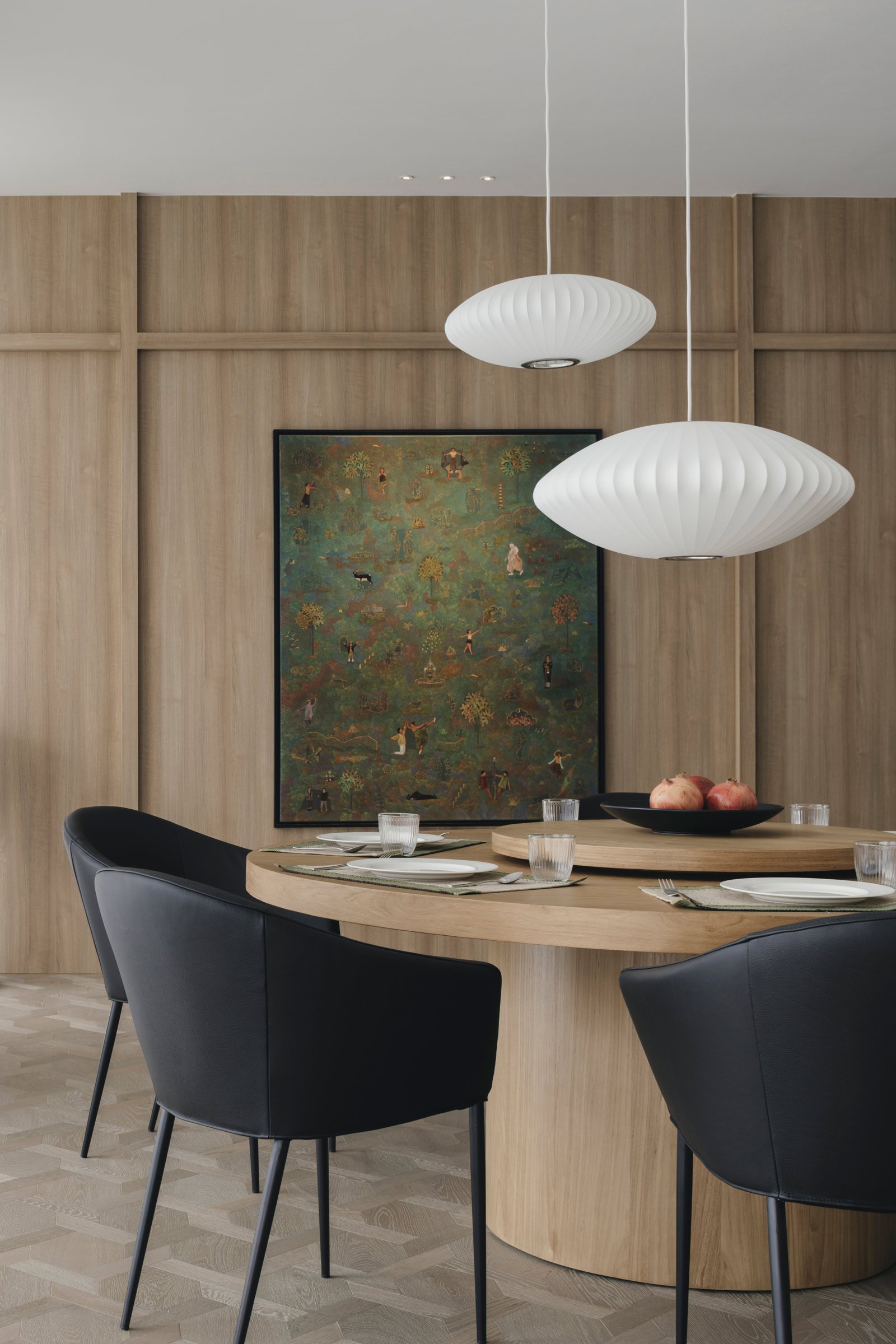
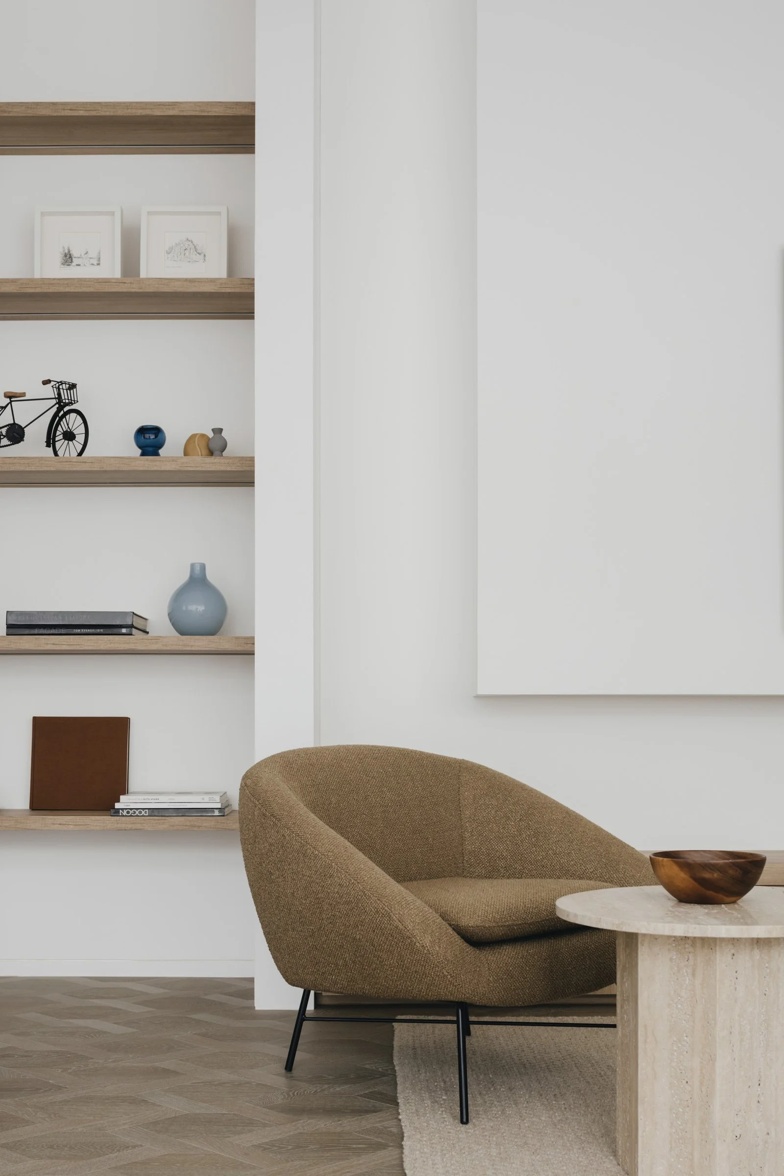
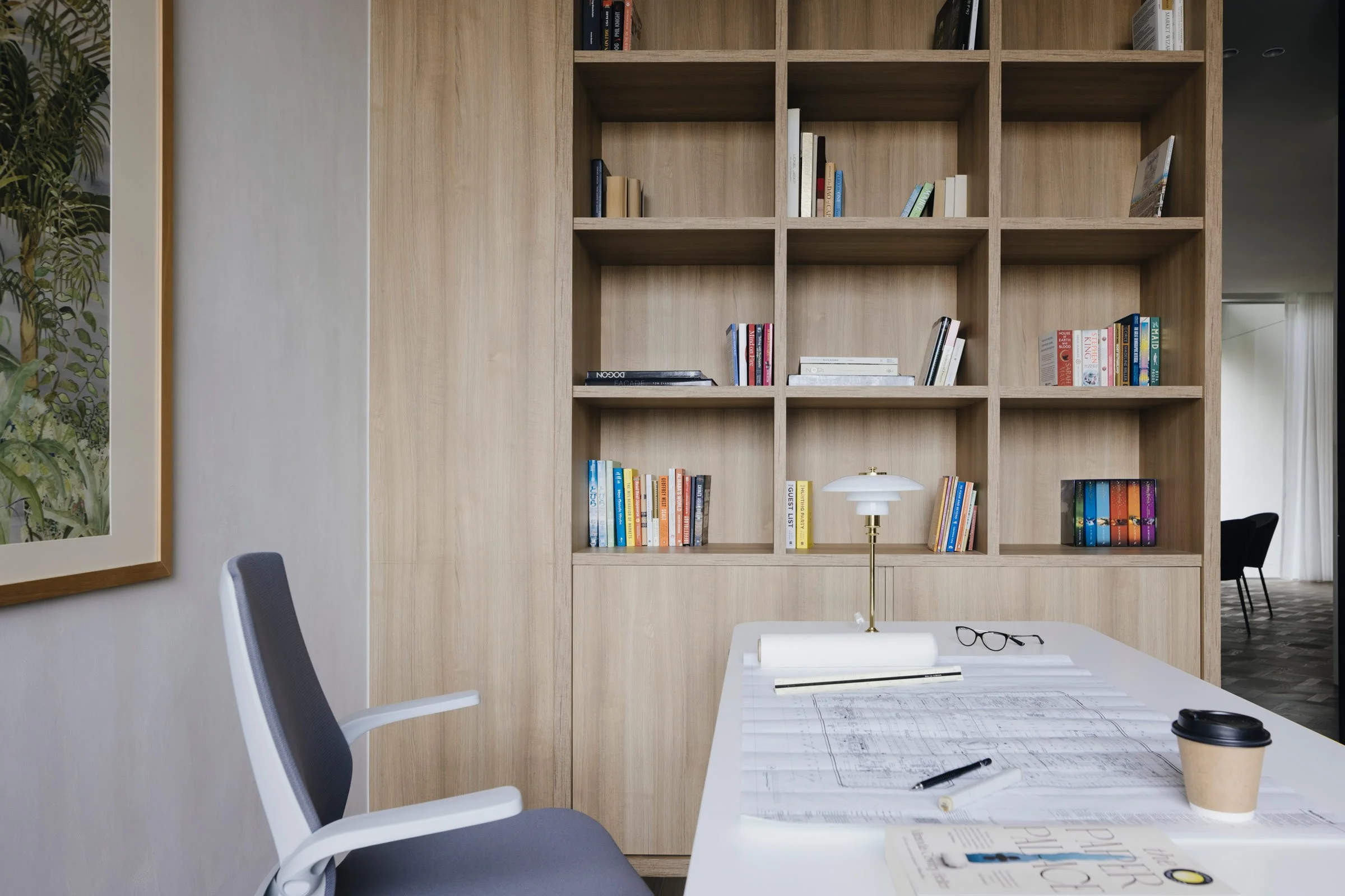
We also wanted the apartment’s look and feel to be contextually sensitive to the design principles of the development. We chose materials such as jute, wood and teak veneer to give the apartment a modern and luxurious, but not overly futuristic, feel, in line with the condominium’s aesthetics.
Please tell us about some of the custom pieces for the space.
We designed several pieces of custom furniture, like the indoor and balcony dining tables, the beds in each room and the children’s lounger. The principles underpinning each piece were the same: luxurious yet understated, comfortable and highly functional.
Do you have a favourite element or design detail in the architecture or interiors?
Initially, the clients were against having anything besides an armchair on the balcony. But when we customised the low dining table with benches and had beautiful olive armchairs placed in front of the louvered blinds and water feature, it became an absolute favourite. The balcony makes a perfect spot to enjoy the sunset, socialise or relax with a book.
Images / Studio Periphery


