A Sophisticated Apartment in Hong Kong’s Mid-Levels
In Hong Kong’s upscale Mid-Levels, local interior studio hoo realised a sophisticated retro-meets-modern family home. Studio founder YC Chen tells us more about the project
Design Anthology: Who is the client and can you tell us about their lifestyle?
YC Chen: The clients are a married couple with two sons. They like spending time at home to relax and enjoy city views.
What was the brief to you for the project?
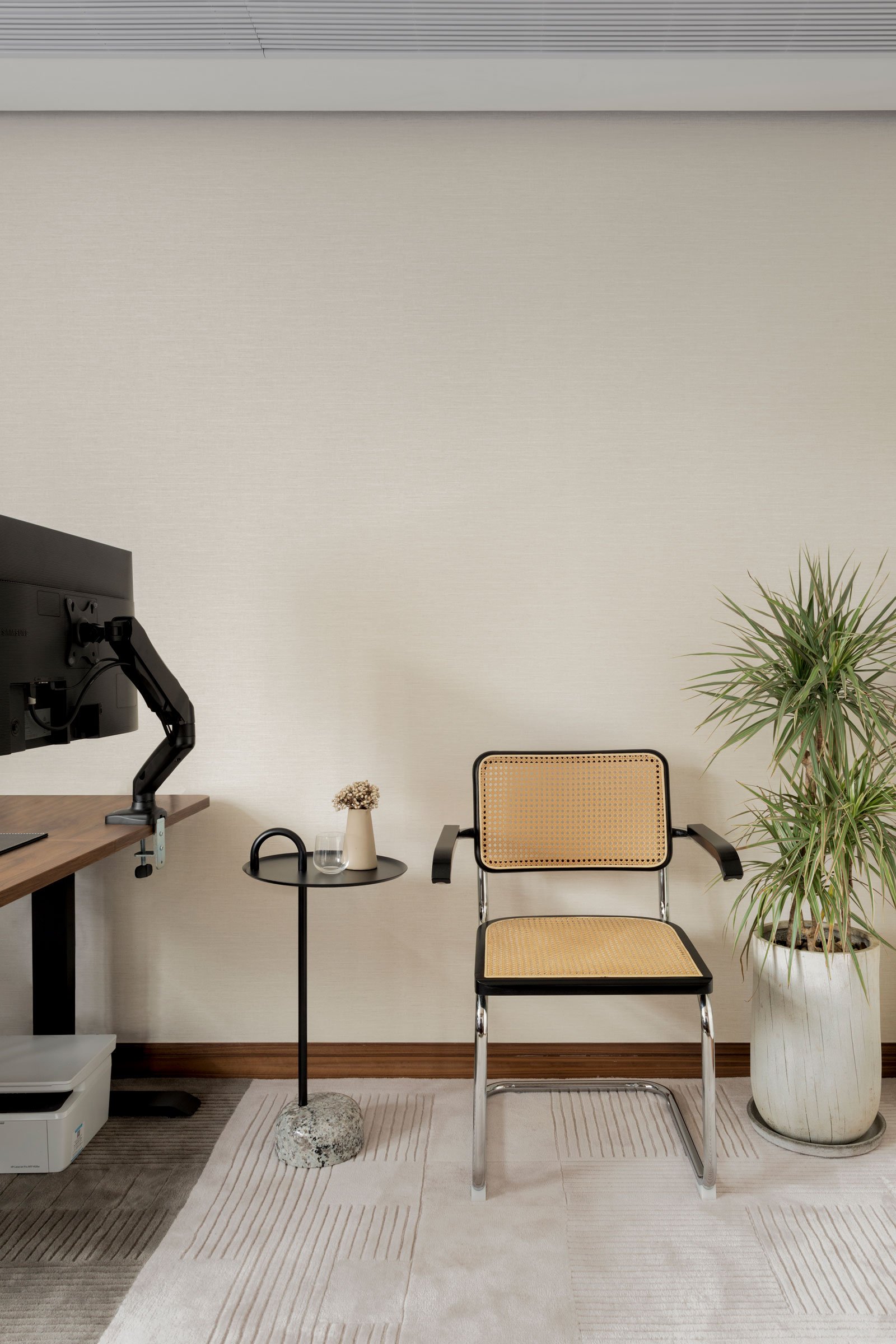
Overall they wanted a design that felt mature and sophisticated. Their sons wanted to share a bedroom and a study, and the husband wanted a separate study for himself.
What’s unique about the building and the location?
The apartment is about 230 square metres, and features a panoramic view of the city.
How did you approach the project — what design references did you try to incorporate into the space?
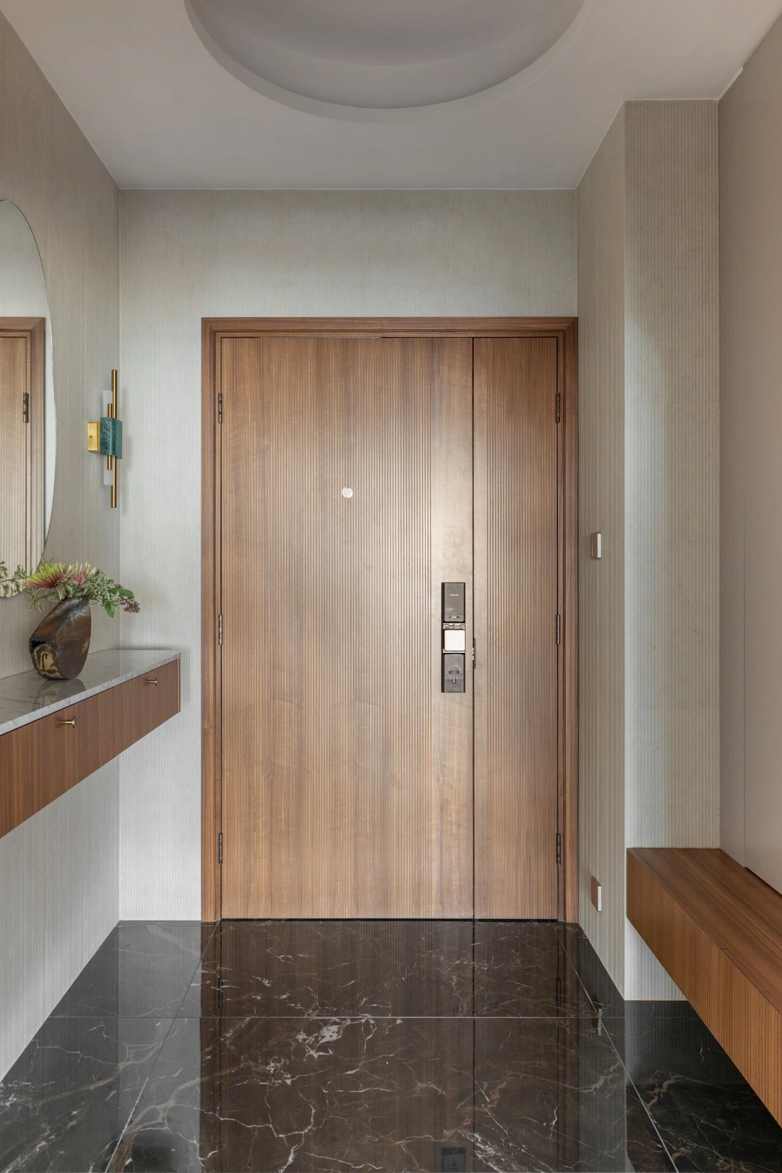
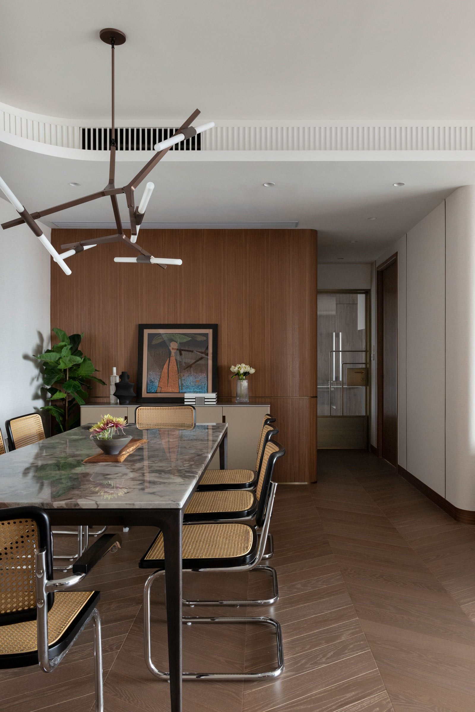
The clients had some old furniture pieces they wanted to incorporate into the design. Because of the iconic location, we chose a mid-century theme to match the surroundings and the brief. The original layout had many half-circle corners, so we incorporated a lot of round design elements such as wall corners, arches and doors throughout the space to echo that.
Tell us a little about the material choices for the space.
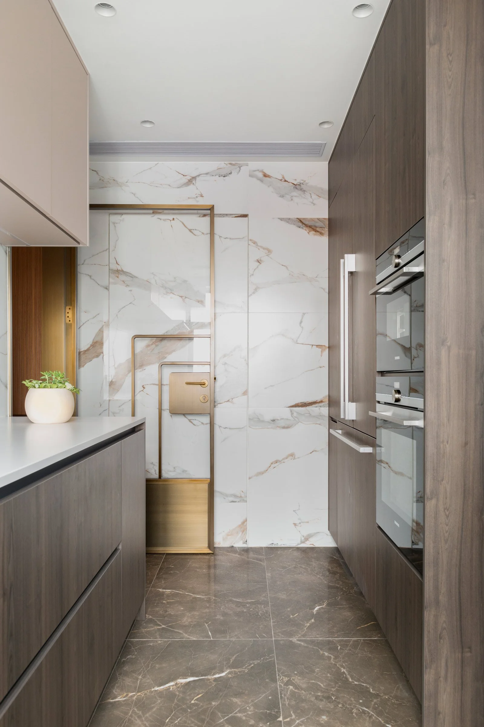
We used different types of marble, stone patterns and vintage bronze trimmings. We also featured different fabrics and wallpapers on the walls.
Tell us about some of the custom pieces.
The custom pieces we designed include the curved ceiling lighting, the curved walls with bronze trimmings in the living room and the feature door leading to the corridor. One special piece is the master headboard, which is curved due to the space’s existing layout.
Do you have a favourite element or design detail?
I like the bronze trimmings we used on some of the walls and particularly in the long corridor. One side the wall is covered in fabric with bronze detailing and features a hidden foot light trough, while on the other side there’s a long mural that evolves along the length of the corridor.
Images courtesy of hoo


