A Tactile Space for Korean Brand Eunoia
Korean fashion brand Eunoia’s new outlet in Kobe was designed by Kooo Architects as a textural space that pays homage to the brand’s muted palette. Co-founder Shinya Kojima tells us more
Design Anthology: How did you first meet the client?
Shinya Kojima: We’d previously worked with Bishop, the distributor, on store designs for fashion brand Danton’s Tokyo store and a space for Orcival, and when it came time to create a space for Eunoia, they turned to us.
What was the brief?
During a meeting with President Mori of Bishop, he suggested that our concept of ‘ichijo-toma’, which emphasises Japanese-style comfort, might align well with Eunoia’s vision. He asked if we’d be interested in designing the space, and instead of providing detailed requests, we were asked to create something that resonated with Eunoia’s fabric textures, monochrome colours and the beauty of curved designs within our ichijo-toma worldview, focusing on how to enhance the presentation of the clothing.
What’s unique about the neighbourhood?
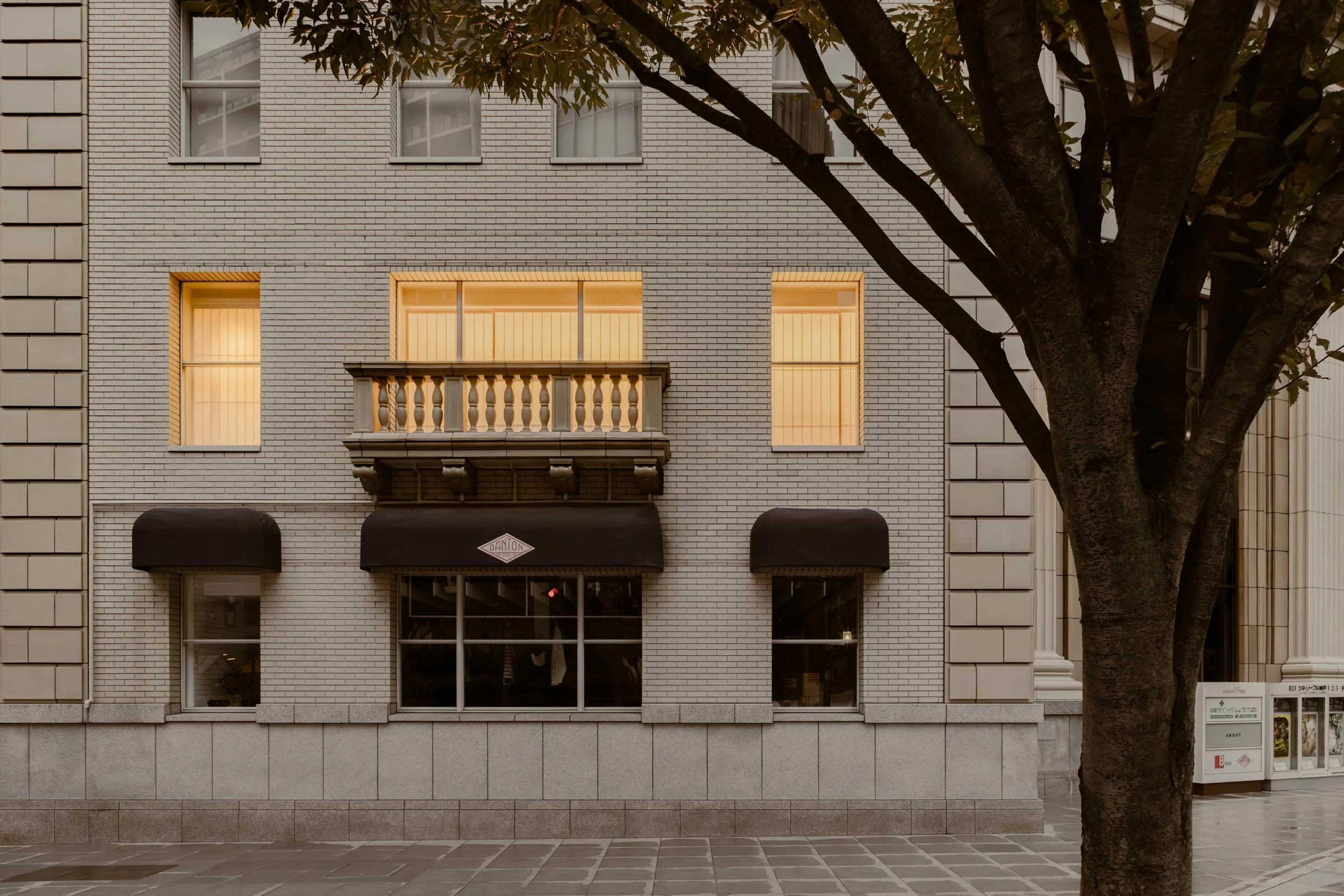
The location boasts a rich natural environment with views of both the sea and mountains. Kobe has a port, and the influence of foreign cultures is evident throughout the city. The shop is housed in a building with the restored facade of the historic Kobe Asahi Kaikan, a structure with a lot of memories for Kobe residents. It’s a grand stone building that reflects the Western architectural influences typical of Kobe’s port city past.
How did you approach the project? What design references or narrative did you try to incorporate?
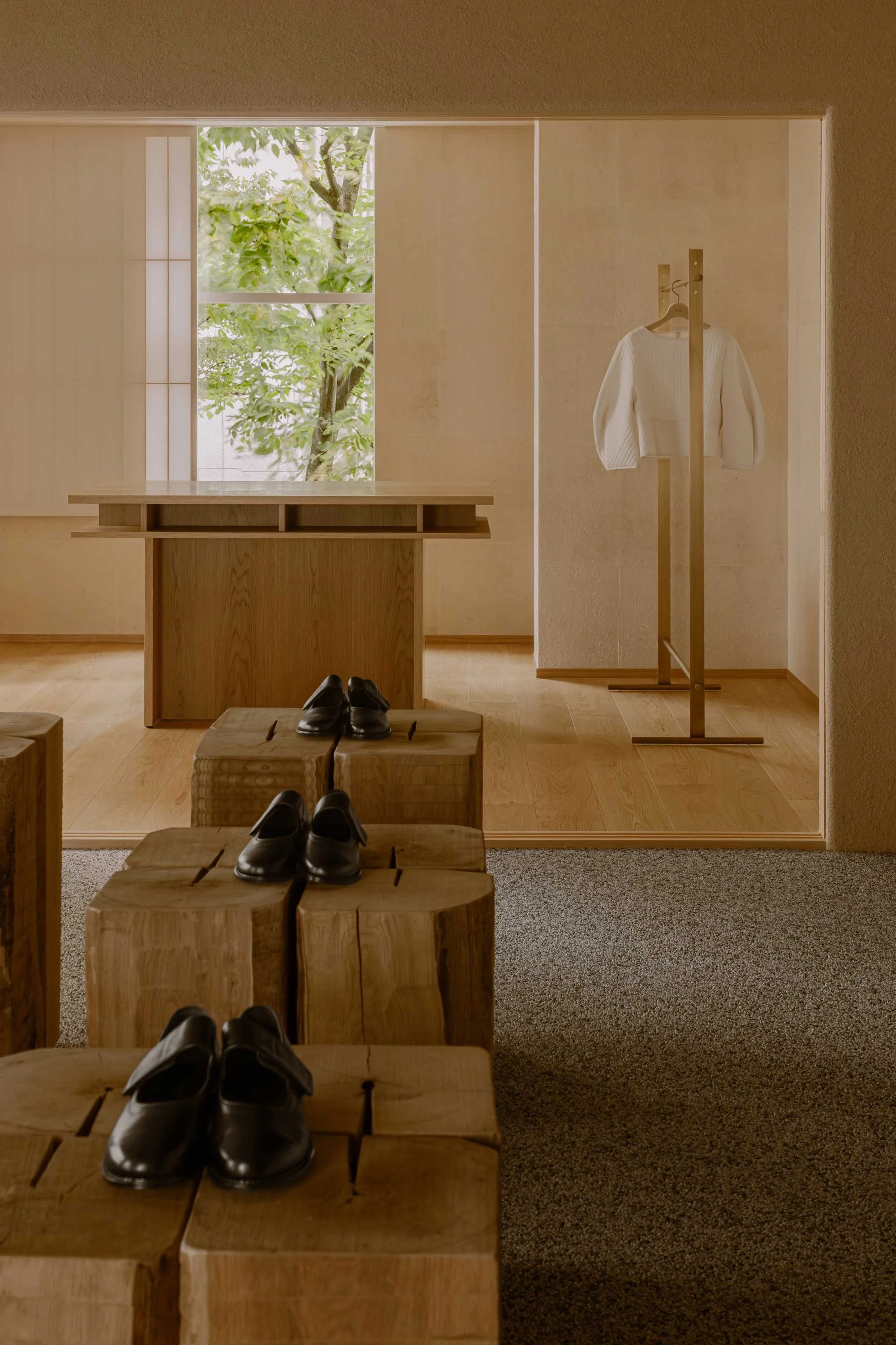
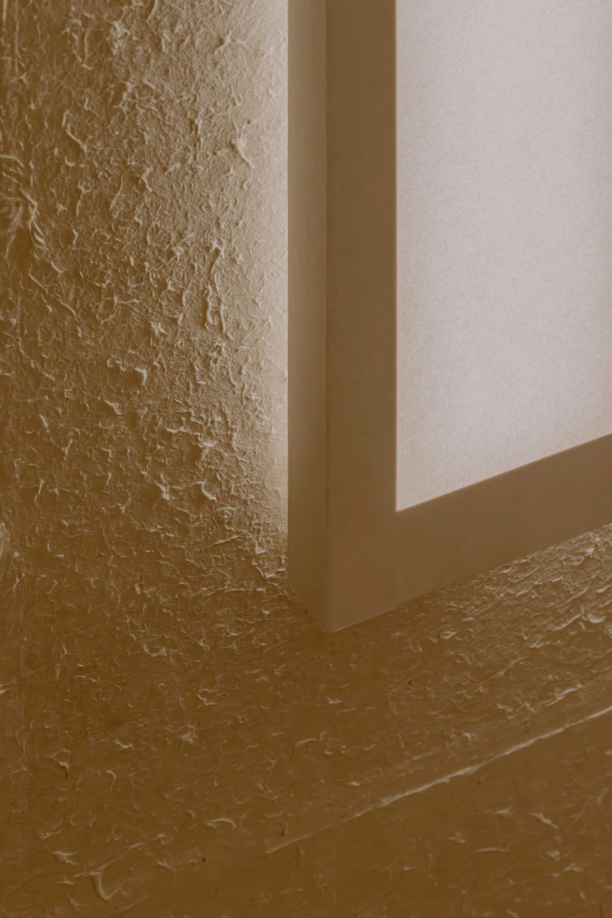
The key feature of Eunoia’s clothing is its black and white monochrome palette. With this in mind, we designed the background shoji screens and juraku stucco walls to enhance these two colours. We also incorporated the brand’s concept of transforming materials into diverse expressions through craft into the spatial design, making it a central theme.
Tell us about the material choices.
We used traditional Japanese materials such as juraku, washi paper and shoji screens. The juraku ceiling and walls subtly incorporate the essence of Eunoia’s clothing with its curved surfaces into the details.
Tell us about some of the custom pieces.
The wooden display fixtures in the centre were custom-made by artisans using the traditional Japanese surface treatment technique called naguri, which looks beaten. We had four types of wood processed with various naguri techniques, and we hope visitors will enjoy the rich expressions that can be achieved from a single material.
Do you have a favourite element or design detail in the architecture or interiors?
One of my favourite elements is the shoji screens. Their ability to diffuse strong sunlight softly into the interior creates variations in light based on the time of day, weather and season. This adds a richness and comfort that cannot be achieved with uniform lighting alone.
Images by Keishin Horikoshi/SS


