A Thoughtful Family Home
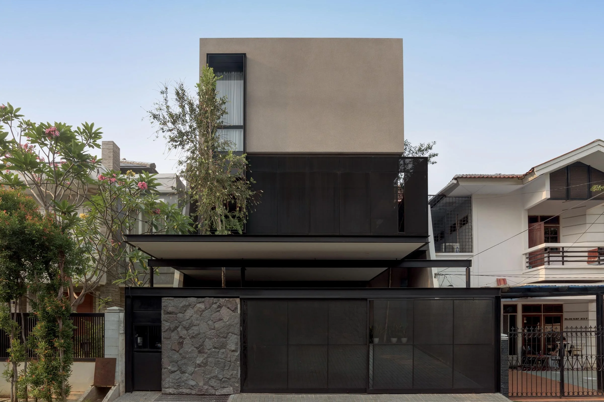
Realised by W+W Design Studio, this three-storey home in North Jakarta was conceived to optimise indoor and outdoor spaces and cater to the family’s lifestyle. Here architects Wennie Hong and William Susanto tell us more about the project
Design Anthology: How did you first meet the client?
William Susanto (WS): We met the client through a mutual friend, who’s actually the contractor for the project.
Can you tell us about the clients and their lifestyle? What was their brief to you for the project?
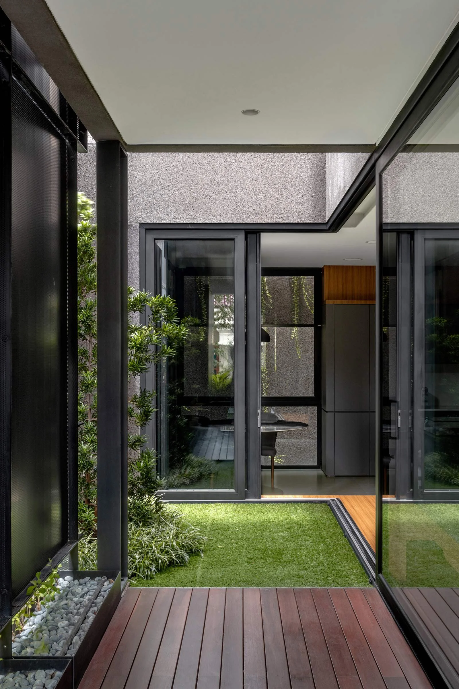
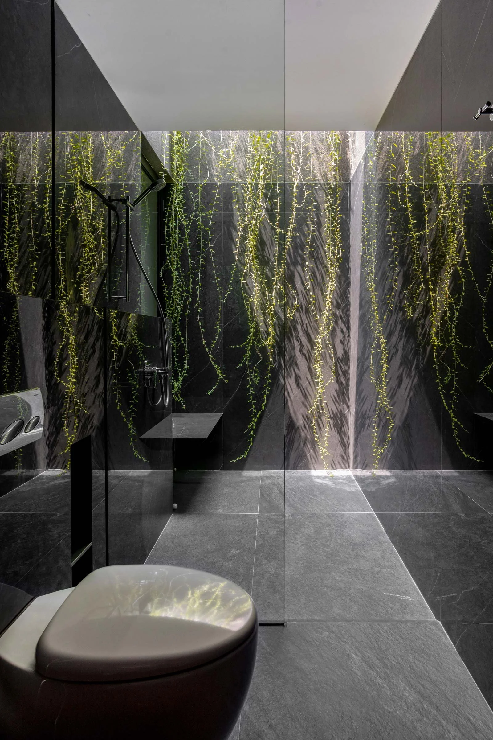
Wennie Hong (WH): The clients are a young couple with a child. Both of them are culinary school graduates who like to cook, bake and host people. It was clear from our early discussions that they wanted a spacious pantry and a kitchen island connected to an inner courtyard where they could gather with their family and friends. They also love gardening and wanted all the rooms to get a generous amount of natural light and cross ventilation, which is in line with our design philosophy.
What’s unique about the building and the location?
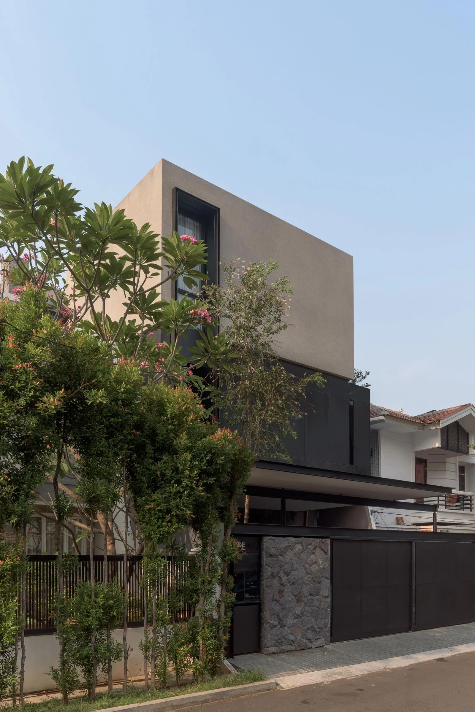
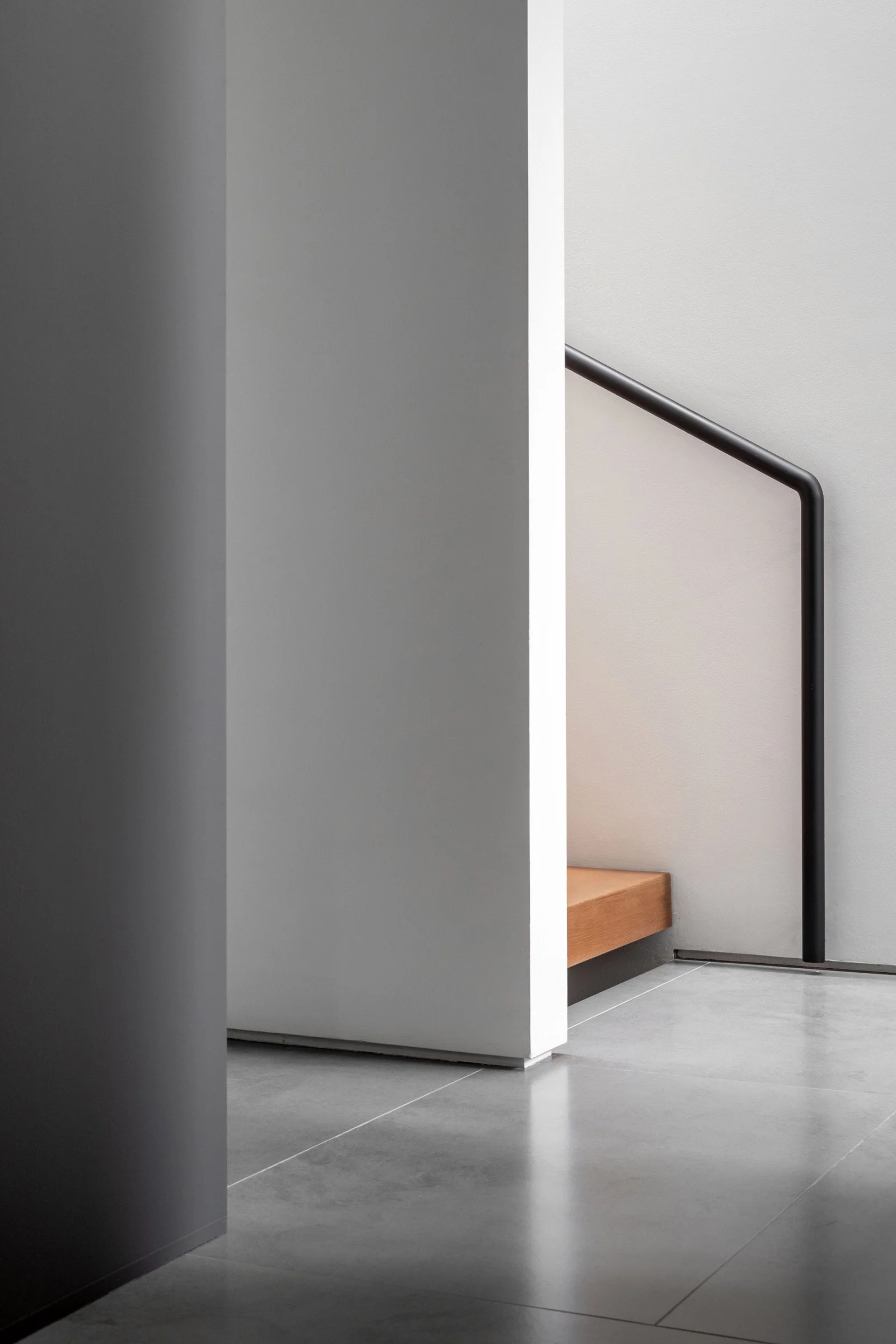
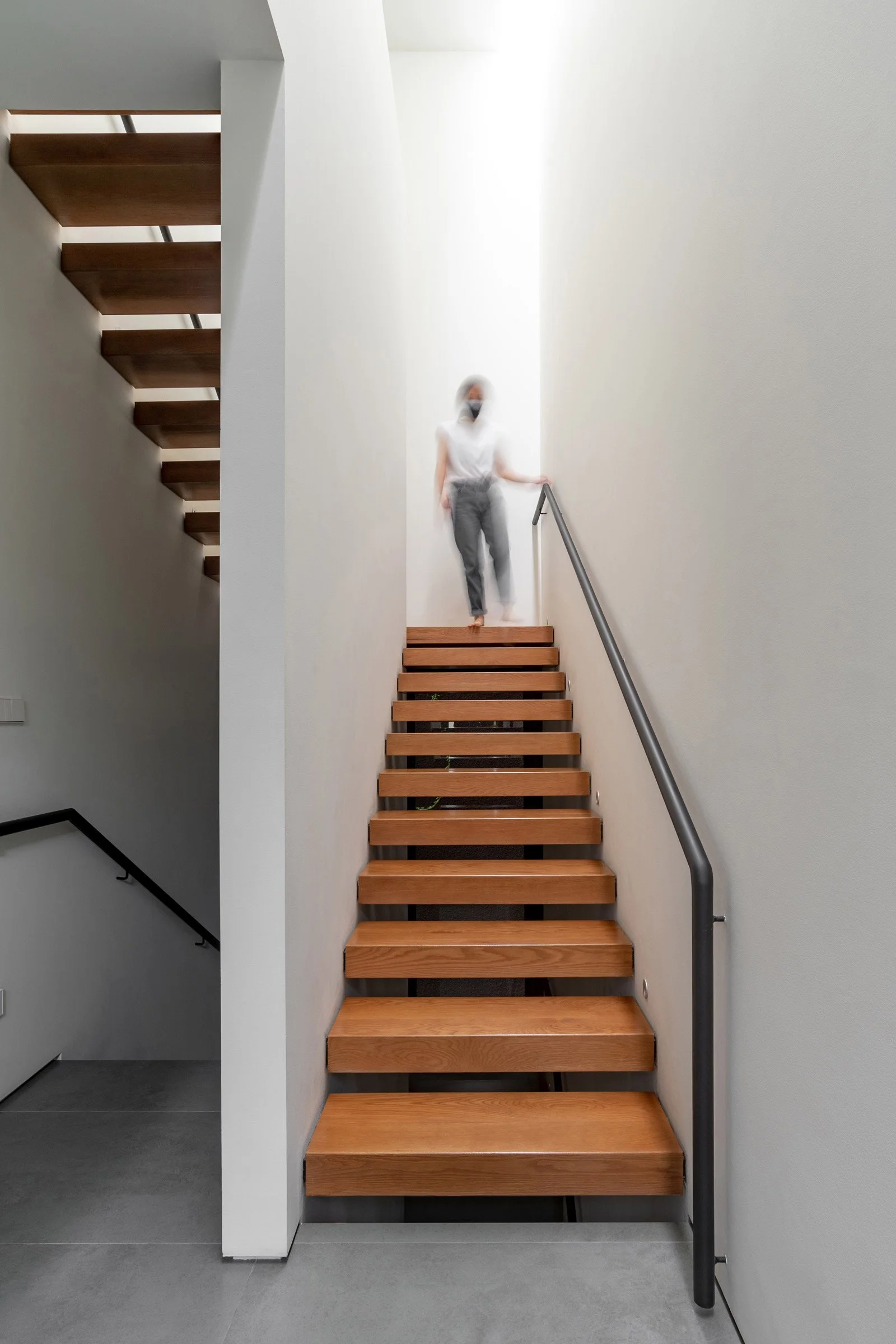
WH: Following the clients’ request, we enlisted a feng shui expert. They positioned the entrance on the left side of the house and a staircase on the right side, which naturally created two adjacent foyers. The staircase connects all levels and is enhanced by a skylight that allows ample natural light to come in during the day, creating a feeling of openness. For the building’s facade, we used perforated aluminium screens to provide privacy to the second floor without adding too much bulk to the house.
How did you approach the project — what design references did you try to incorporate into the space?
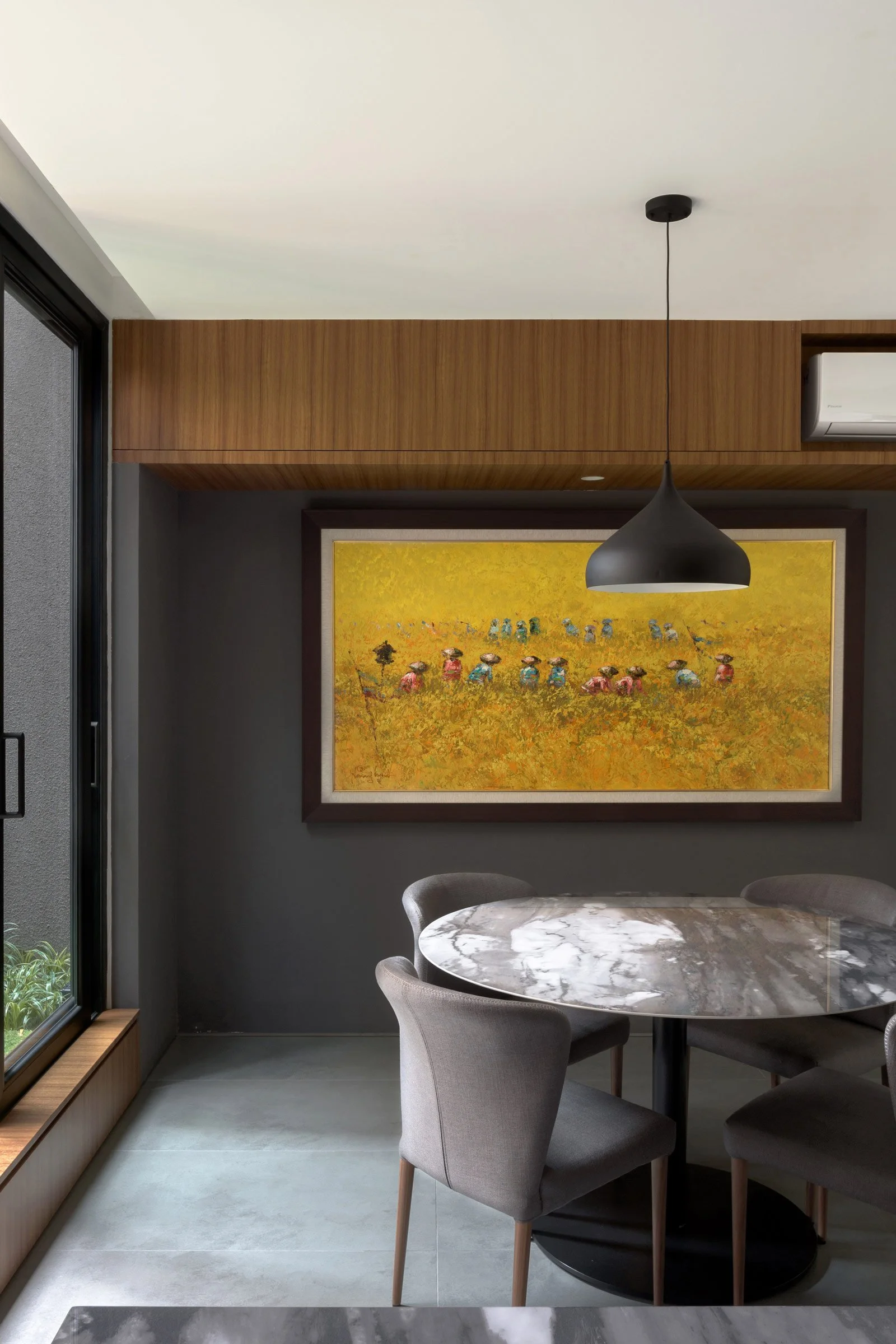
WS: A key focus for us was laying out and proportioning the spaces optimally. For instance, the main living areas — the living room, dining room and pantry — were designed with plenty of storage space for practicality, and the size of the areas is proportionate to how much the family would use the space.
Please tell us a little about the material choices for the space.
WH: Each room was designed to have a different character and function. For the main foyer, we used andesite and natural stone flooring to create a semi-outdoor space. We wanted the staircase to work as a light well, so the walls were finished in a lighter colour to better reflect the daylight. The living area was deliberately designed in darker tones to highlight the garden.
Which elements are custom designed?
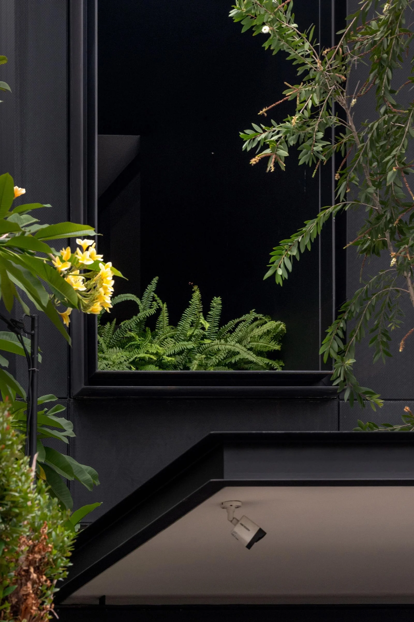
WS: The perforated aluminium screen on the facade was custom built for the project. We wanted the screen to have a knock-down system and a low maintenance screen, so we worked closely with the contractor in order to achieve this.
Images / Daniel Jiang

