When Two Become One
Melbourne practice studiofour has harmoniously linked this heritage Federation home and its gabled addition to create an environment with better human connection, views and light
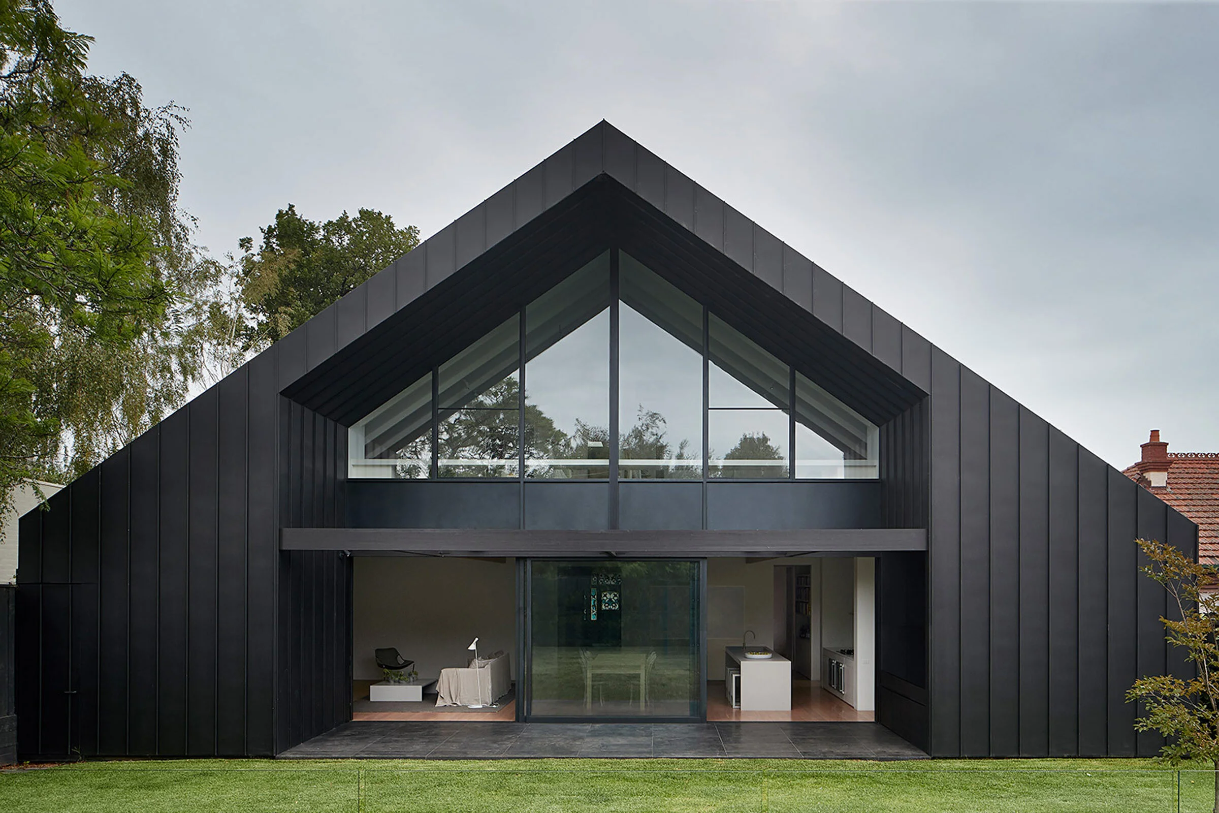
For the restoration and extension to this Federation home in Melbourne, architecture and interiors practice studiofour adopted an approach that involved blending the old and the new, fostering an easy, seamless correlation between both. ‘For a project like this, the typical response is often a clear cut between the existing and the addition, but we wanted to create a more fluid connection with a design that bleeds into both building fabrics,’ says studio co-director Annabelle Berryman.
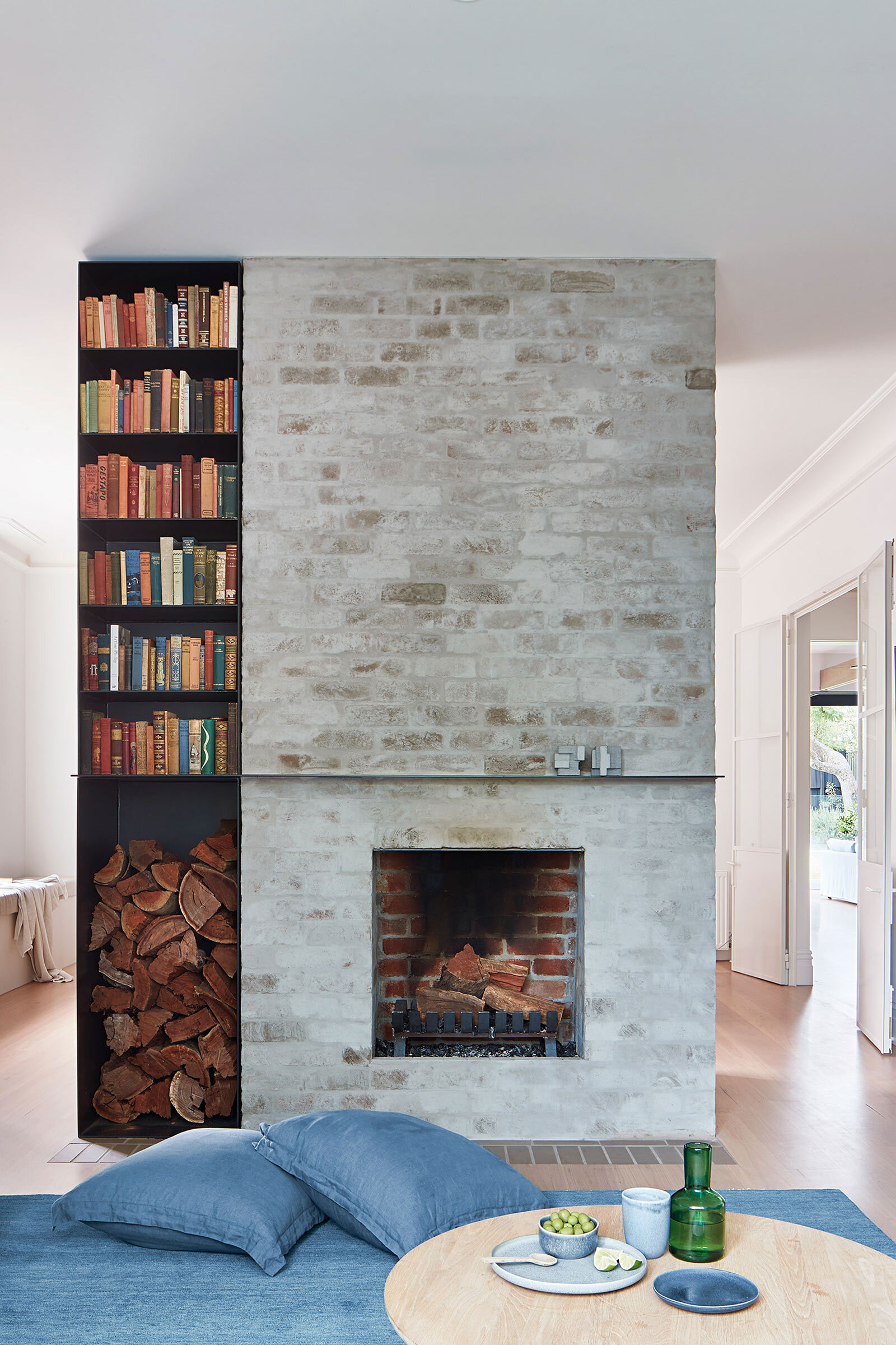
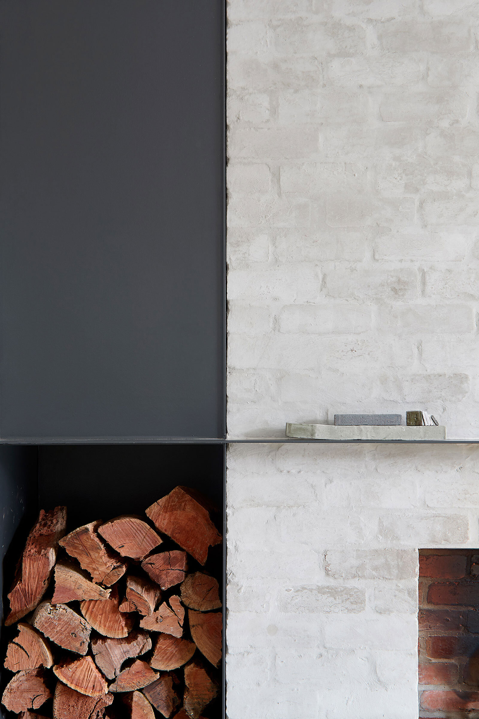
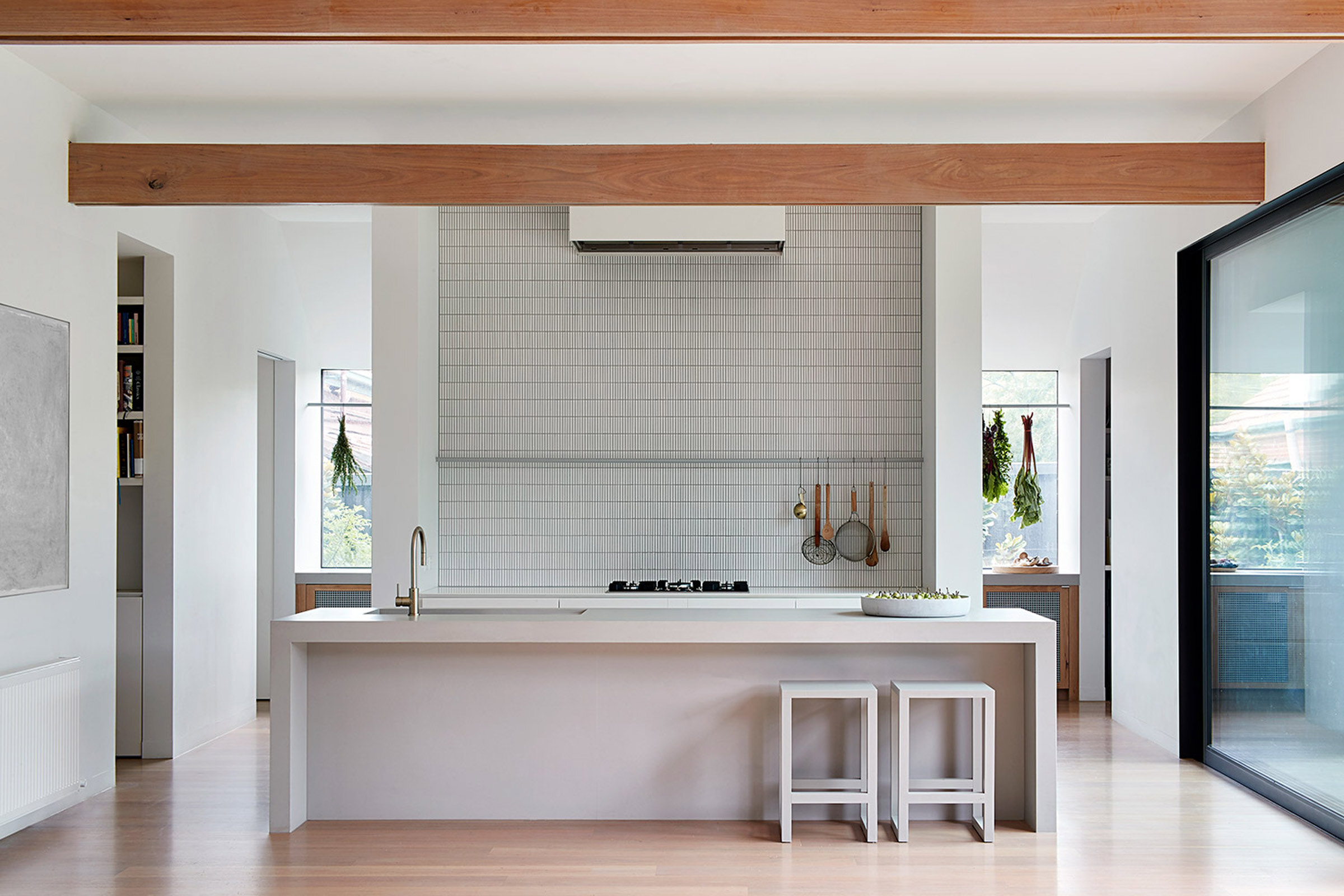
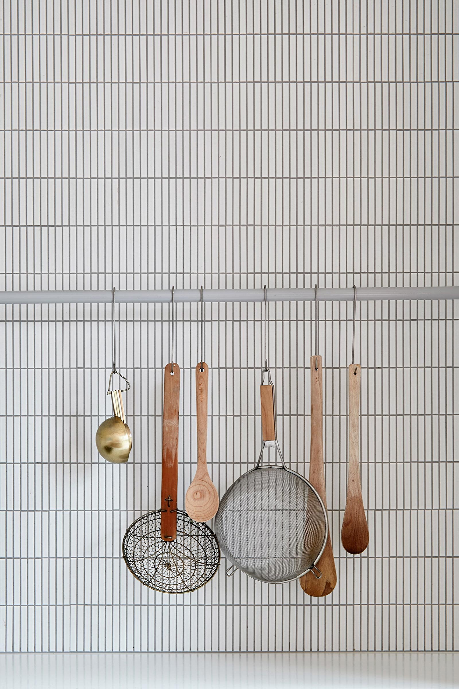
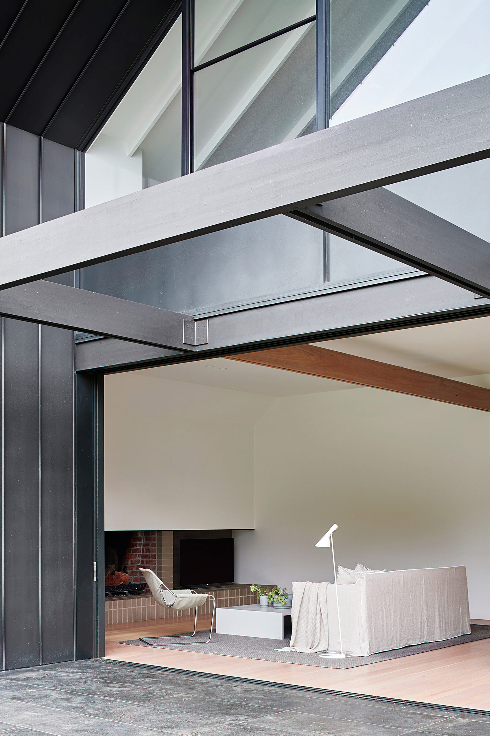
This blending was achieved through the repetitive use of pattern, form and materiality, expressions apparent in the black zinc cladding at the new rear, which echoes the mantels in the period front rooms; the existing timber fretwork that has been reinterpreted in the back beams; and the tessellated tiles on the old bathroom floors that inform the new kitchen splashback. Most significantly, the pitched facade is mirrored and modernised in the silhouette of the oversized steep peak on the rear roof.
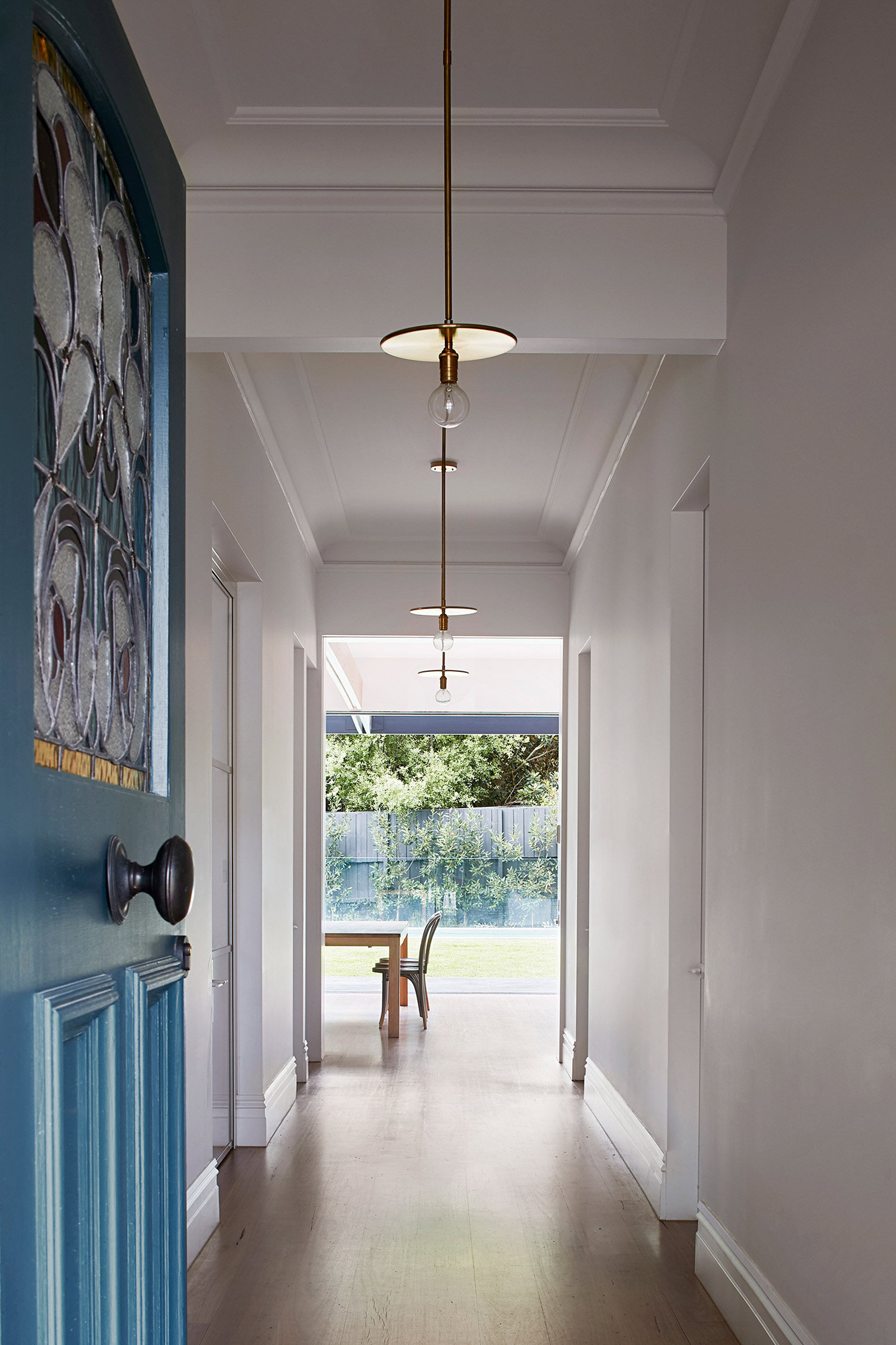
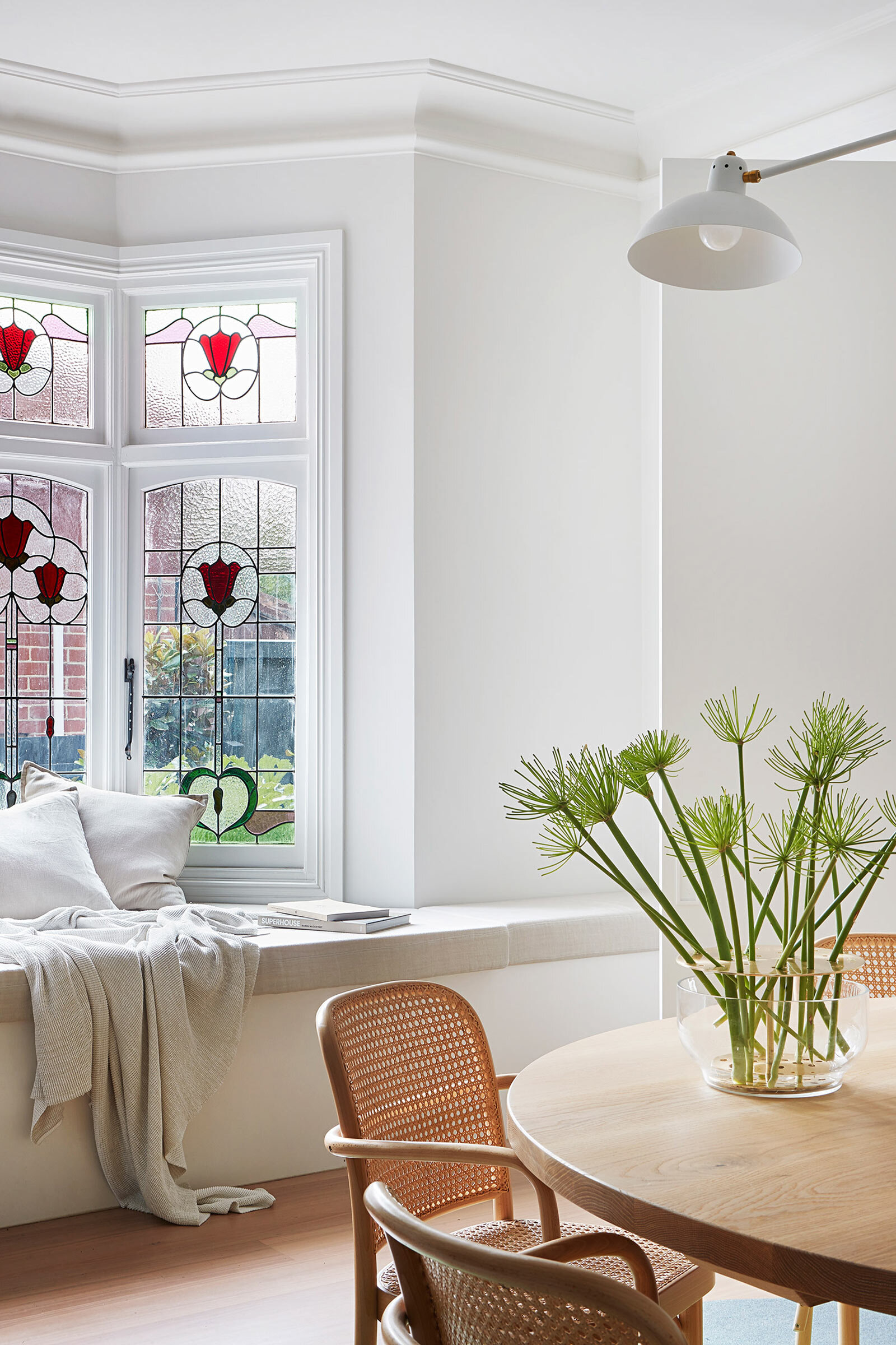
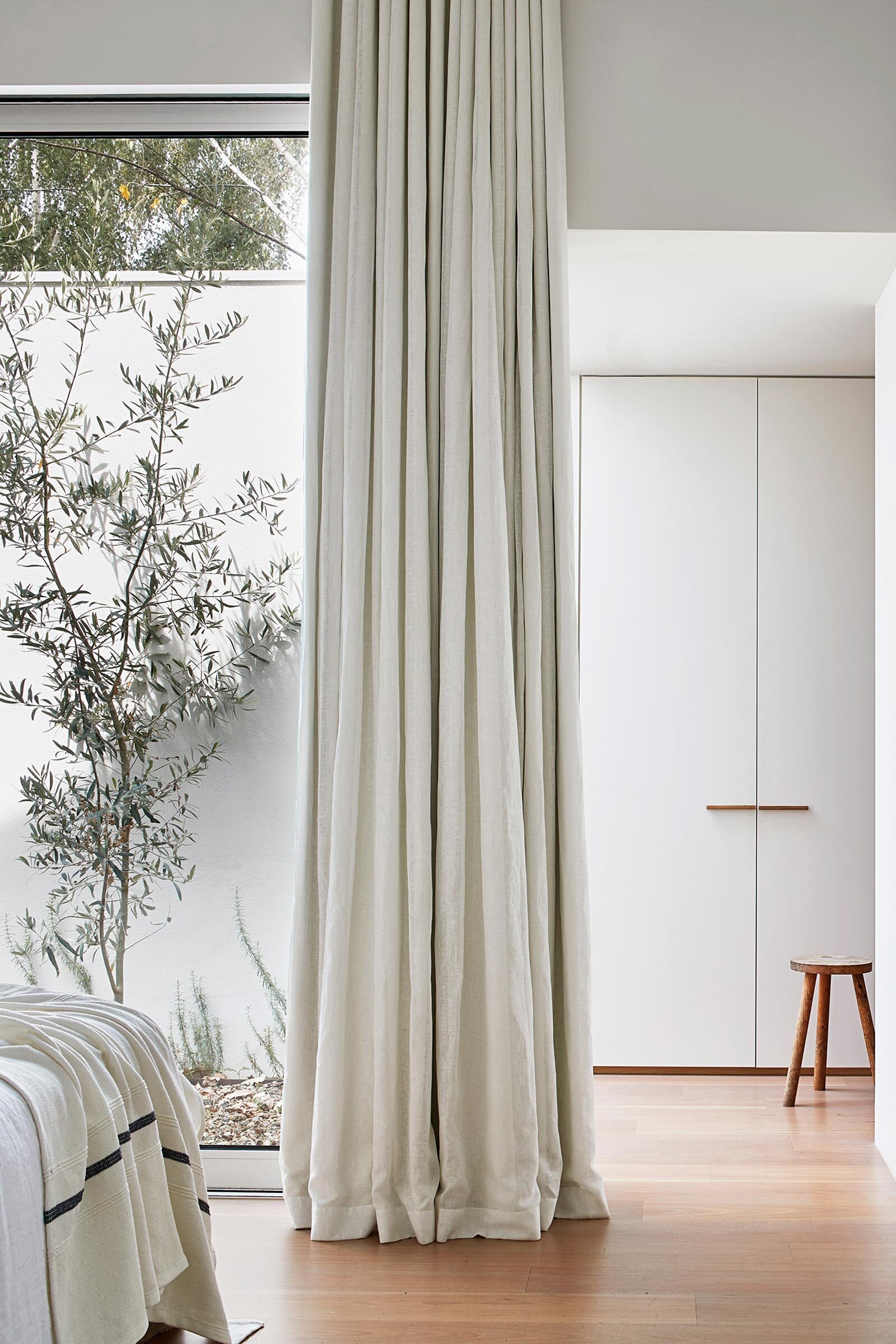
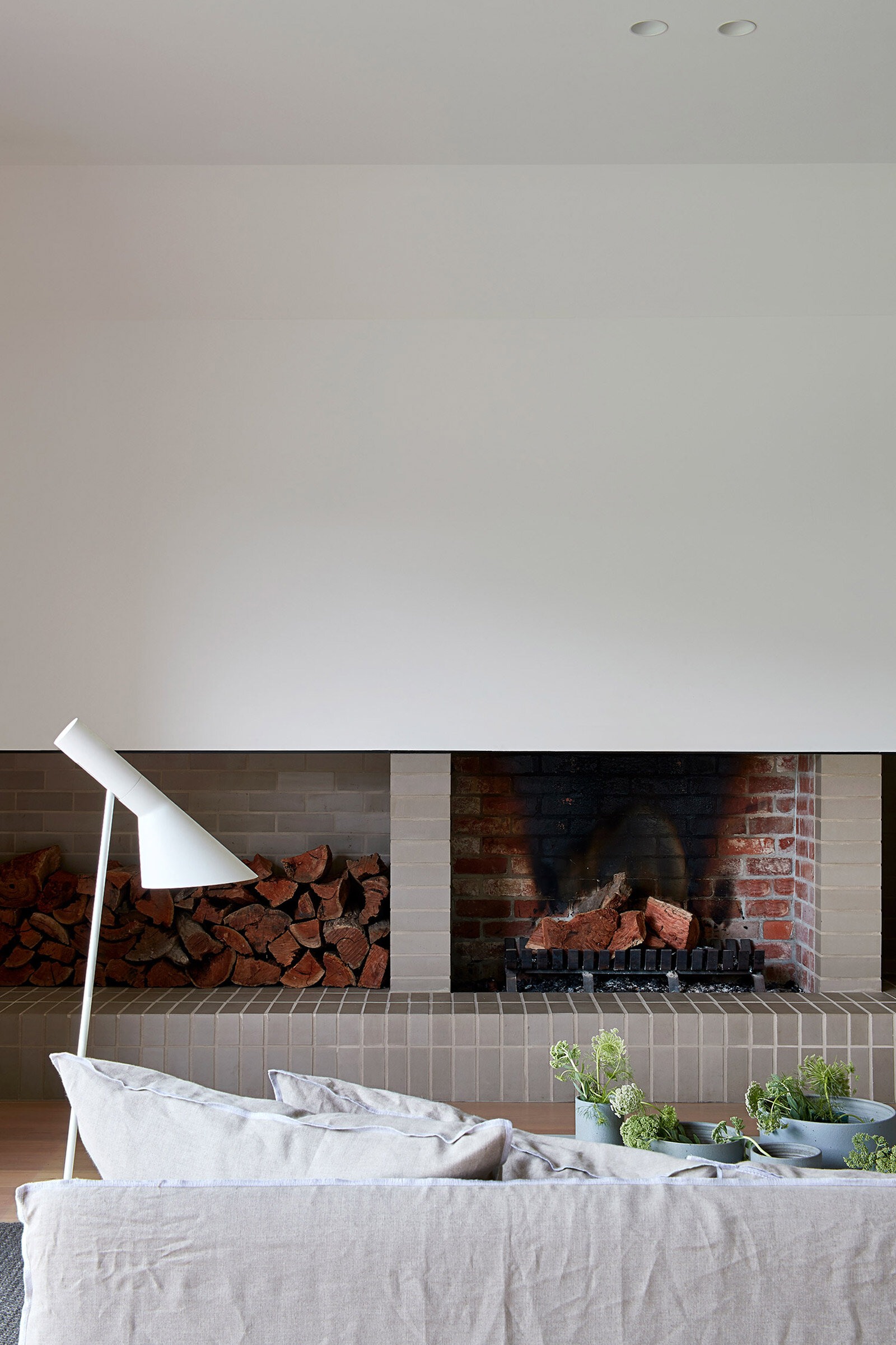
Creating a stronger relationship to fresh air, views and light within the often dark and uninviting heritage fabric was a key part of the brief, and interventions were treated sensitively. ‘Older homes like this weren’t designed with health in mind. We wanted to add that in a respectful, dignified way that would give the family an awareness of the seasons,’ Berryman says. Portal openings were created in the dark, compartmentalised rooms off the corridor by widening the accessways and inserting steel-framed glass doors, while brick walls on either side of back-to-back fireplaces were knocked down so the sitting room and dining room could open up and work as one. In the master bedroom, orientations were rearranged to achieve aspect and accessibility to a new interior courtyard. The colour palette, too, was a central factor in the home’s cohesiveness, with natural, organic shades of grey, cream and off-white serving as a calm, consistent thread running throughout.
The result of a 1980s addition, the upper level had a steep stairway to three attic-like rooms with little access to light or ventilation. While the opportunity for alteration was limited because the ground level ceilings needed to be left intact and the external terracotta tiles left in position, a little more ceiling height was achieved by removing the plasterboard and battens, stripping the structure right back to get some lift.
‘Every little detail in this project gives the whole vision strength,’ Berryman says. ‘There’s an honesty to it. We like to think that the client stimulated our vision, and we took it a few steps further.’
Text / Carli Philips
Images / Shannon McGrath


