A One-of-a-Kind Industrial Conversion in Hong Kong
Multidisciplinary studio Design Eight Five Two (DEFT) converted two units in an industrial building into a three-bedroom apartment, working with local craftspeople and custom designing almost all features to realise their vision of a unique home that reflects its industrial context. Here, studio co-founder Peter Lampard shares more about the project and process
Design Anthology: How did you first meet the clients?
Peter Lampard: I was introduced to the client through her brother, a fellow designer who I met during an exchange programme at Yale back in 2011. Her and her partner approached us in late 2018, as they had purchased a property and were looking to undertake a complete renovation.
Can you tell us about them and their lifestyle?
They were fantastic to work with. As an active couple with a young son, they were very open to some of my more experimental ideas about how to approach their unique space, and despite both coming from a finance background, they have a keen eye for design themselves.
What was their brief to you for the project?
Our brief was surprisingly open, with only a few basic functional stipulations revolving around their storage requirements. Otherwise, they were entirely open to our interpretation of the space and layout. As their timeline was flexible, we were fortunate enough to have six months to dedicate to the initial design process . We used this time to develop five layout plans, each with its own pros and cons that would highlight different aspects of the site.
What is the overall size of the apartment?
The site combines two adjacent units of a very large floorplate, totalling almost 225 square metres. While the floor plan is rather large, the 4-metre-high ceiling became a defining feature that we used to our advantage.
What’s unique about the building and the location?
The apartment sits on the corner of a north-facing building in Chai Wan — on the east end of Hong Kong Island — with stunning views out to Junk Bay and amazing sunlight at most hours of the day. In every room, the window apertures are nearly full height, which enables natural light to penetrate deep into the spaces.
Due to the large, square-shaped floor plan, there was one corner at the back of the space that didn’t get any natural light, and this eventually became the family’s den. We took full advantage of the high ceiling and installed a CoeLux skylight, which uses nanotechnology to reproduce the natural light and appearance of the sun and sky.
How did you approach the project — what design references did you try to incorporate into the space?
The project is a contextually informed design that draws on the bespoke craft of multiple local trades, and our intention was for the home to draw references from the heavy industrial presence in Chai Wan. Our clients wanted to feel as if their home was appropriate to the neighbourhood, not a foreign object without context.
We took references from the cast-iron window frames of older industrial buildings in the area to develop an interior window system that reflects the industrial feel the clients were looking for, while also achieving high solar heat-gain performance.
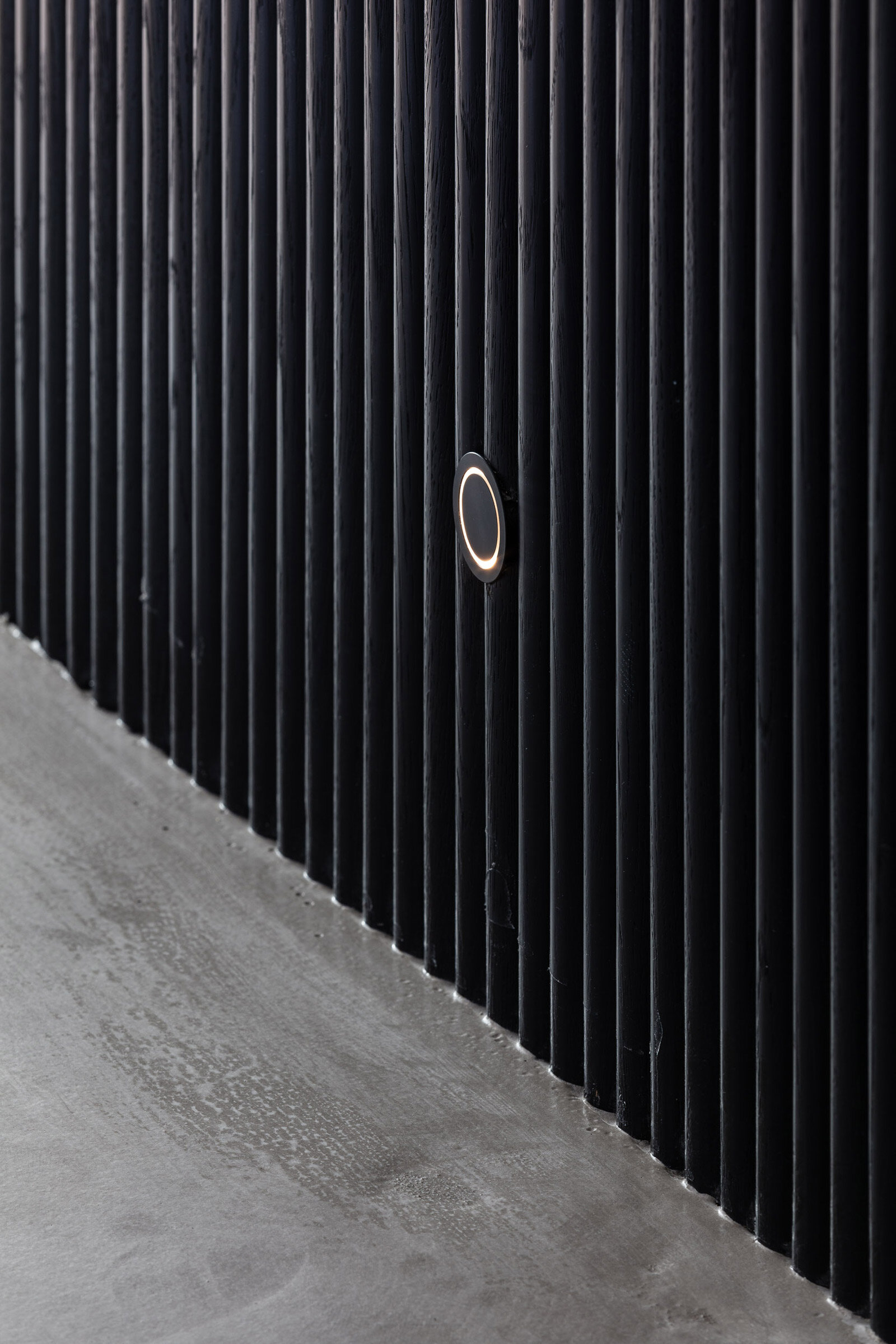
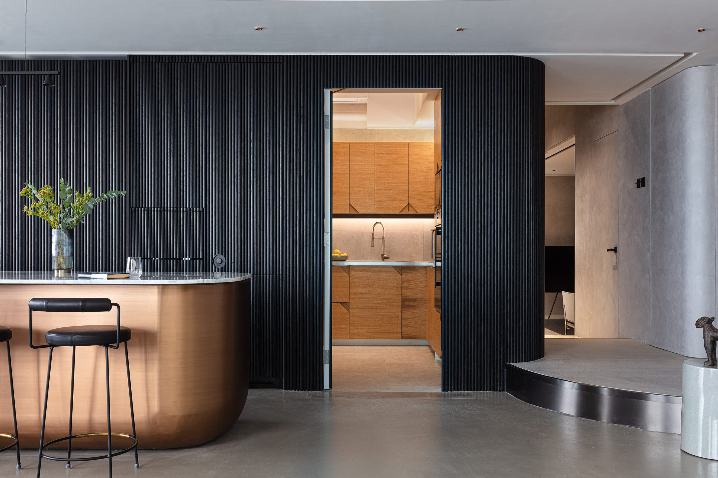
Introducing a variety of curved elements, like the rounded kitchen island, wooden wall claddings and rounded wall corners further softens the space to differentiate the home from a typical industrial aesthetic.
Please tell us a little about the material choices for the space.
Hand-plastered Marmorino walls and polished concrete floors provide a neutral backdrop for the layering of contrasting materials, such as walnut veneers and copper detailing. We avoided using colour in the built-in furniture and finishes to leave room for the clients’ more expressive soft furnishings and artwork.
Can you tell us about the custom pieces?
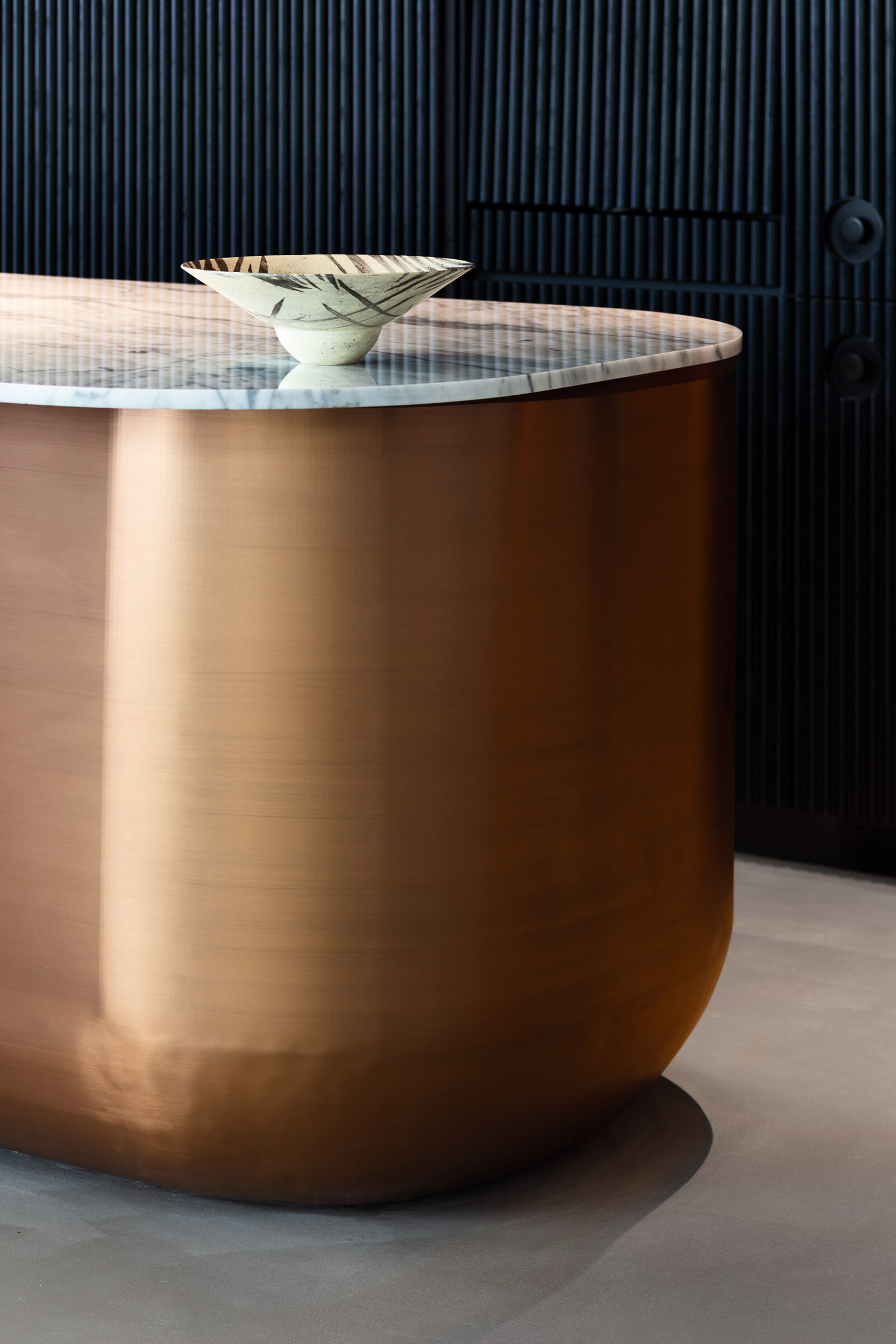
Incorporating local metalwork was a key element of the design, with bespoke pieces in every space. The open lounge and front kitchen area is anchored by a three-and-a-half-metre-long handmade copper and marble island. The countertop slab of Carrara marble was handpicked from a stone yard in Yuen Long for its soft blue veining, which contrasts nicely against the copper base. We also designed the bespoke kitchen cabinetry, which was made from real oak in Poland. Behind the island, a two-metre panel slides open to reveal a hidden prep kitchen, with additional concealed doors for the refrigerator, freezer and back kitchen.
Do you have a favourite element or design detail in the architecture or interiors?
Apart from the kitchen, which is one of my all-time favourite designs, the son’s bedroom is one that makes my own son jealous. We lifted the bed above the wardrobe and then fitted a net hammock to the open side of the bed both to stop him from falling out also to allow him to climb out over the floor below. Closer to the window, we created a platform system with panels that can be flipped over with cushions for protection when the playing gets too rough.
Images / Dennis Lo


