Minimal Space, Maximum Impact at DUX Coffee
In designing new Melbourne cafe DUX Coffee, architecture and interiors firm Pierce Widera embraced the site’s original features to create an impactful experience within the petite space. We spoke with studio co-founder Nat Widera to find out more about the project
Design Anthology: How did you first meet the client?
Nat Widera: The owners of DUX Coffee approached us after speaking with a mutual connection. Our first meeting was at the cafe premises; back then the store was used by a neighbouring business as a storage and seating area. We were impressed by the clients’ passion and vision for their business and were immediately on board!
What was their brief to you for the project?
The brief was quite simple but tricky at the same time: to provide a great backdrop for quality coffee and pastries in quite a constrained space.
The overall size of the space is only 24 square metres, but the ceiling is raked and the highest point is six and a half metres! The challenge became fitting in everything that’s necessary for running a coffee shop while emphasising the height of the space.
Where is the coffee shop located?
DUX Coffee is in The Don Arcade, a small hidden arcade in Hawthorn, Melbourne. A lot of university students walk past on their way from the train station, so we created something that would draw them in to grab a coffee on their way to class.
What’s great about the neighbourhood and what makes the location unique?
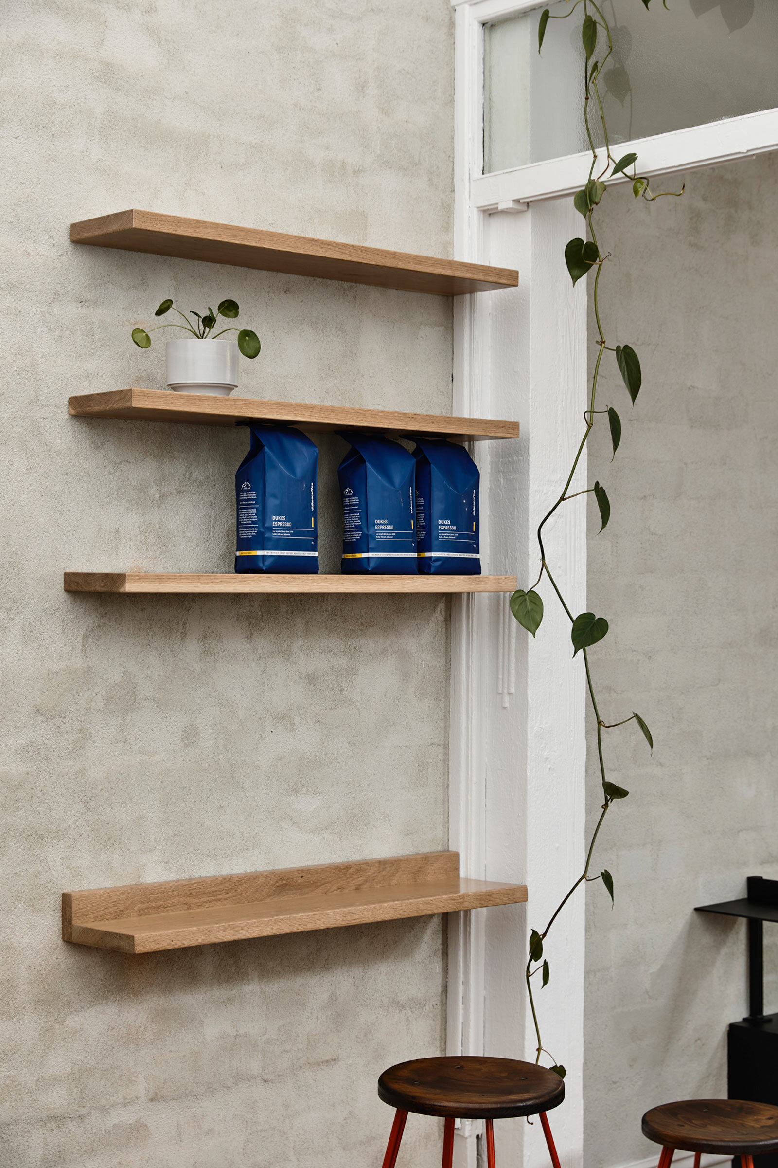
The shop owners in the arcade are a small community — they support each other and create a great atmosphere for their clients. The location is unique because the shop is just not what you would expect — it’s completely surrounded by adjoining buildings but has amazing natural light thanks to the clerestory windows. This was something we really wanted to highlight in our design.
How did you approach the project — what design references or narrative did you try to incorporate into the space?
Our aim was to restore and retain as much as possible. It was important for us to tell the story of the evolution of the site, so we chose to leave the existing blocked off windows visible, showing the adjacent building that was built a long time ago.
We tried to salvage the existing timber floor, but in the end that proved to be impossible and so we made the decision to use recycled timber as an alternative. We turned the existing exposed brick wall into a great backdrop for the main bar, the focal point of the space. The site itself gave us all the clues about how to respond accordingly in order to highlight the strong points (and hide the weaker aspects).
Please tell us a little about the material choices for the space.
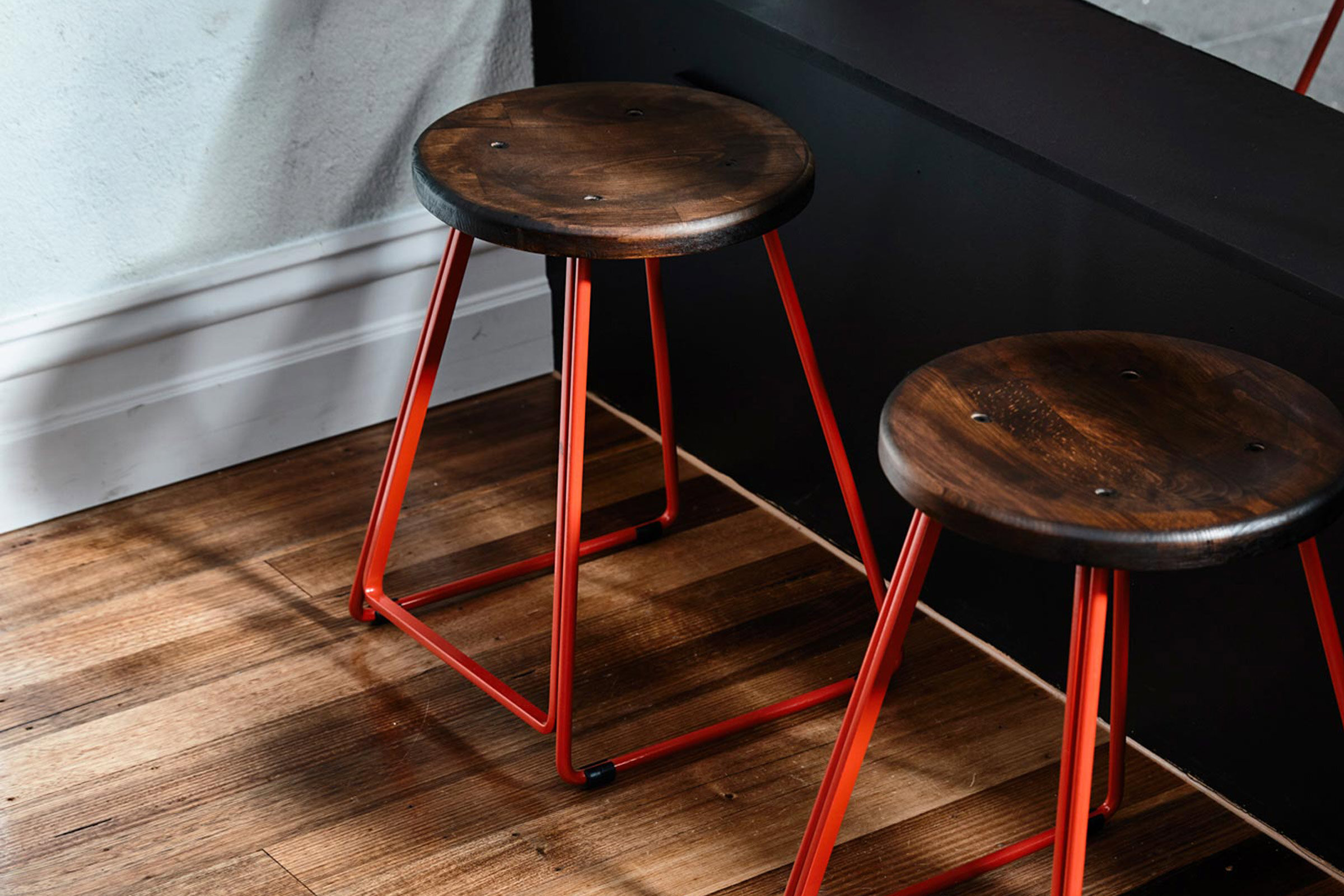
The materials are relatively simple and extremely honest. We used a bagged finish on the brick wall, creating a neutral backdrop for the concrete bar, and the pale grey powder-coated metal splashbacks are also designed to blend in. The back bar has been kept deliberately subdued, focusing on functionality. Cutting through the material palette is a rich red powder coating used in the frames of the stools and the menu board.
Please tell us about some of the custom pieces for the space.
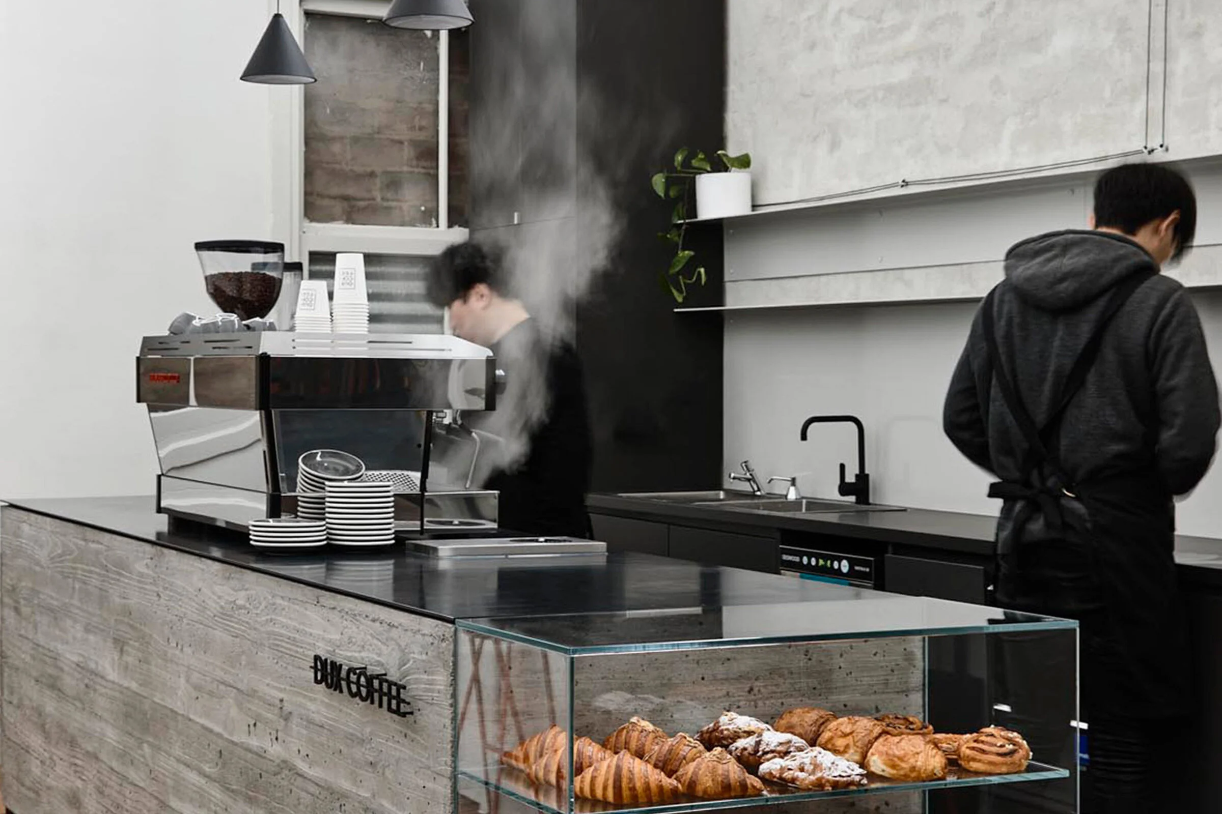
The main design element is definitely the monolithic concrete bar. Apart from hosting the coffee machine with all its accessories, it also includes a glass display for pastries.
Do you have a favourite element or design detail in the space?
Our favourite element is definitely the bar. Due to size constraints, the concrete ended up being a very experimental element — we had to keep its thickness to a minimum, but we only had one shot at it because of time constraints. It was quite nerve racking, but once the timber boards were removed and the end result was revealed, we all felt a real sense of pride and achievement.
What other features are you most excited about?
We love how the old and new complement each other — there’s an honesty about the design that provides a timeless result. But most importantly, the coffee and croissants are delicious!
Images / Derek Swalwell


