A Family Apartment with Room to Grow
Designed by local firm Right Angle Studio, this Singapore apartment at the top of a lush hill combines large open-plan volumes with simple, Japanese-inspired interiors. Here co-founders Alex and Jay Liu tell us more about the project
Design Anthology: Can you tell us about the client and their lifestyle?
Alex Liu (AL): The clients are a couple of young professionals working in law, and they both love to travel. When we first met them, they were expecting their first child and needed their new home to be spacious and child friendly.
What was their brief to you for the project?
Jay Liu (JL): The couple wanted to incorporate certain elements they liked from places they visited while travelling, but they gave us full control of the overall interior design direction.
What’s unique about the building and the location?
JL: The 145-square-metre apartment sits on the highest level of a four-storey building surrounded by lush greenery. The high ceiling and the huge arc above the living room window are unique features of the apartment and set it apart from other units.
How did you approach the project — what design references did you try to incorporate into the space?
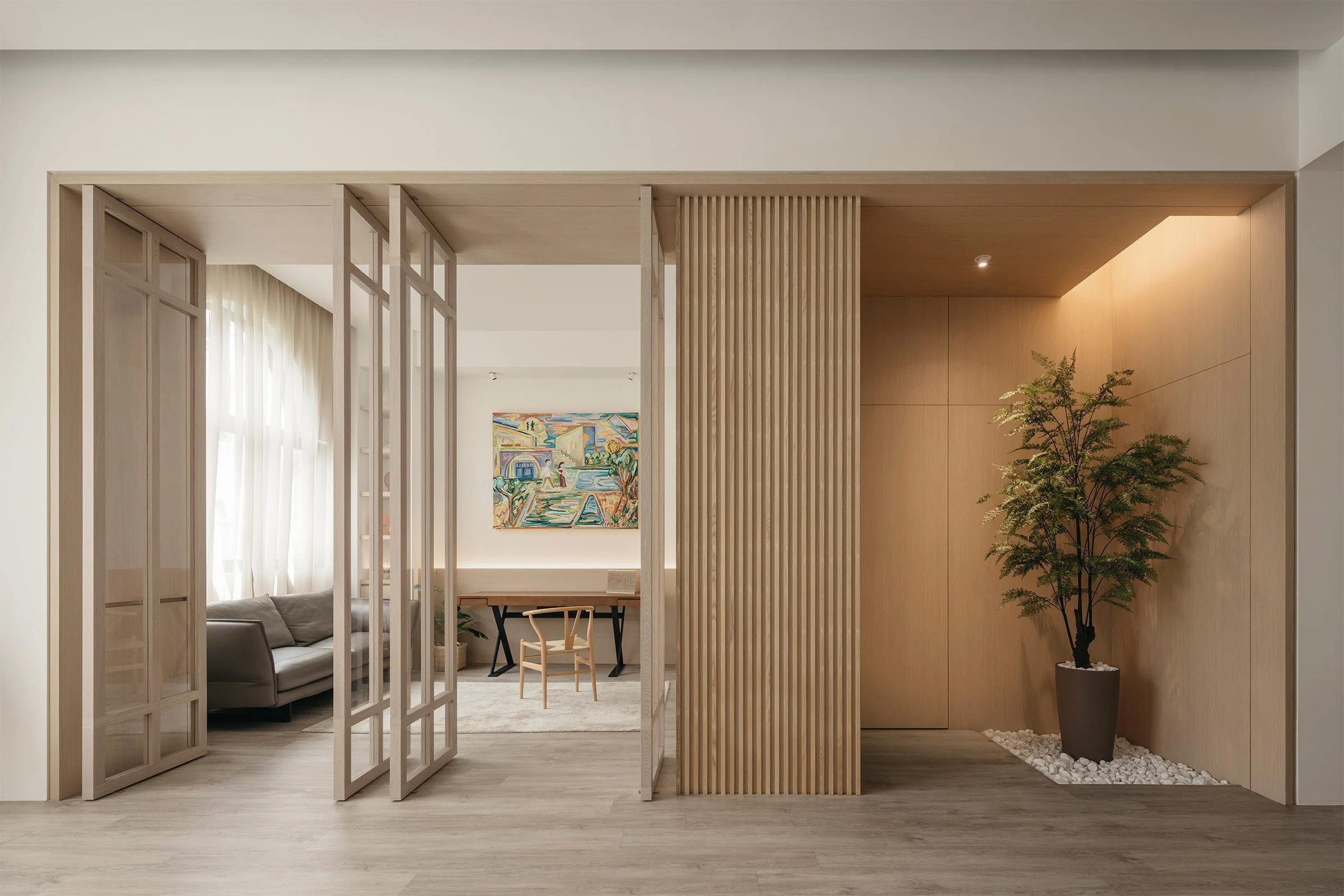
AL: Being huge fans of the Zen and wabi-sabi philosophies, the clients chose a lighter colour palette for the apartment. The main highlight of the space is how the living area and the study room are connected to each other. We decided it wasn’t ideal to partition them into separate enclosed rooms and disconnect the areas completely. Instead, to maintain a certain level of privacy, we built a full-height portal made of wooden pivoting door panels — which double as a design feature — to establish a relationship between the two spaces.
The clients also allowed us to curate furniture pieces from specific brands that would suit their lifestyle and the design narrative.
Please tell us a little about the material choices for the space.
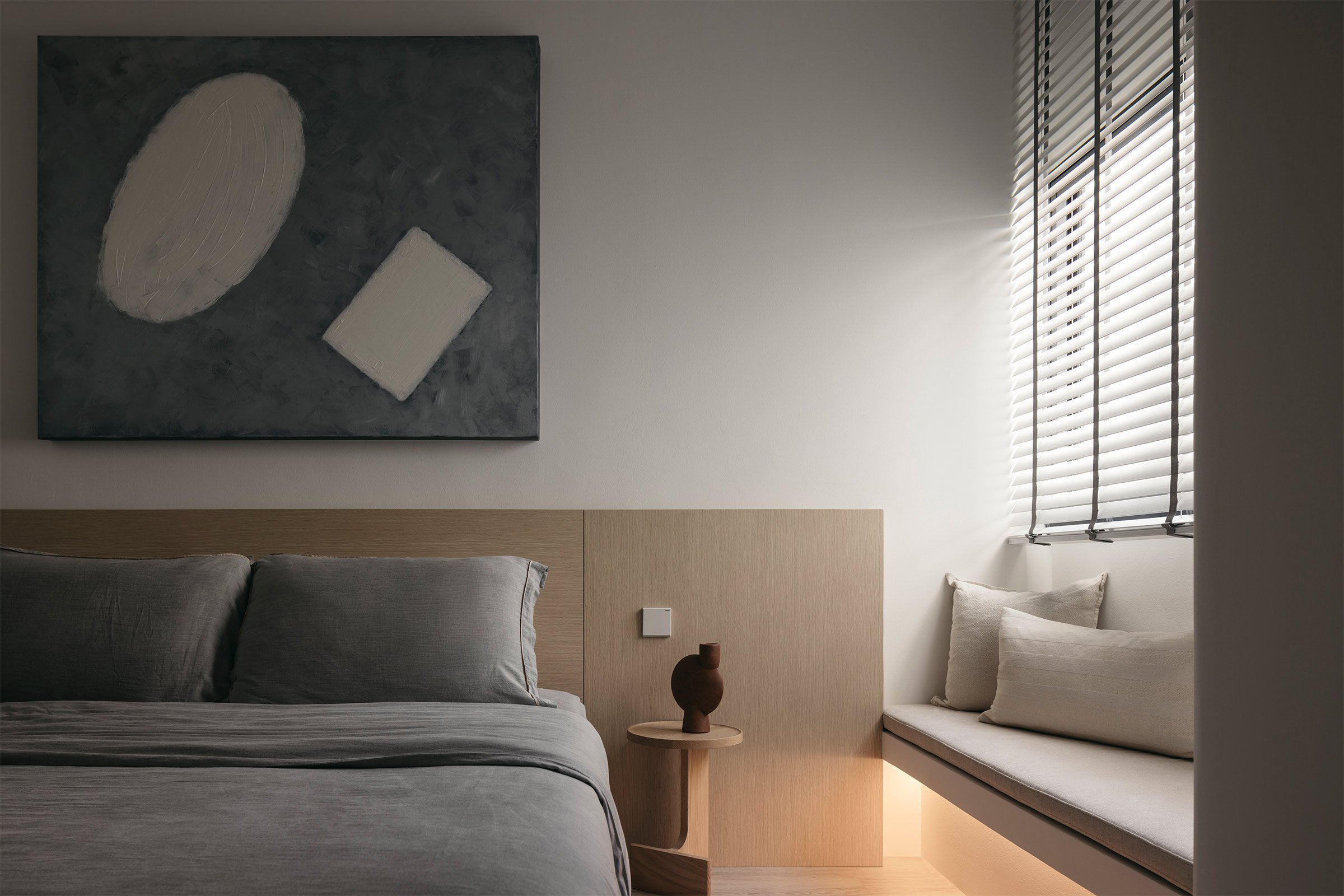
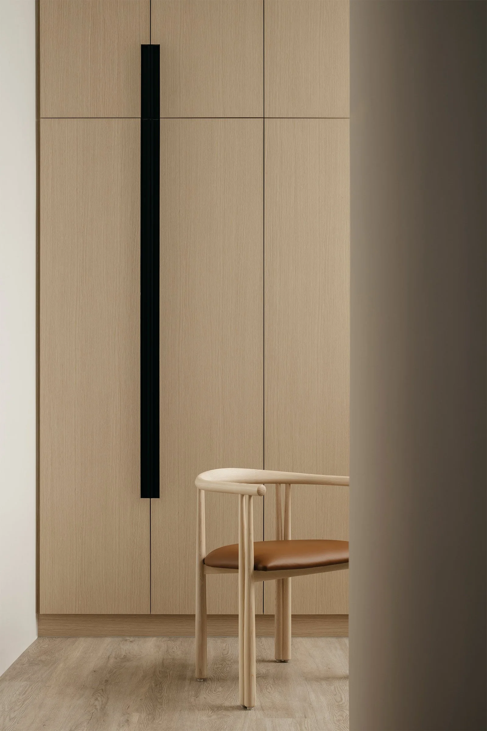
JL: We used natural ash wood and natural marble as the main materials for the space.
Do you have a favourite element or design detail in the architecture or interiors?
JL: A common motif in most of our projects (like the Green House, for example) is the portal. Here we inserted one in the living room, where, thanks to the height of the ceilings, we were able to choose a tall design that accentuates the volume of the space. These are the pivoting door panels that stretch across the width of the entire living area. There’s also a concealed section of the portal at the other end of the space that leads to the guest bathroom.
Images / Studio Periphery


