New Melbourne Gym 1R is an Immersive Experience
Branded as The King of Gyms in the UK, 1R has launched in Australia with a space designed by Foolscap Studio to reflect the gym’s trademark nightclub meets fitness studio aesthetic
Image by Simon Shiff
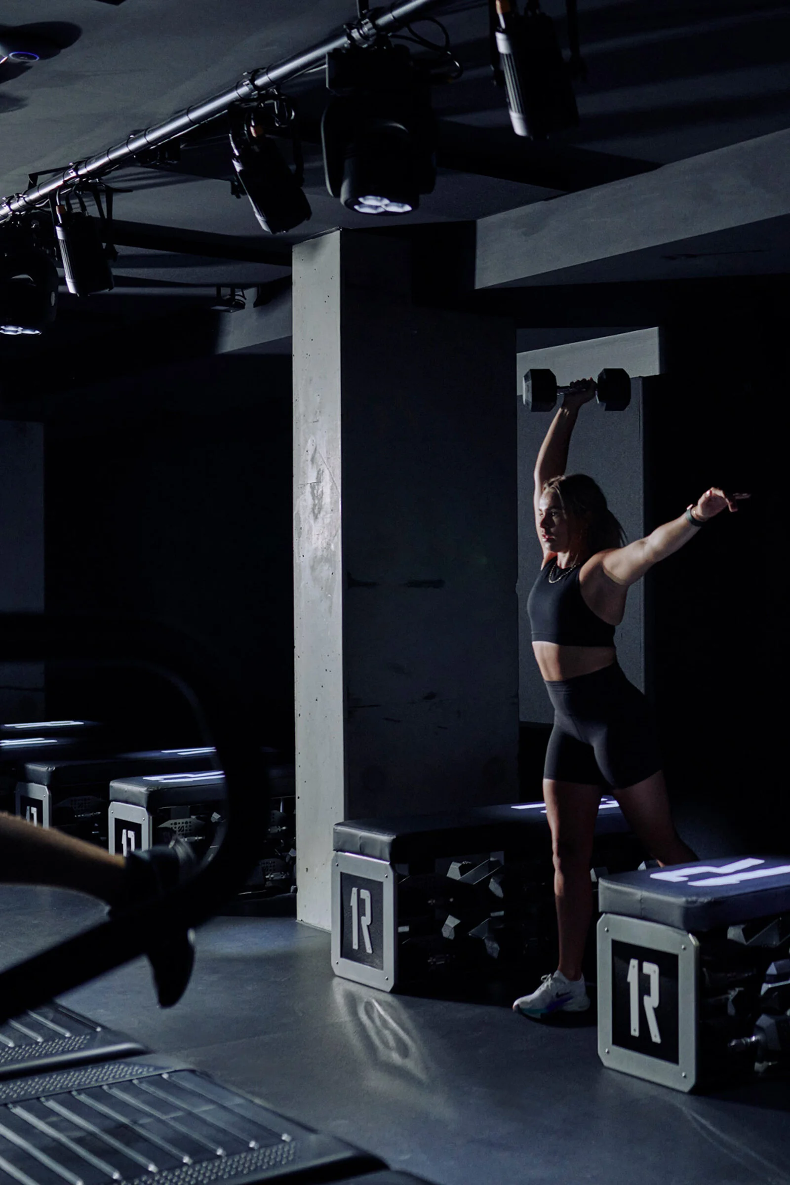
New Melbourne gym 1R is split into two levels: ‘the world above,’ an illuminated ground-floor reception, and ‘the world below,’ a dark, subterranean bunker with high-powered workout studios. As Adele Winteridge, founder of multidisciplinary design practice
Foolscap Studio, explains, the downstairs area is an ‘inwards-looking experience, private and disconnected from the outside world.’ Conversely, the street-access floor is an ‘external and outwards-facing experience’. Here, backlit glass bricks are laid in a cell-like formation, a ‘nod to the cells that make up the human body,’ says Winteridge, who worked alongside interior designer and project lead Emily Minchin.
The gym is an immersive experience that’s just as much psychological as it is physical. A curated soundscape was fundamental to the concept, with trainers spending weeks testing out music in the lead up to the opening. ‘You may not see it, but this is a super technical space,’ says Winteridge. ‘Each of the exercise chambers is a separate container from the existing fabric, so it’s essentially its own insulated acoustic bubble.’ With high-intensity energy at the heart of the space, ‘walking in from the quiet corridor is like entering an incredible party,’ she says.
Lighting was crucial to the overall design, and is proximity to mirrors was carefully considered. ‘There’s a specific magic that happens when spaces are lit well,’ Winteridge notes. ‘The mirrors and lighting in the changerooms are different to those in the studio. And that goes hand in hand with the acoustics, because mirrors reverberate noise. The visuals and sound were integral to the performance of the space.’
Echoing the no holds barred dynamism of the classes, the industrial interiors feature plenty of tough materials, such as reconstituted stone, rubber flooring, yellow PVC strip curtains, stainless steel and, in the locker rooms, aluminium chequer plate sheeting and chain link partitions reminiscent of basketball court fencing. Strip lighting integrated into the exposed ceilings adds to the utilitarian sensibility. ‘It’s a clean slate for dramatic transformation,’ Winteridge says.
While it was essential that the design remained true to the identity of the brand, connection to the location was also important. ‘There are universal elements of 1R here, but we considered how to augment and shift them without losing the essence of what has come before,’ the designer explains. ‘We created a clean, crisp ground floor suited to the urban fabric of the neighbourhood and the dark central concrete corridor is also a nod to Melbourne’s iconic alleyways. It’s 1R with a twist.’
Text / Carli Philips
Images / Simon Shiff & Willem-Dirk du Toit
Image by Willem-Dirk du Toit
Image by Simon Shiff
Image by Willem-Dirk du Toit
Image by Willem-Dirk du Toit
Image by Willem-Dirk du Toit
Image by Simon Shiff
Image by Simon Shiff
Image by Willem-Dirk du Toit
Image by Simon Shiff
Image by Simon Shiff
Image by Simon Shiff
Image by Willem-Dirk du Toit
Image by Willem-Dirk du Toit
Image by Simon Shiff
Image by Willem-Dirk du Toit
Image by Simon Shiff
Image by Simon Shiff


