Rustic yet Refined Dining at Fireside
Designed by local firm M.R. Studio, new Hong Kong restaurant Fireside melds the rustic and the sophisticated to celebrate open-fire cooking. Studio founder Myron Kwan tells us more about the project
Design Anthology: How did you first meet the client?
Myron Kwan: Chef Miguel Gallo of the Cupping Room Group approached me after visiting our project BAR DE LUXE, which happens to be in the same building as Fireside — H Code in Hong Kong’s Central.
What was his brief to you for the project?
Chef Miguel’s idea for the restaurant was a rustic open-fire cooking concept with a modern twist, so the interior had to feel both casual and refined.
How did you approach the project — what design references did you try to incorporate into the space?
The interior of the 185-square-metre restaurant is inspired by the idea of a campfire out in nature. Informed by the restaurant’s primal, old-fashioned cooking style, the dining space is rustic and unpretentious yet still refined.
Please tell us a little about the material choices for the space.
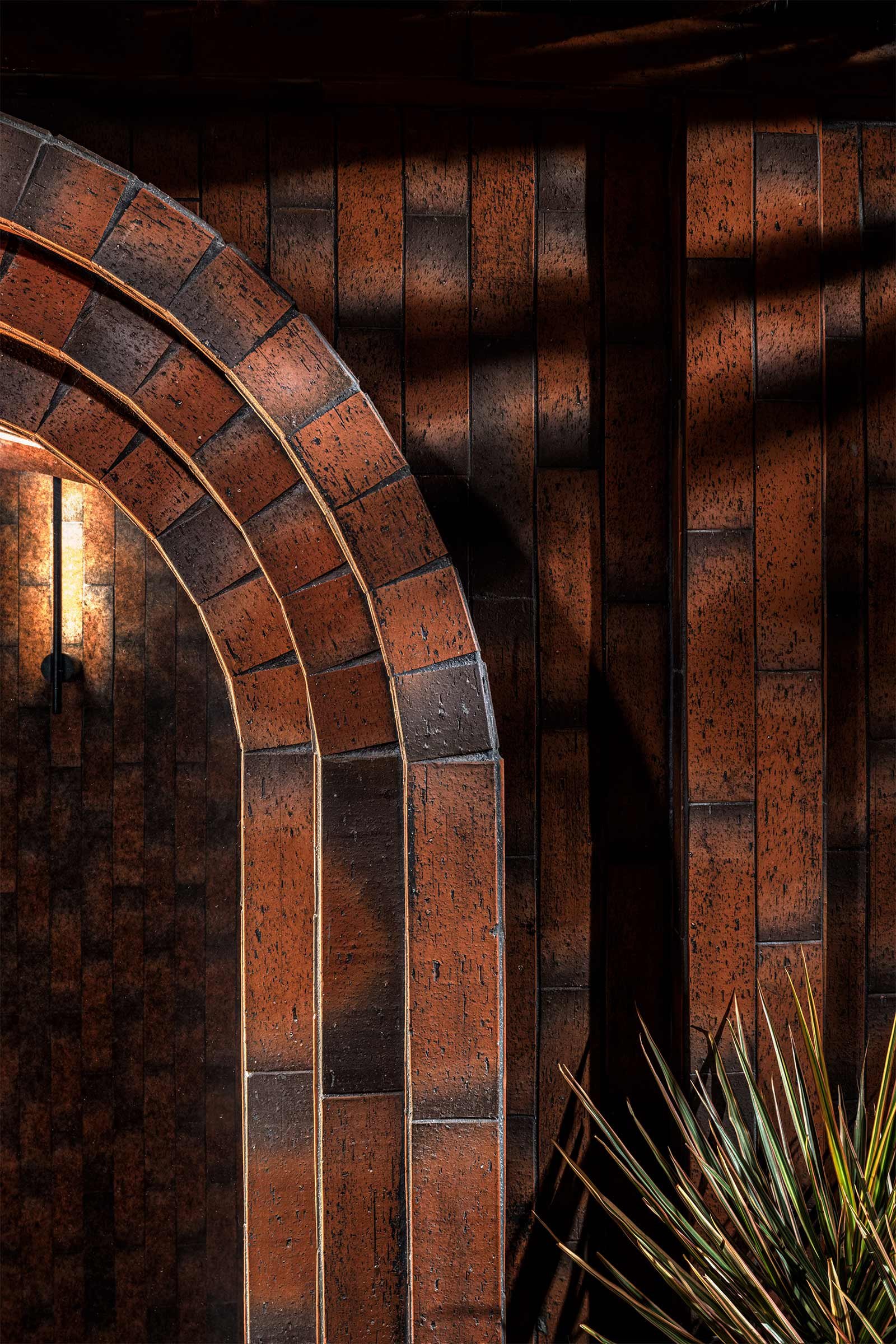
We selected red bricks for the walls, since the process of making bricks, the drying and firing, echoes the cooking methods used in the restaurant. We decorated the ceiling with hemp ropes, a nod to the kind of ropes used for camping, and included other natural materials like black oak timber, firewood, leather, marble and plants to create a rustic atmosphere with a luxurious twist. The warm colour palette is dominated by shades of red, which reflects the ‘fire’ theme of the restaurant, and black and grey tones to add a lived-in yet sophisticated feel.
Which of the pieces did you custom design?
We were asked to design a new combined bar counter and chef’s table for the restaurant. We created an alcove that takes the shape of the kitchen table, into which we inserted a lower dining table. This arrangement offers a flexible semi-private dining experience, while allowing guests dining at the adjacent seating to be immersed in the cooking experience. We also designed a screen to provide some privacy for guests sitting at the bar counter.
Do you have a favourite element or design detail in the interiors?
One of my favourite elements is the floor-to-ceiling dry-aging room, where different premium cuts are displayed in a gallery-style way.
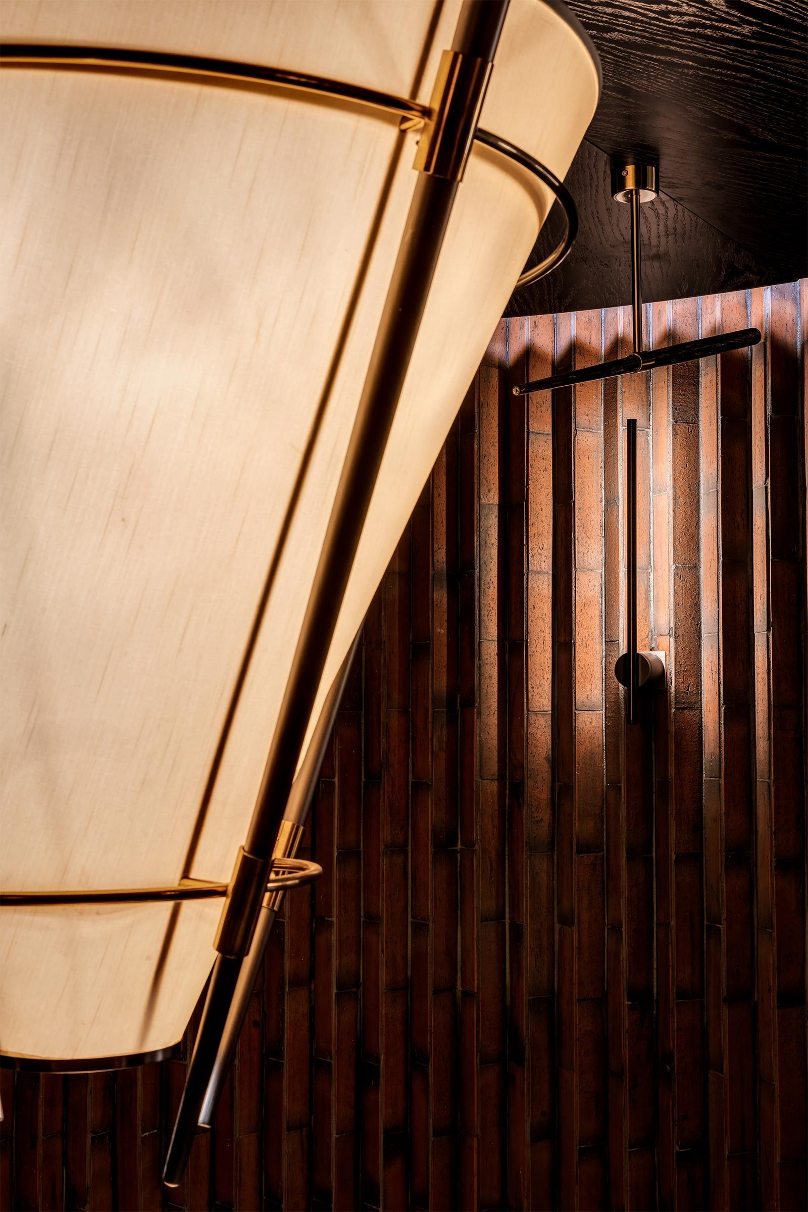
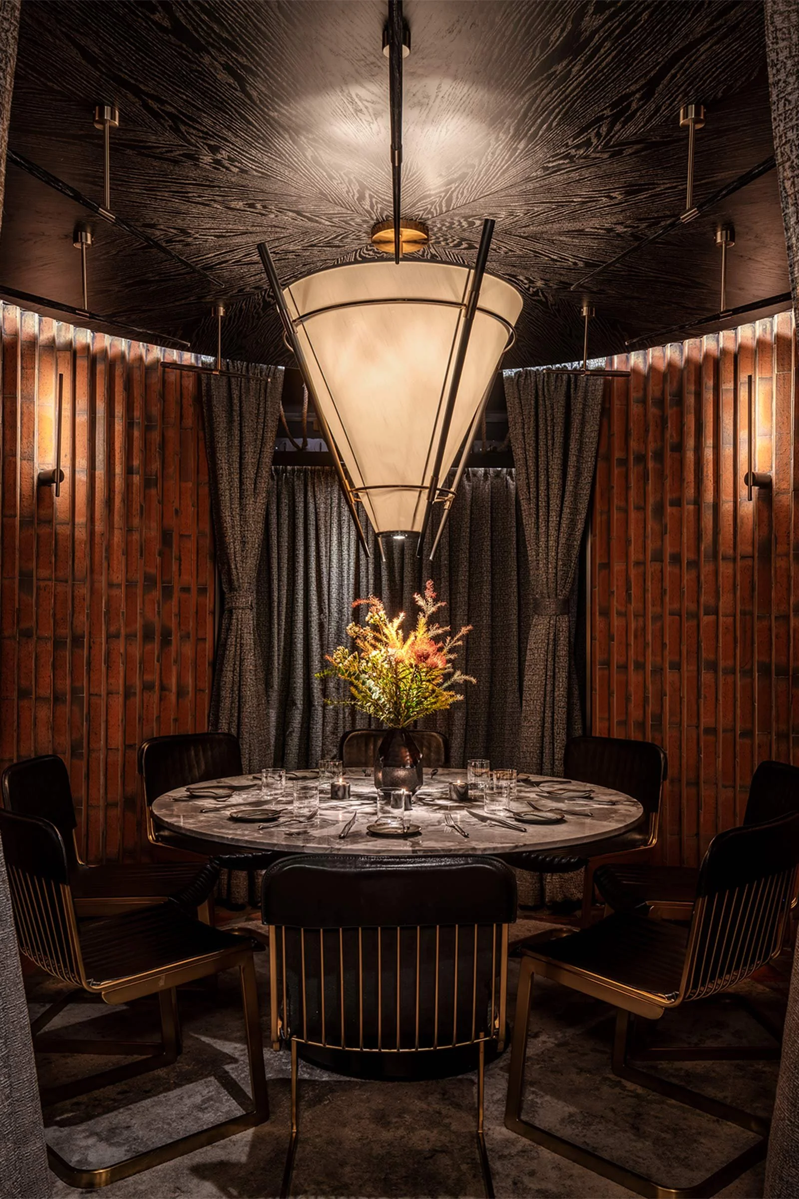
The round private dining room is another highlight. It emulates the shape of a tent, and was designed with flexibility in mind so the curtains can be either drawn to create an open atmosphere, or closed for special events. The oak ceiling, brass pendant lamps, marble table and the elegant carpet all work together to create a mood that distinguishes this space from the rest of the restaurant.
Images / Steven Ko


