Gaga Toast Rises in Shenzhen
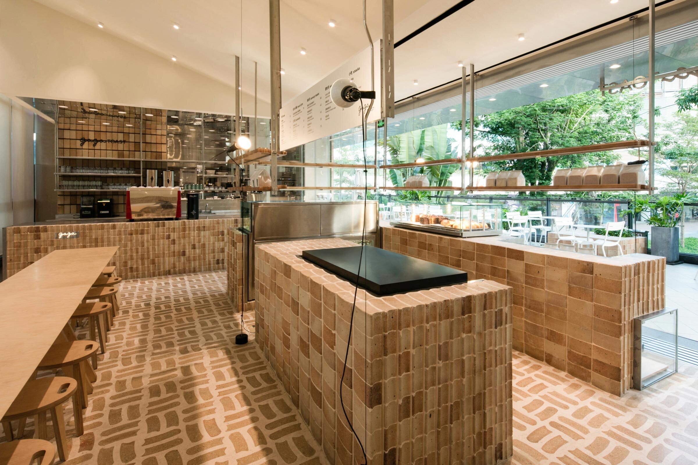
Realised by dongqi Design, new bakery Gaga Toast is designed entirely around the humble slice of toast, with a bread motif realised in everything from the swathes of bespoke brick to the branding and menu design. Studio creative director Yuan Yuan shares more about the project
Design Anthology: How did you first meet the client?
Yuan Yuan: A friend introduced us to the owners of restaurant group gaga over a meal.
What was the brief to you for the project?
gaga is a casual dining chain with multiple locations all over Shenzhen. The owners teamed up with renowned Japanese master baker Tomohiro Nogami to create a menu based on quality ingredients from Japan, and we were invited to showcase bread in a new way.
Where is the bakery?
Gaga Toast is located in Shenzhen’s Nanshan District, a bustling coastal area full of artist communities and historic sites.
What’s great about the neighbourhood and what makes the location unique?
Nanshan District is a tourist hub right by the sea, but it definitely appeals to the creative crowd. With art museums, mall complexes, an aquarium and iconic landmarks, it’s just the right amount of upbeat and chill, making it one of Shenzhen’s best weekend hangout spots.
How did you approach the project — what design references or narrative did you try to incorporate into the space?
Our team wanted to create a new concept bakery and develop its visual identity following this narrative. We named the space Gaga Toast and proposed a narrative of ‘More Than Toast’. Gaga Toast isn’t only a bakery that serves delicious bread, but also a gathering space full of toast motifs.
Please tell us a little about the material choices for the space.
Toast-themed elements permeate the space, and the entire spatial narrative is centred around a specially shaped brick. Some bricks are shaped in a metal mould and baked at a high temperature, so the process of brick making is not dissimilar to that of bread or toast baking. We worked closely with craftsmen to create a unique texture on the surface of the brick, with aggregate elaborately combined with concrete to form a unique surface finishing so the bricks look almost like the crust of a slice of toast.
Please tell us about some of the custom pieces for the space.
We designed different combinations for different functions and applied these throughout the entire space, from the walls to the floor, and from the counter to the merchandise display and the moveable fixtures. We also kept the metal mould used to shape the bricks, and we turned them into plates for brand-related materials and merchandise display.
Do you have a favourite element or design detail?
Our favourite part is how we explored the limits of brick laying to fully showcase the irregular geometrical shape of the brick. In terms of the visual identity, the brand-owned patterns and graphics were generated and applied to various touchpoints, from print materials to digital content and from furniture to packaging — almost anything you can imagine. The visual language is friendly and bold, and we hope it encourages people to gather together for a chat over freshly baked bread.
Images / Raitt Liu


