Rough Meets Refined at Kermis
In designing new Tokyo restaurant Kermis, PANOF Design reinterprets Japanese aesthetics by combining recycled elements with more delicate pieces. Here head designer Yoshiaki Soma tells us more about the project
Design Anthology: How did you first meet the client?
Yoshiaki Soma: We met at a bar a few years ago and have been totally on the same page ever since.
Where is the restaurant located and what’s great about the neighbourhood?
Kermis is located in Tokyo’s Shirokane neighbourhood, a quiet and elegant area that’s being developed more and more. The building itself is 50 years old.
How did you approach the project — what design references or narrative did you try to incorporate into the space?
I love the ancient Japanese philosophy of wabi-sabi, but we wanted to avoid creating a typical Japanese restaurant. The chef's cooking style is based on creative taste compositions with seasonal ingredients, so we tried to echo this in the interior’s materials.
Please tell us a little about the material choices for the space.
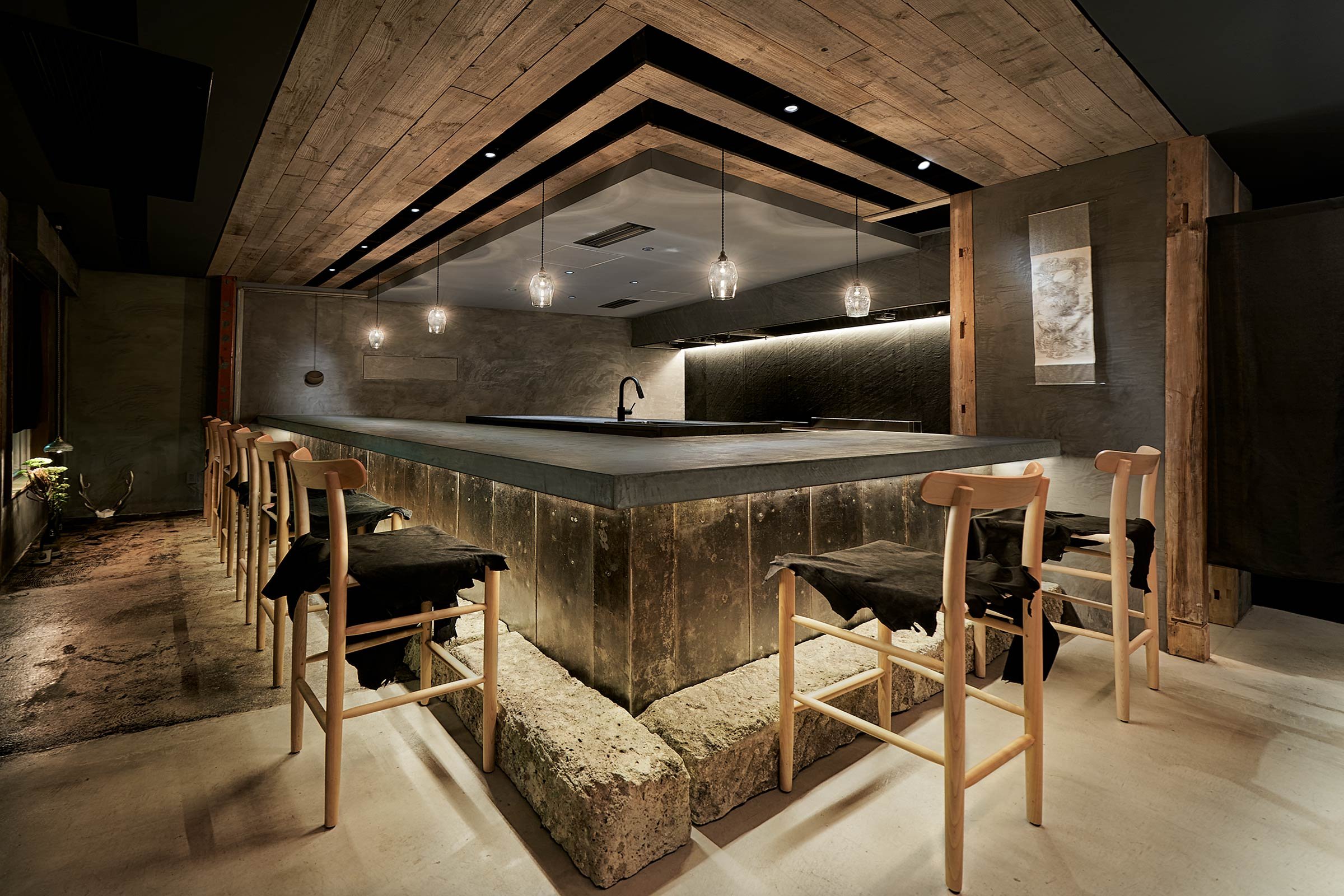
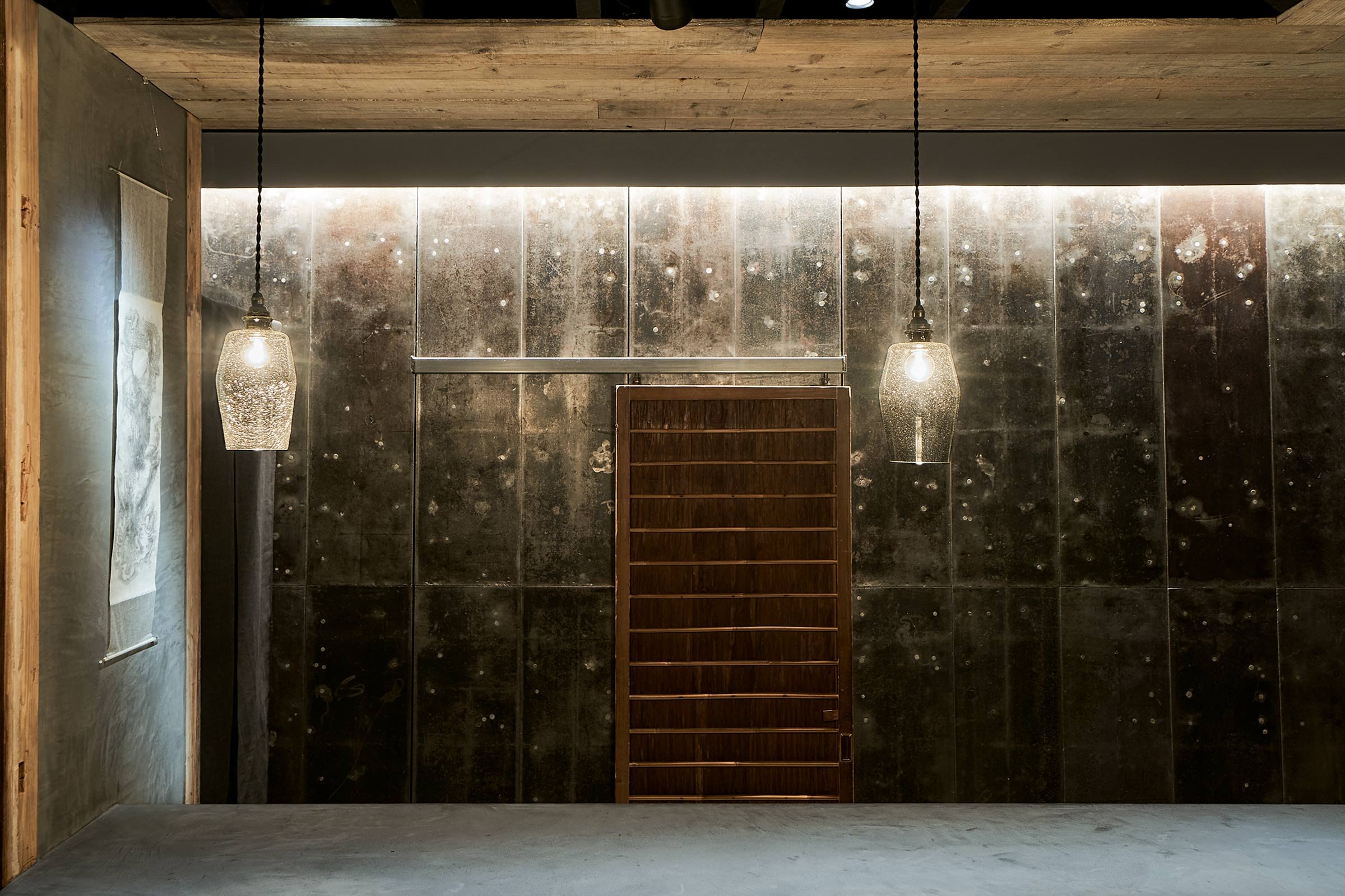
In order to reduce waste, we tried to incorporate recyclable materials into the interiors. We left the steel plate walls as they originally were and crafted the counter from concrete and steel plate and then added stones at the bottom. We kept some old wooden elements found in the original space and complemented them with a wooden door, which we found in an antique store.
Please tell us about some of the custom pieces for the space.
I asked a group of artist friends to help me with the production of custom pieces, which seemed to fit this project. I had to make some difficult specifications, but they turned out exactly as I had envisioned.
Do you have a favourite element or design detail in the interiors?
The iron plate walls are definitely noteworthy. Usually, the iron plate is covered with concrete and is invisible, but here we left them exposed. I also really like the custom-made glass lighting shades.
Images / Tomohiko Ogihara and Yoshiaki Soma


