Neptune is an Easy Breezy Neighbourhood Spot
Realised by Hui Designs, Neptune’s refreshing, porous design makes it an exciting new urban marker in Singapore’s Katong district
With many urban centres quietened as a result of COVID-induced work-from-home arrangements, F&B businesses are increasingly looking to the suburbs. In Singapore, new establishments have sprouted up in the Katong district, to the delight of residents. Neptune, opened in March 2021, is a new addition to the historic neighbourhood, which is characterised by its charming pedestrian scale.
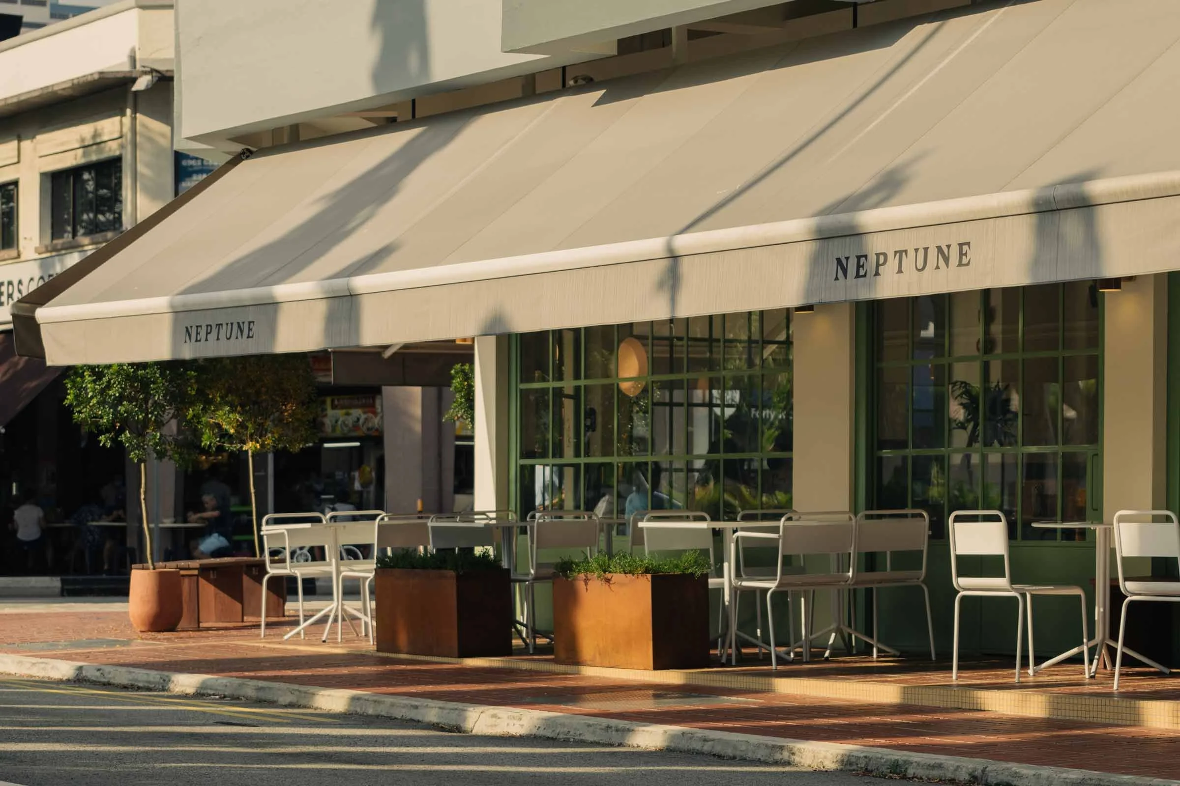
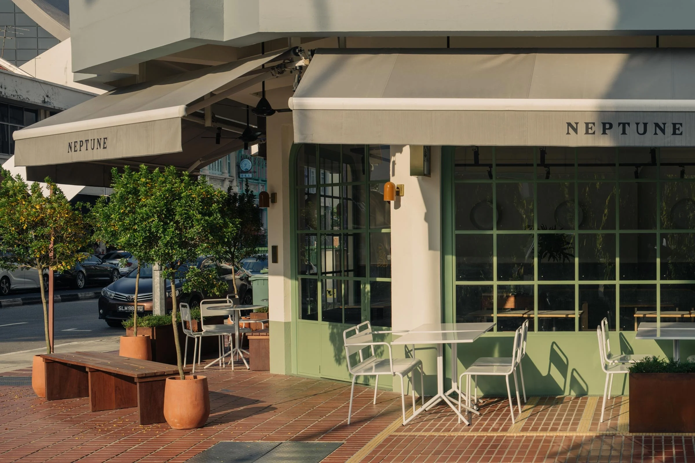
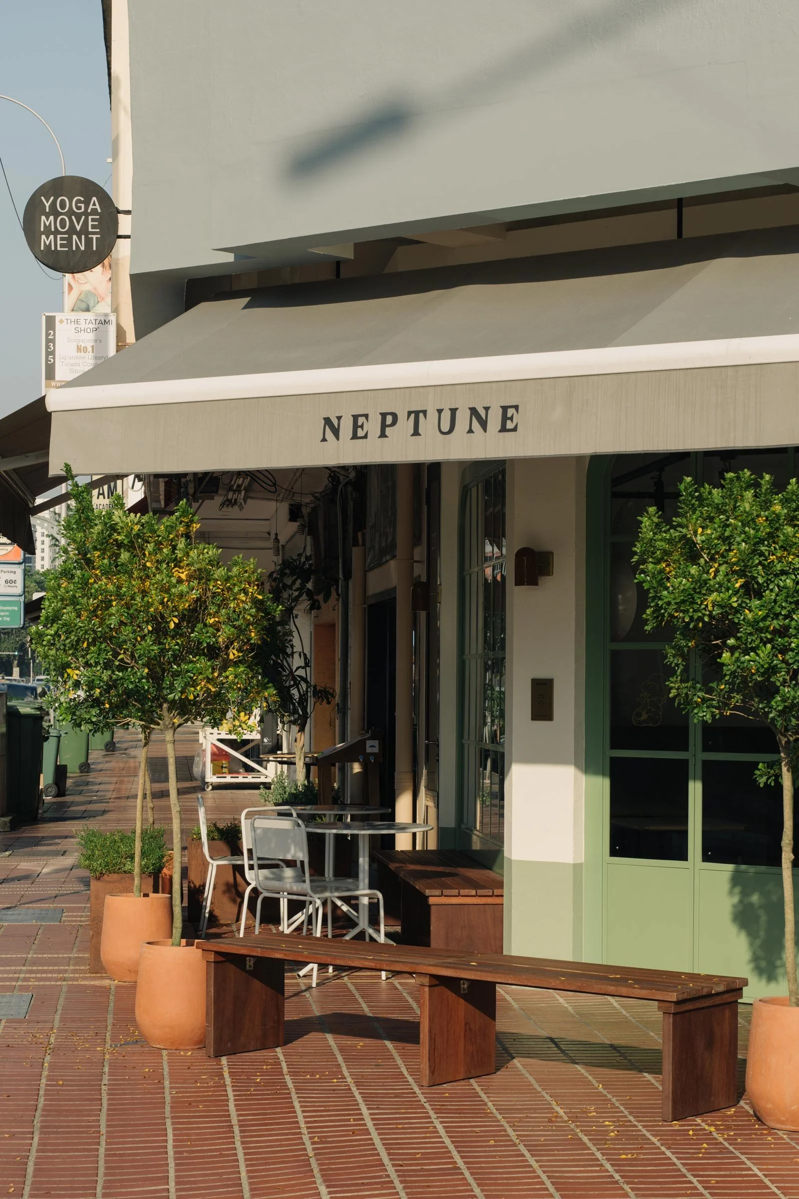
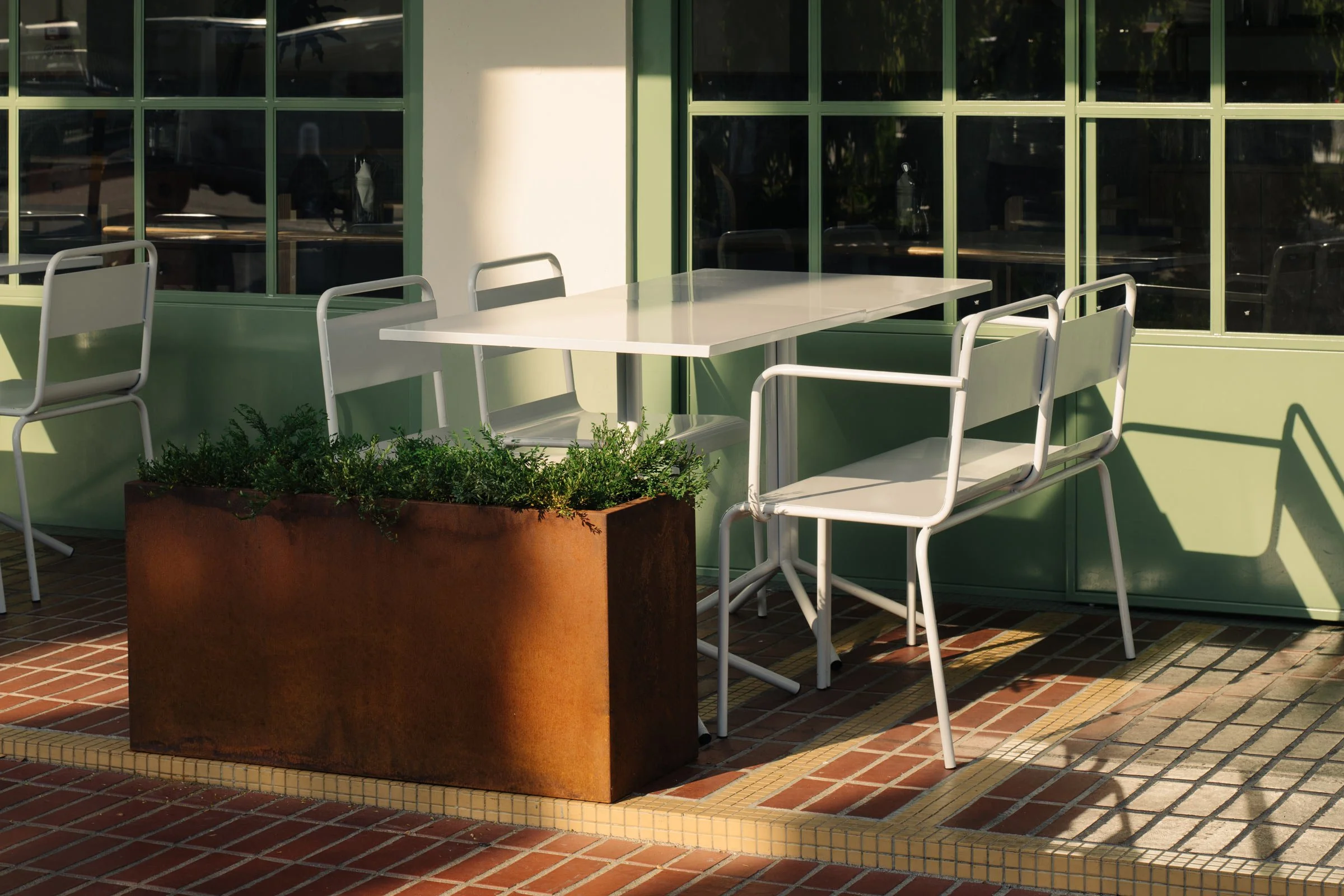
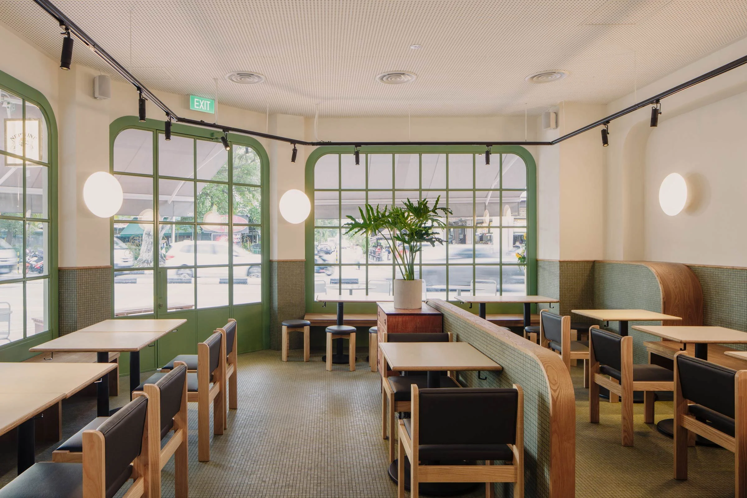
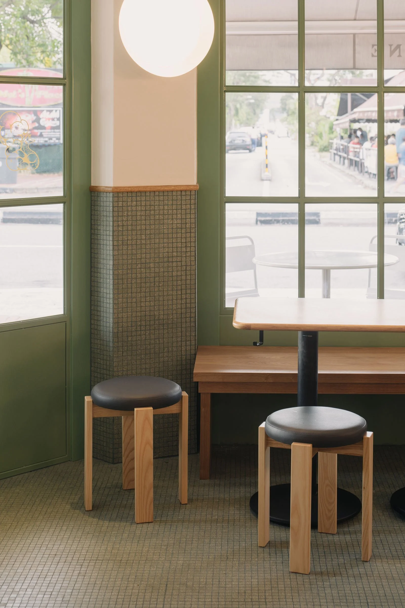
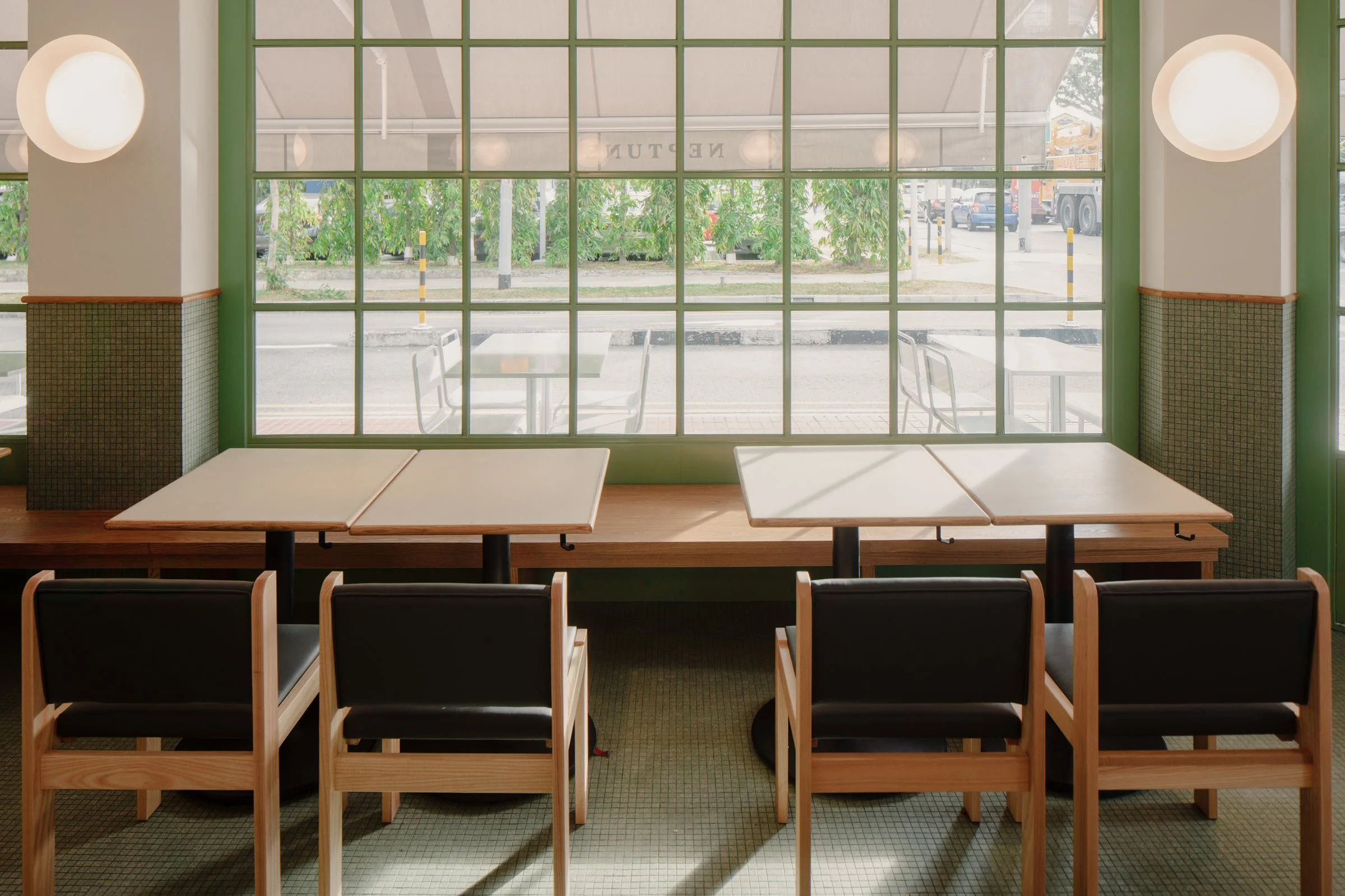
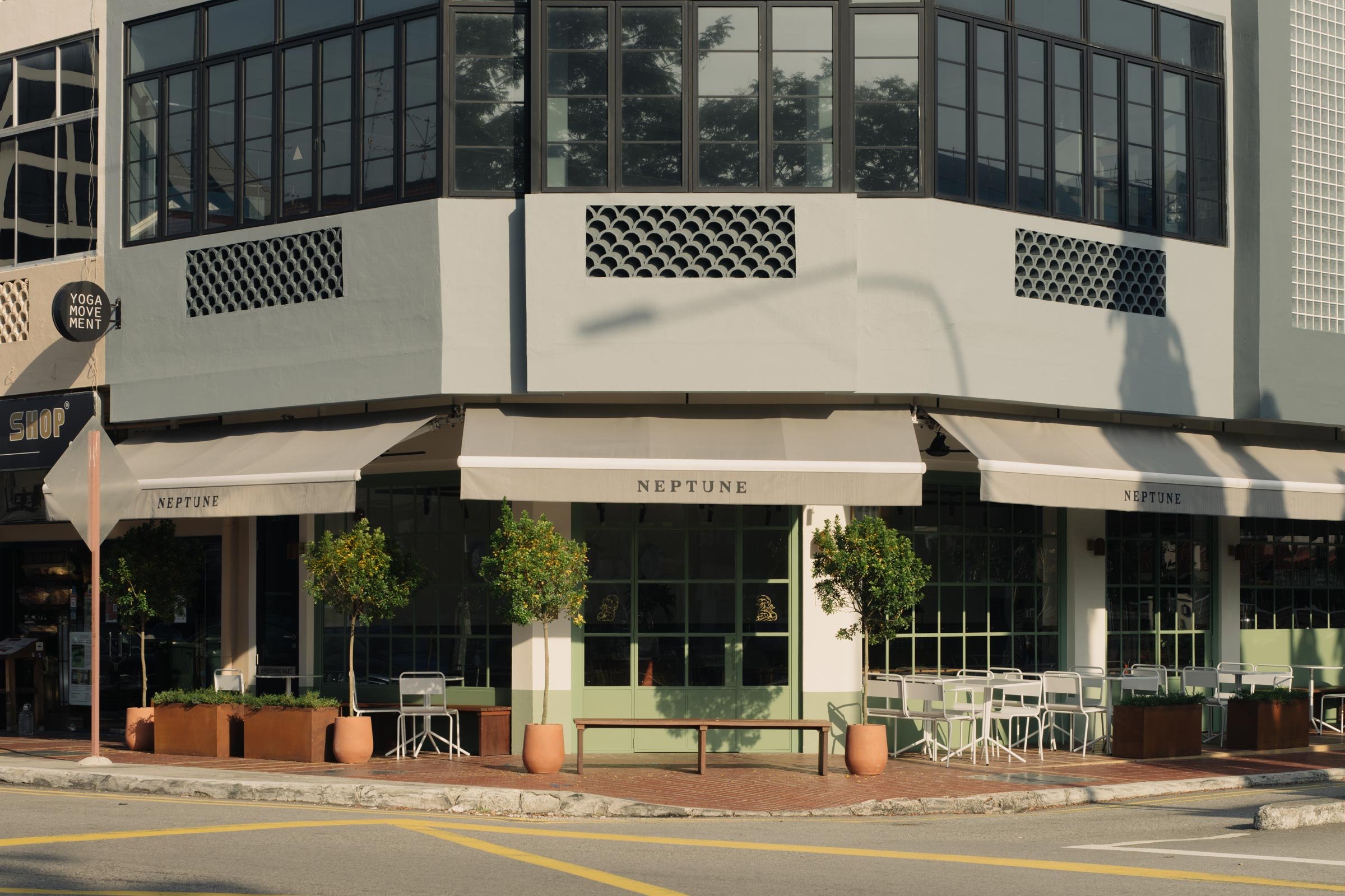
Launched by the owners of a string of popular cafes, including Atlas Coffeehouse, the 70-seater eatery is situated at the end of a row of shophouses, giving it a distinct presence. Lim Siew Hui of Hui Designs — who also designed some of the brand’s other cafes — made the most of this by cutting out large windows that are articulated with mullions and softened with chamfered edges, and bring in much natural light. Benches line the inside walls, while outside, ample al fresco seating builds a strong connection with the streetscape.
‘My approach is to always embrace the site. The corner unit is fronted by the busy East Coast Road and also faces a quieter adjacent street leading to a residential area. I knew I wanted this venue to have a sidewalk cafe vibe like you’d find in the suburbs of Melbourne,’ says Hui. ‘Most of all, I wanted it to have a neighbourhood, friendly atmosphere where the residents in the area can see themselves hanging out in.’
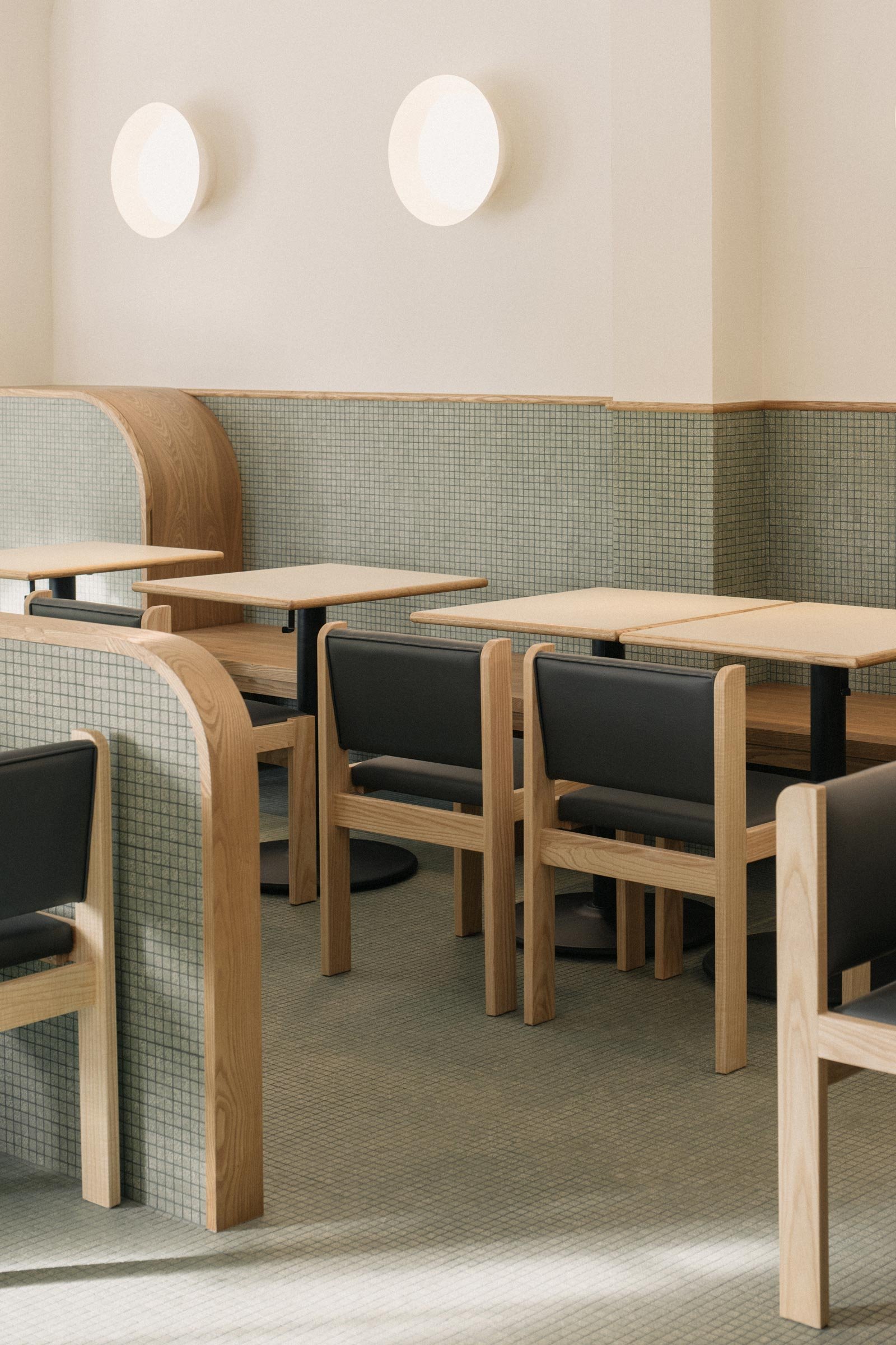
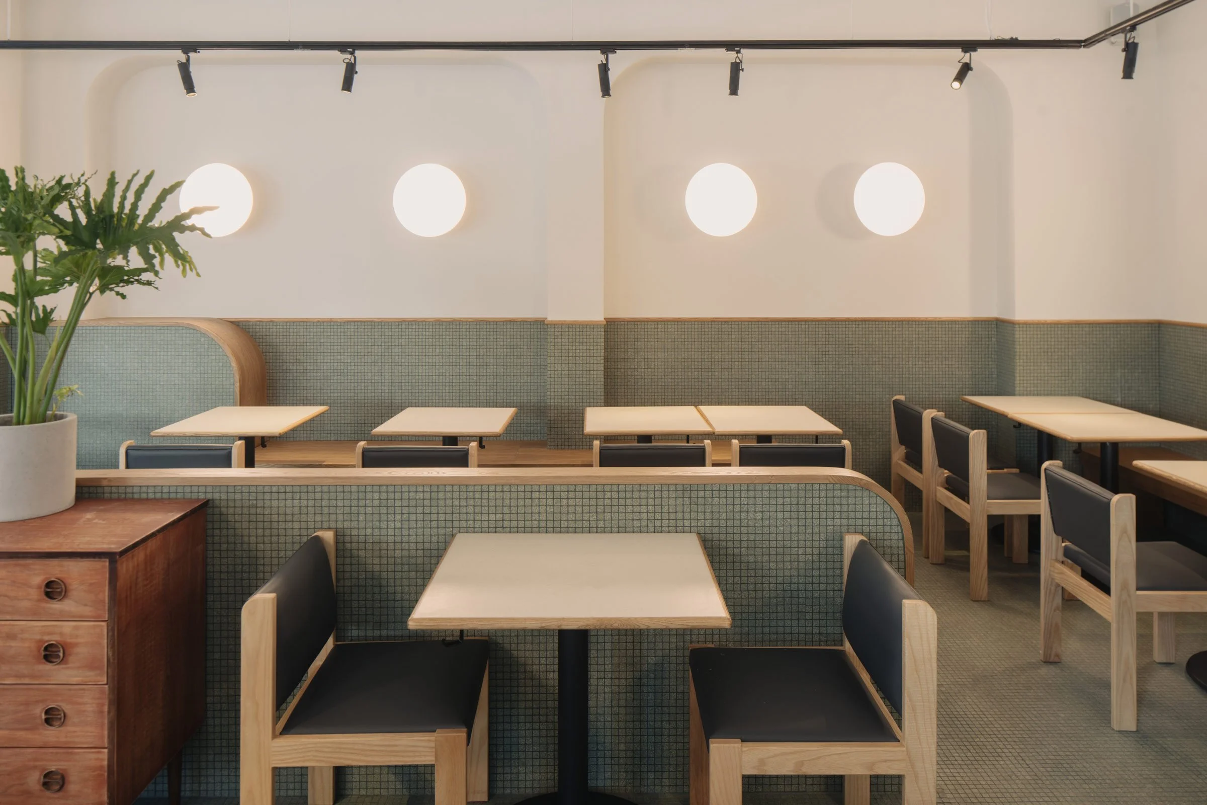
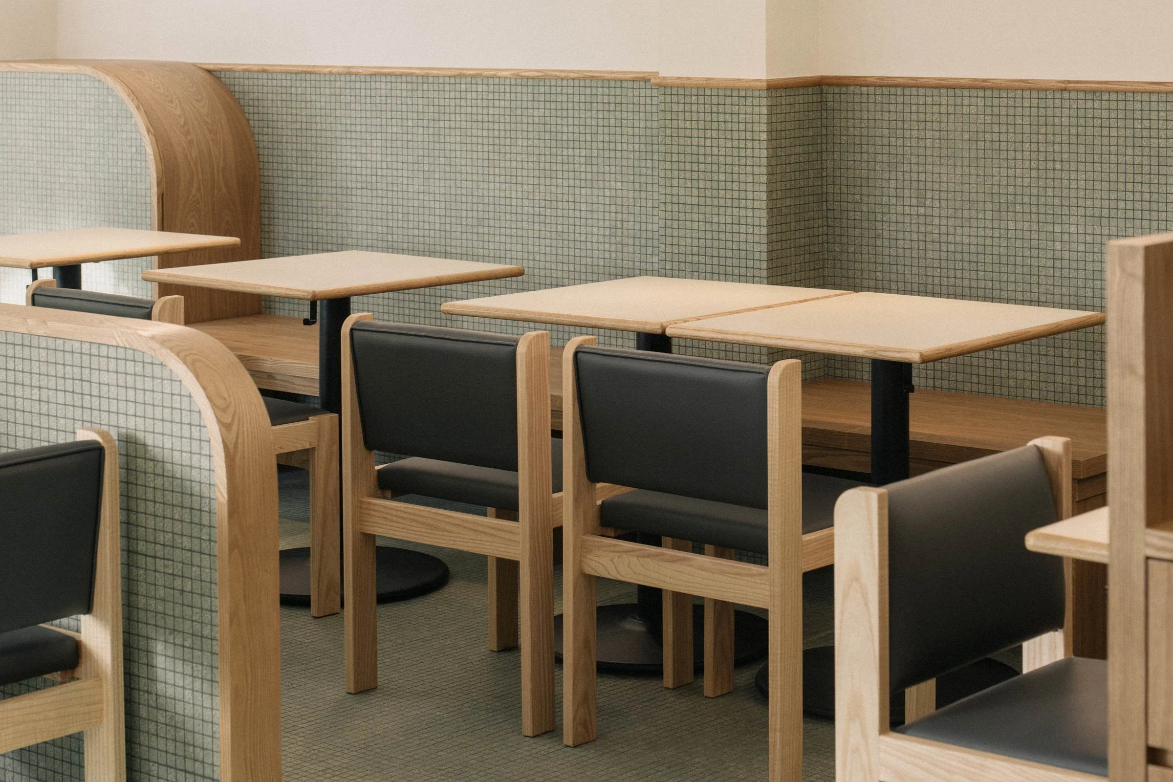
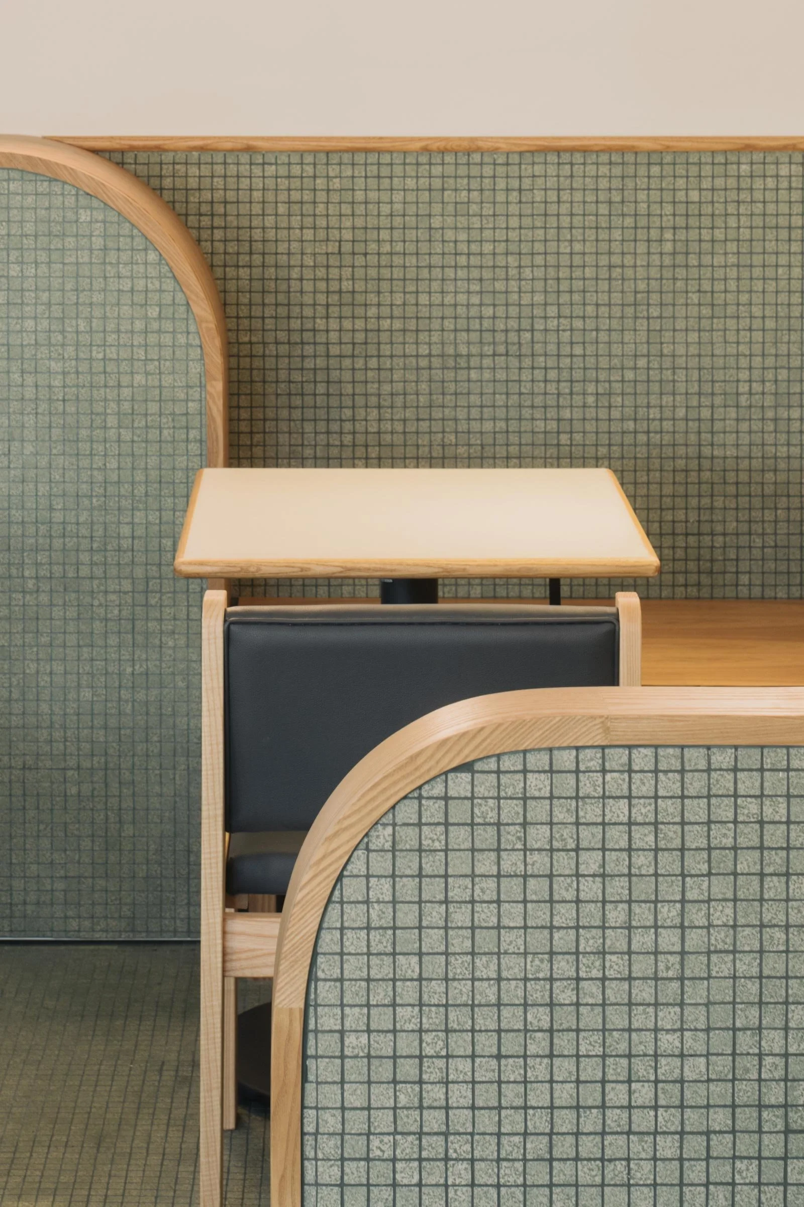
An amiable palette of sage green colours the window mullions and mosaic tiles that cover the floor and climb up the walls. ‘These are the kind of tiles one would find in old-world kopi tiams (coffee shops). I asked the supplier to produce monochromatic sheets for me without the usual flecked patterns so that it’s more modern. I wanted to localise the interior design with the mosaic tiles, to give it a new yet familiar look,’ Hui explains.
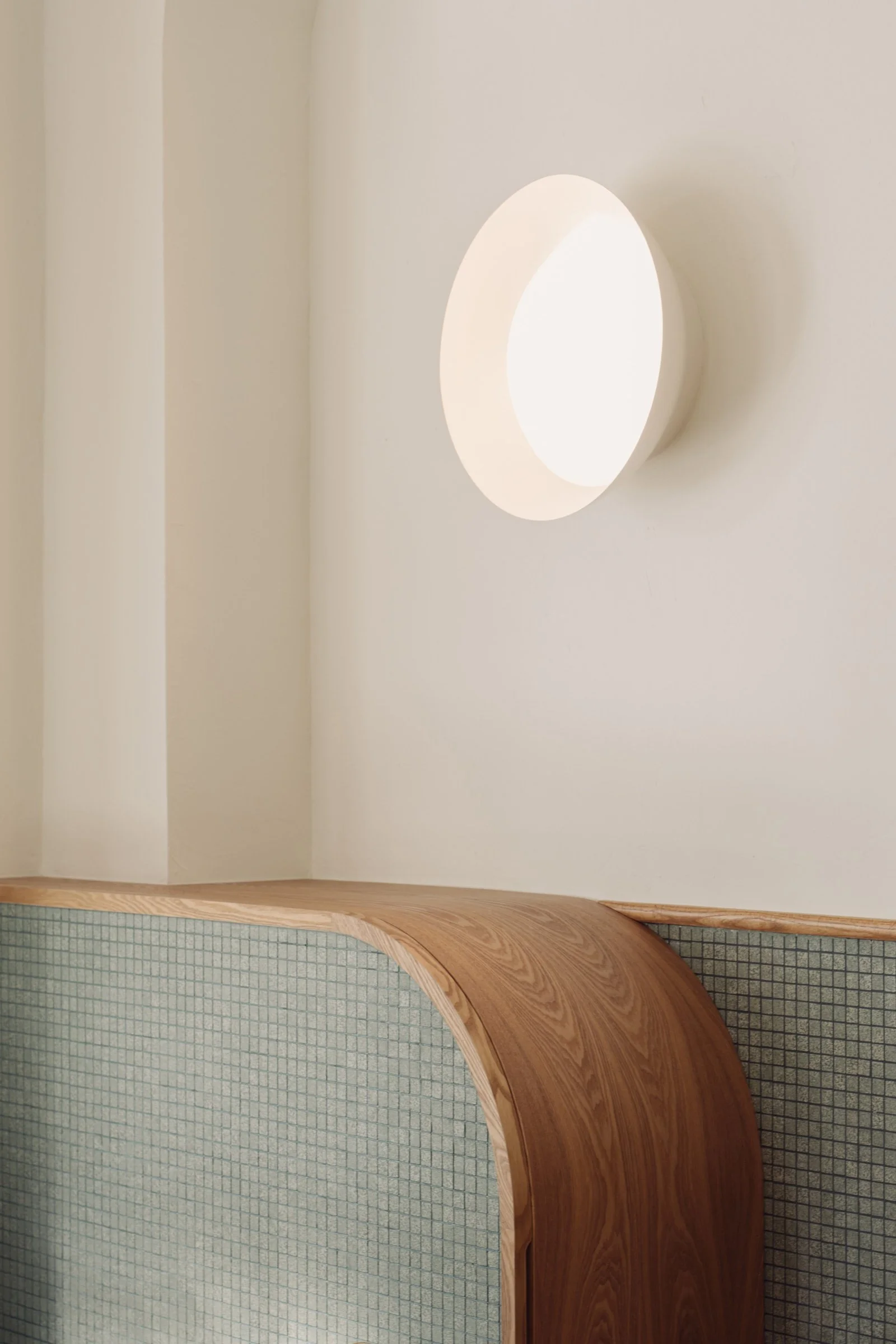
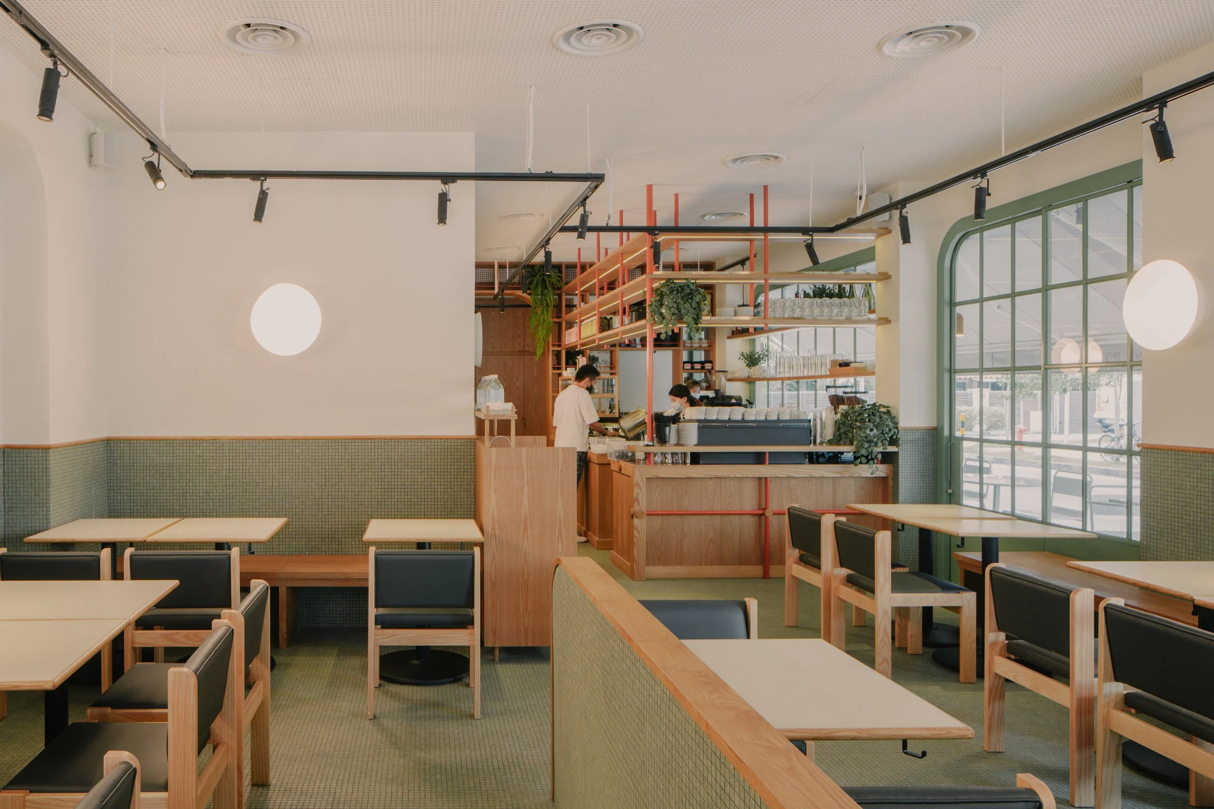
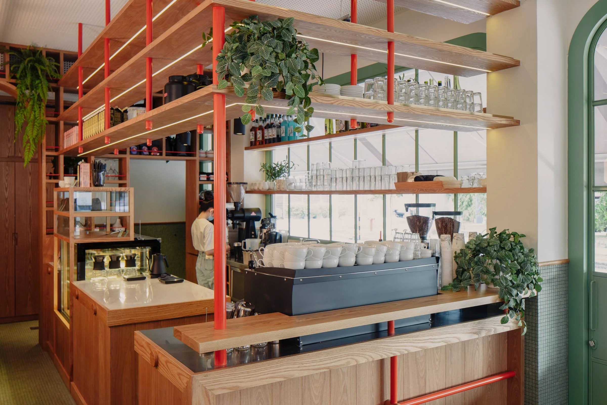
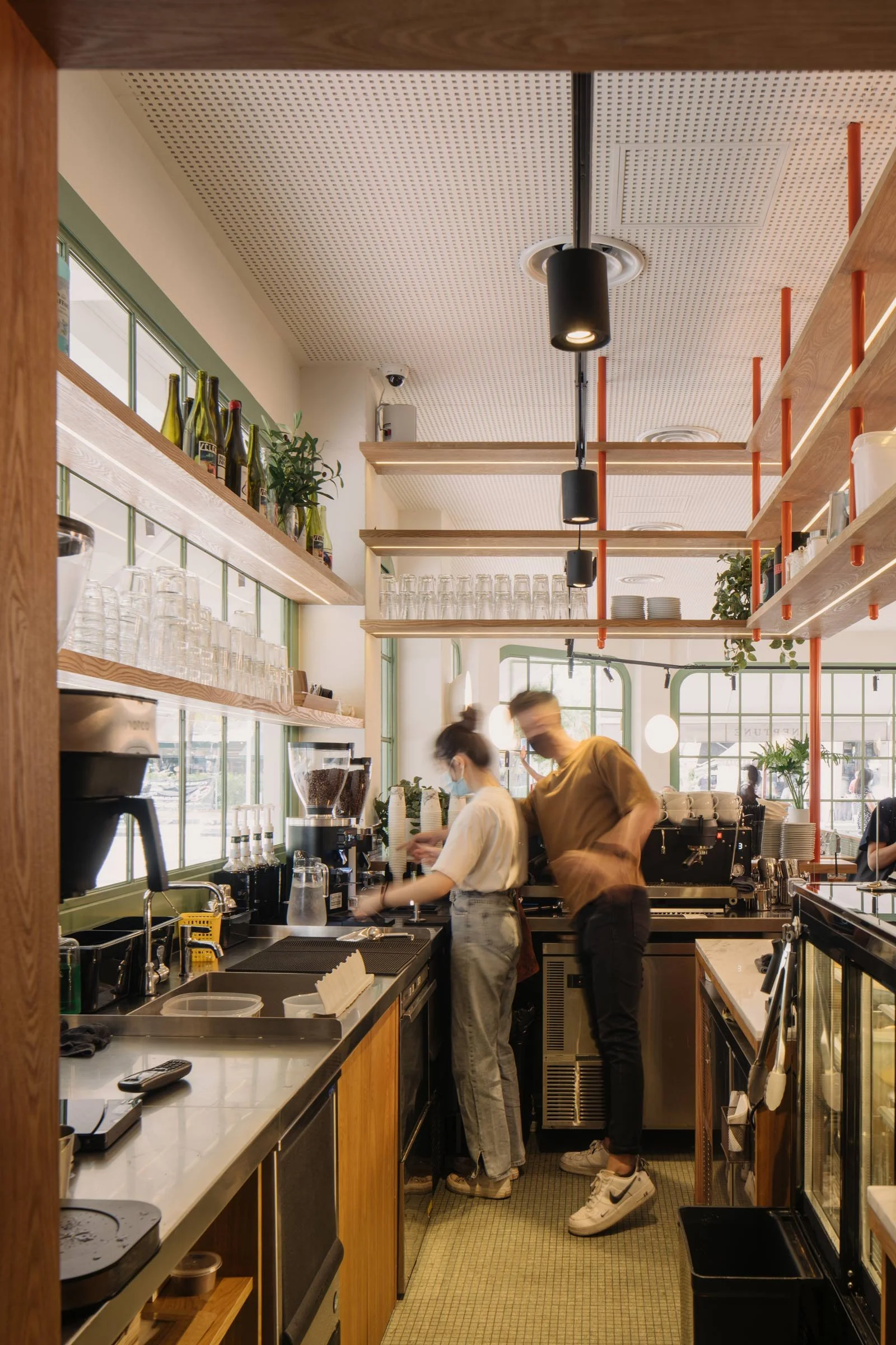
To the back, the coffee counter is clearly defined as a box. Tubular elements in burnt orange make the space a focal point, and exposed timber framework alludes to the woodwork in classical Japanese architecture. The graphic language of these orange elements is echoed in the black ceiling lights, and three-dimensional circular sconces add this play of geometry. Hui’s intricate level of detailing extends to the design of the dining chairs, their classic lines and natural timber bodies keeping with the theme.
Text / Luo Jingmei
Images / Khoo Guo Jie
