Take a Seat at Park Bench Deli
Beloved Telok Ayer takeout spot Park Bench Deli has re-emerged with a vibrant redesign that encourages interaction with both locals and the local context. Dean Chew of local firm DRAWN. shares more about his approach to the project
Design Anthology: How did you first meet the client?
Dean Chew: I have known Andrei Soen, the founder of Park Bench Deli, for quite a few years, and our friendship has always been rooted in our common love of good music, food and most importantly, developing projects and initiatives that enrich the community. I’m a frequent customer of PBD, especially in the last two years or so, and it was during Singapore’s lockdown in 2020 that Andrei had the idea of revamping PBD.
What was his brief to you for the project?
Andrei was very conscious of what he wanted from the start. PBD had thrived in its earlier years as a quick takeout space, and he wanted the revamp to be the exact opposite — to convert it into a seated restaurant that allows people to linger. He was also toying with the idea of introducing a bar, which would transform PBD into an evening hangout spot. What was very clear to me is that the new PBD should be people-centric, and that it should have the flexibility to transition throughout the day and accommodate different sets of users.
Where is Park Bench Deli located?
It’s nested in the colourful heritage neighbourhood of Telok Ayer Steet, home to many cafes and bars. Telok Ayer is also part of Singapore’s main CBD conservation enclave, and it’s one of my favourite pockets on the island — it’s the archetypal collage of Singapore: the colours, the mixing of old and new tenants, the architectural motifs and styles of the shophouses, and the five-foot ways that connect seamlessly.
How did you approach the project — what design references or narrative did you try to incorporate?
I’ve worked extensively with these shophouses for the past decade or so, so I’m always conscious of my design interventions and how they impact the scale, the surrounding context and, most importantly, the five-foot ways. My departure point is to first and foremost consider how a user might interact with the new shopfront, and the relationship between the five-foot way and the entrance. I was really interested in seeing how I could blend the new shopfront with its immediate context, and almost allow it to ‘disappear’, such that the experience of the shopfront is primarily about a spatial encounter rather than a jarring facade.
So, what I did was simply recess the new shopfront one and a half metres away from the boundary line and continue the pebble-wash border as the new flooring for the entrance.
We also created a chamfered entrance bulkhead that not only creates the impression of a bigger space, but also references the eclecticism of the neighbourhood, which is full of undulating facades and rooflines.
Please tell us a little about the material choices for the space.
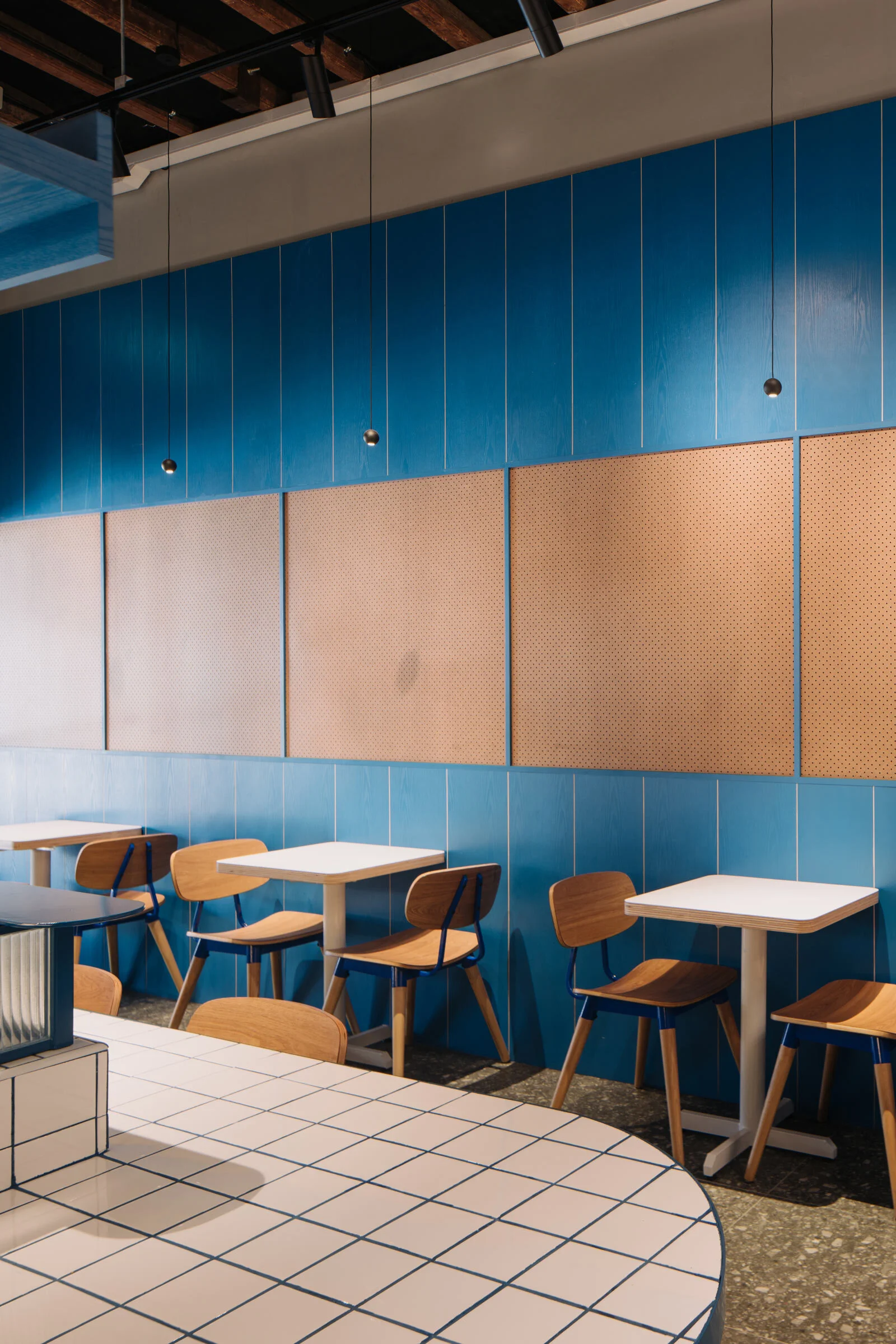
I usually like to work with a constrained palette, and test how I can create different permutations of a certain material. I translated the blue of Park Bench Deli’s brand colours into the mild steel frames of the entrance and hatch windows, and also stained a series of ash veneer panels in the same blue. The vibrant shade really gives a pop to the entrance.
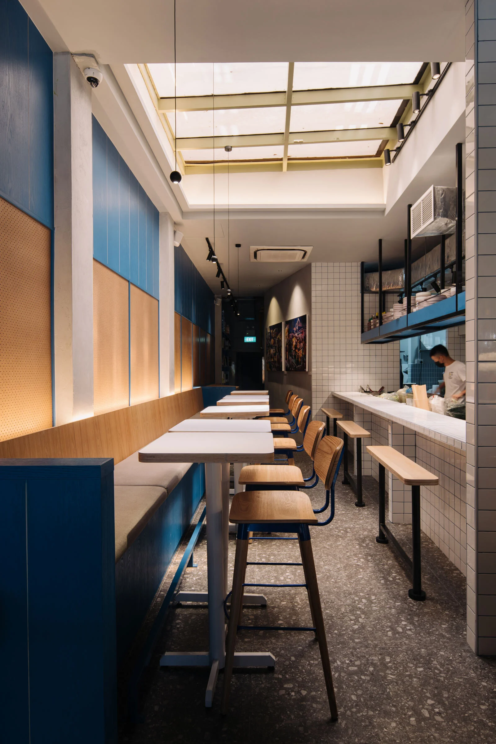
For the new bar counter, I went slightly nostalgic with white ceramic tiles. But as with a lot of my work, there’s always a slight deviation, and here I added a twist by filling the tiles with bright blue grout. The interior walls are mainly clad with a combination of blue veneer panels and perforated MDF boards, while the middle section of the space is flanked by a series of high banquette seats in natural plywood panels and heather grey upholstery. Overall, the space feels rather familiar with a touch of retro, but also contemporary at the same time — ‘future-vintage’, perhaps.
Do you have a favourite element or design detail in the interiors?
My favourite element would probably be the bar counter and the hatch window at the front, which also serves as an order and collection section. The recessed shopfront has proven to be incredibly successful, and you can really see how people interact with the space. Fundamentally, it’s about the social aspects, and these components allow and encourage people to congregate in a casual manner — that’s the most gratifying part of this creative journey.
Images / Khoogj


