An Industrial Warehouse Becomes an Experiential Showroom
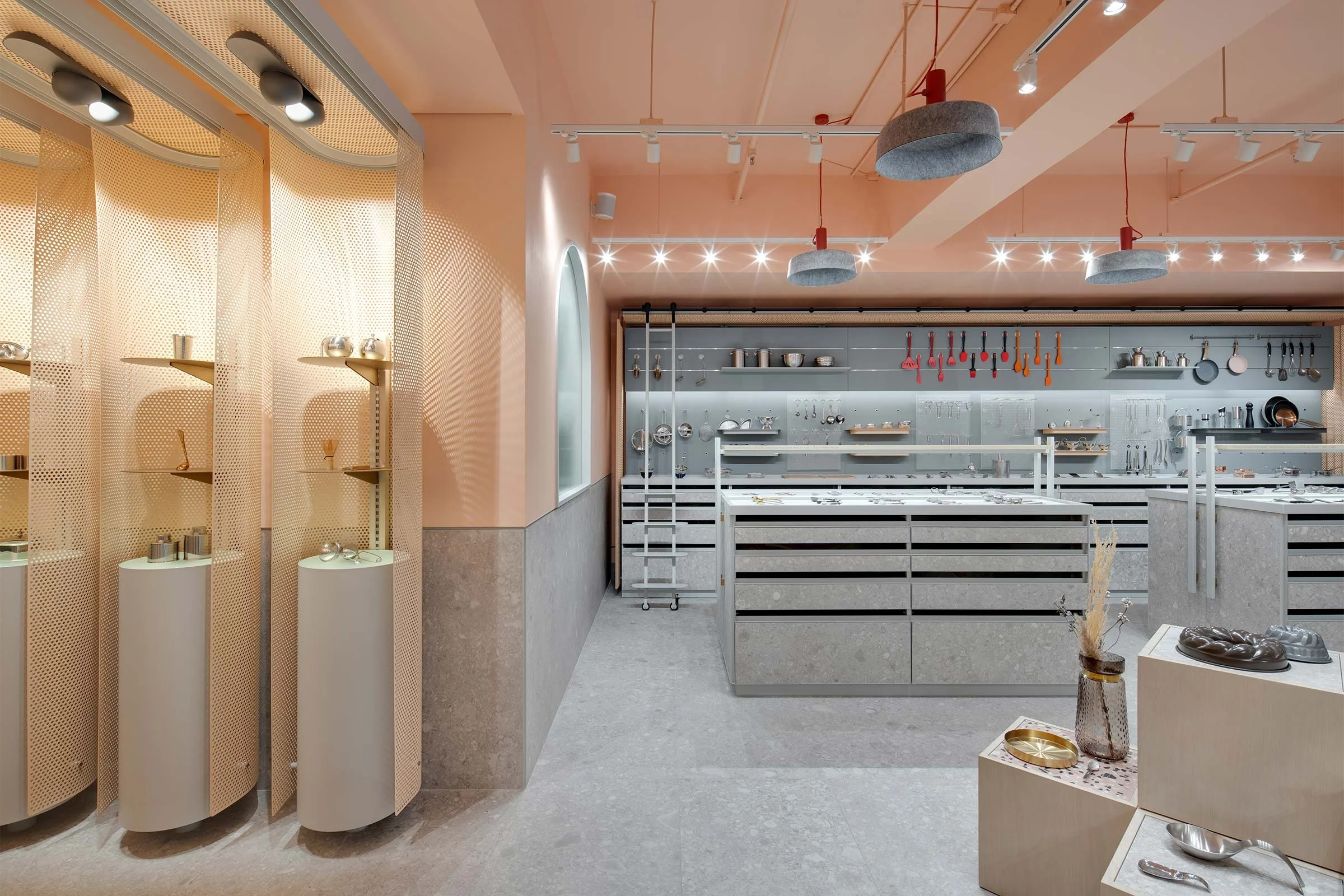
Boutique commercial design firm Studio X transformed Lee Yuen Houseware’s Hong Kong warehouse into a vibrant experiential showroom that brings buyers closer to the brand. Here the studio’s creative director Rufus Turnbull tells us more about the project
Design Anthology: What was the client’s brief to you for the project?
Rufus Turnbull: The brief was to turn Lee Yuen Housewares’ stockroom into a customer experience-driven showroom designed to give clients — buyers for the likes of Williams Sonoma and Whittard of Chelsea — a hands-on and thorough understanding of the company’s product range.
What’s great about the neighbourhood and what makes the location unique?
The showroom is in Hong Kong’s Kwun Tong, a post-industrial area with a wide array of different businesses functioning out of diverse building typologies — from walk-ups and concrete warehouses to gleaming Grade-A office towers. The showroom takes over 140 square metres in an industrial space, with bare concrete corridors, the odd wooden palette propped up against the wall, and the ever-present chunter of steel trolleys ferrying goods in and out.
How did you approach the project — what design references or narrative did you try to incorporate into the space?
We always start any project by asking ourselves how we can improve the performance of the business. In this case, the original space evoked a back-of-house stockroom more than a showroom. Products were crowded onto generic shelving without any merchandising principles or visual hierarchy, and there was no consideration for how buyers would be able to engage with the space and the products. Due to the nature of the product development business, the client's catalogue is forever expanding and they were running out of space.
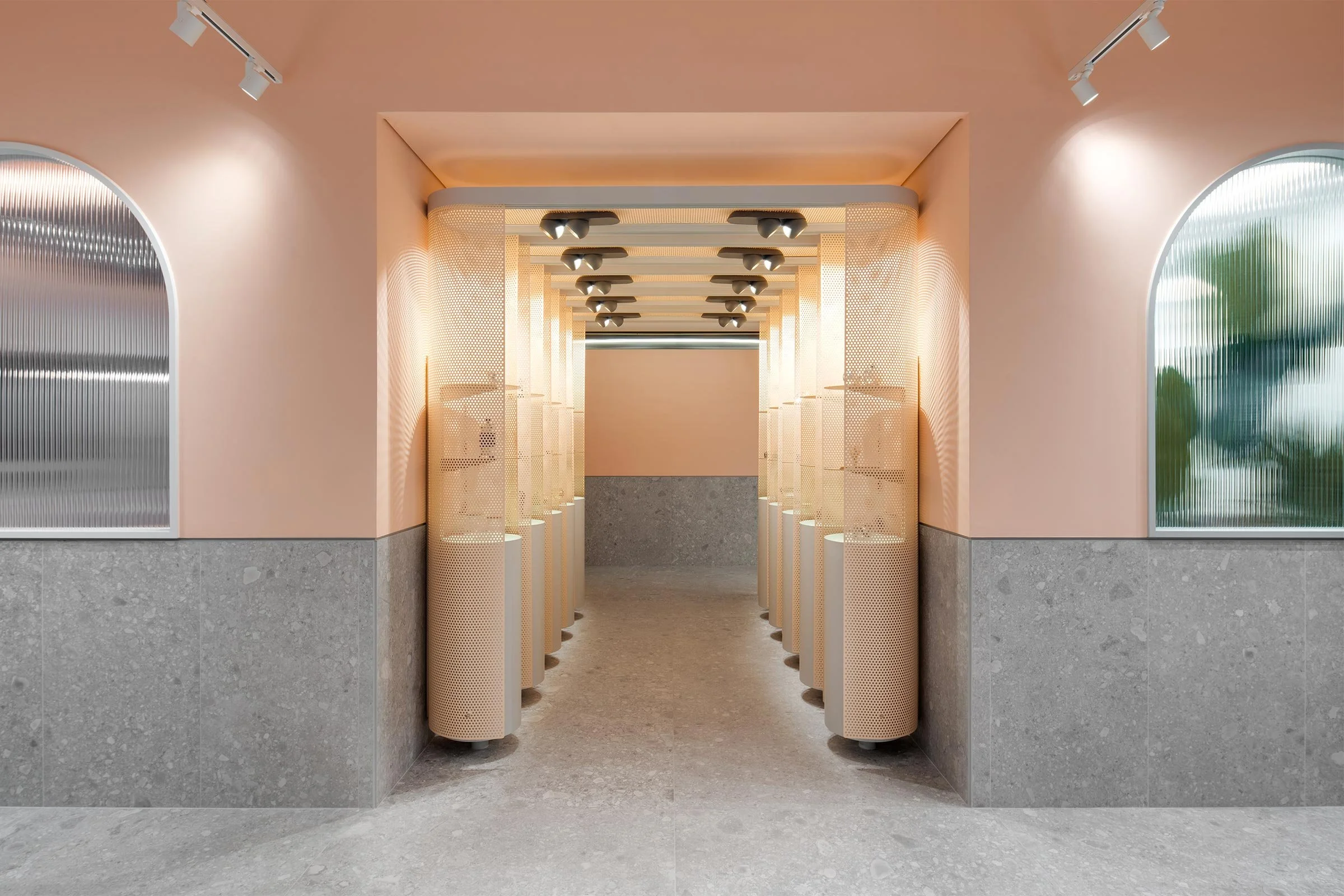
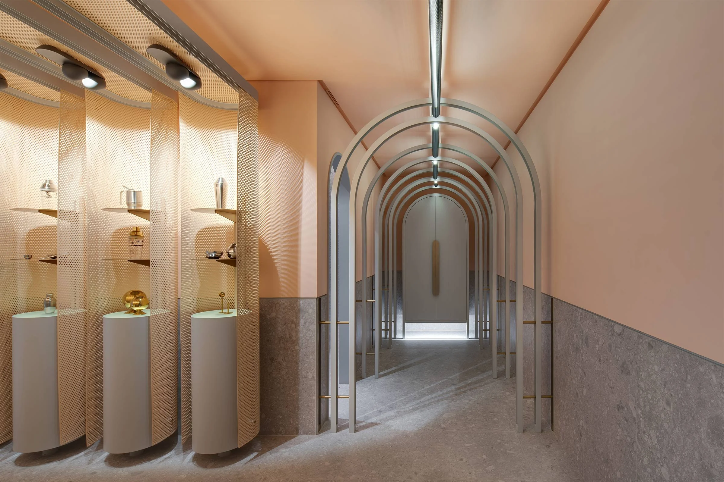
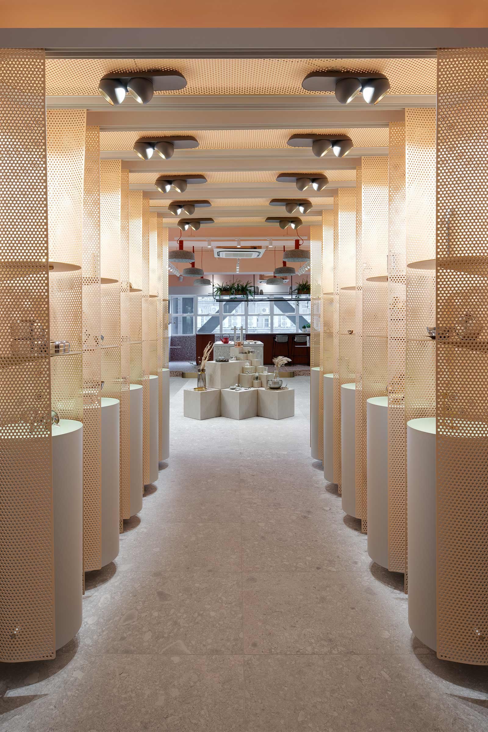
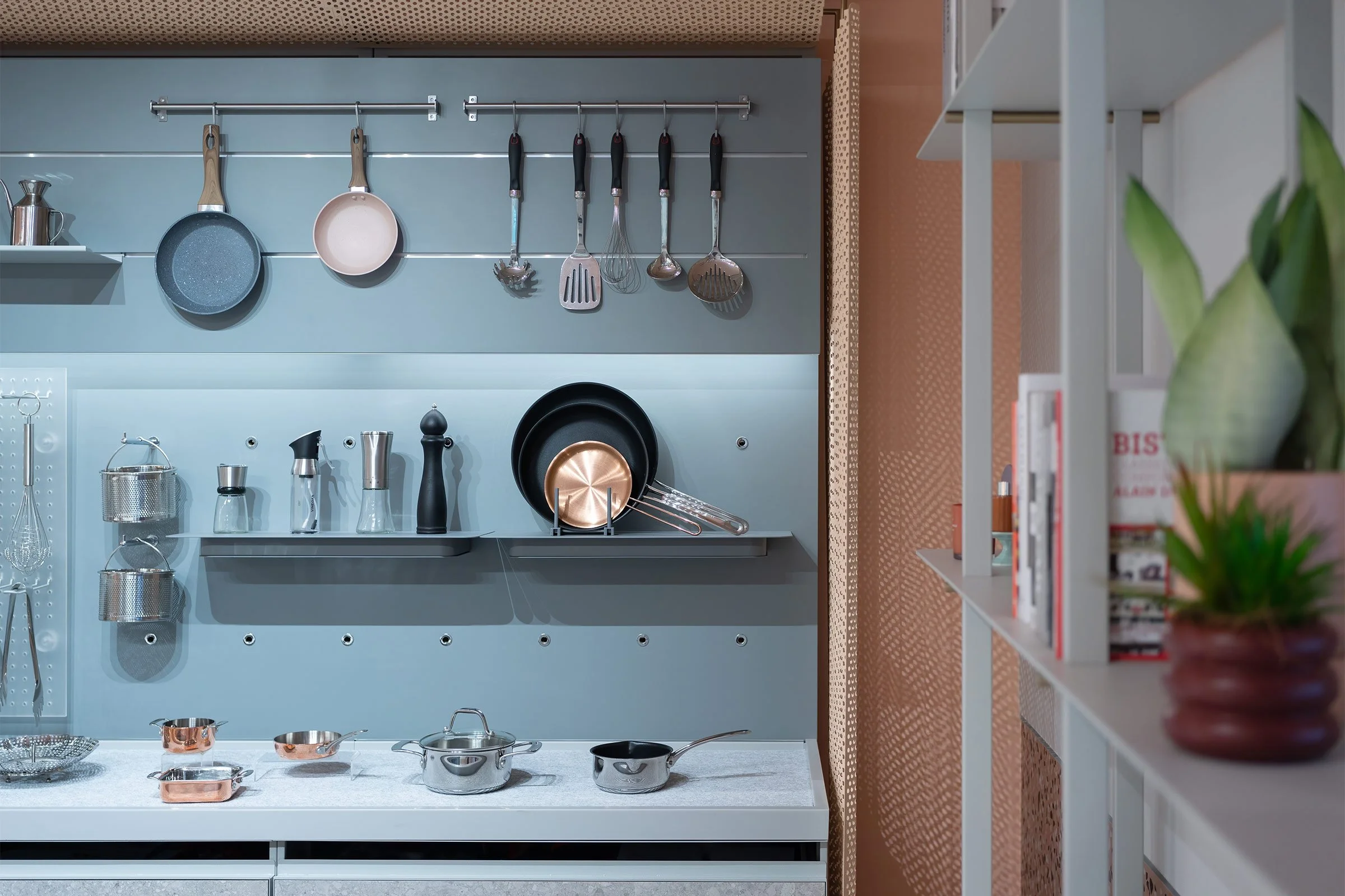
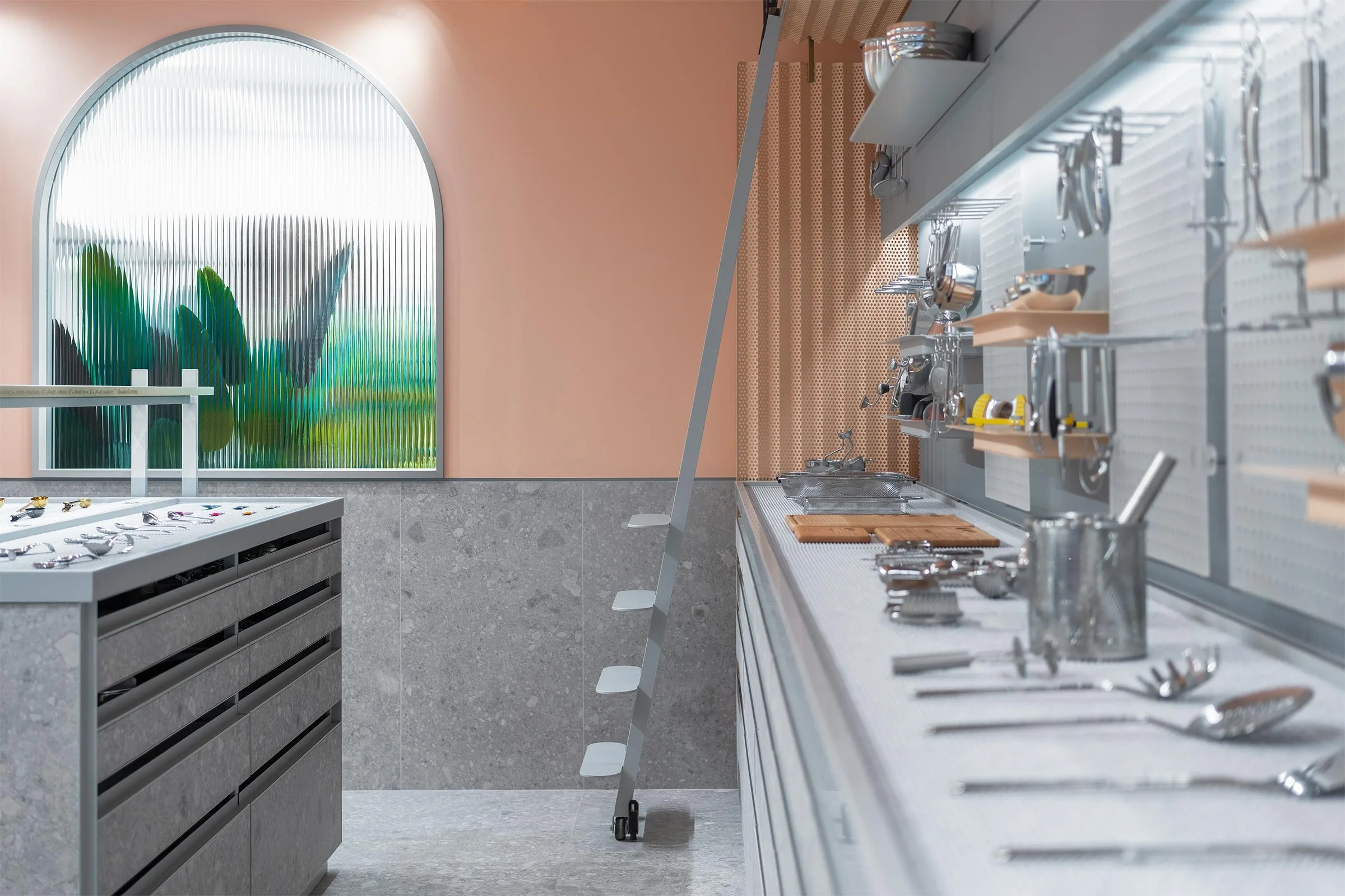
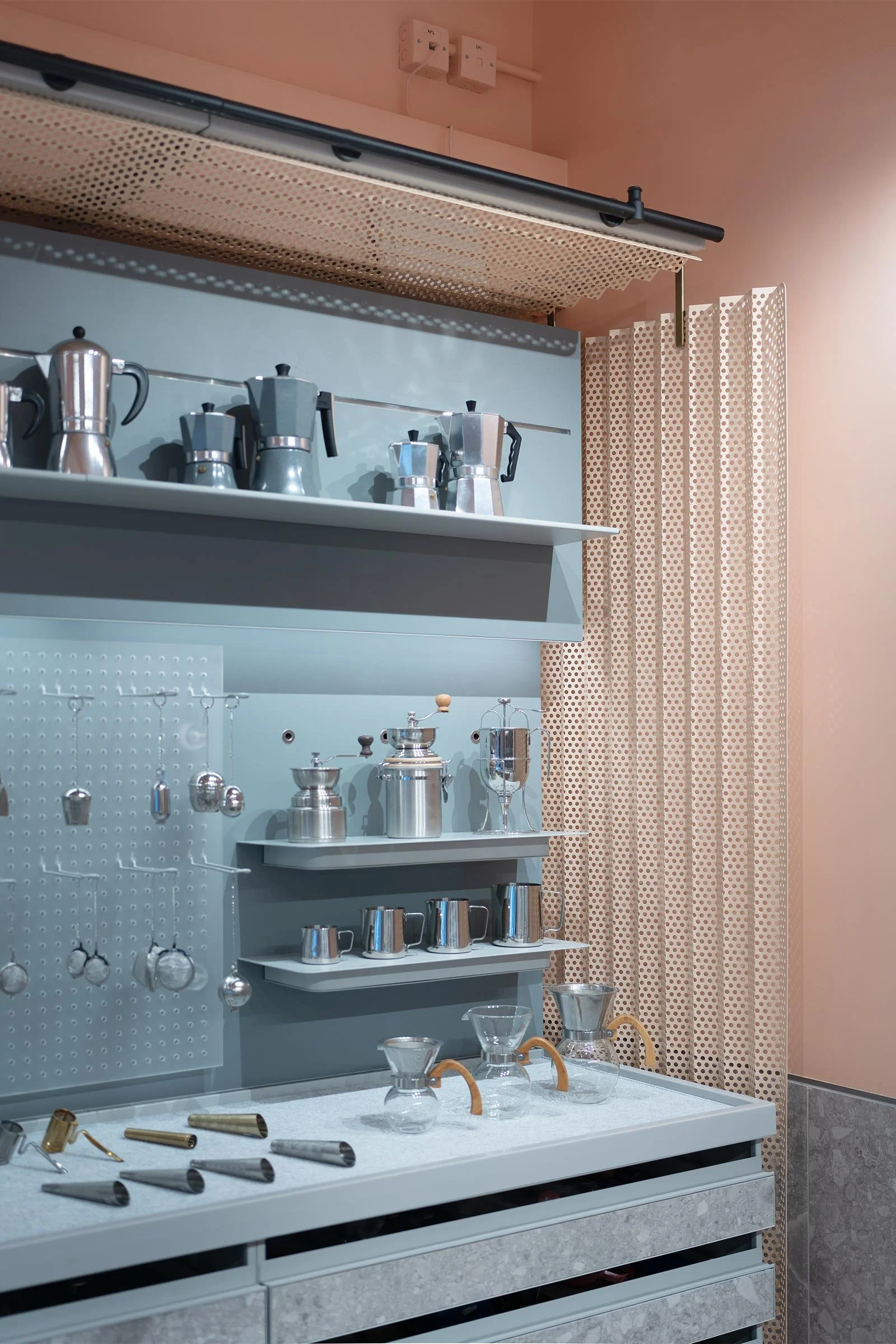
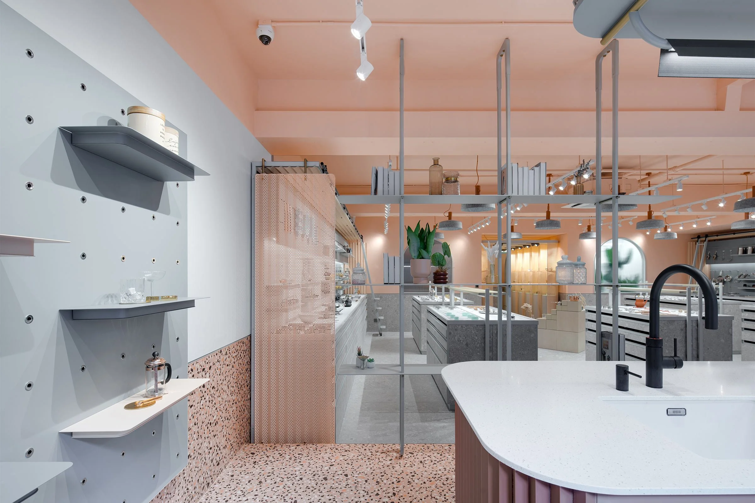
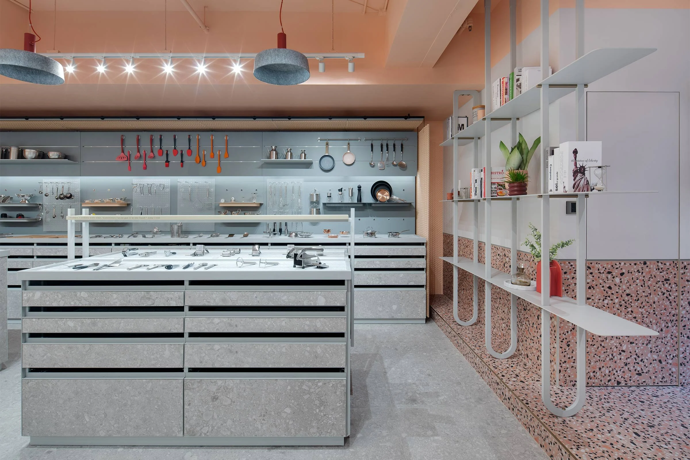
The project involved auditing and reorganising more than 5000 products in order to maximise the usage of the existing warehouse space. We adopted a method of visual merchandising to display feature products and incorporated an indexed storage system with pull-out drawers for the entire catalogue. We redesigned the space to provide buyers with an immersive understanding of the company’s product range, with the chance to break out and enjoy a drink along the way. Kwun Tong can often be seen as an inconvenient outpost for buyers, so part of the objective was to make the showroom something to look forward to.
Please tell us about some of the custom pieces for the space.
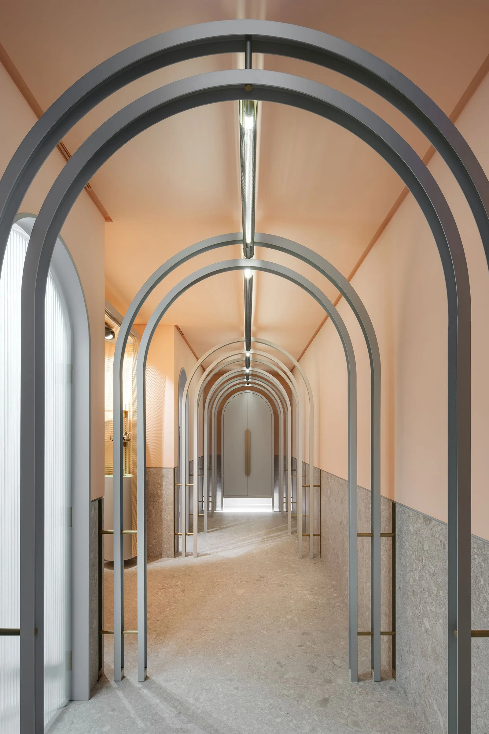
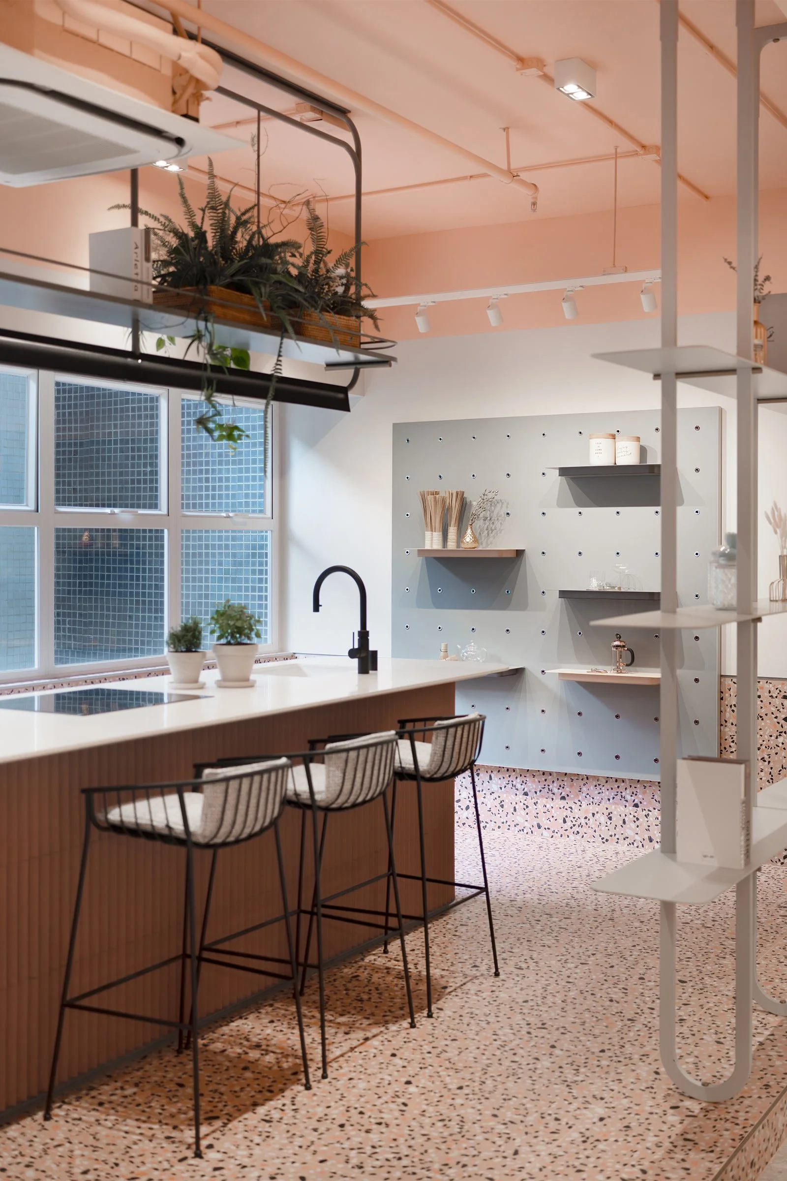
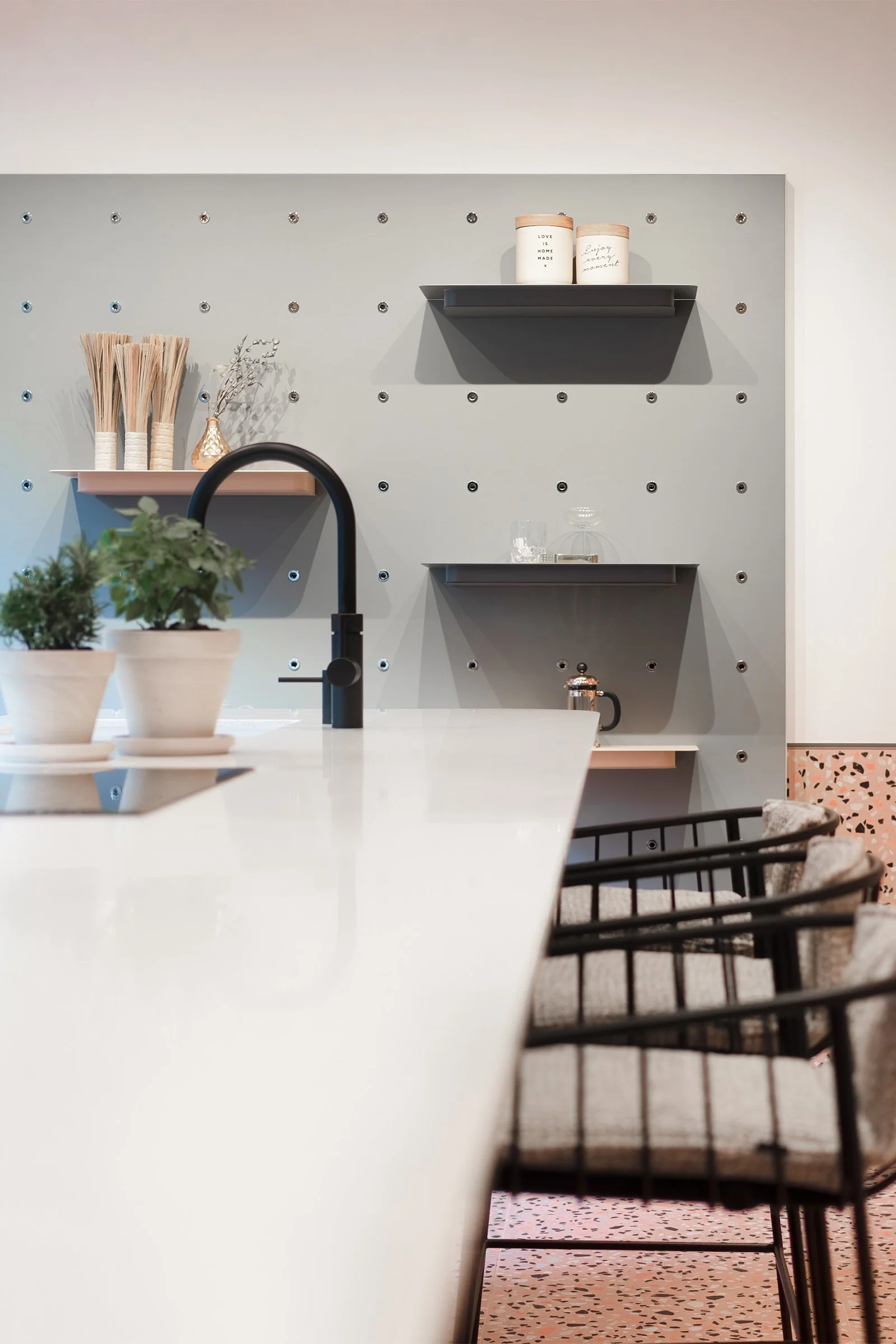
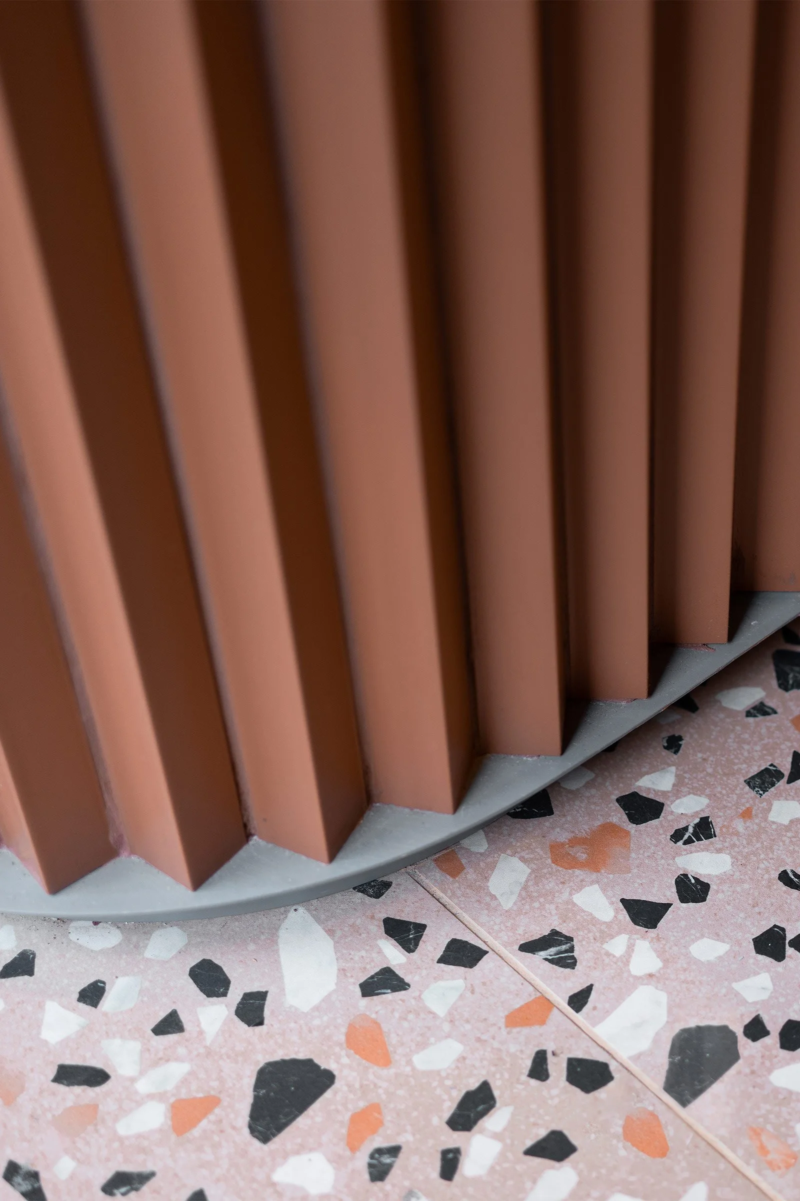
The brief was very unique and so the project is completely bespoke. We developed a series of custom joinery and fabrication items that were designed, prototyped and overseen by our delivery team. These included everything from the gallery catwalk to the merchandising units, the lobby trellis and the ceramic-clad kitchen island. We also created a test space next to the kitchen to allow the client to test merchandising strategies during meetings, and drinks and food (made using the products) can be served at the same time.
Do you have a favourite element or design detail in the interiors?
I’m proud that we were able to double the product capacity of the space, while increasing its utility. We also used Lidar technology to capture the space and will be working with the client to create a shoppable virtual showroom.
What other features are you most excited about?
The showroom also features a working kitchen, a product demo area, meeting rooms and a catwalk-style gallery to display new products.
Images / Kris Provoost

