A Heritage Cottage Becomes A Modern Family Home
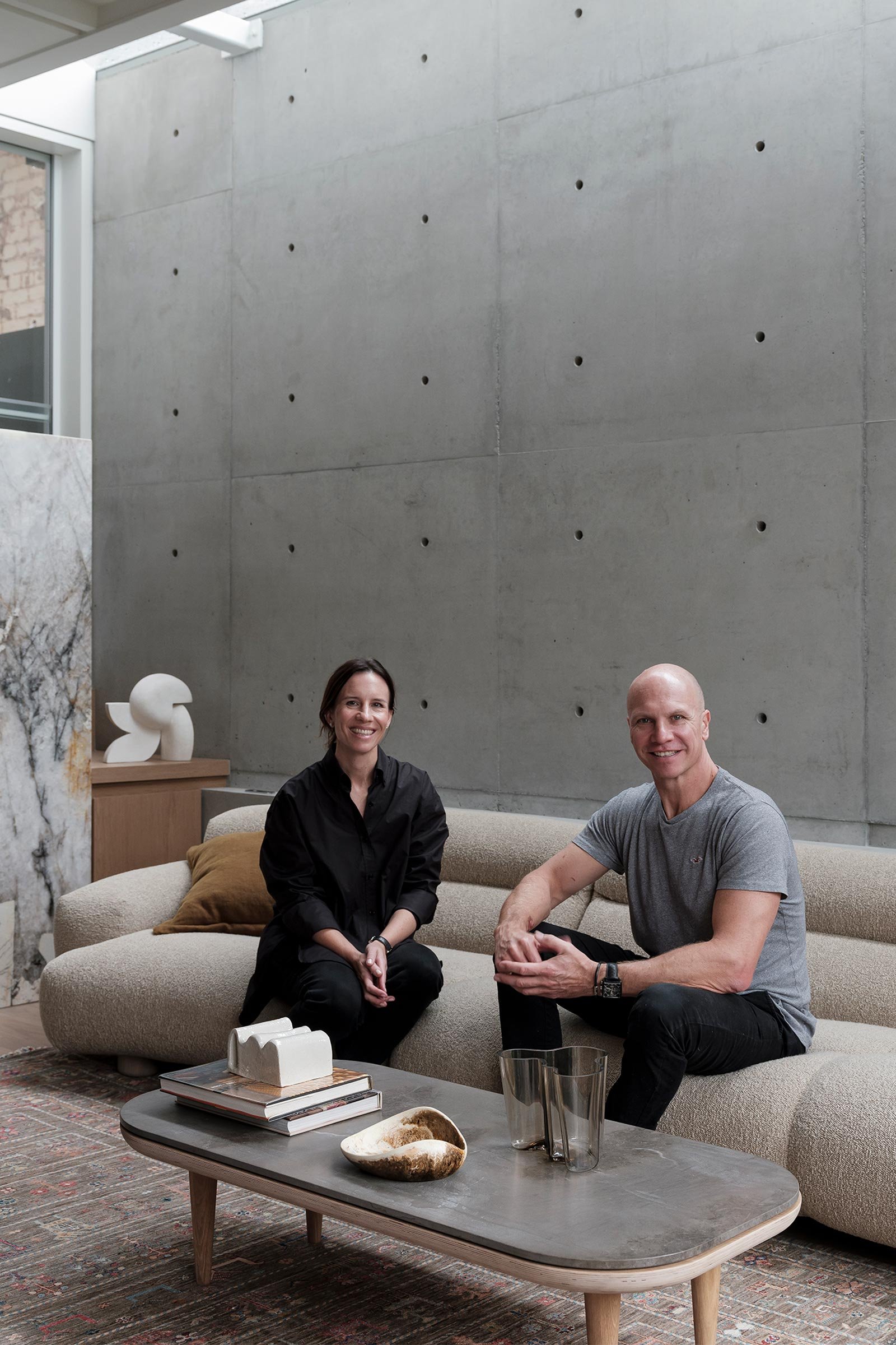
Designed by local firm Porebski Architects and built by Pamment Projects, this 1882 worker’s cottage in Sydney’s inner west was transformed into a light-filled contemporary family home. Directors Victoria D’Alisa and Alex Porebski tell us more about the project
Design Anthology: Who is the client and how did you meet them?
Victoria D’Alisa: The clients are a very fun, easygoing working couple with a two-year-old boy. We were referred to them by their brother/brother-in-law. They loved the design process and were open to our ideas, which benefited the design.
What was the brief to you for the project?
Alex Porebski: They wanted a three-bedroom house with a cellar and a beautiful garden. The rest was up to us, to create a liveable space for the family and their future additions.
What’s unique about the building and the location?
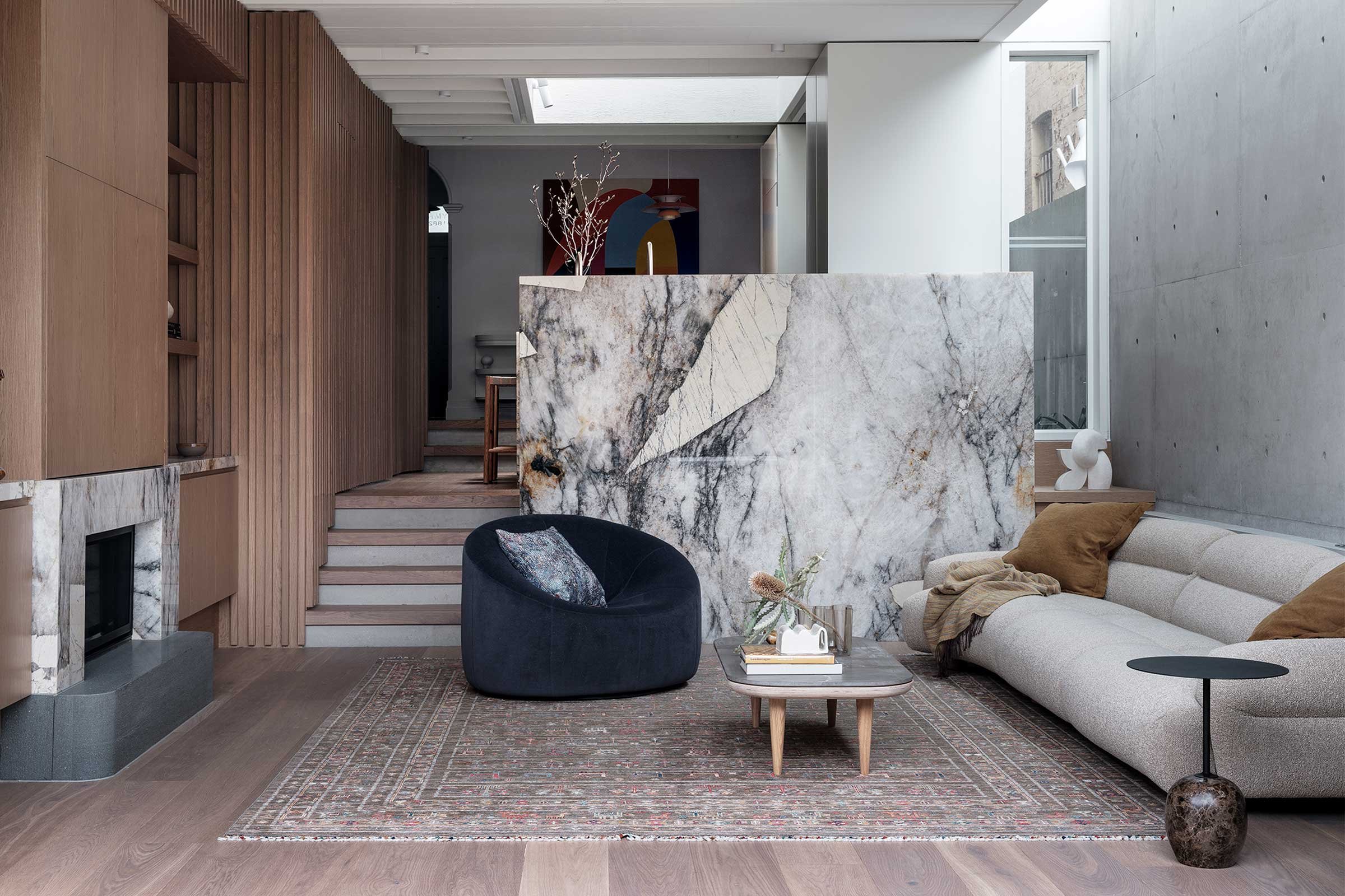
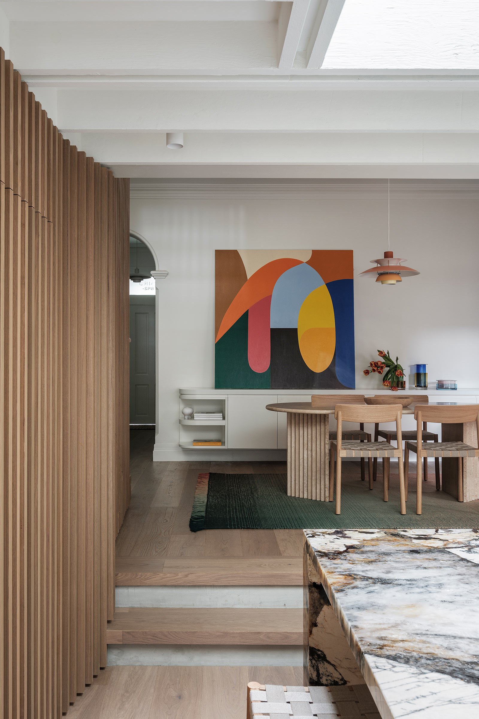
Victoria D’Alisa: Although the 170-square-metre house appears modest from the street, we took advantage of the six-metre frontage by designing the ground floor boundary to boundary to increase the size of the rooms. The site has a fall from front to back, and we used this to step the house down and create varying volumes throughout. As one travels through the existing house, there’s a step down into the kitchen space that opens up onto a circular skylight centred over the kitchen. More steps lead down to the living room with its three-metre exposed timber ceiling. The new extension features two skylights, a circular oculus over the kitchen to draw natural light into the centre of the house and a lineal skylight running the length of the off-form concrete wall in the living room.
How did you approach the project — what design references did you try to incorporate into the space?
Alex Porebski: The owners really liked the heritage aspect of the house and wanted to tie the old to a contemporary addition. They mentioned their interest in the idea of a sunken retro living room, which we were able to achieve thanks to the natural ground levels. We also wanted to have a strong connection but subtle separation between the heritage house and the new extension. We accomplished that by using exposed ceiling joists in the new area, which also provide additional ceiling height. We replaced traditional mouldings and skirtings in the front heritage section, with flush shadowline skirtings, cornices and reveal architraves defining the new extension.
Please tell us a little about the material choices for the space.
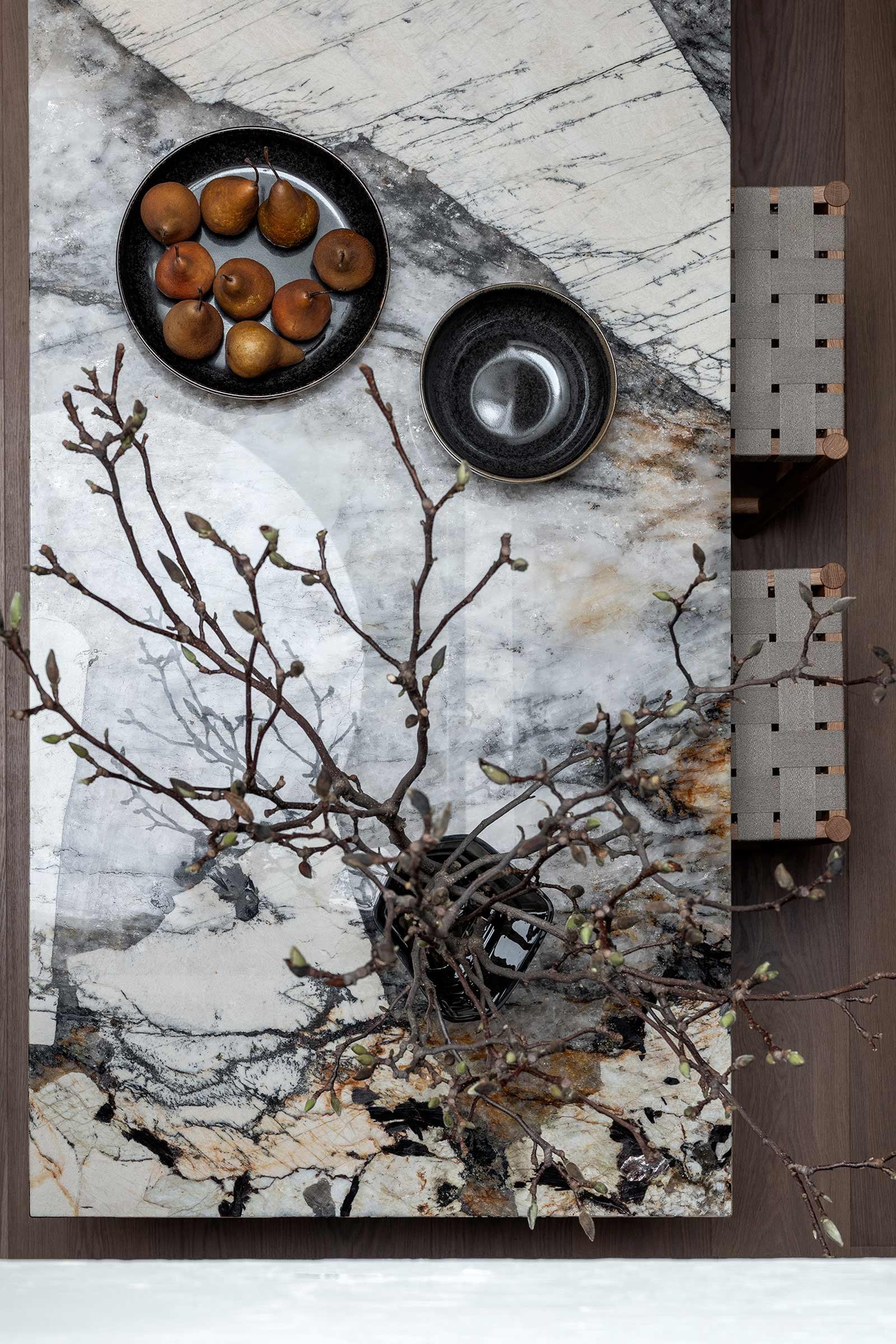
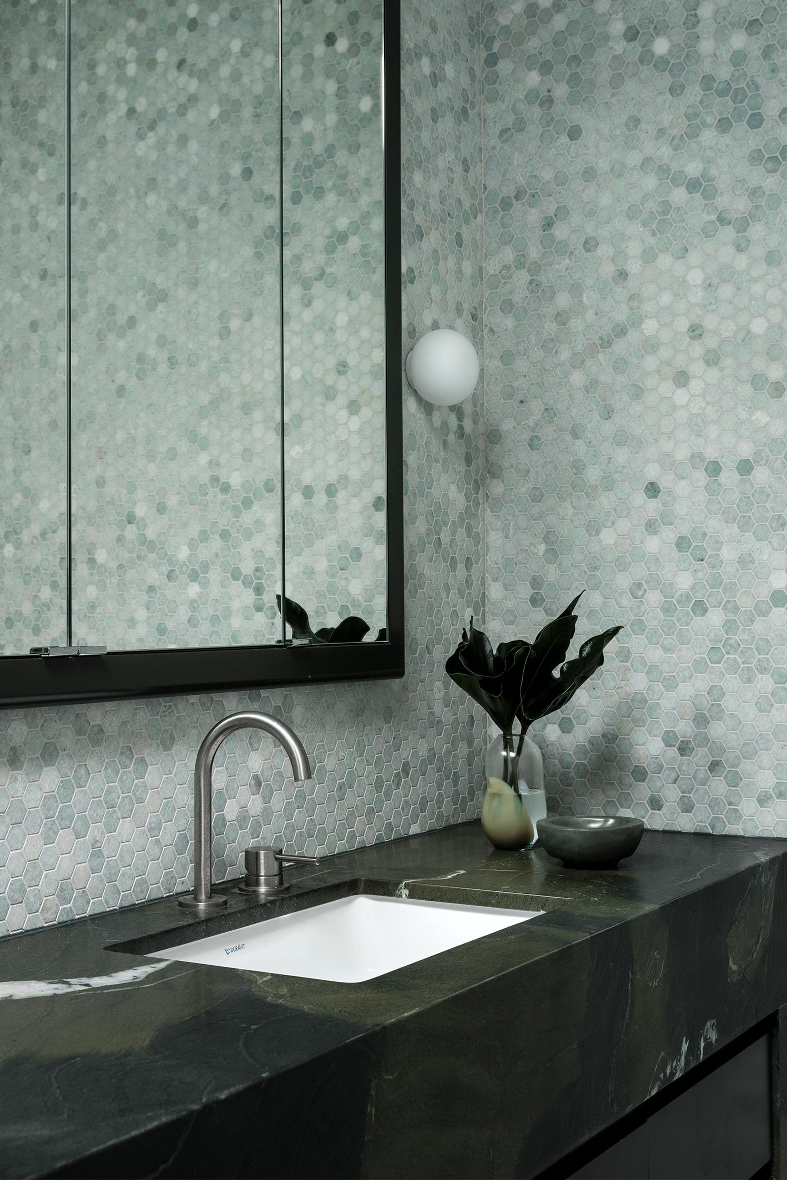
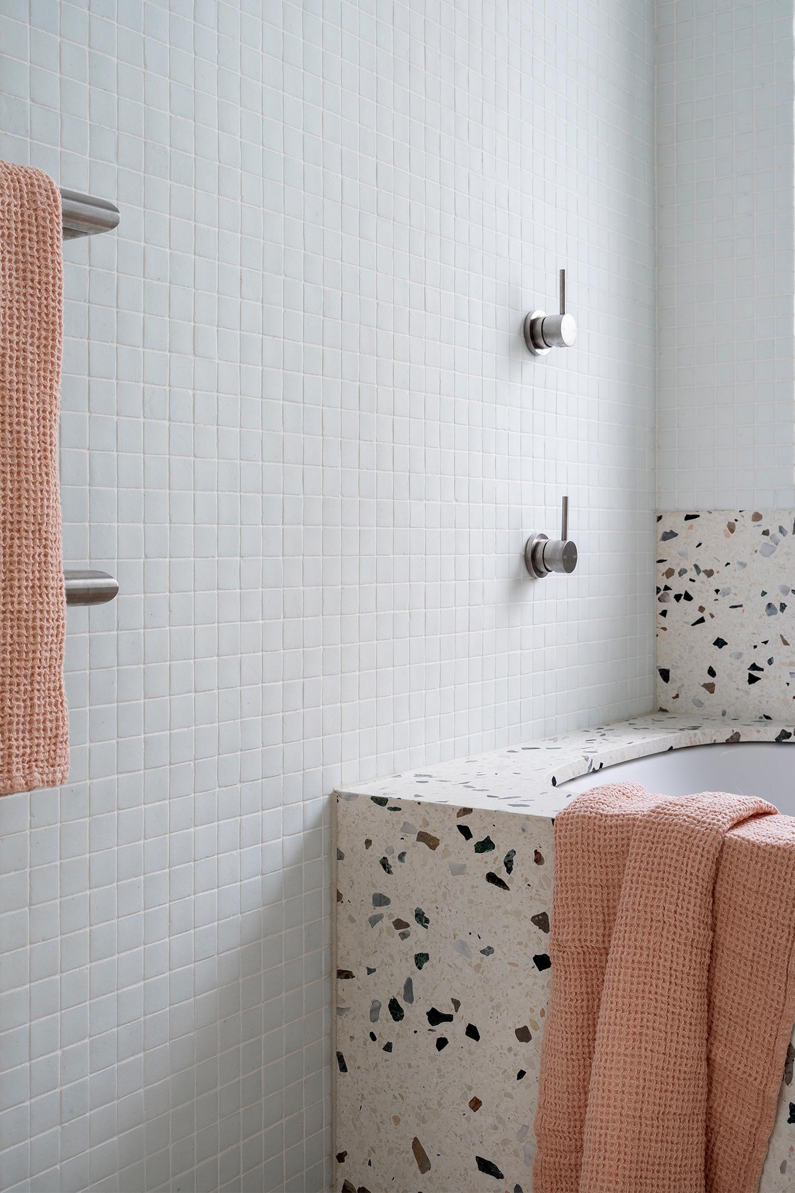
Victoria D’Alisa: We used off-form concrete as a base for the first-floor addition and implemented a lightweight structure to tie the old to the new and match the concrete. This also allowed for the timber floor structure to be exposed and become a feature of the ground-floor ceiling. On the ground floor, we used timber for the floors and joinery and used a beautiful Patagonia Alpha granite to complement and soften the concrete. Upstairs, we used terrazzo for the kids’ bathroom and Bolivia quartzite for the ensuite.
Please tell us about some of the custom pieces for the space.
Alex Porebski: All the joinery is custom-made, including the curved off-form concrete bench in the garden.
Do you have a favourite element or design detail in the architecture or interiors?
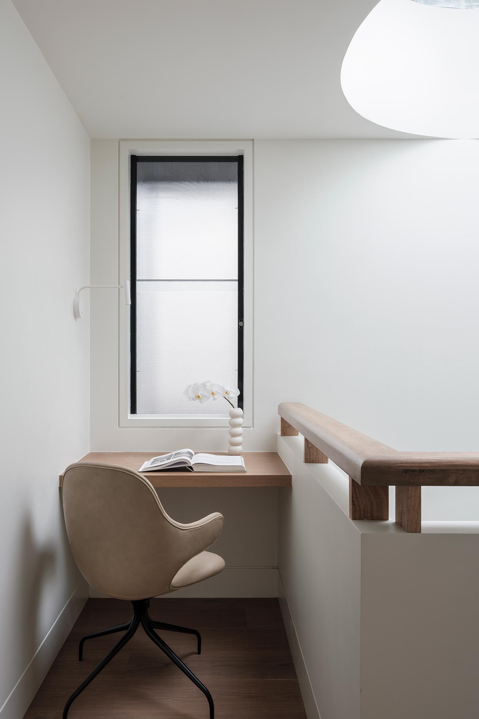
Victoria D’Alisa: It would have to be the central circular skylight that welcomes daylight into the centre of the house and highlights the off-form concrete wall. There’s also the batten staircase that extends through the ground floor to conceal the powder room, the walk-in pantry and the steel column that supports the stairs.
Images / Tom Ferguson
Stylist / Alexandra Gordon


