A Smart-Casual Taipei Home
Designed by local firm PhoebeSaysWow Architects Ltd., this family home in a newly developed area of Taipei City combines bright and airy spaces with modern applications of traditional craft. Here studio co-founder Shihhwa Hung shares more about the project
Design Anthology: Who are the clients and how did you meet them?
Shihhwa Hung: The clients are a couple with a teenage daughter. They’d been living and working in Shanghai for over a decade and decided to get a second home in Taipei during the pandemic. We were introduced through common friends and helped them look for their new place in Taipei. Their work is high pressure, so they wanted a soothing and uplifting space where they can work remotely and practice yoga.
What was their brief for the project?
They wanted an urban home with a cosy yet refreshing atmosphere, with lush plants, a rich interior palette and plenty of natural light.
What’s unique about the building and the location?
The apartment is located in a newly developed area of Taipei City, where residential towers are built right next to each other, creating potential discomfort for residents. We focused on careful interventions to tackle these possible issues by creating an airy and refreshing atmosphere with a lot of natural light, improved ventilation and an optimised layout for more privacy.
How did you approach the project — what design references did you incorporate into the space?
We renovated the 125-square-metre apartment with a smart-casual style in mind, bringing in refined elements without making the space look too posh. We incorporated the visual languages of stripes, line works and translucence as our main design references. We also imagined the home as a mini gallery for the clients’ daughter, who is an art major. We laid long, wide planks of unlacquered Douglas fir on the floor and installed traditional local rattan screens and lush plants throughout the home to infuse the space with a soothing feel.
Can you tell us a little about the material choices for the space?
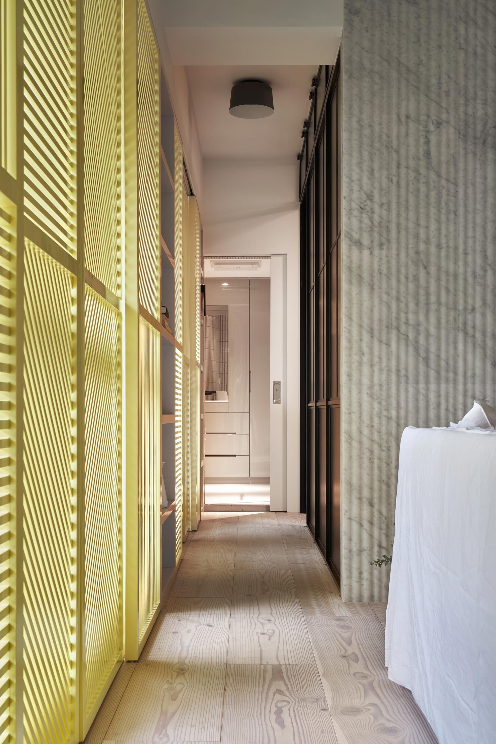
We created a rich dialogue between different materials by juxtaposing wooden elements, such as the Douglas fir flooring and the woven rattan screens, with earthy elements like green tiles, Carrara marble mosaics and trims, and grove-patterned wall cladding. The yellow sliding louvres and metal glass screens add further texture to the space by incorporating crisp line works.
Please tell us about some of the custom pieces for the space.
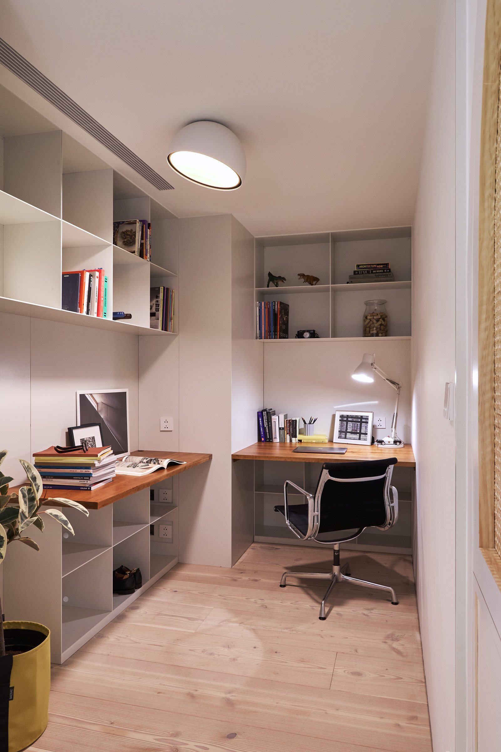
There are quite a few custom elements worth mentioning. The master bedroom features handmade rattan screens on the double doors and wardrobe doors. This particular design promotes good air circulation and reduces the weight of the doors. Aesthetically, it’s a modern reinterpretation of traditional craft and gives the interior a natural and warm character thanks to its texture. We also designed metal frame partitions throughout the home, incorporating different framing languages and glazing options, which gives a unique character to each room. The entrance closet and the shelves in the study both feature unique metalwork: we installed a custom peg board in the entrance closet to create a flexible and playful storage space, and for the study, we created shelves with the same metal framing as the partition door, and chose cherry wood for the desktops for its beautiful grain and tone.
Do you have a favourite element or design detail in the interiors?
The yellow sliding louvres are one of my favourite elements. They sit in between the interior and the exterior and create visual impact on both sides. This design detail creates a sense of privacy while creating a transition between indoor and outdoor.
Images / Hey!Cheese


