On Higher Ground
Monocot Studio experiments with spatial hierarchy and subtle demarcations of space in this Singapore apartment
Most apartments built today rarely convey a sense of ceremony. More commonly conceived with real estate in mind rather than inspiring the inhabitants, spaces are sufficiently efficient and their surfaces are flat. But Mikael Teh of Monocot Studio has managed to upend this tendency with the renovation of a four-bedroom apartment in Singapore that is more architectural than decorative.
First, he conceived a small lobby after the private lift lobby as a space for pause. Sliding pocket doors beyond unfold neatly to reveal the dining room. This small corner, tastefully adorned with timber furniture including a trio of Carl Hansen & Søn chairs, is serenely lit by discreet yet elegant Candela Di Vals pendant lamps designed by Swiss architect Peter Zumthor for his Therme Vals hotel project in the mountains.
The home has a similarly meditative quality. On one side, the living area and tea corner sit on a platform, which Teh says, ‘was crucial to the design, both spatially and functionally’. He explains that it’s carefully aligned to demarcate a change of spatial zoning, ‘and gives a nod towards the Japanese culture of stepping up onto a different platform for tea appreciation while sitting on a tatami mat.’ What’s more, he adds, ‘The LED lights underneath also help to elevate a zone of higher hierarchy as a family gathering and bonding area.’
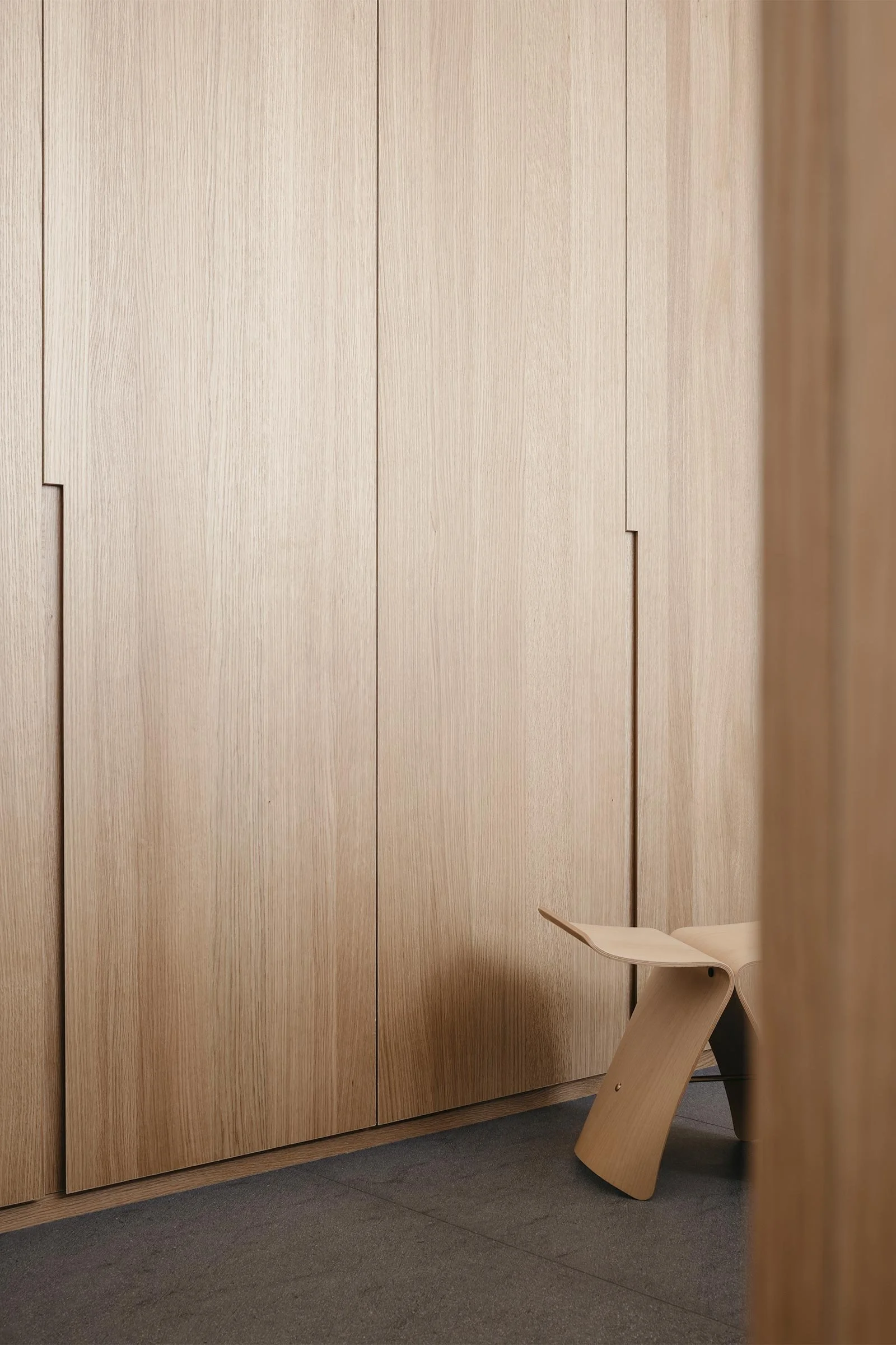
The Japanese element was in the brief: the clients love Japanese culture and wanted their home to evoke the Aman Tokyo, designed by the late Kerry Hill, where they’ve stayed. ‘With reference to the atmosphere of tranquillity in a Japanese teahouse, the materials are kept to minimum colours and variation. Most of the interior is covered with light-toned American oak veneer and engineered wood to create a monotone canvas that is warm and soft,’ Teh explains.
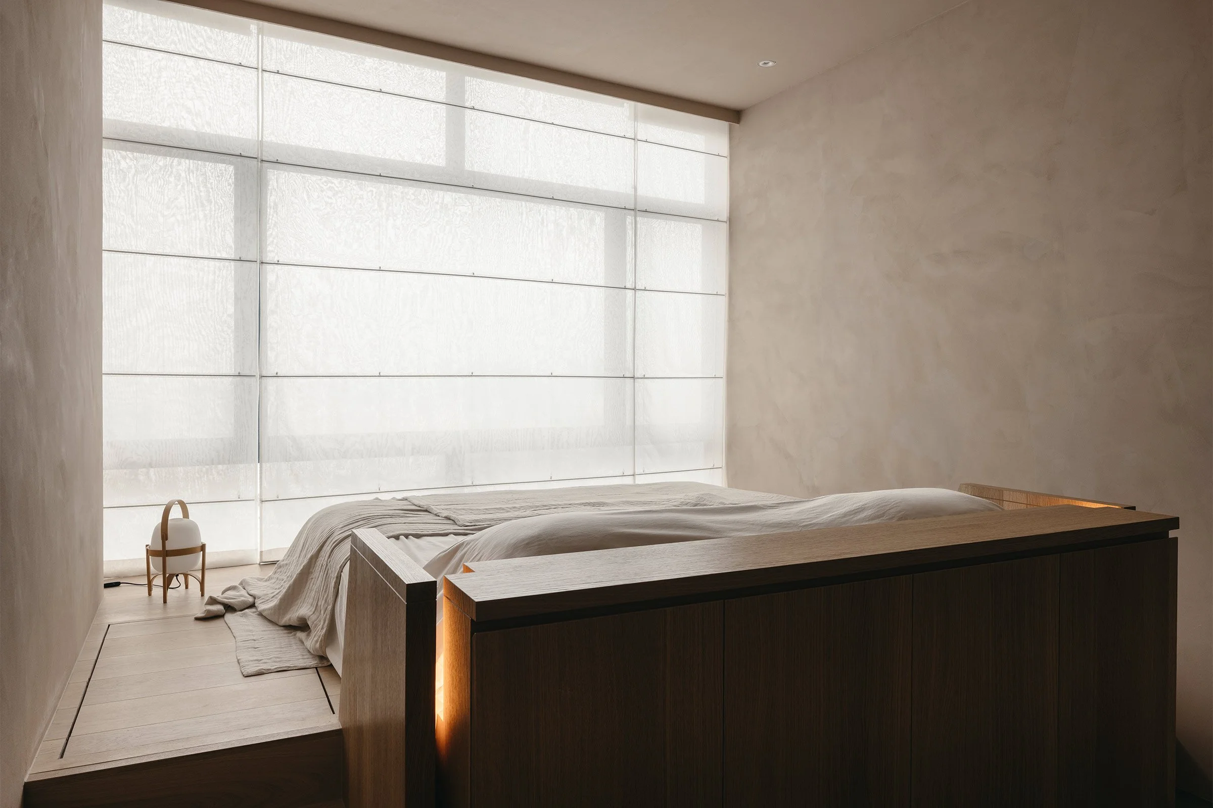
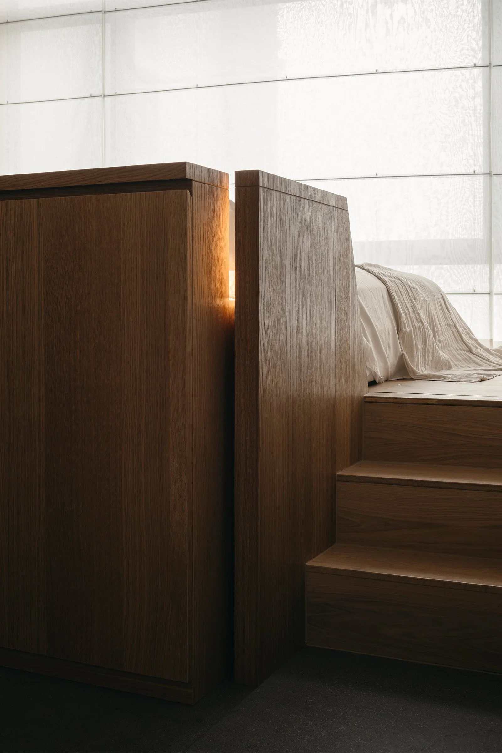
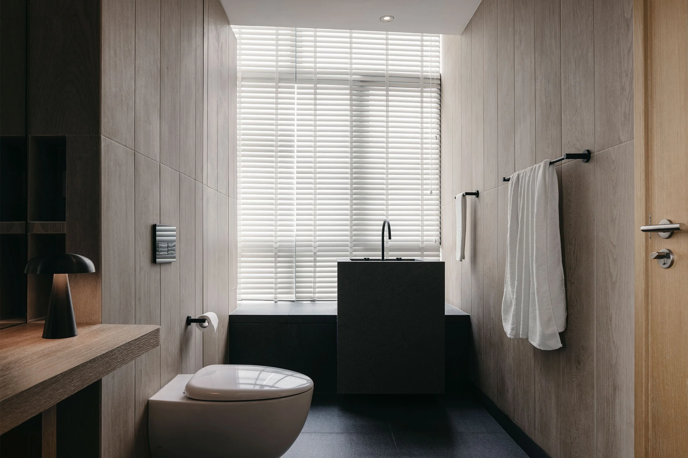
The master bedroom employs a similar strategy, with a raised platform for the sleeping zone that doubles as storage. Teh oriented the bed toward the window to focus on views of the city, and walls painted with a sandy texture are meant to evoke a sense of earthiness. The monolithic quality of the built-in headboard echoes the master bathroom’s blockish washbasin, while stone-like vertical tiles, dark granite and wooden tiles wrap the space and lend to the overall intimate atmosphere that defines the home.
Text / Luo Jingmei
Images / Studio Periphery


