Less is More in this Design Firm’s Office
For their office, Ahmedabad-based multidisciplinary firm Intrinsic Designs translated its philosophy of ‘less is more’ into a simple but sophisticated space. Here founders Shivraj Patel and Shruti Malani discuss their design process
Design Anthology: What brief did you give yourselves for the project?
Shivraj Patel (SP): To suit our working style, we wanted to create a space that feels homely while still having a sense of sophistication. We didn’t want an office filled with objects, so we designed the space only with the things that are really important to us.
What was your initial inspiration for the design?
Shruti Malani (SM): Since this is our own office, our design philosophy of ‘less is more’ was our only inspiration. We wanted to have an office that felt humble while giving off positive vibes. We usually take a minimalist approach towards our own space, and for us that means working with the objects that are really important to us and that we actually need. So eventually the office took shape with the pieces of furniture and art that really have meaning in our lives.
What was the inspiration behind the colour palette?
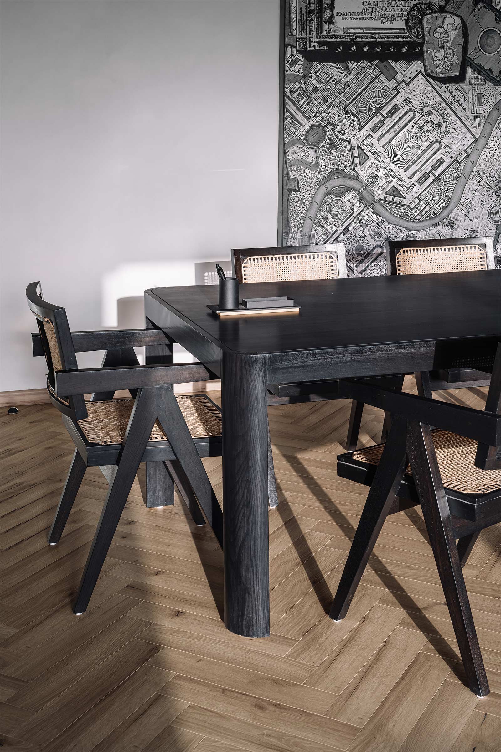
SP: We like oak wood and whites, and we used clear or fluted glass to bring some transparency. We had a Campus Martius ichnography map that we wanted to incorporate in the conference room, so we chose a black table to complement it.
Can you tell us about the materiality and design details?
SP: We used oak and oak veneer throughout the studio, and painted the walls with a light Marmorino stucco with a matt finish. All the woods and veneers were covered with water-based PU to achieve a matt finish. For the partitions, we used clear glass where we wanted to maintain a sense of connection, and fluted glass everywhere else. Between the principal’s studio and the conference room is a sliding, foldable partition that can be tucked inside to make the studio larger when the conference room is not in use.
Was sustainability a consideration, and if so, how was that incorporated into the construction and design?
SM: The idea was to use as many natural materials as possible to create a humble and grounded atmosphere, so we used plenty of wood and natural stone throughout. During the construction process, we ended up with a lot of leftover stone and wood, which we used to design small accessories like stationery boxes, coasters and a platform for the office temple.
Images / Ishita Sitwala


