This Singapore Apartment Was Designed as A Tropical Escape
In Singapore, local interior design firm Studio Metanoia took inspiration from Eastern European villas and the wabi-sabi aesthetic to realise this couple’s apartment immersed in lush vegetation. Studio lead Cher Lin and interior designer Wei Ting Tan share more about the project
Design Anthology: How did you first meet the client?
Cher Lin: The clients, Nicholas and Jessica, came across our portfolio and approached us.
Can you tell us about them and their lifestyle?
Wei Ting Tan: The name Museion Botanica came from the clients, and loosely means ‘museum of botany’. They’re serious botany lovers, and their backyard has been transformed into a lush garden that houses a collection of more than 150 plant species. The couple is a laid-back duo during their down time and avid travellers who bring home objects with sentiment from their travels.
What was the brief to you for the project?
Cher Lin: Our clients provided references of Eastern European villas, including some they’ve stayed in. They wanted their home to be a tropical escape where they could recreate their best memories from their travels.
What’s unique about the building and the location?
Wei Ting Tan: The apartment is 130 square metres, and sits on the ground floor. The clients purchased it specifically for its large open backyard, which is a rare feature for a Singapore condominium. We removed the original grass patches, retiled the ground and filled a portion of the space with soil bedding to harvest palm trees. A colony of birds has since made its home in their garden.
How did you approach the project? What design references did you try to incorporate?
Cher Lin: The key focus was to create a luxe, organic design that embraces the wabi-sabi aesthetic and blurs the boundary between a home and a summer retreat. The clients both work from home often, and we wanted them to feel as though they’re working remotely from a resort. An elevated sense of escapism from the hustle and bustle of the city is what we set out to achieve.
We were inspired by our favourite architects including Serhii Makhno and Antoni Gaudí, and also took reference from one of our favourite beach resort groups, Casa Cook Hotels.
In terms of layout, we turned the two existing bedrooms into a single private space only accessible from the study. Internally, the rooms are separated using heavy linen curtains instead of a door to enhance the fluidity of the space.
Tell us a little about the material choices for the space.
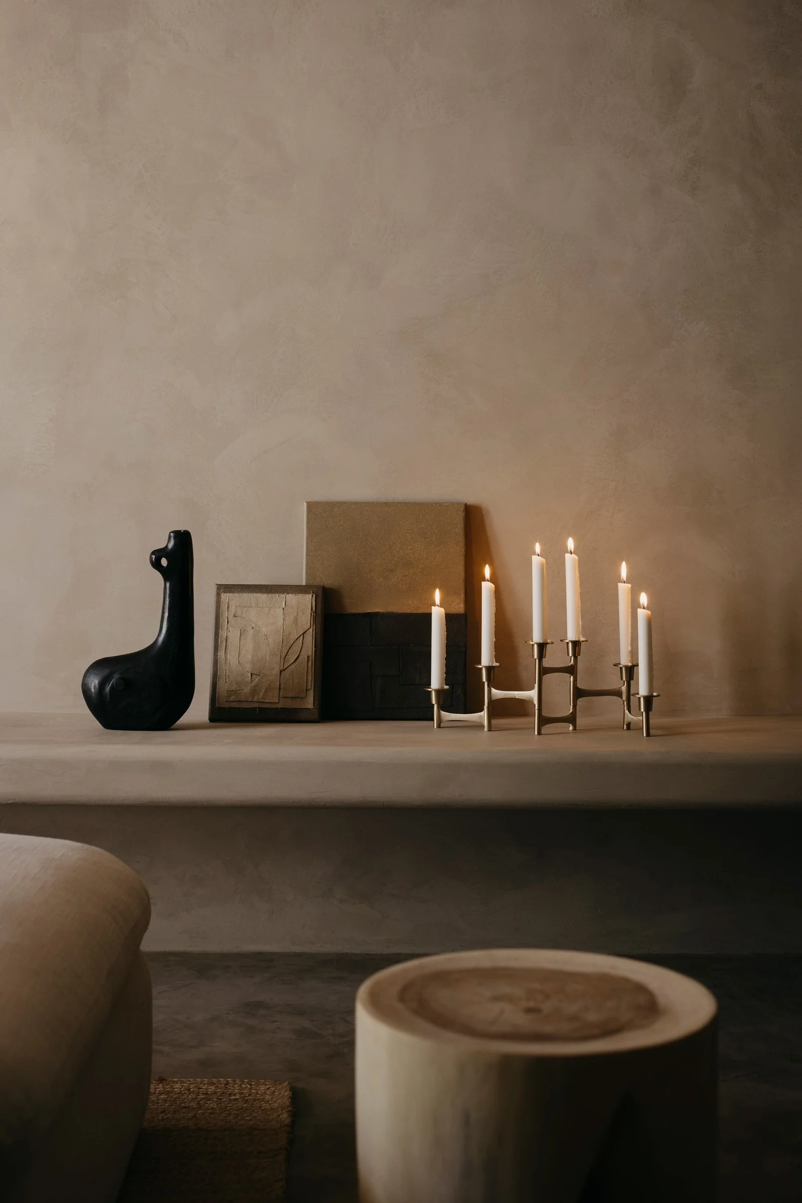
Wei Ting Tan: We used a lot of rough, natural materials and earthy hues, which perfectly mimic nature and create a warm, calm and restorative space. To enhance the wabi-sabi feeling, we used textured micro-cement and limewash floors and walls throughout, while concrete beams and original rough walls were left untouched or deliberately reinstated. Elements such as curvaceous features, muted linens and sculptural decor soften the space. We also sourced antiques from around the world to decorate the interiors.
Tell us about some of the custom pieces.
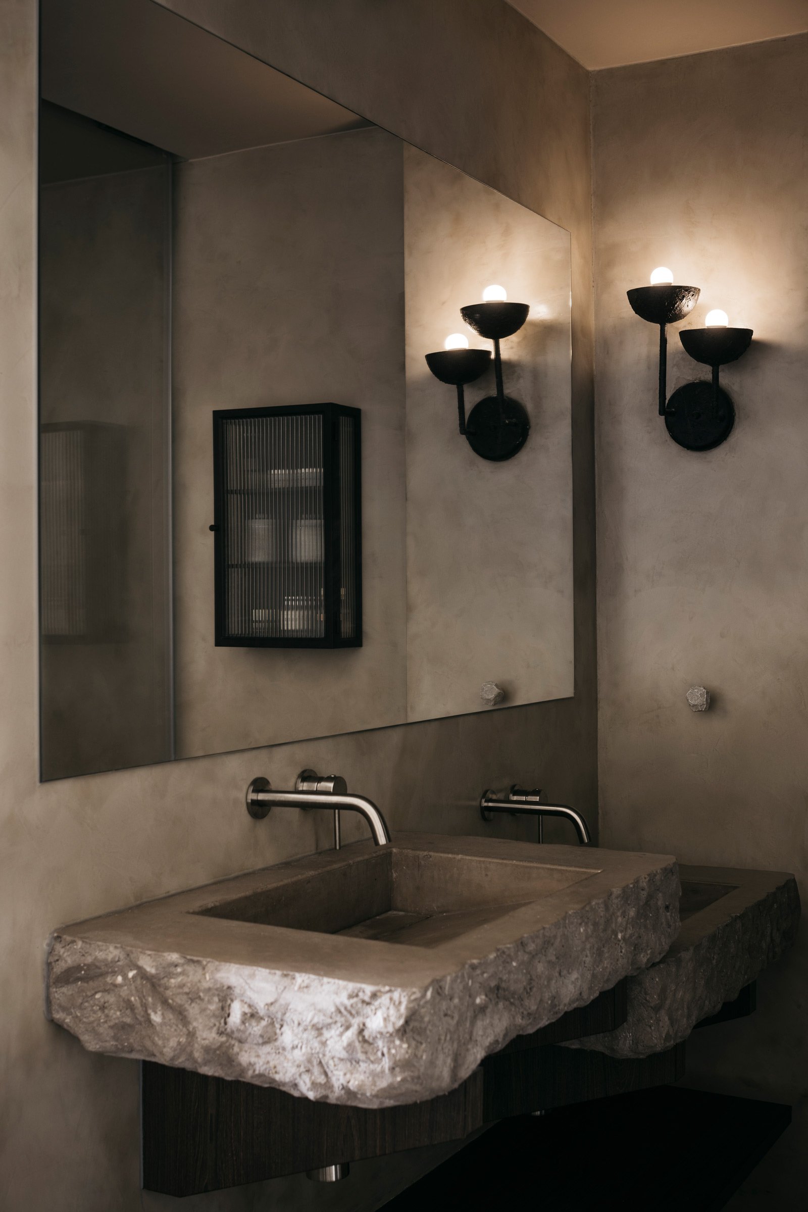
Cher Lin: In the master bathroom, we’re particularly proud of the custom sinks handcrafted from concrete. These were one of the key elements in creating an authentic resort ambience within the open-concept bathroom. We could’ve used treated stone or sintered surfaces for the sinks but the intention was to allow the concrete to age naturally with time. While most local clients would’ve rejected the idea of incorporating a raw material that isn’t easy to maintain, Nicholas and Jessica were fully on board.
Do you have a favourite element or design detail?
Wei Ting Tan: We love how connected and laid-back the space feels, as we replaced quite a few doors with curtains to section the areas or kept them opened entirely. While the entire space feels open, the dark, moody palette in the master bedroom and bathroom feels sensuous and imbued with a sense of raw luxury. We incorporated many irregular curvaceous design details on elements such as edges, walls, beams, display and shampoo niches to deliberately create a softer, unfinished-look.
As a nod to the design of Mediterranean gardens, the tiled floor in the backyard was done in a ‘crazy paving’ pattern. To execute this cost-effectively, we proposed three variations of stone textured square tiles, which were broken manually before being laid randomly.
We also particularly love the Mabel light from Casa Gitane in the corner of the dining space.
Images by Studio Periphery


