Soft Simplicity
Hong Kong studio JAAK designed this serene apartment with a soft, minimalist aesthetic inspired by Nordic and Japanese design philosophies. Here co-founder Wich Chau tells us more about the project
Design Anthology: Can you tell us about the client and their lifestyle?
Wich Chau: The client is an independent woman who has a relaxed lifestyle despite having a busy work life. She likes to enjoy her coffee in the sun every morning and wine with friends in the evening. She also likes photography and opera, and has good taste in general.
What was her brief to you for the project?
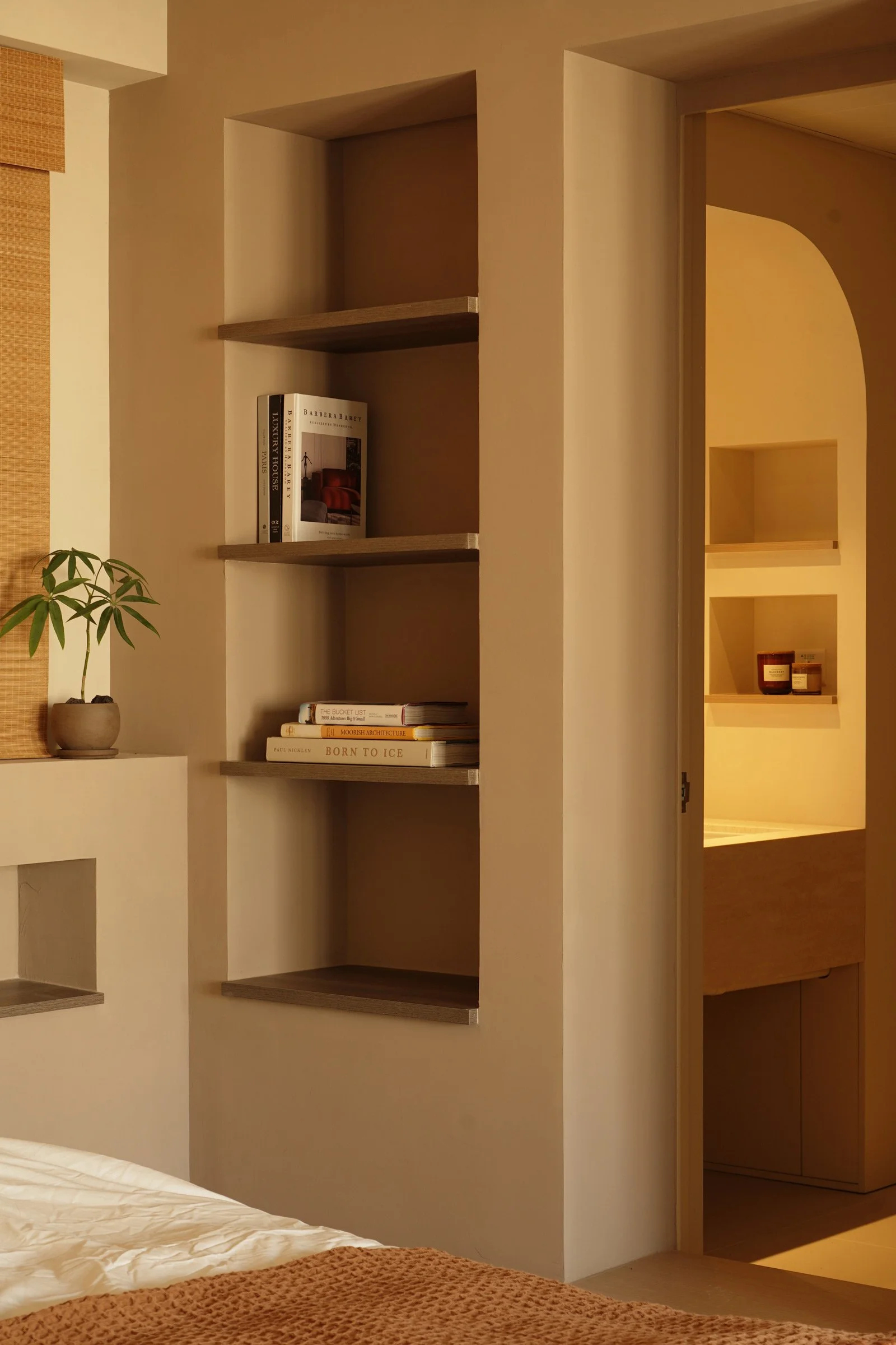
The client wanted a large bookcase with doors, because she prefers reading to watching TV and wanted to keep the space as clean and tidy as possible. She also requested a desk for her home office.
What’s unique about the building and the location?
It’s a typical residential building in Hong Kong’s Sai Ying Pun neighbourhood. Although it’s located in a busy district, the building is surrounded by a quiet and peaceful community and old buildings. The apartment itself is 75 square metres, with a balcony that looks out to the city.
How did you approach the project — what design references did you try to incorporate into the space?
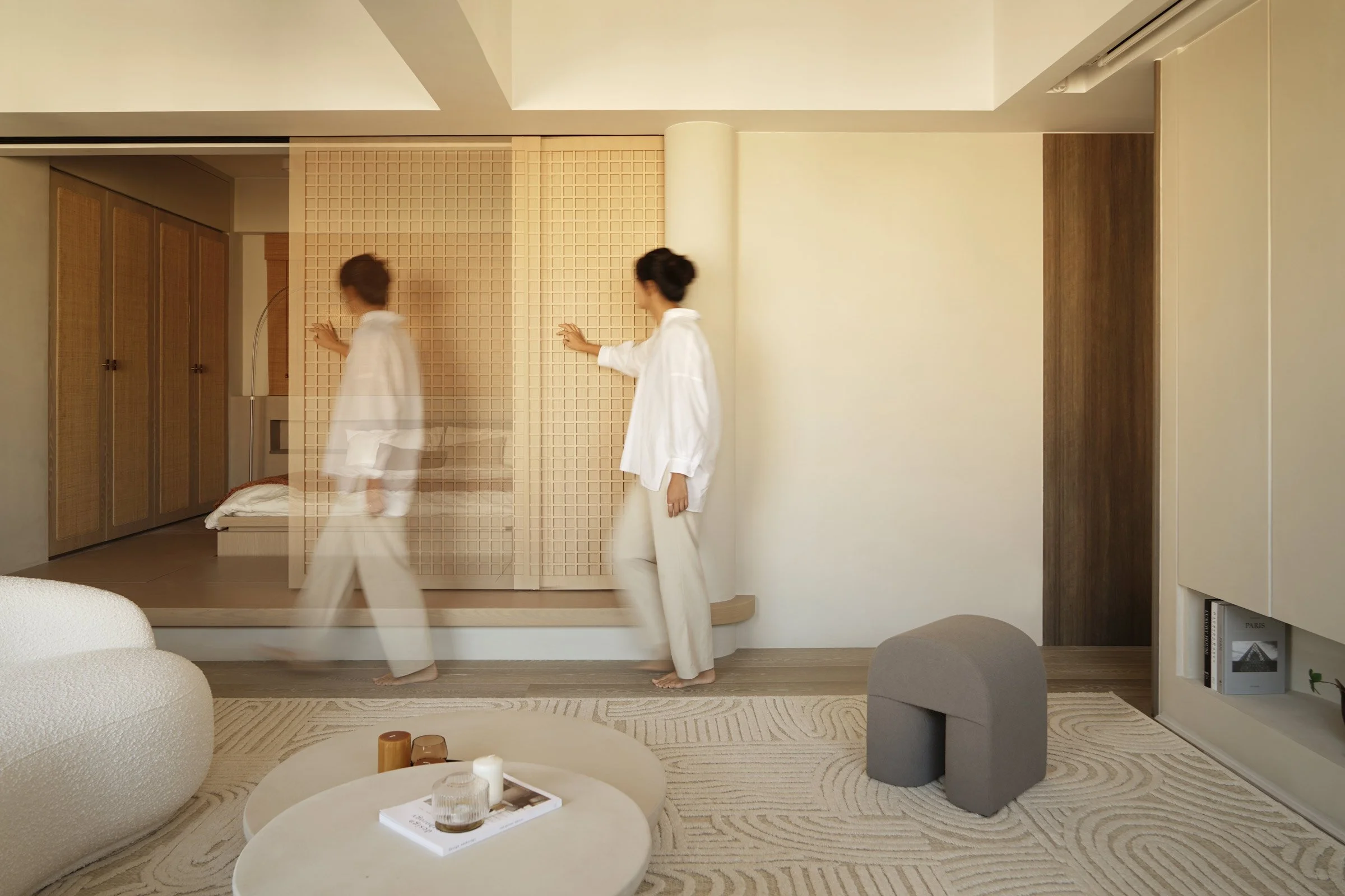
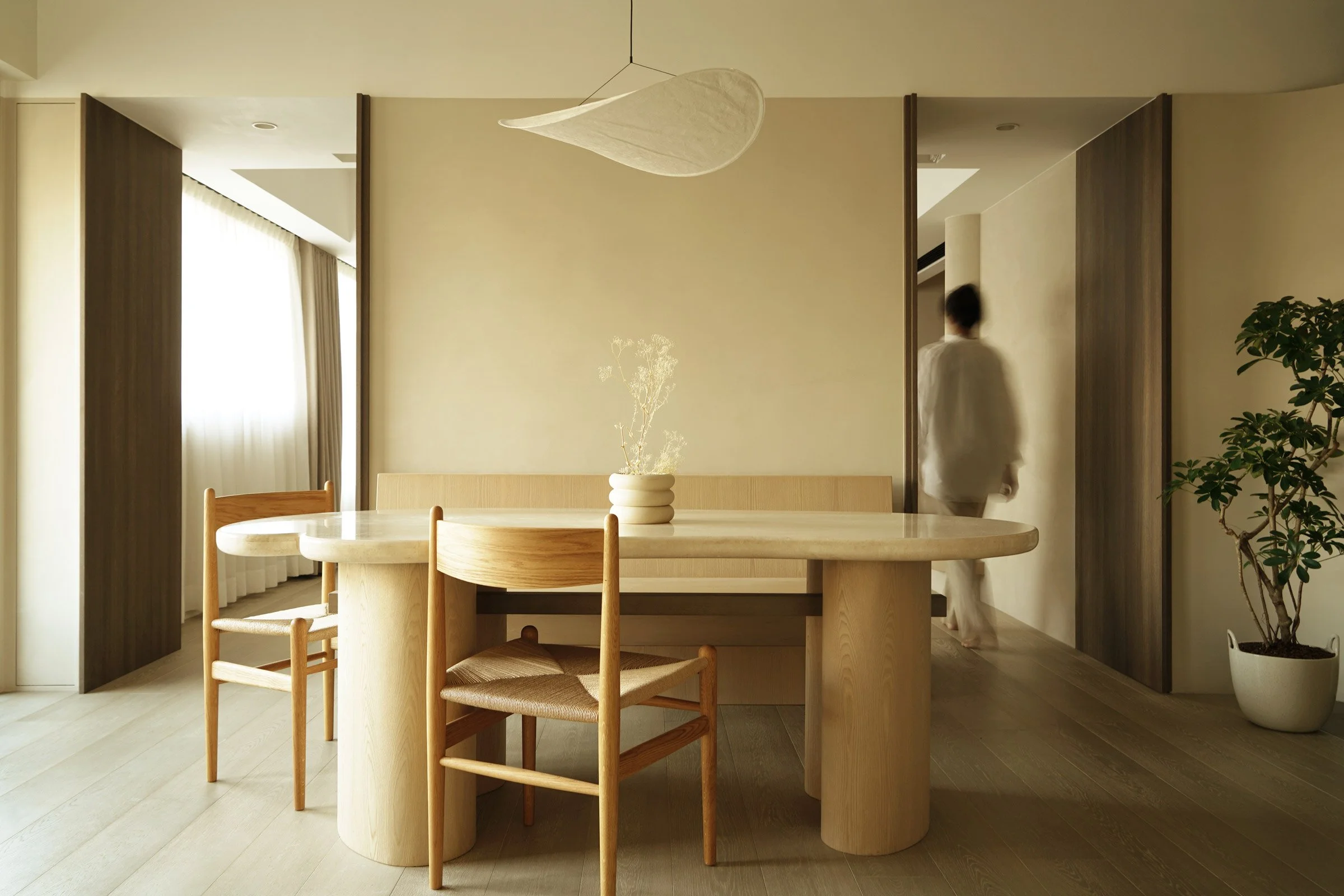
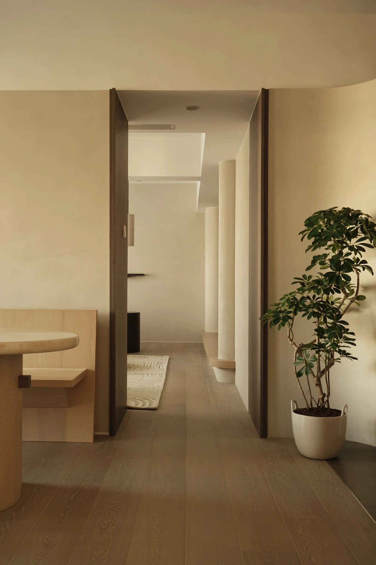
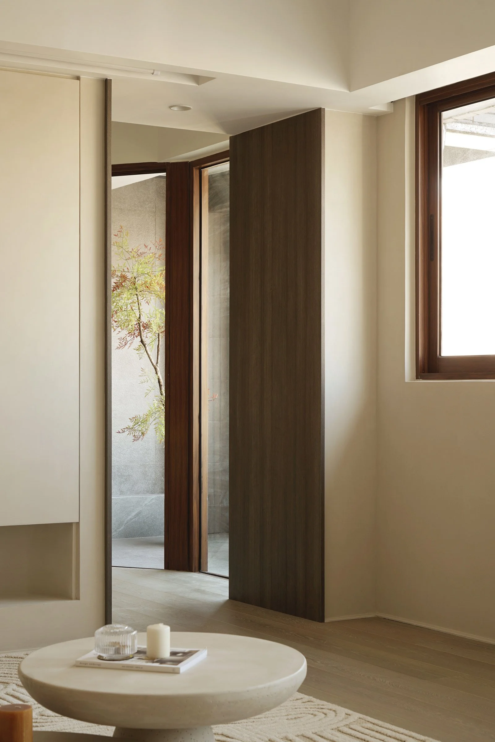
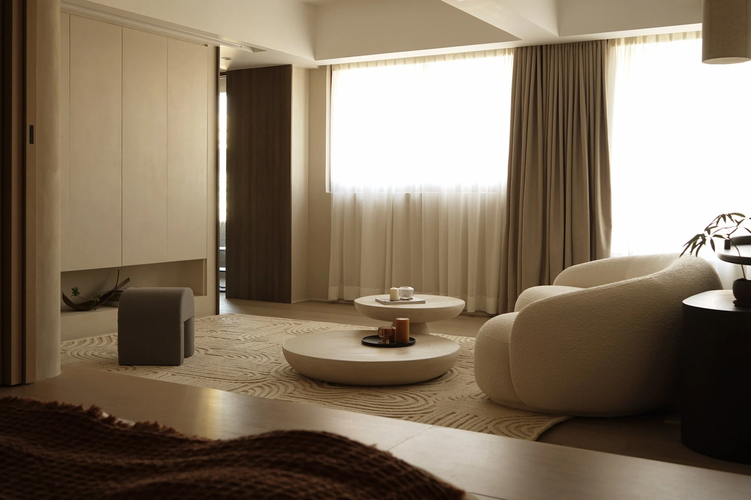
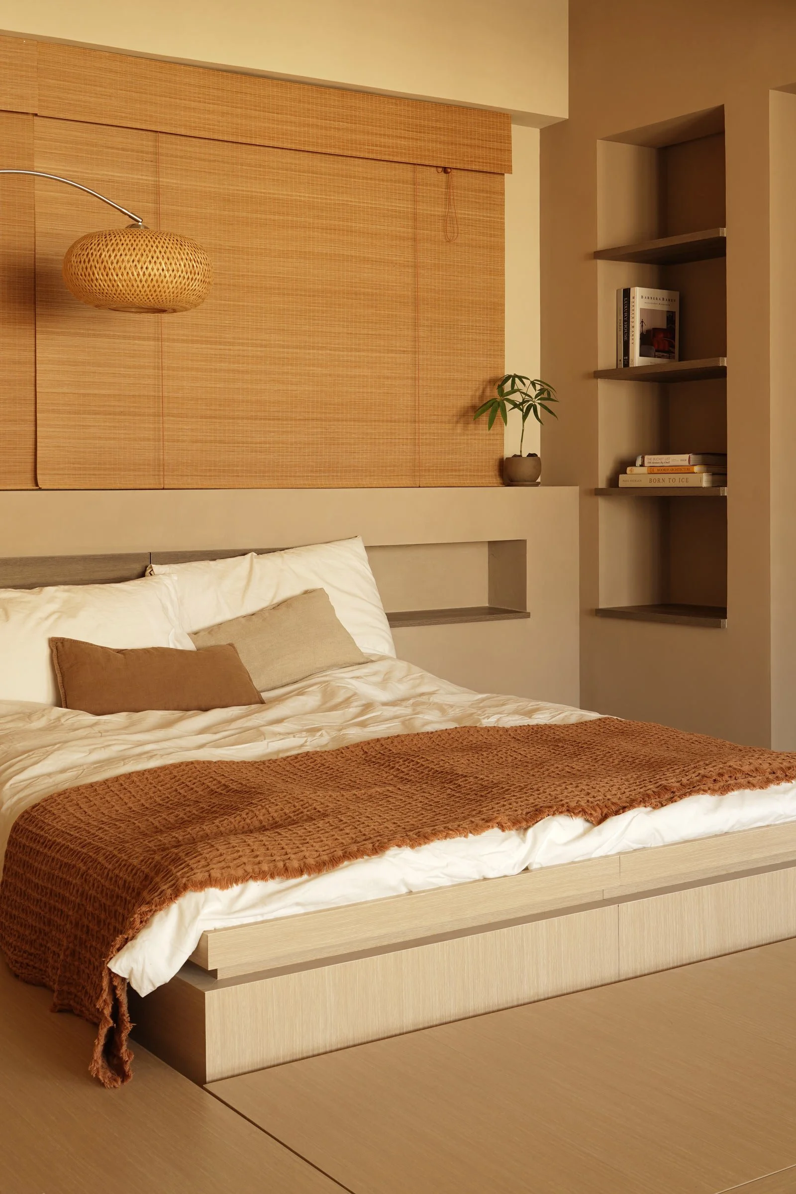
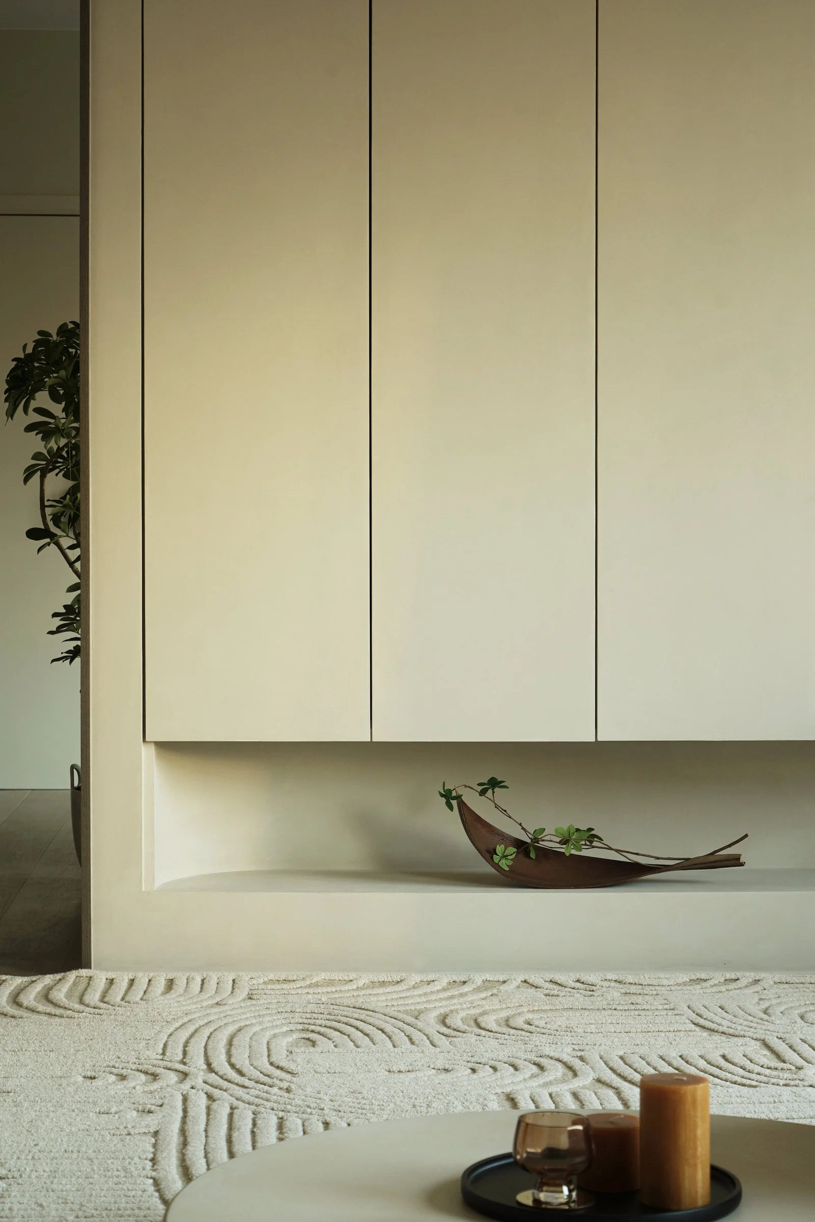
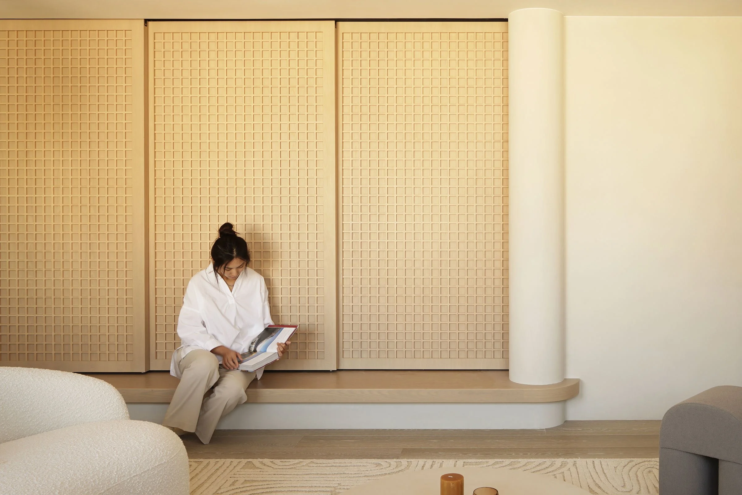
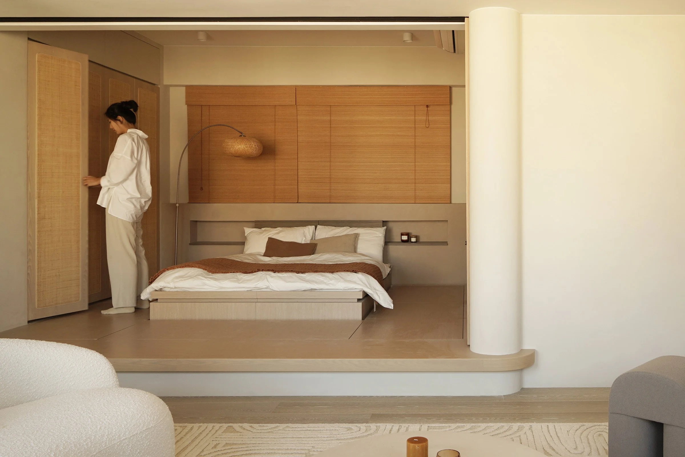
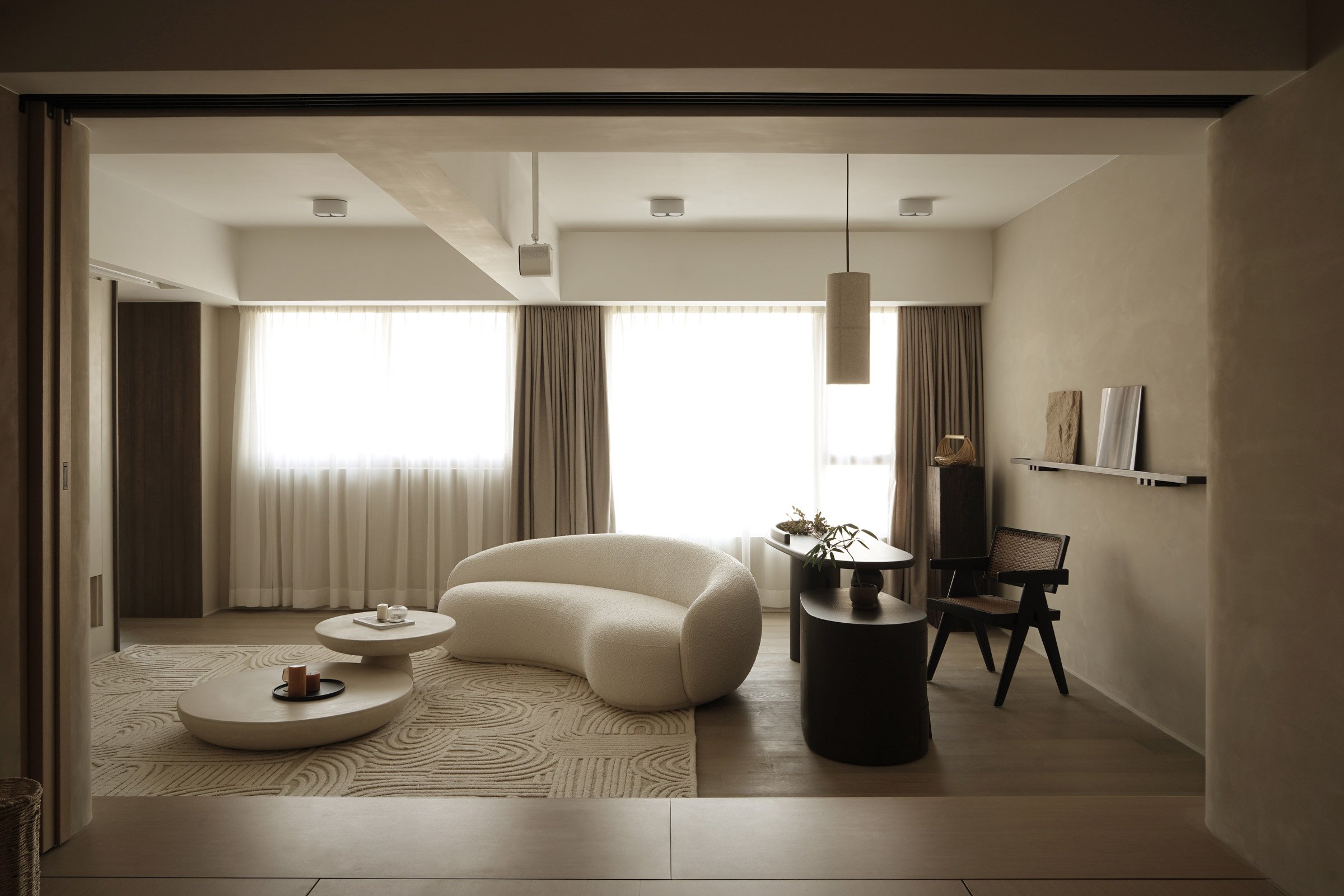
Since the client likes a soft, minimal aesthetic with a wabi-sabi vibe, we decided to blend Nordic-style design with Japanese accents. In the living room, the minimal bookcase with a curved niche at the bottom evokes the form of a fireplace in a cosy Nordic home. A pair of symmetrical doors divide the dining and living rooms, and sliding doors, designed with a small grid pattern inspired by Japanese shoji doors, separate the living room and bedroom. During the day, all the doors can be opened to connect the rooms and make an airy, bright space.
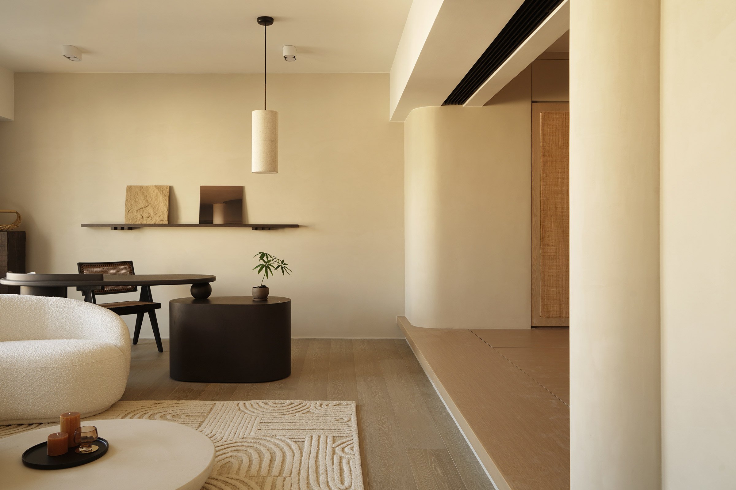
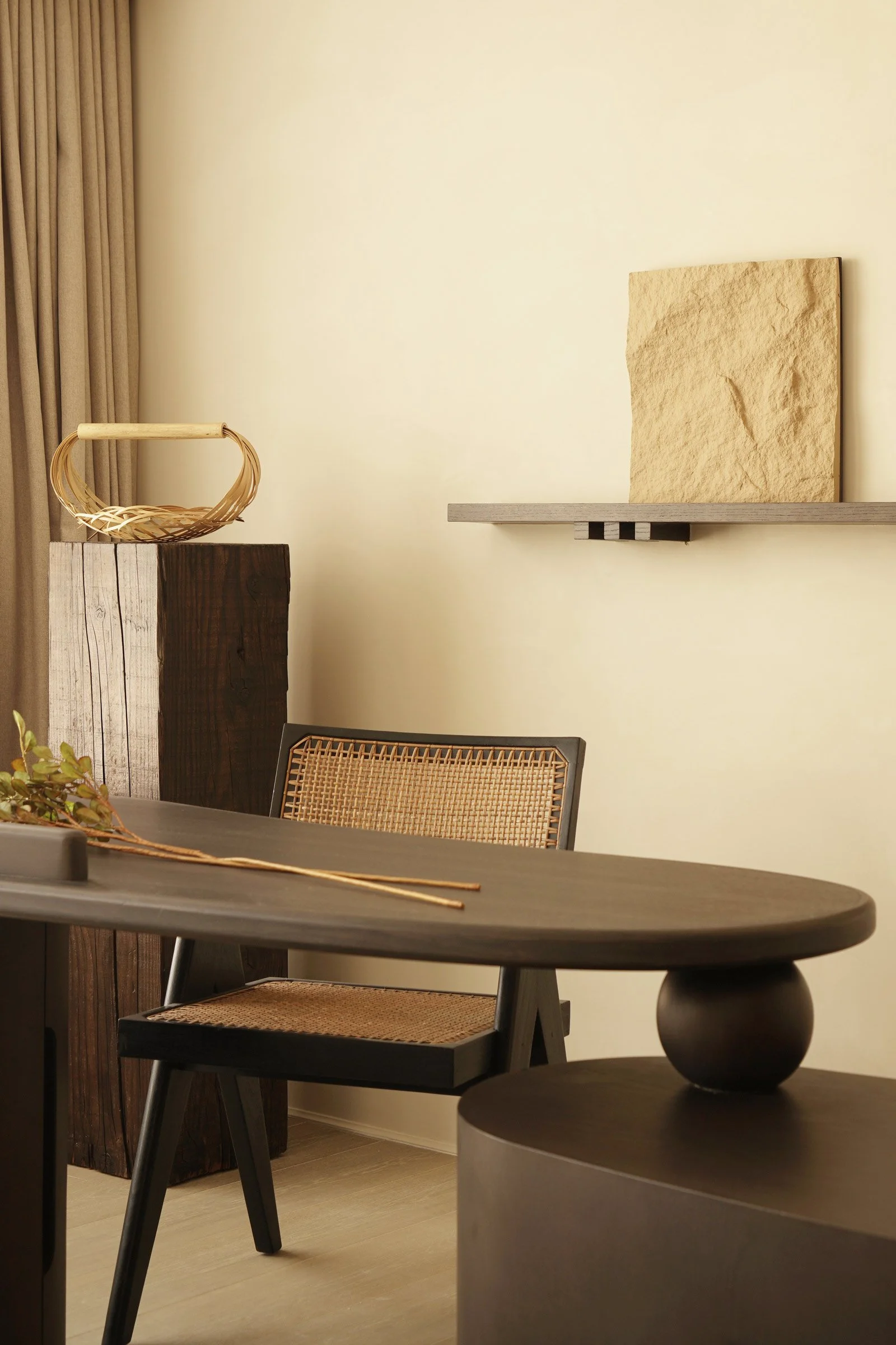
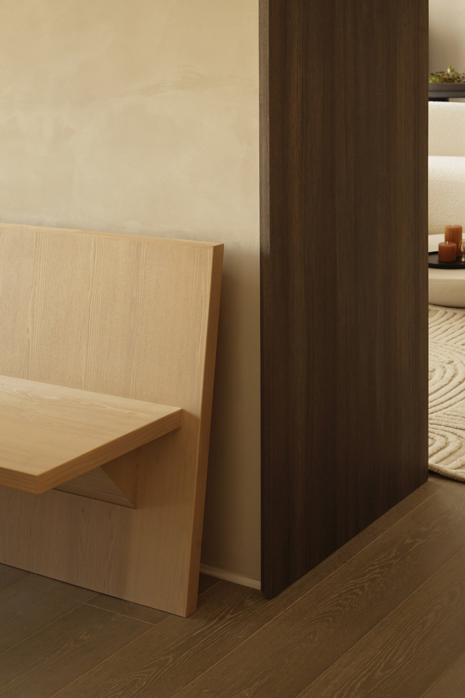
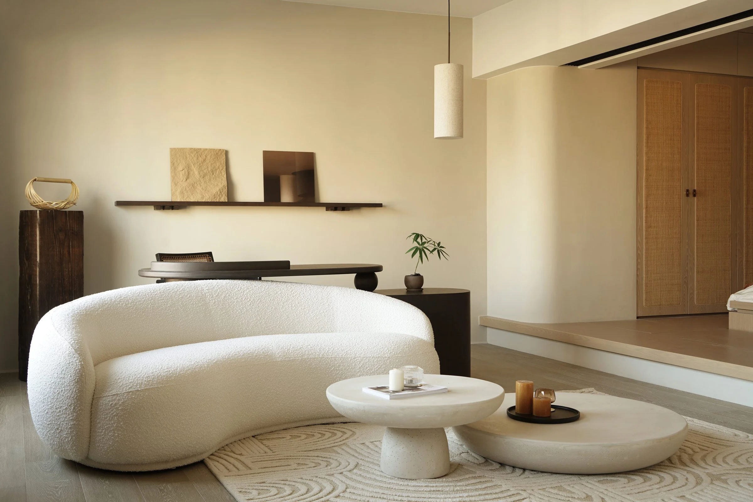
We also added a bespoke timber ledge and a raw timber block to balance the Nordic and Japanese details. The bedroom’s raised floor makes the sleeping area feel quite special.
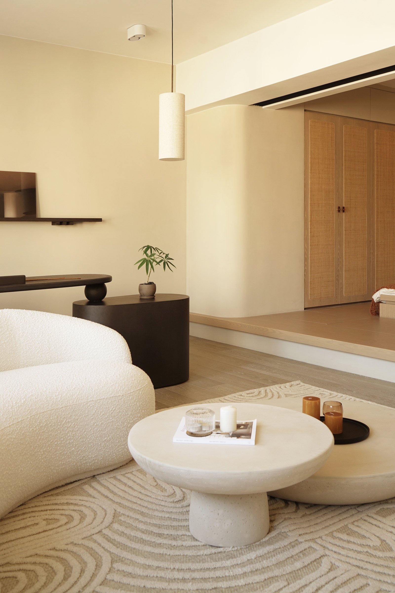
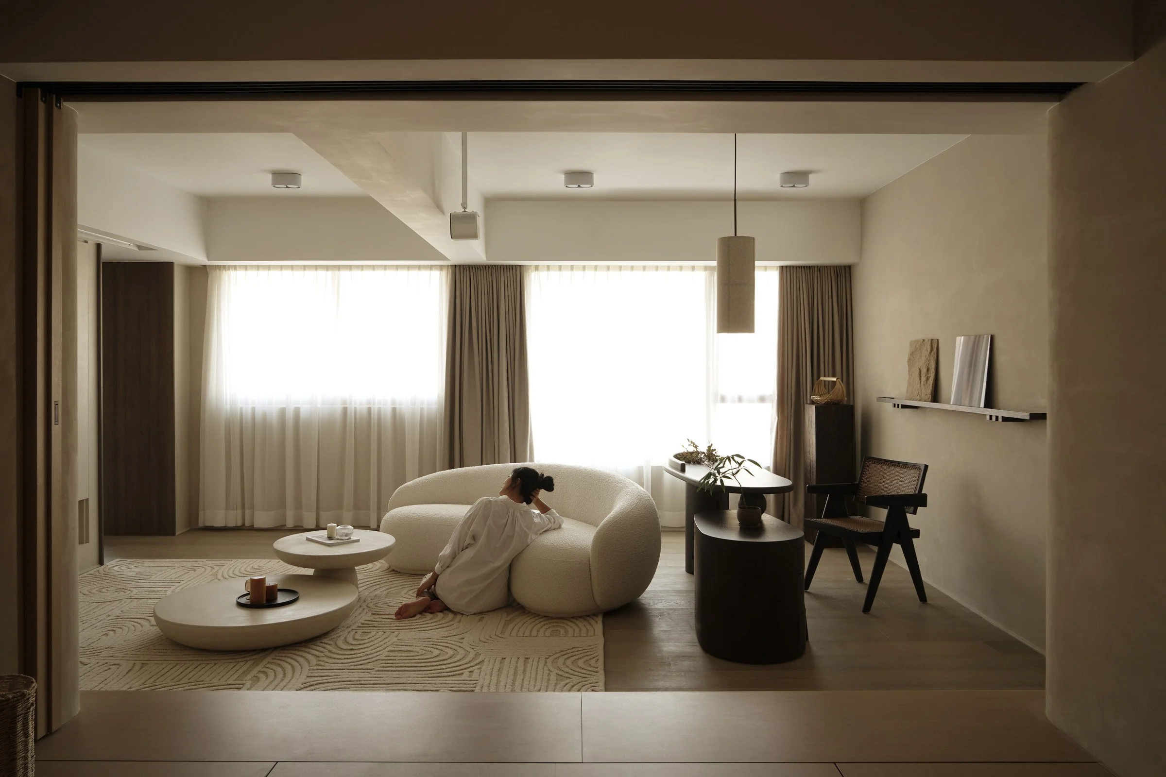
We selected soft and curvy loose furniture pieces, such as the living room rug, sofa and round stone coffee table set, and used off-white textured paint and stained dark wood highlights.
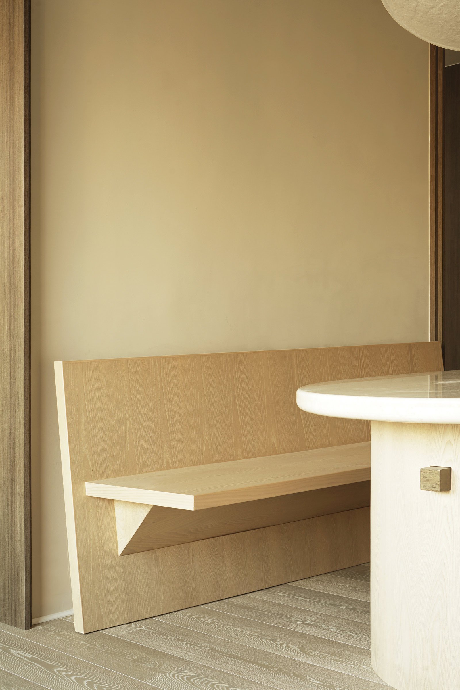
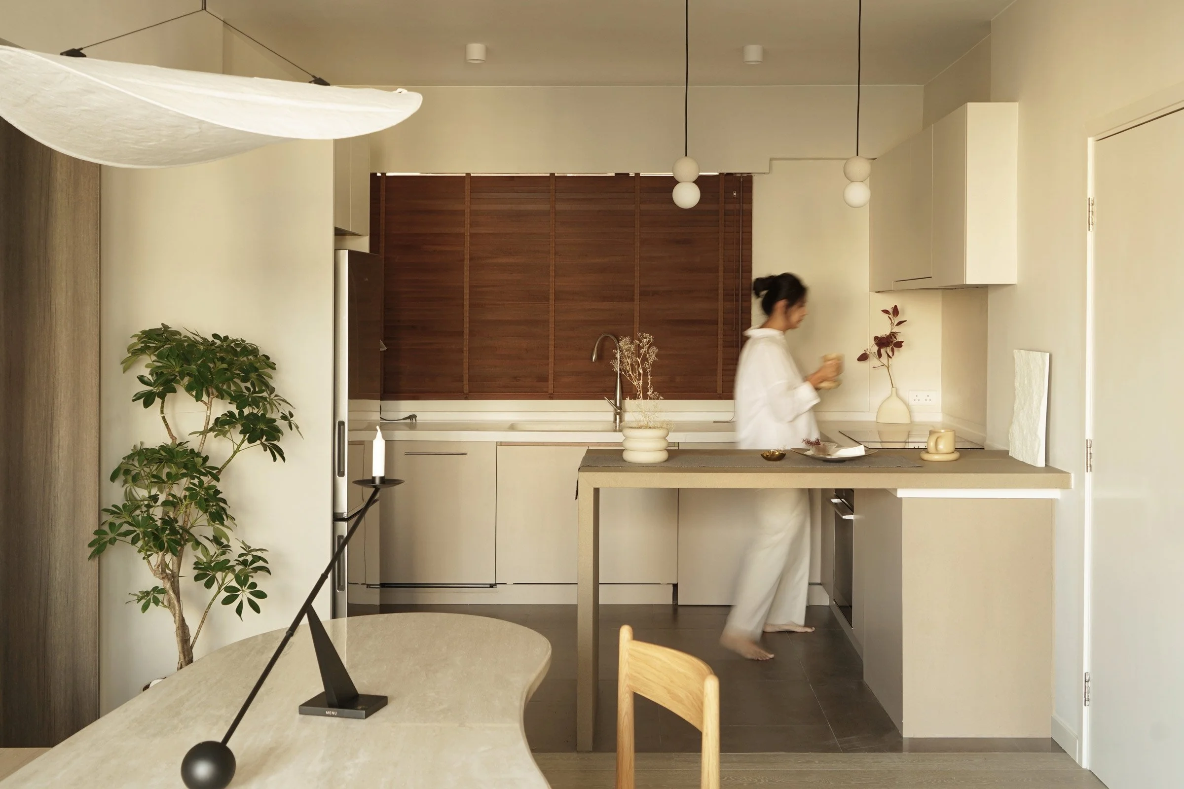
We also custom designed several pieces, which we intended to be poetic references to the philosophy of wabi-sabi. For the dining table, dining bench and work desk we developed organic, curvy forms inspired by water. The travertine tabletop was inspired by the shape of a lotus leaf, which is a symbol of calm and purity.
Please tell us a little about the material choices for the space.
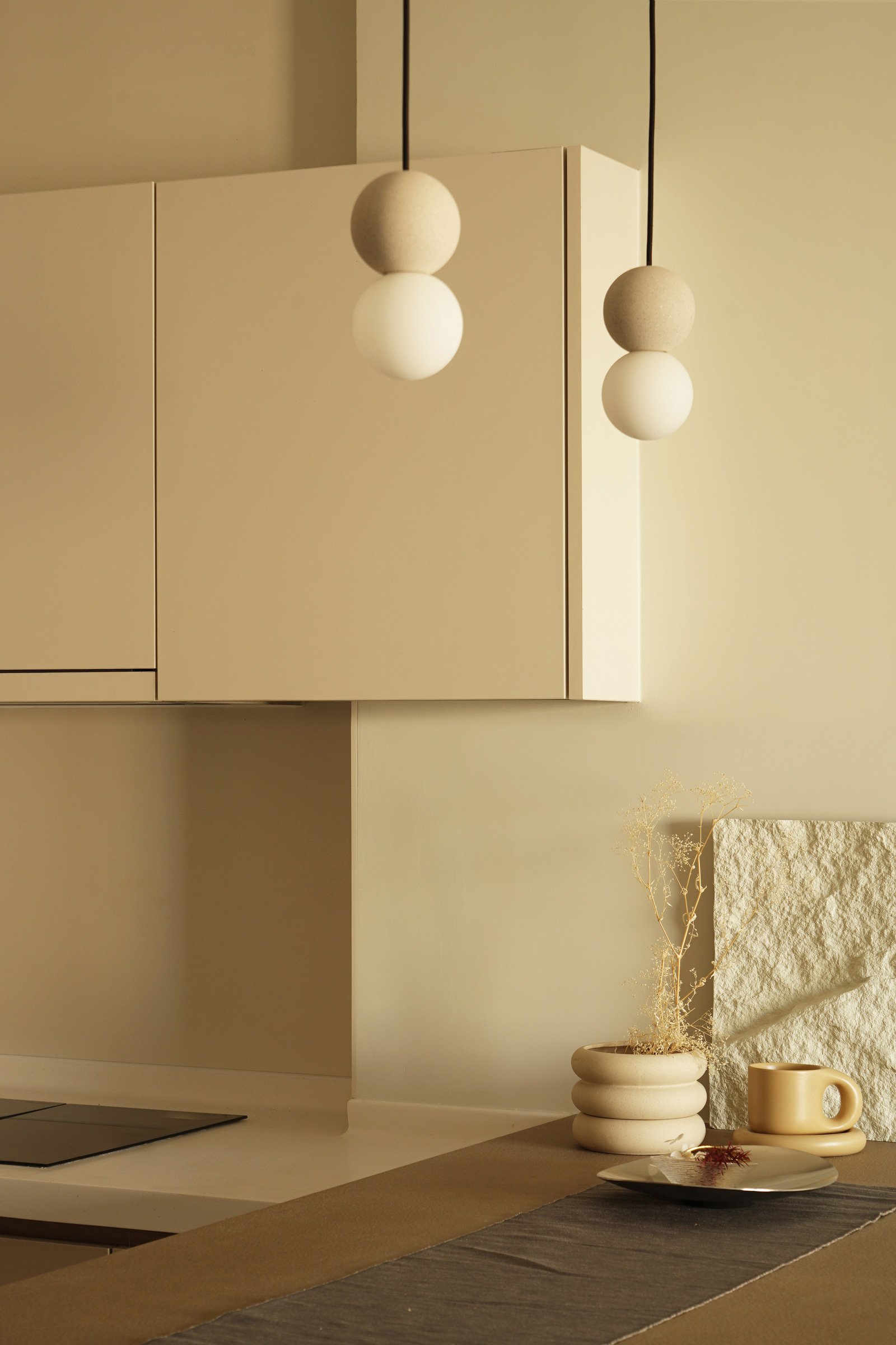
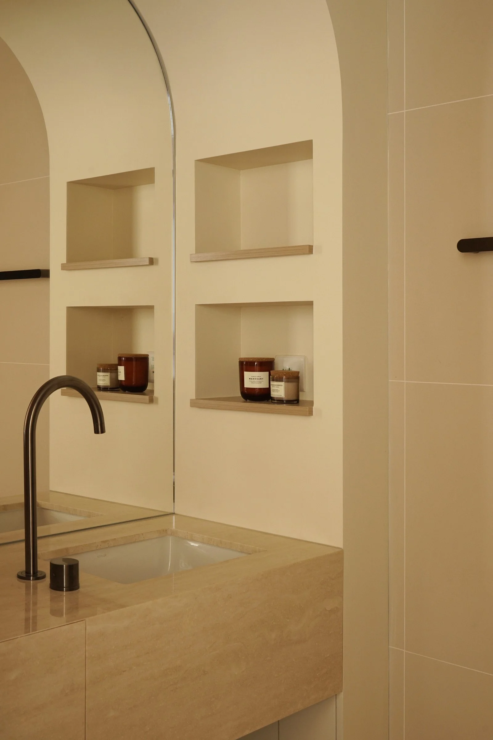
We used plenty of St. Leo marble paint, mainly in a calm off-white colour. In order to downplay the bookcase in the living room, we applied the same marble paint on the walls and the bookcase doors. In the bedroom, we used a muted greyish-purple colour to enrich the colour spectrum and make the sleeping area feel warmer and softer. We used travertine for the dining table and the bathroom countertop, rattan for the wardrobe doors and bamboo for the bedroom blinds and bathroom windows.
Do you have a favourite element or design detail in the architecture or interiors.
My favourite part of the project is the bespoke furniture. I think these pieces really bring a unique character and atmosphere to the space.
Images / Wich Chau

