A Clay-Clad Aesop Store in Nagoya
Koichi Futatsumata of Fukuoka firm CASE-REAL designed Aesop’s new Nagoya store using local soil as the main material
Design Anthology: How did you first meet the client?
Koichi Futatsumata: We started working with Aesop in 2016 when we designed their store in Sapporo. Since then, we’ve collaborated on various stores in Kanazawa, Nihonbashi, Shinjuku and other locations in Japan.
What was the brief to you for the project?
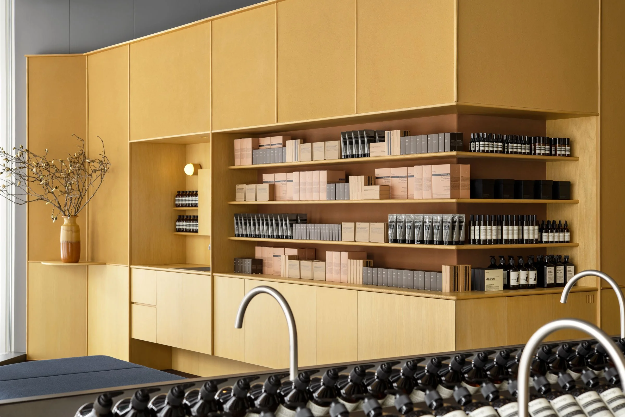
The idea was to incorporate different variations of soil, the main material, while matching the aesthetic of Aesop’s products.
Where is the store?
The 87-square-metre site is located in Maruei Galleria, a new shopping mall in Nagoya’s Sakae. Sakae is one of the areas currently being redeveloped in Nagoya, and this mall is one of its new developments.
How did you approach the project — what design references or narrative did you try to incorporate into the space?
To create a contrast with the urban background, we chose a natural material — soil, in this case — as the main material for the project. We sourced soil from the area of Mino, about 40 kilometres north of Nagoya.
Humans have been using soil and clay in their daily lives throughout history: in bowls for meals, flower vases to add colour to their lives, or as a material for plastering walls or making tiles for buildings. In the heart of this urban development, we felt that it was meaningful to create various elements using these natural materials.
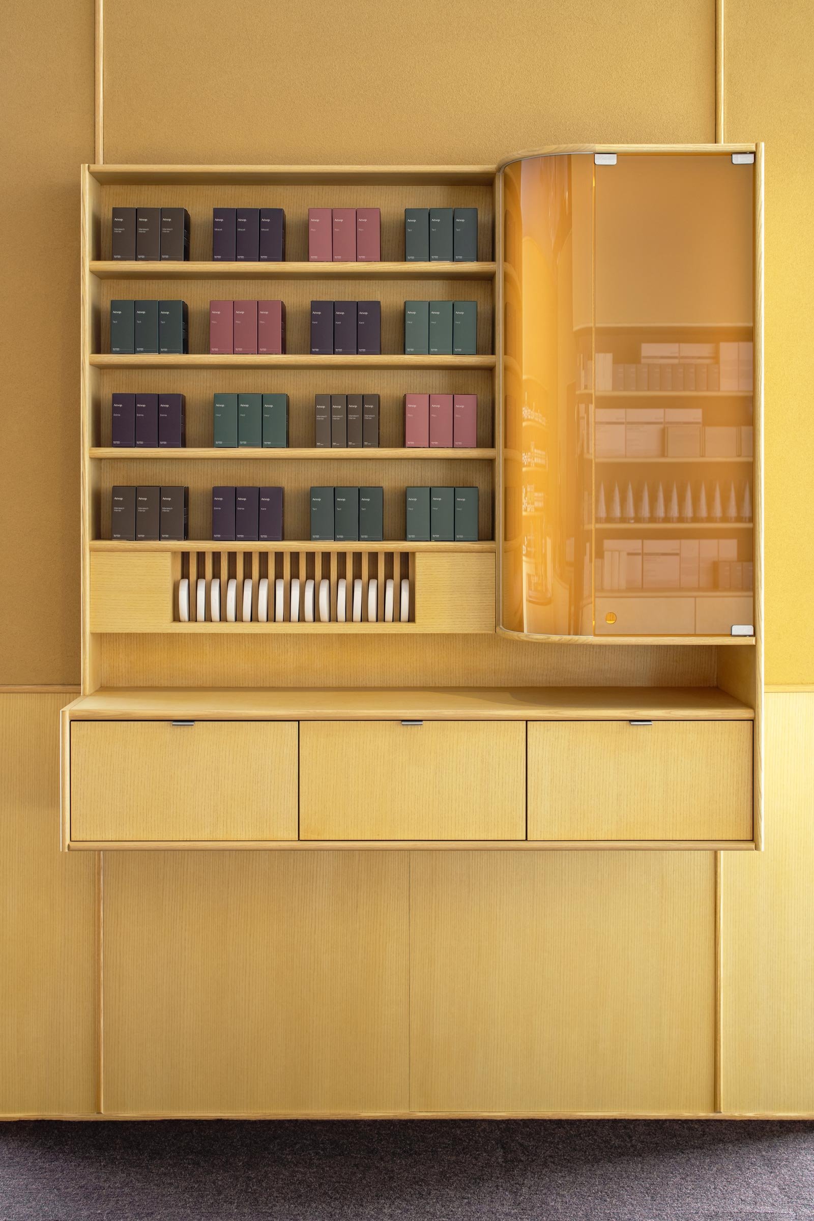
Everything is custom designed. We used clays in two different colours as plastering materials for the walls. We used wood for the shelves and the storage furniture and stained them with the same soil in a powder form.
Do you have a favourite element or design detail in the architecture or interiors?
I like the round edges of the wooden parts such as the shelves and countertops. While there is a moderate tension in the space, the parts that can be felt by hand are softened. We wanted to create details that would match with the clay.
In order to prevent the wall plastering from cracking and ensure the accuracy of the construction work, rounded details were also incorporated in the store’s transition areas. This adds richness to the overall expression of the walls.
Images / Courtesy of Aesop


