Urban Shelter
In Taipei, local design firm NestSpace Design gave a fresh look to this compact apartment, mixing an open, bright layout with references to the neighbourhood’s traditional architecture
Located in a quiet alley in the centre of Taipei, this 40-square-metre apartment was recently renovated by local firm NestSpace Design, with the aim of creating a peaceful, clutter-free environment in line with its owners’ busy lifestyles. ‘Our clients work in the medical industry and have long days and stressful working conditions, so they needed a shelter-like home to relax their minds and bodies,’ explains NestSpace Design’s Jun-Cheng Yeh. ‘They like to read and exercise at home — particularly since the pandemic — so we had to reorganise the floor plan and incorporate a multi-use area to accommodate for that.’
The clean, simple layout is paired with textural natural materials such as light oak and plaster, creating a soothing atmosphere. ‘By opening up the space and developing it upwards, we wanted to create flexibility and introduce natural light and ventilation, turning the apartment into a bright and airy environment,’ Yeh explains. ‘The vertical development creates various views between height transitions as well as extra hidden storage space.’
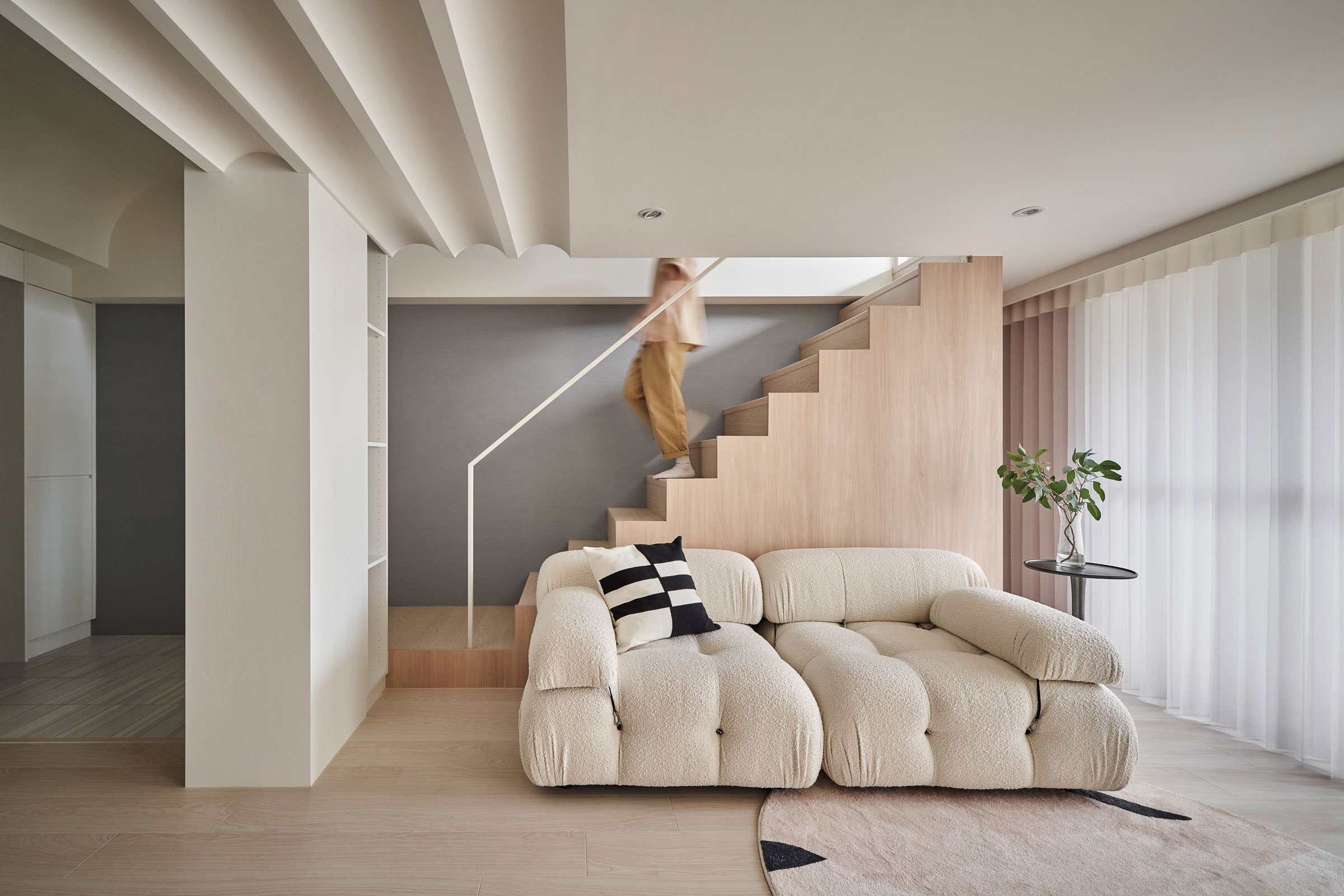
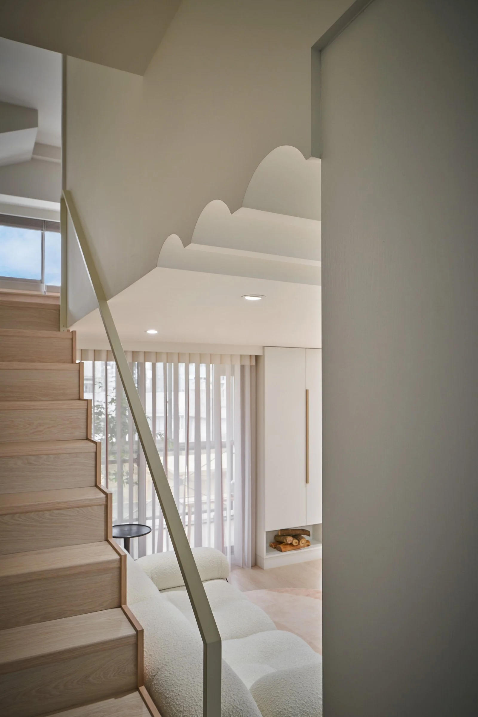
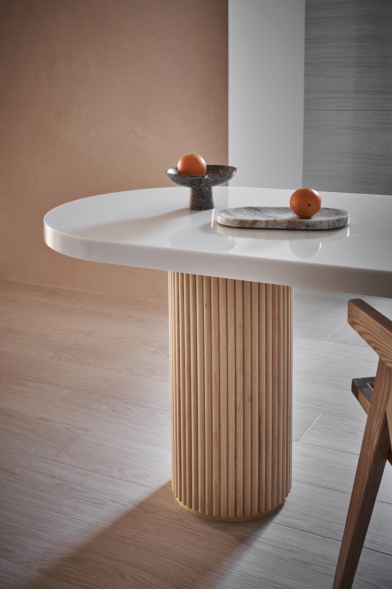
Throughout the home, cabinets act as lightweight partitions to separate the common and private areas while optimising natural light and air flow. Connecting the ground floor to the mezzanine level, simple, geometric stairs were oriented so that natural light from upstairs could reach the ground floor area. In the kitchen, a built-in dining table acts as a central island and a temporary desk, its oak base and curved stone top exuding a sturdy yet comforting feel.
Another aim of the design, Yeh says, was to embrace the rich urban landscape of the neighbourhood, where old and new coexist in harmony. ‘We wanted to add elements representing the local culture in the interior. For example, the living room ceiling took its rhythmic shape from the vernacular tiles on the roof,’ the designer says. ‘Those elements eventually evolved into design codes, such as straight lines, corners and arches. It became a peaceful realm that opens up a dialogue between old and new.’
Text / Nina Milhaud
Images / Hey!Cheese


