A Bold Brooklyn Brownstone
Michael K Chen Architecture (MKCA) undertook the gut renovation and interior design of this four-storey Brooklyn brownstone, honouring both the home’s history and the clients’ characters, and generously applying swathes of bold colours to define spaces and background art and design pieces
Design Anthology: How did you first meet the client?
Michael K Chen Architecture: It’s a great story. The clients are a married couple who each asked someone close to them for a recommendation. He asked his best friend and business partner, who trained as an architect, and she asked her brother, a mechanical engineer — and they both recommended us! The clients decided that if our firm was the one that each of these people would recommend, we were clearly right for them.
Can you tell us about the clients and their lifestyle?
He is a tech investor who mainly works from home, and she is an artist and art teacher at a public high school. They’re homebodies, but they’re a lot of fun, and they love food and cooking too. They expressed a strong love for mid-century design and architecture, and they love colour. They collect art, for personal joy rather than prestige, and they like offbeat pieces with a sense of humour. When we first met them, they were planning to start a family — and now they’re expecting their first child!
What was their brief to you for the project?
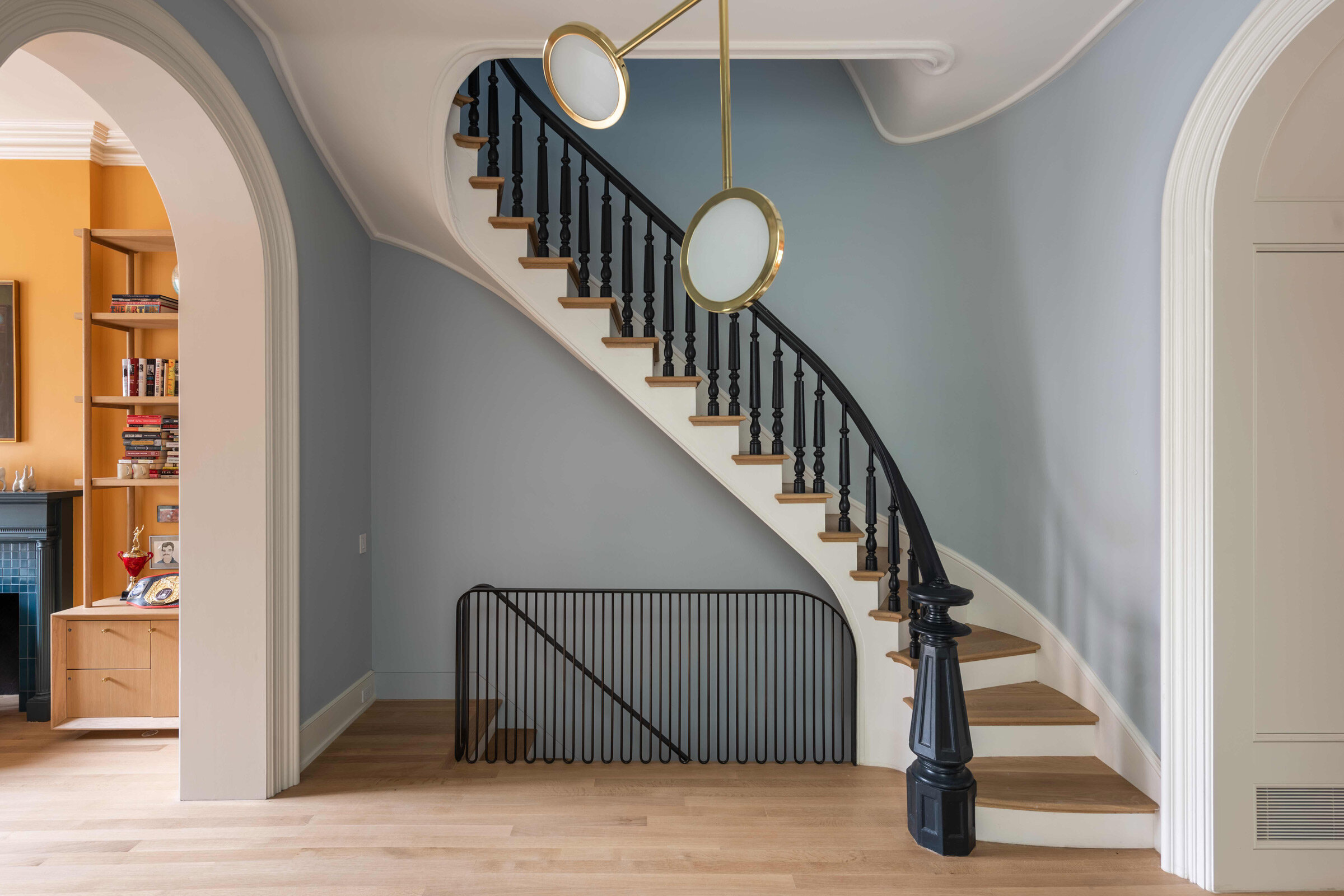
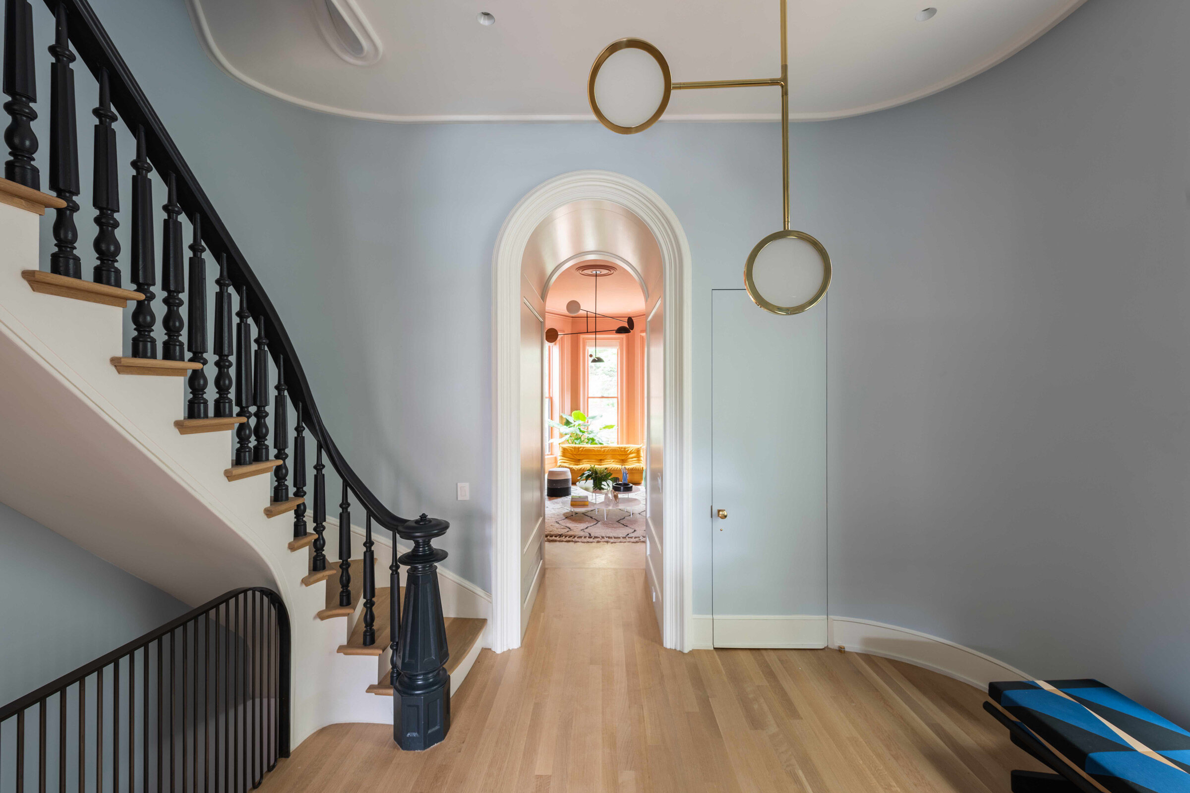
The home was originally built in 1895 and had been standing empty for over 20 years. When we started the project, the building was absolutely crumbling and falling to pieces, but at the same time, the spaces and proportions of the house were truly spectacular. It’s not an overly large building, but spaces like the central stair hall and airy parlour were impossibly gracious and grand. Our charge was to reclaim the house’s original architectural integrity and then balance that against an effort to modernise and make the home suitable for how people live now. For us, that meant balancing restoration-minded detailing and materials with crisp, modern insertions and spaces, and looking for aesthetic and detailing strategies to create continuity, contrast and tension.
From a design perspective, the greatest challenge was striking a balance between restoration and looking forward. Brooklyn is full of restored brownstones, where everything is painted white and rooms are filled with modern furniture — but none of us were interested in that approach. We were looking for something more layered, more playful, and where the approach to balancing the 19th and 21st centuries has more of a spatial impact.
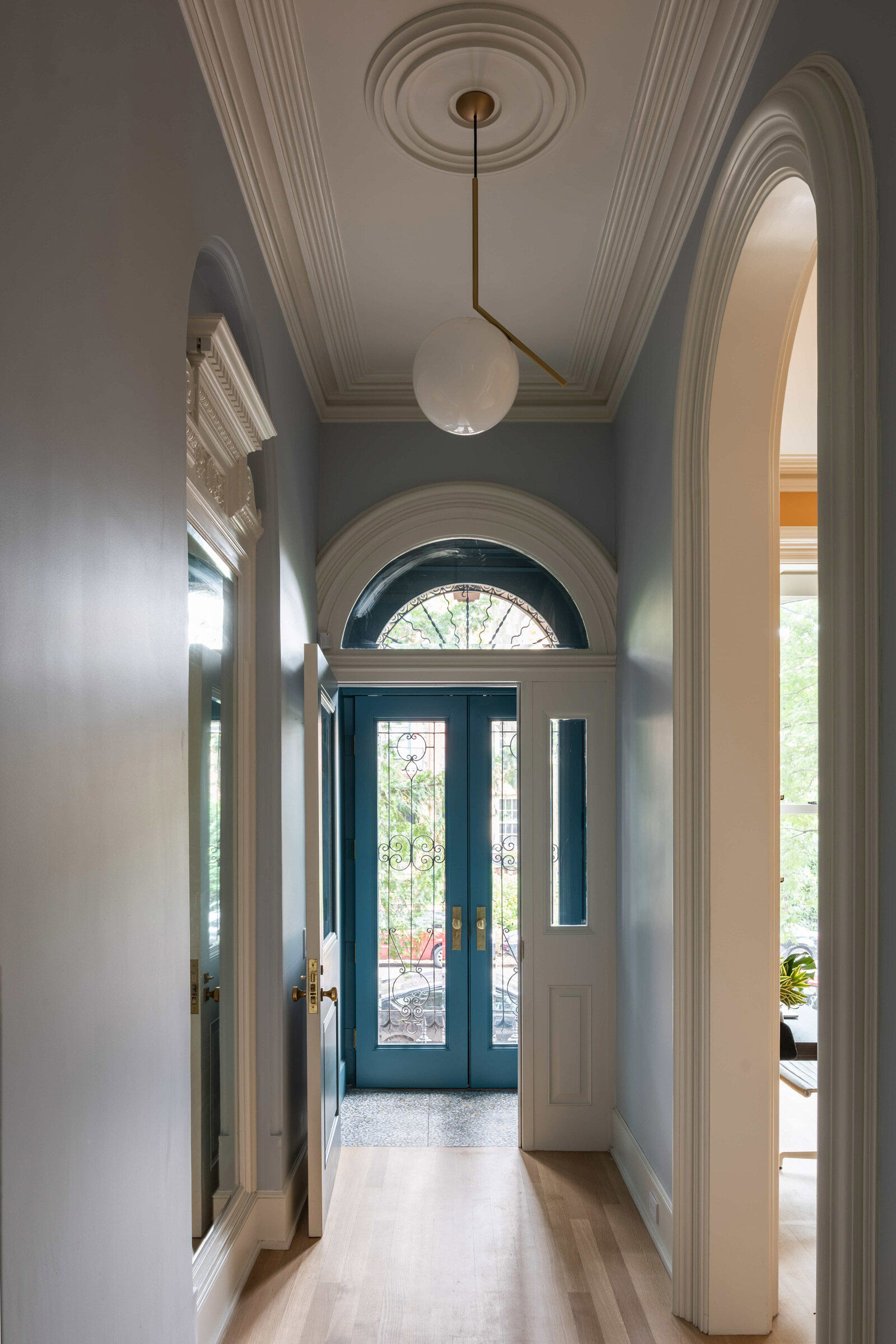
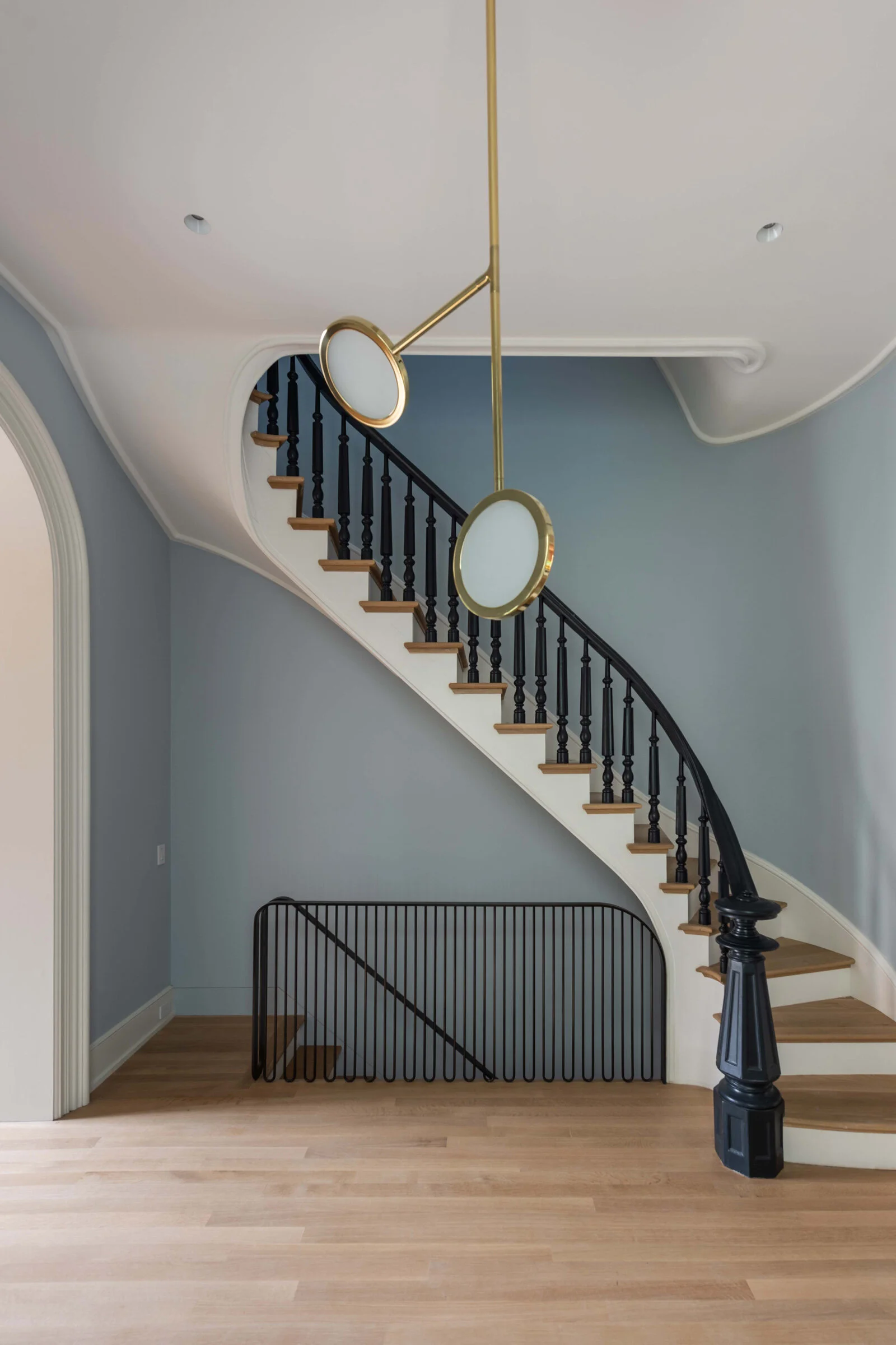
Not much of the original detail of the house was retained, partly because it was in very poor condition, and partly because of the dangers of the original lead paint. Even when stripped and repainted, trim that had once been painted with lead paint can still produce dangerous dust and toxic paint chips that is harmful to children. So, many of the plaster details were recreated from profiles and casts taken from the originals, and many of the wood trims and mouldings were replaced with matching profiles. Others, like the carved mirror in the entryway, were carefully restored.
How big is the home overall?
The home is 335 square metres spread over four floors and a cellar, with a oversized backyard and generous front garden.
How did you approach the project — what design references did you try to incorporate into the space?
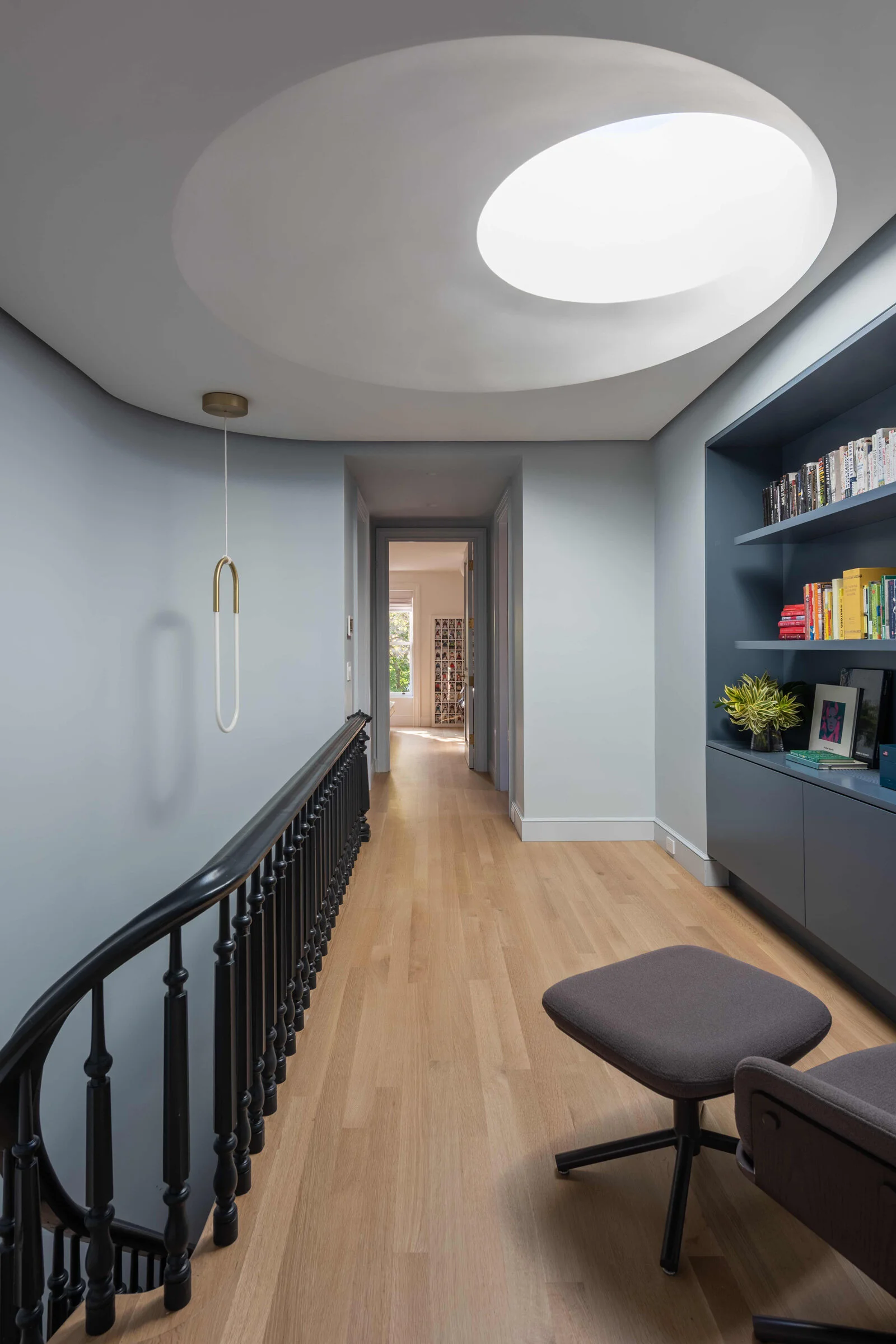
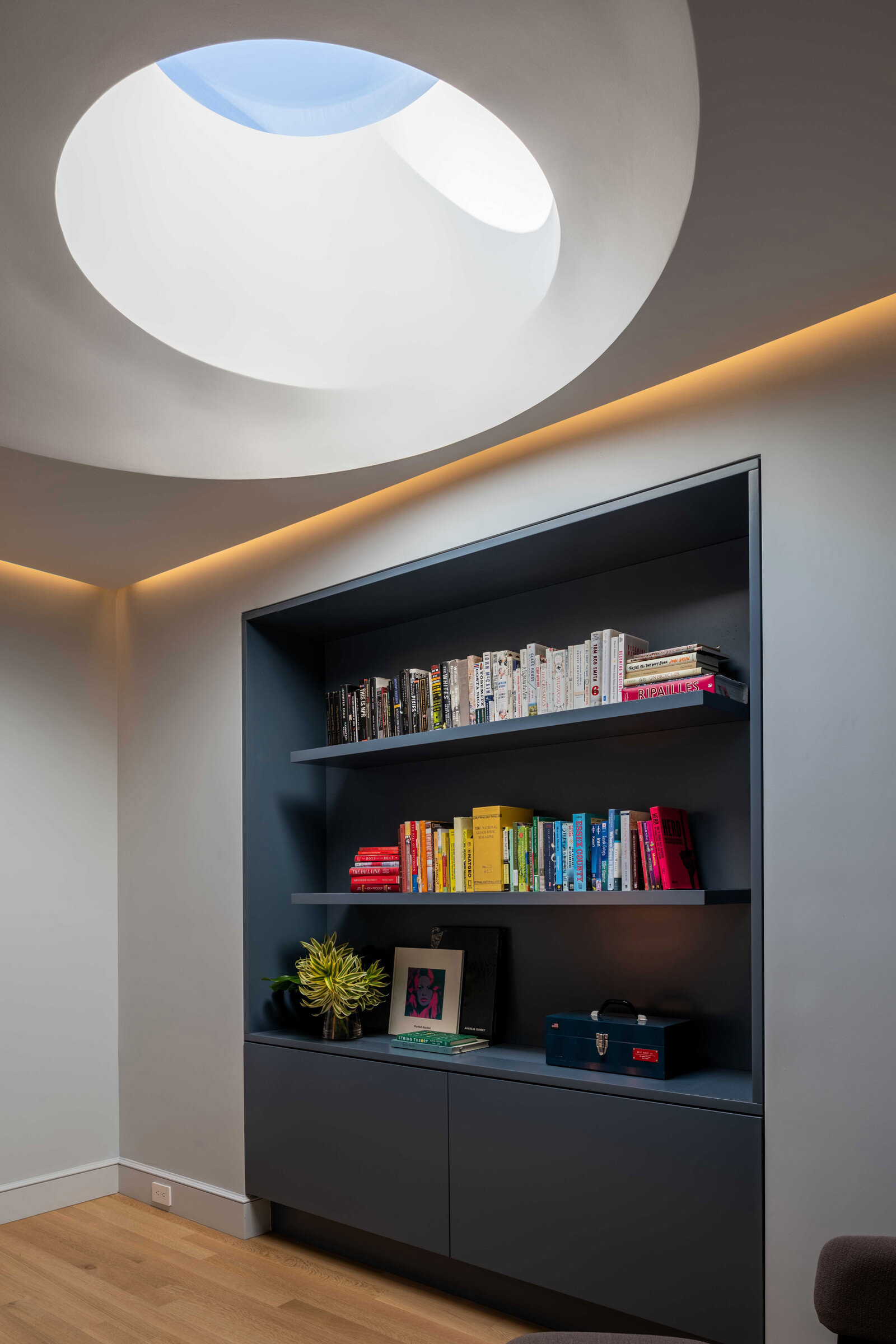
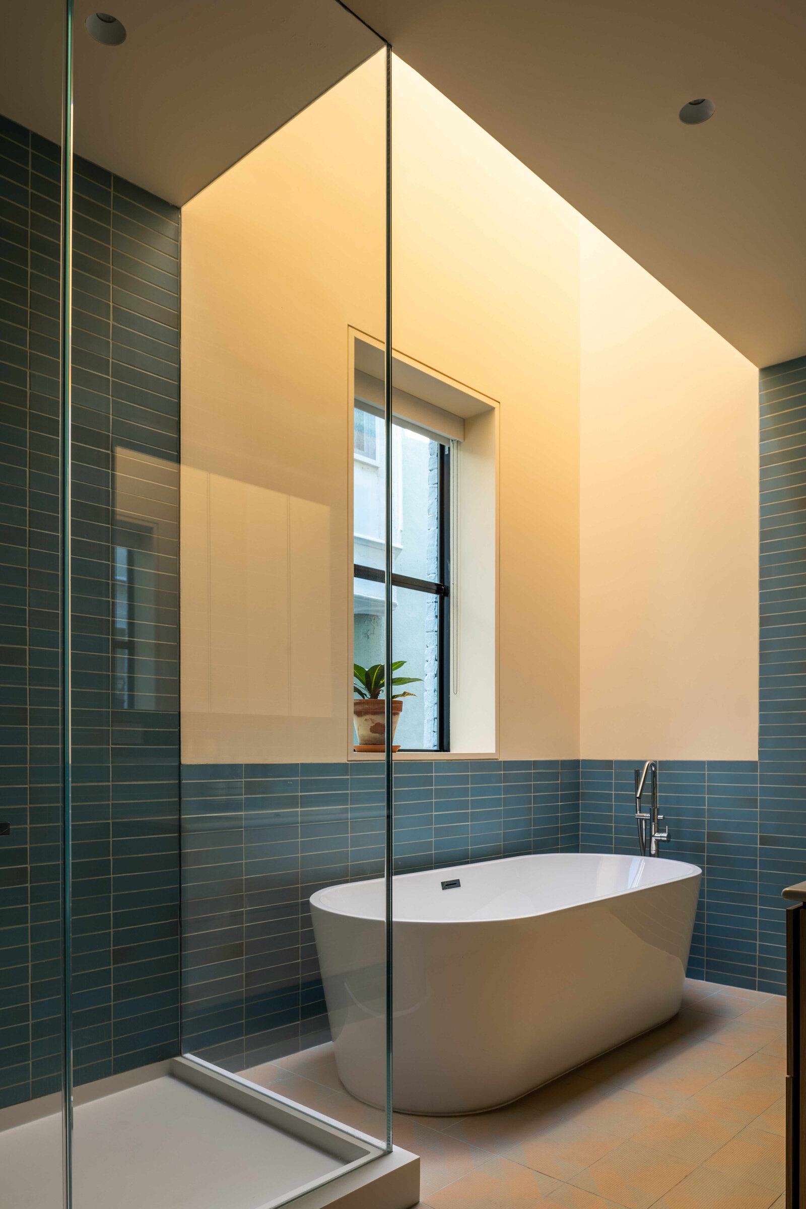
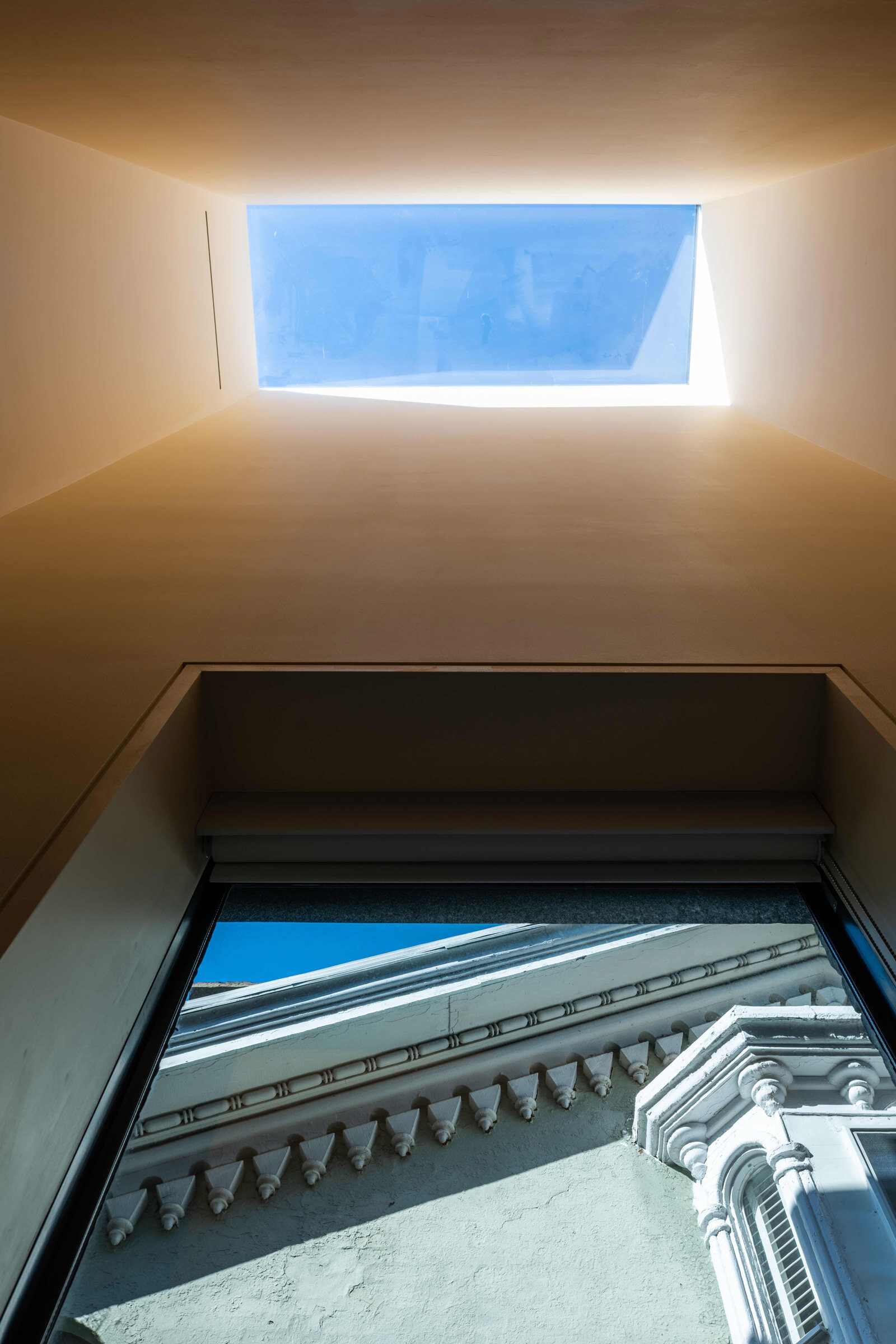
Brownstones are notoriously dark, particularly on the main floors and in the middle of the building. So, we approached the project with an intention to bring in more natural light, which was achieved through two very sculptural skylights — one in the main bathroom and the other capping the stair on the top floor.
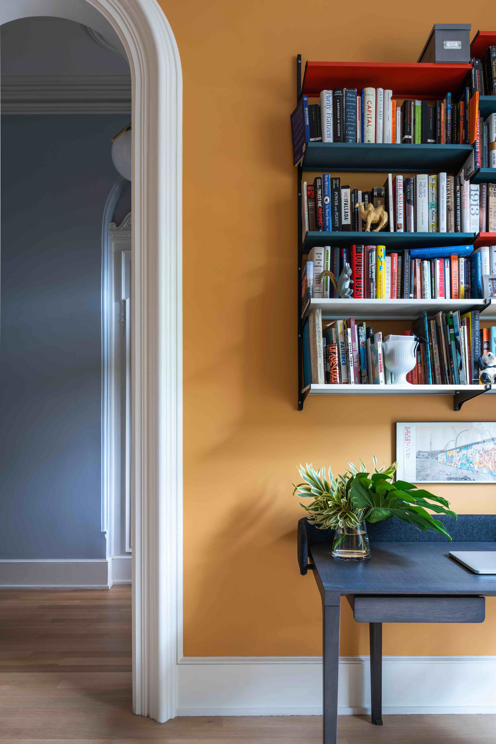
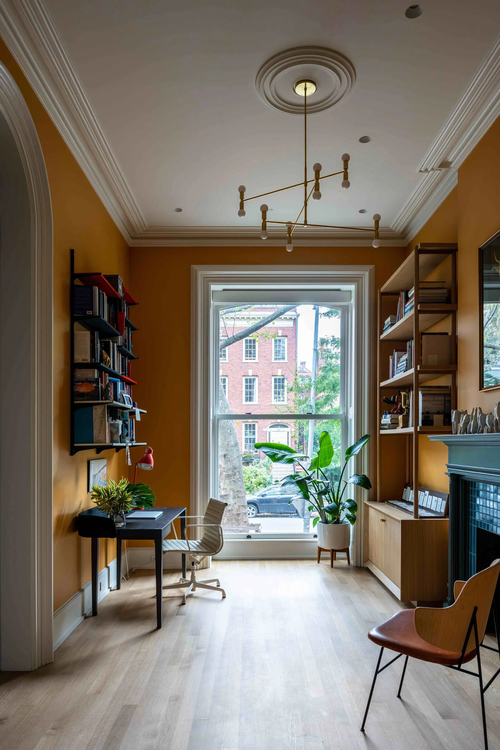
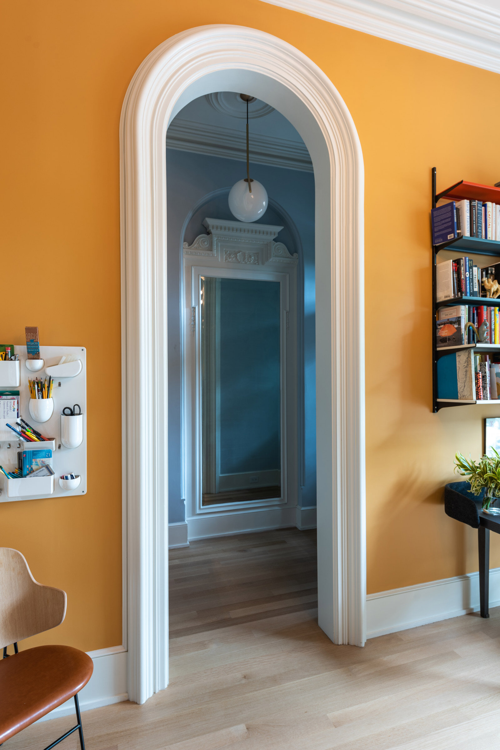
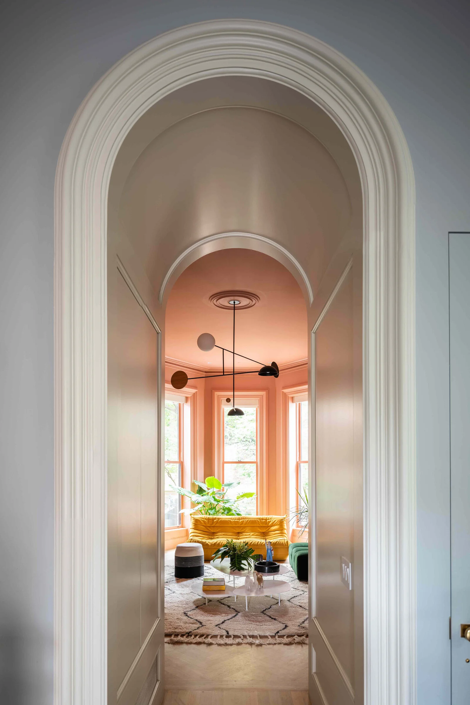
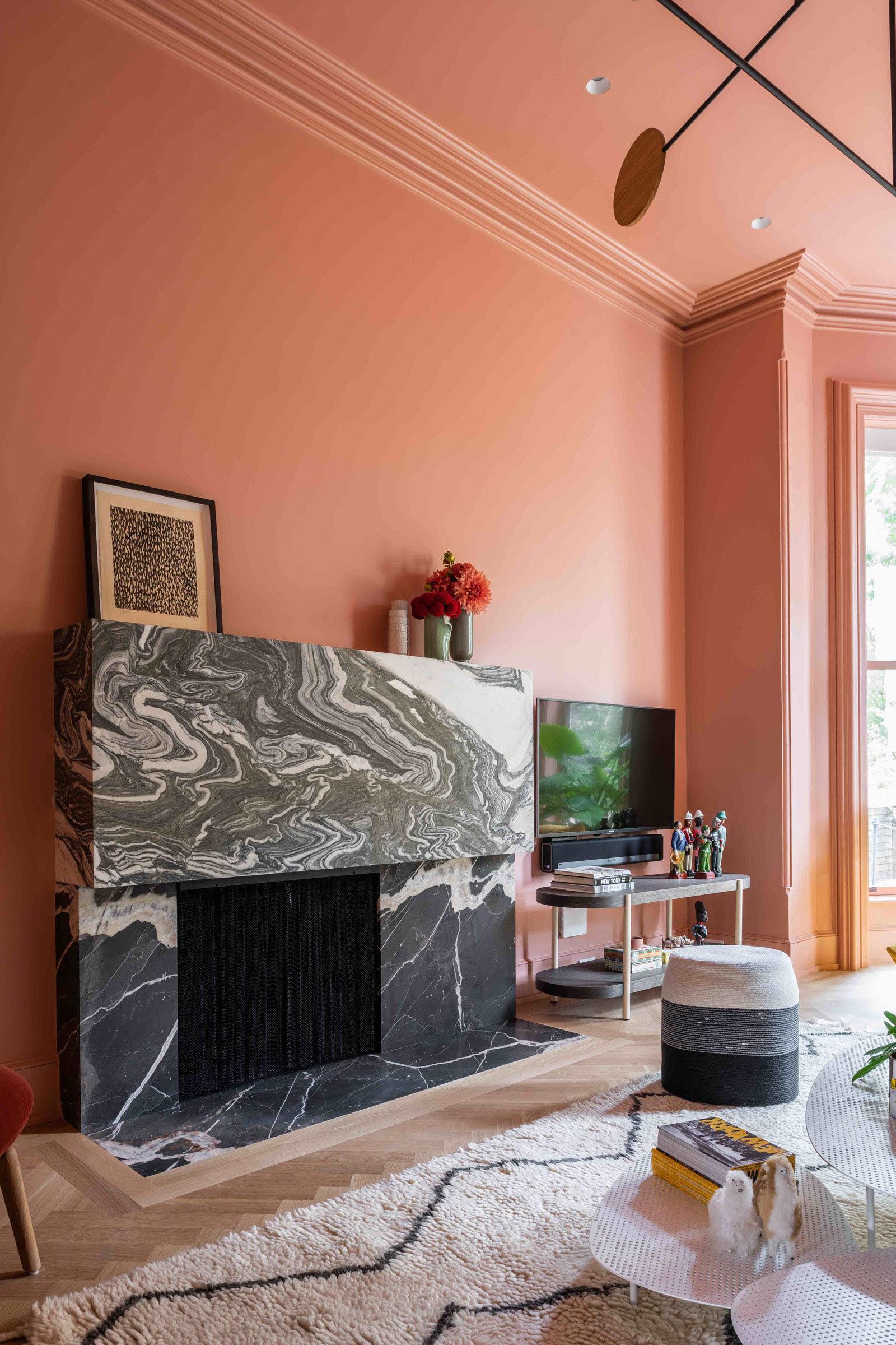
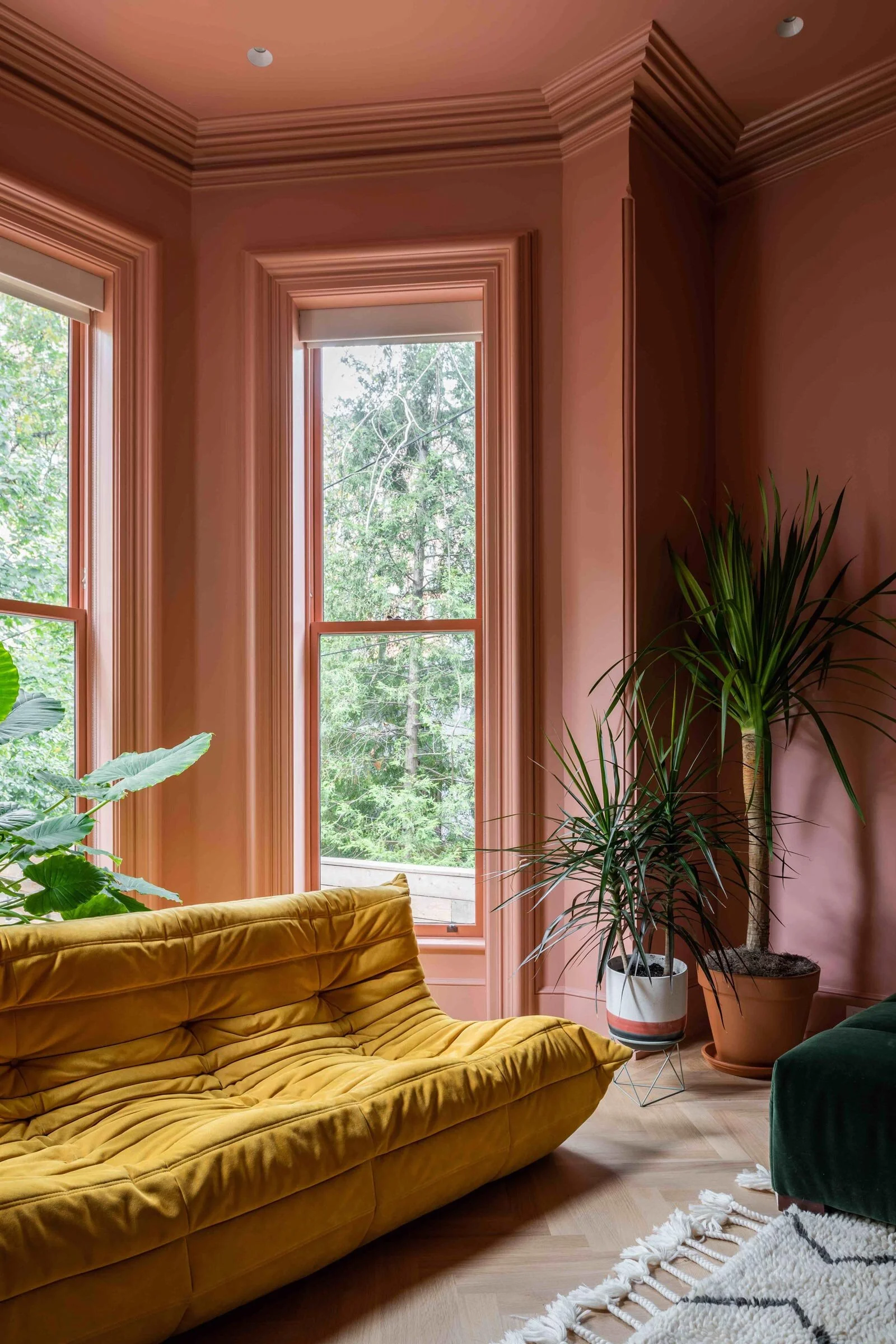
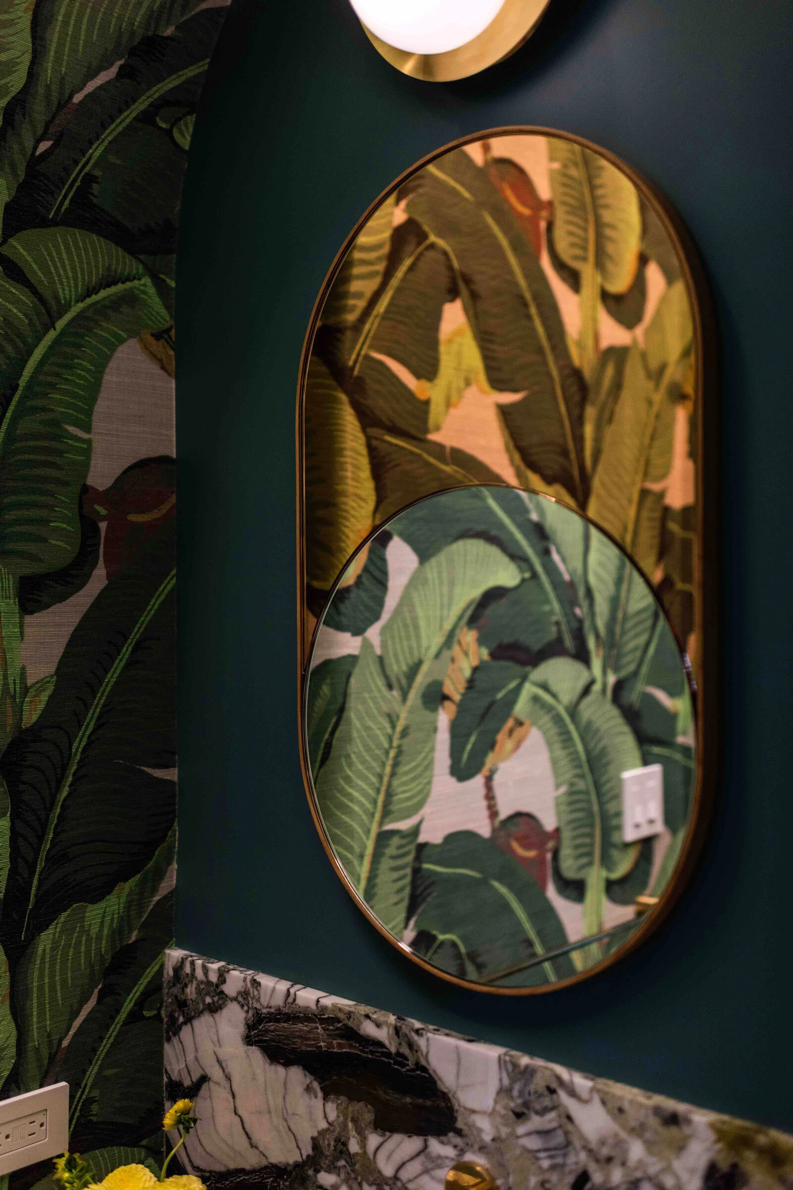
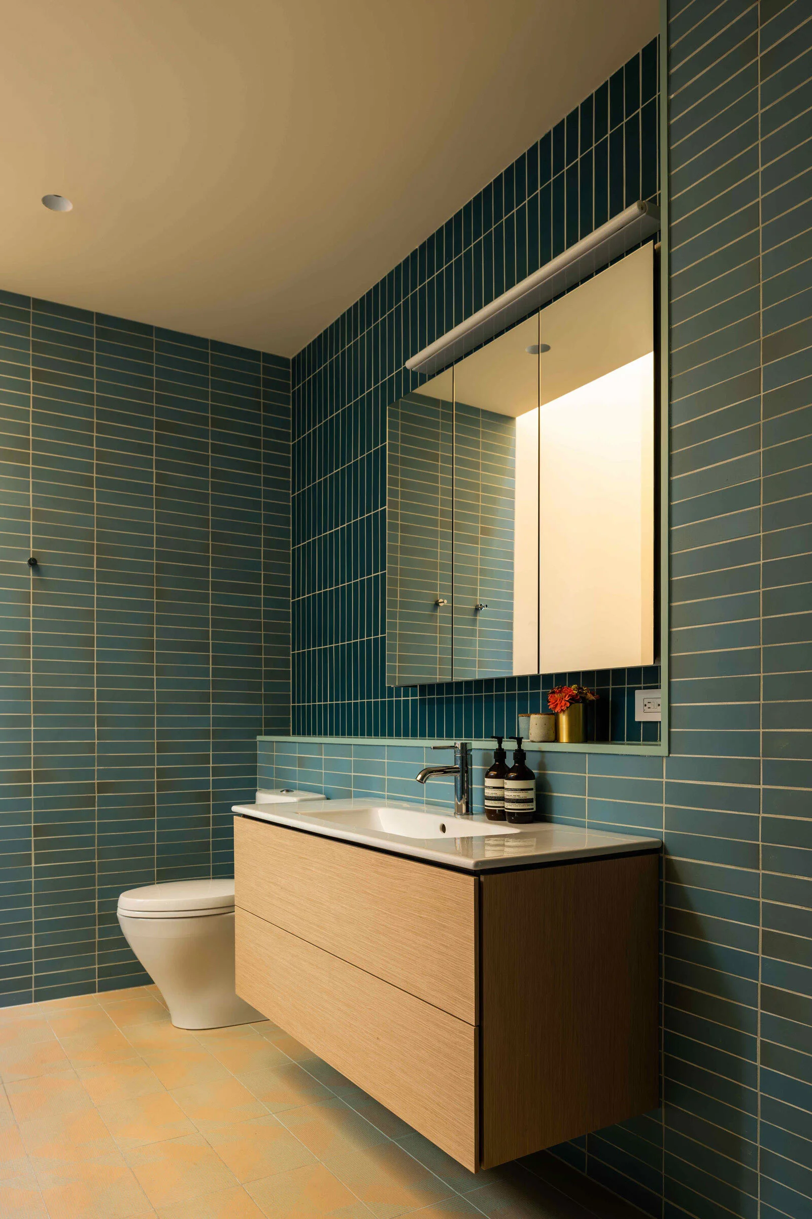
Elsewhere, our approach to light is expressed through colour. The clients wanted a colourful environment, and we interpreted that by applying colour in a deeply spatial and experiential manner. We painted the walls, ceilings and trims in one colour — often a dense, saturated hue. We wanted to get away from the use of colour as an accent or a ‘pop’. Here, you don’t look at the colour, you inhabit it. In the more immersive rooms like the living room, even the most subtle shifts of light over the course of the day are accentuated, producing dramatic fluctuations in how the colour feels in the space.
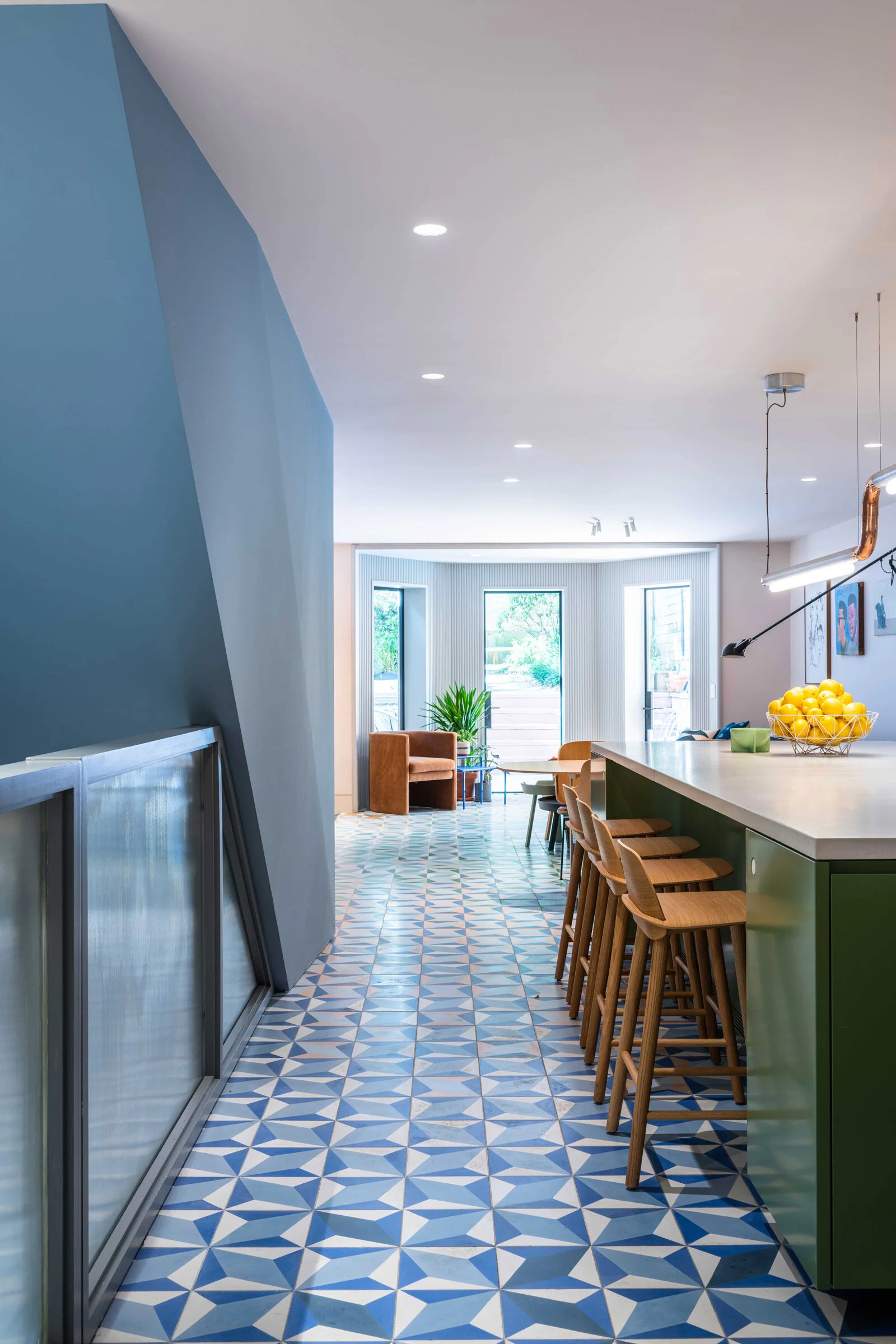
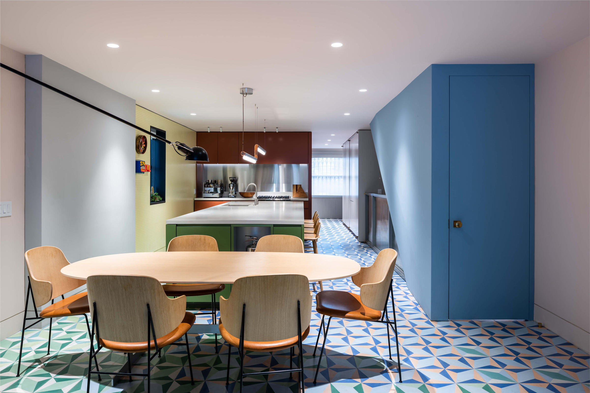
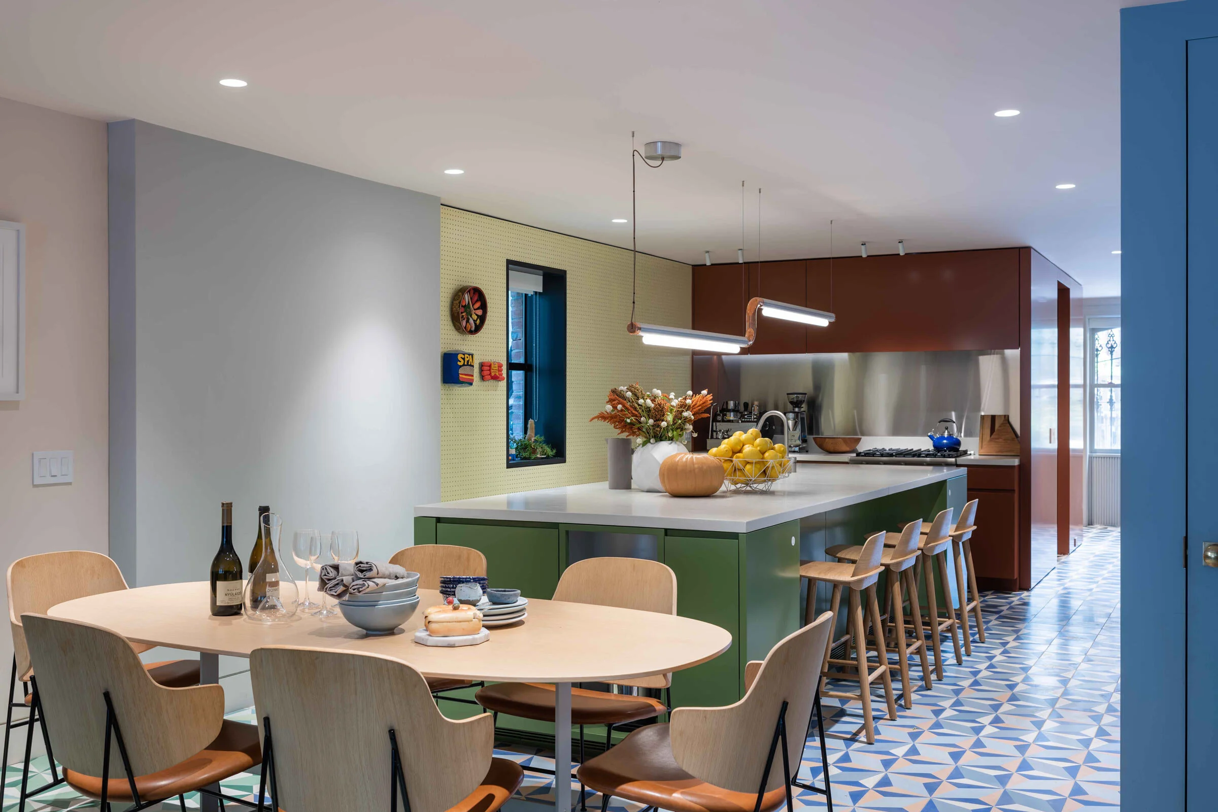
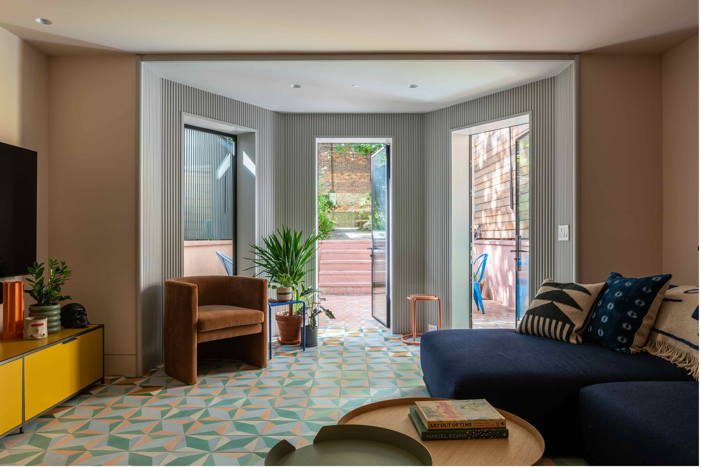
On the ground floor, where the kitchen, dining space and lounge are, we took that concept of the fluctuation or gradient and applied it to the floor, which is made up of 2,600 custom cement tiles that gradually shift in colour from black and white at the front of the building, to blues, greens, pinks and terra cotta in the kitchen and lounge, and eventually spills out into a sunken terrace at the rear. It’s almost like a weather map, tracing the functions of the different spaces and tracking how they mix and flow into each other.
Please tell us a little about the material choices for the space.
In addition to colour, we tend to prioritise texture — so you’ll see an immersive approach to paint and material, colour blocking, and the use of ribbed wood surfaces that are tactile and also promote the play of light and shadow.
Do you have a favourite element or design detail in the architecture or interiors?
I particularly like the steel railing at the transition between the historic and modern parts of the house. The railing nestles along the underside of the restored stair, and then right at the corner, the steel swerves at a moment that we called an ‘anti-newel’, a void where one expects a post to be. It’s a playful detail with a lot of personality, and it’s also superbly crafted. In many ways it sums up the approach to the project as a whole.
As told to / Suzy Annetta
Images / Alan Tansey

