Koffee Mameya and Omotesando Koffee Share a New Space
Located in K11 MUSEA, Omotesando Koffee’s third branch in Hong Kong also incorporates the first overseas store for its sister brand, Tokyo roasting institution Koffee Mameya. We speak with designers Yosuke Hayashi of 14sd and Alessandro Perinelli of Perinelli Design to find out about their approach to creating a single representative space for both brands
Design Anthology: How did you first meet the client?
Yosuke Hayashi (YH): I designed the first Omotesando Koffee in Tokyo, which opened in 2011. I was introduced to founder Eiichi Kunitomo the year before. Eiichi then introduced me to Russell Stradmoor, who partnered with Eiichi to take Omotesando Koffee overseas, when they started working on this Hong Kong branch.
Alessandro Perinelli (AP): I met Eiichi Kunitomo and Russell Stradmoor in 2016, and I designed the Singapore and London locations of Omotesando Koffee locations.
What was their brief to you for this location?
YH: The brief was to create Omotesando Koffee’s third store in Hong Kong and incorporate the roastery Koffee Mameya. We had to understand the individual character, purpose and business of the two stores, and make them coexist in the adjacent space.
AP: As Perinelli Design, our main task was to blend the two brands into a flagship concept store that fits within the K11 MUSEA setting. After Yosuke developed the first concept, we were asked to develop the design and details and to coordinate the construction.
What is the overall size of the store?
Together the two stores and office space span about 135 square metres, with Omotesando Koffee taking up just over 70 square metres, and Koffee Mameya occupying 45 square metres.
How did you approach the project — what design references or narrative did you try to incorporate into the space?
YH: We tried to understand the conditions and characteristics of the mall environment and to find a way to clearly realise the brands’ concepts and stories that we had created so far. The Koffee Mameya bean shop experience is more specialised, so dialogue with customers is important and a more closed environment is preferable. With this in mind, we zoned the space in the back for Koffee Mameya and used the open space with the atrium in the front for Omotesando Koffee, the first point of contact for customers.
AP: A visual connection is created between the Omotesando counter and the Mameya counter through a set of walls that emphasise the perspective and thus the connection between the spaces. We placed an oak trellis above the walls of the atrium area to close off the volume and give the area a feeling of permanence. Simple geometries surround the Omotesando seating area to create a minimalist, calm space that is in contrast with the surrounding shopping mall.
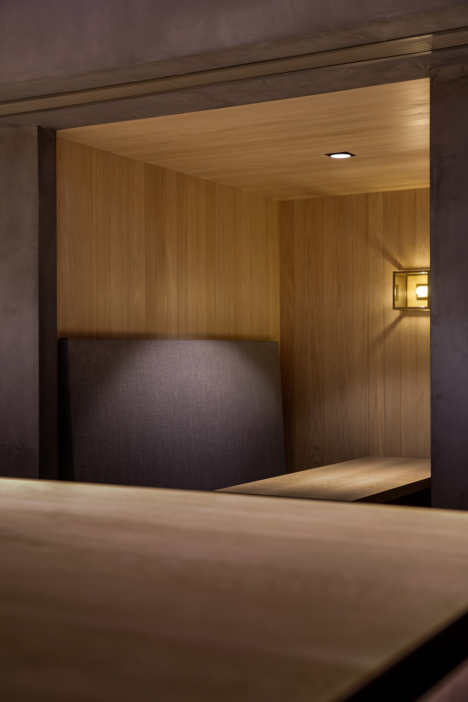
The Mameya portion of the cafe needs to be discovered. The path takes you around the Omotesando space into a side opening that leads to two counters: the classic Mameya counter, a replica of the original in Omotesando Tokyo, and a second coffee bar counter with stools and banquette seating nooks, a ‘coffee speakeasy’ of sorts.
Please tell us a little about the material choices for the space
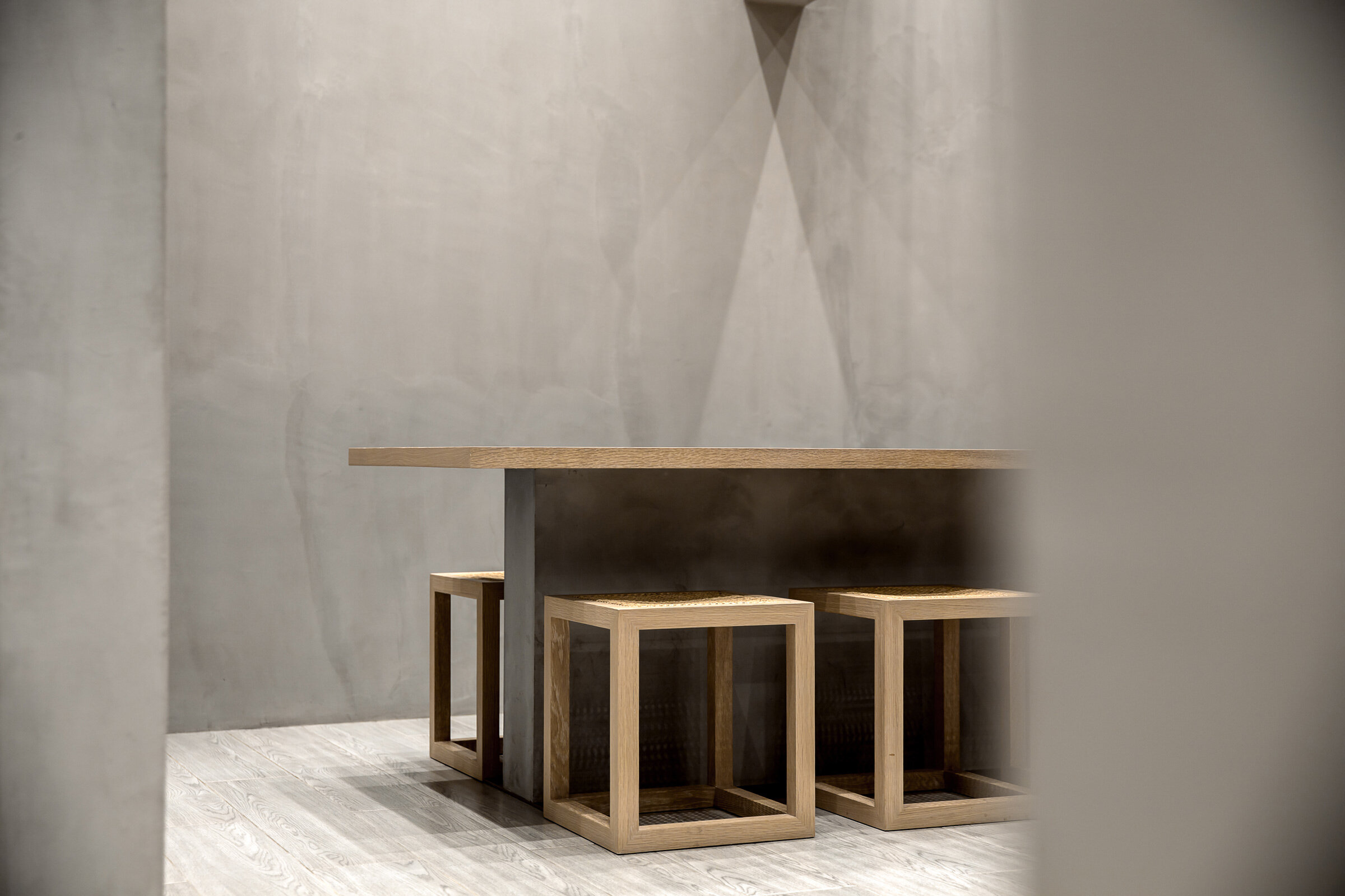
YH: The materials are based on what I have used in previous Omotesando stores, so concrete and mortar, wood, brass and so on. I also introduced new materials such as high-quality fabrics and rattan for the furniture elements.
AP: With its brass exterior frame and black internal surfaces, the Omotesando Kofee ‘cube’ becomes the centrepiece in an otherwise muted setting. Softer, warmer tones and muted lighting make Mameya an intimate space where we hope people will want to linger. The dark grey concrete floors and walls are set against a solid white oak counter and seating nooks, complimented by upholstery in grey Kvadrat linen.
Please tell us about some of the custom pieces for the space
YH: Most of the elements are custom-made. The stools and highchairs are custom designed, as are the shelves behind the Mameya counter, which we designed based on the size of the bags of beans. The coffee beans are packaged in a cloth bag, and the colour of the bag is different depending on the degree of roasting. If you look at the shelf from a distance, you can see the gradation that visualises the levels of roasting.
AP: The Omotesando counter with its centre island is a first of its kind. Anticipating a high volume of customers, there’s space for a cashier and two independent barista stations. The barista station has been completely customised to pack all the required equipment in a minimal footprint while maintaining the best ergonomics for the barista.
Do you have a favourite element or design detail in the space?
YH: I’m interested in the individual details, but I’m also interested in how a concept of an architecture or a shop is integrated and harmonised by various elements, materials and details.
AP: The seating area in the Omotesando Koffee section is a favourite element. The spotlights between the trellis create shadows on the plaster concrete walls that enrich the space and emphasise the geometry and symmetry of the volumes.
Images / Harold de Puymorin, HDP Photography


