Designed for Family Life
Realised by Porebski Architects, this family home near Sydney’s Queens Park is defined by modern, open-plan and light-filled living spaces connected to lush outdoor areas. Here studio director Alex Porebski shares more about the project
Design Anthology: How did you first meet the clients?
Alex Porebski: I’ve been good friends with one of the clients since we studied and practiced architecture together. He has since moved into a construction role but still pursues his passion for architecture and design.
Can you tell us about them and their lifestyle?
The clients are a couple with two young children. Both clients have a passion for architecture and design. They selected furniture pieces for their new home from their own collection and coordinated the joinery and interiors finishes themselves. They enjoy entertaining friends in a relaxed environment.
What was their brief to you for the project?
The brief was to design a new family home that would be theirs for the next few decades. They wanted an open-plan entertaining house with a connection to the outdoor areas, with the open kitchen, living and dining areas flowing out to the rear garden. They also wanted three bedrooms, a study, a media room and a double garage — and a swimming pool!
What’s unique about the building and the location?
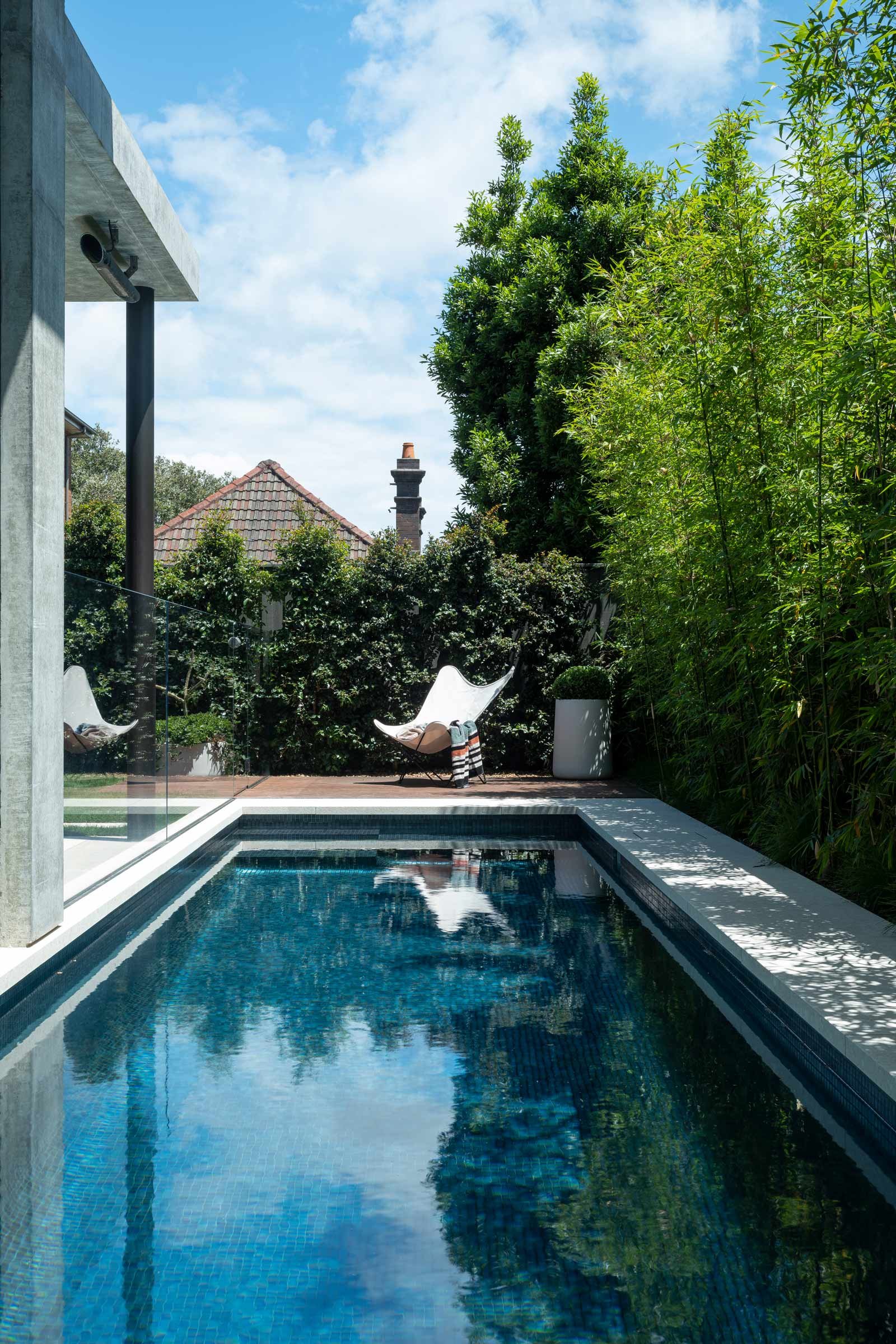
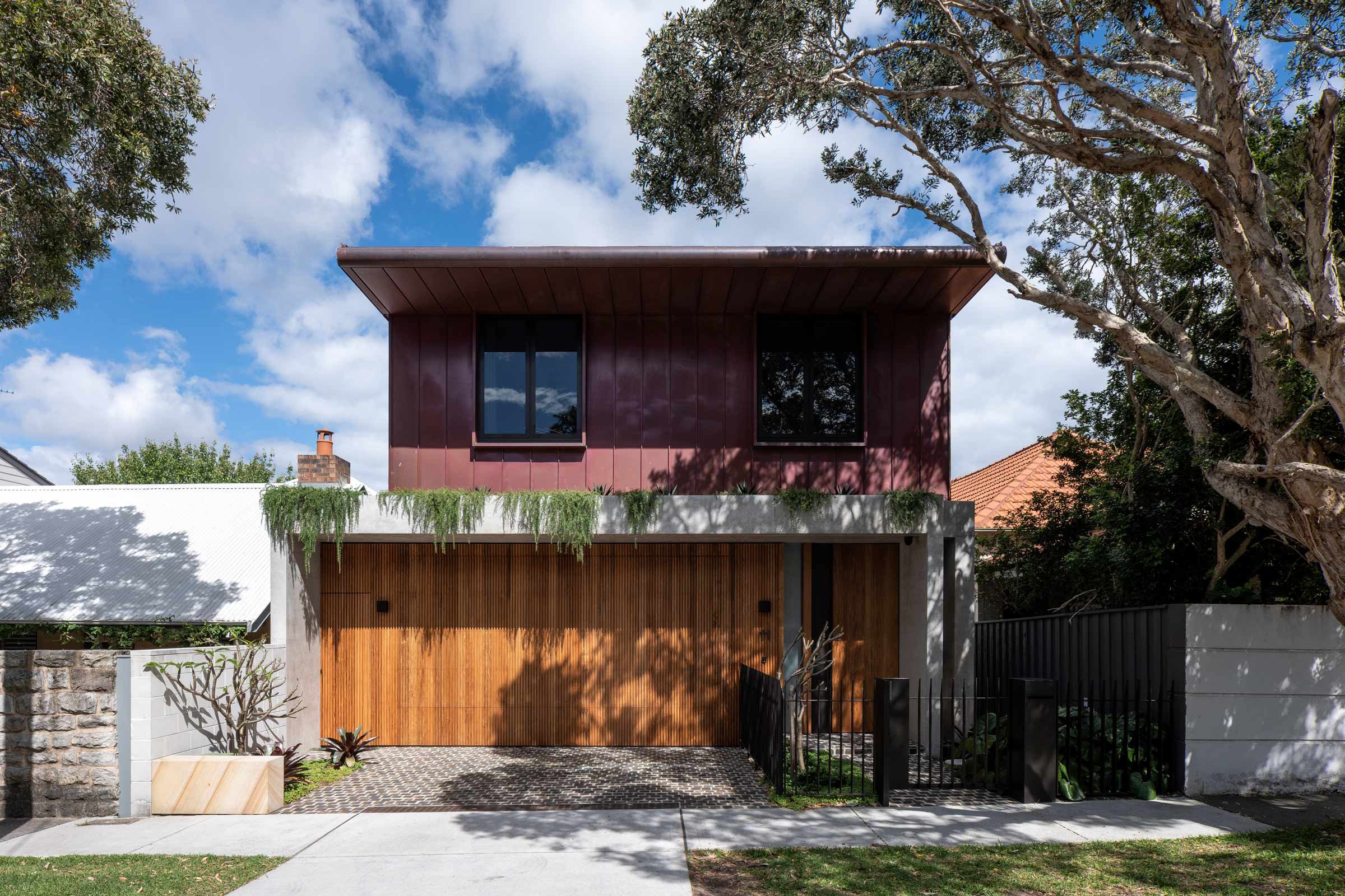
The 255-square-metre house sits on the hill in Queens Park. A unique aspect of the project is the swimming pool, which is positioned along the site’s northern boundary as a continuation of the entry hall, creating a key focal point. The other unique feature that distinguishes the house from its neighbours are the finishes, predominantly off-form concrete, copper and timber panelling.
How did you approach the project — what design references did you try to incorporate into the space?
We aimed to draw as much northern light into the house as possible. As the site has east-west access, opening the northern side was critical. We incorporated the swimming pool along the northern boundary, which creates a large setback that forms an open-plan, L-shaped living area. This opening and the skylights allow for light to flood the living spaces.
Please tell us a little about the material choices for the space.
The interior palette is characterised by warm and natural materials with sophisticated, minimalist detailing. The light pink terrazzo floor and stained American oak timber and brass detailing on the walls are complemented by off-form concrete, limewash timber-panelled ceilings and large areas of frameless glazing.
Which are the features are custom designed?
We custom designed the cantilevered American oak floating staircase, the off-form concrete skylights, the terrazzo flooring, the stucco walls, the external copper wall and the roof panelling, and the American oak timber and brass joinery.
Do you have a favourite element or design detail in the architecture or interiors?
I like the way the volumes increase as you enter the house, and then lower again and then open up to the double-height circulation area with the cantilevered staircase, concrete skylights and double-height window. You then move through the living room with high ceilings, which flows out to the covered terrace and garden.
The house also has numerous environmental measures that are seamlessly integrated within its structure. For example, off-form concrete awnings provide sun protection, a rainwater tank is stored under the covered terrace, windows feature low-emissivity glazing and there are photovoltaic panels installed on the roof and in the landscaping around the house.
Images / Tom Ferguson


