Arches Define This Family Apartment
In this Mumbai home, realised by local firm ns*a Architecture and Interiors, arches define a series of elegant spaces designed to reflect the family’s lifestyle and interests. Here studio founders Neesha Alwani and Shruti Jalan share more about the project
Design Anthology: How did you first meet the client?
Neesha Alwani (NA): The clients are actually friends of ours. They have always appreciated our design sensibility and were keen to work with us on their new apartment.
Can you tell us about them and their lifestyle?
Shruti Jalan (SJ): They’re a family of four; the husband and wife are professionals in their mid-40s, and they have a daughter and a son. The family is well travelled and has a great collection of art, artefacts, family memorabilia, antiquities and other bits collected over the years of travelling.
The couple likes to entertain, which is one of the reasons we replanned the original four-bedroom apartment to become a three-bedroom home, with an expanded living and dining space to accommodate a larger seating area and dedicated dining space.
What was the brief to you for the project?
SJ: The clients wanted a space that exudes warmth, a space where they can find a sense of calm and retreat from city life. It was also crucial that the home has a generous living and dining area for entertaining.
How big is the apartment and what are some of the standout features?
NA: The overall size of the apartment is just over 150 square metres. It’s located in central Mumbai, and the building boasts beautiful views of the racecourse and the Arabian Sea. The apartment has lofty ceilings and wall-to-wall windows that allow the spaces to be flooded with natural light.
How did you approach the project — what design references did you try to incorporate into the space?
NA: The high ceilings inspired us to create a series of arches to define the openings, and the form is carried throughout the interiors.
Our design philosophy is to create a well-balanced and harmonious space, and our designs reflect the clients’ personalities, so each is unique. We prefer to design spaces that are customised for an individual client and their requirements. These clients were clear about the kind of space they wanted, which gave us direction for the concept.
SJ: Shades of ivory, grey, walnut and burnished copper dominate the colour palette and contribute to the sense of cosy sophistication. The architectural details, textures and organic elements stand out against the neutral canvas. By keeping the art and accessories in a single hue, we’ve made the space feel more modern.
The main door at the entrances is designed to resonate with the arched openings, with a series of ribbed arched profiles painted in shades of grey. The arches define the openings and form a trio of arches at the end of the corridor. Two of the arched openings house the console and bench, while the third is the entrance to the living room. Grey tiles with inlaid strips of Carrara marble form a pattern of grey and white flooring. Chenille and linen in grey, white and off-white work with white linen sheers to keep the living room neutral and calming.
The grey-and-white striped floor continues into the kitchen. The worktop is made of white quartz while the cabinetry comprises wooden laminated under-counter shutters and matt brass laminated overhead shutters.
A wooden console with contoured shutters divides the dining room from the living room. The long wall next to the dining area is made up of panels that conceal storage units, made from a combination of a ribbed wooden surface and smooth off-white matt PU on top.
In the master suite, full-length windows offer infinite views of the bay, and a palette of wood, grey and marble predominates.
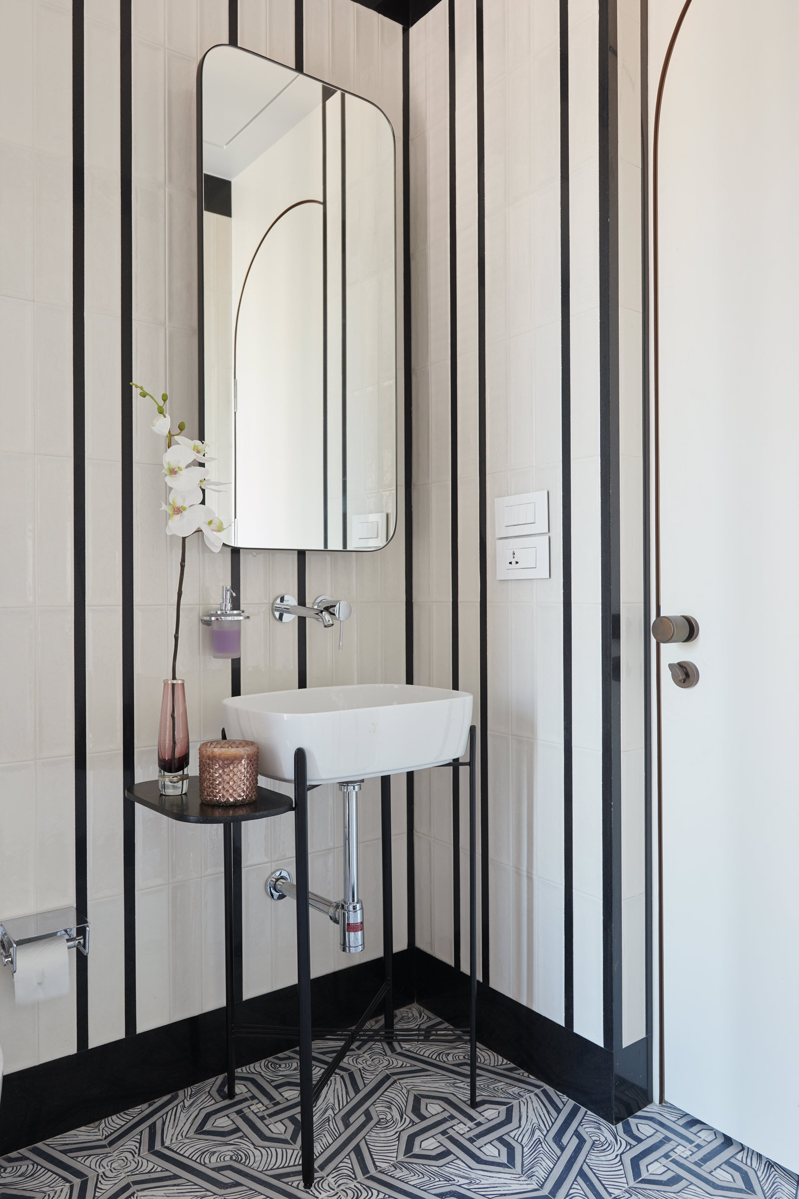
A series of arched doorways lead to the children’s bedrooms, which were designed to reflect their individual personalities. The daughter, who’s quite creative and musical, wanted soft materials and colours, so we went with mint green and coral for both her bedroom and bathroom, while the son’s room has a bold black and white stripe.
Images / Suleiman Merchant


