A Local Touch at Locaāhands
Designed by Isso Architects, Locaāhands Dining Club is defined by local materials, an understated aesthetic and a sense of harmony between indoors and out. Here studio principals Wibisono Soegih and Stephanie Tatimu tell us more about the project
Design Anthology: How did you first meet the client?
Wibisono Soegih (WS): The client is a family friend. We’ve known him since we started Isso Architects.
What was his brief to you for the project?
Stephanie Tatimu (ST): He wanted a space that feels timeless, a blank canvas to support the restaurant’s seasonal woodfire-based menu.
Where is the restaurant located and what makes the location unique?
WS: Locaāhands is in Surabaya, Indonesia’s second largest city, in a residential area close to the main road, which allowed us to use the front terrace for outdoor seating.
How did you approach the project — what design references or narrative did you try to incorporate into the space?
ST: True to our dedication to sustainable construction, the design really revolved around retaining as much of the original building’s foundation as possible.
Please tell us a little about the material choices for the space.
WS: The meaning of the name Locaāhands as intended by its owner is ‘local hands’. To honour the restaurant’s name, we focused on using locally sourced materials. For example, we covered the backyard flooring with sand-coloured bricks that we sourced from local villages.
Please tell us about some of the custom pieces for the space.
ST: Almost all of the interior furniture is custom made. Our favourite piece is the wooden wall cabinet in front of the kitchen, which is used to store plates and cutlery. The rigid and conventional rectangular shapes combined with the ribbed glass sliding doors give a timeless feel to the dining space.
Do you have a favourite element or design detail in the interiors?
WS: We like the mezzanine, which we created to add spatial layers to the space and maximise the seating capacity. We also designed the dining area with an open concept and a direct view of the open kitchen to enrich the guest experience.
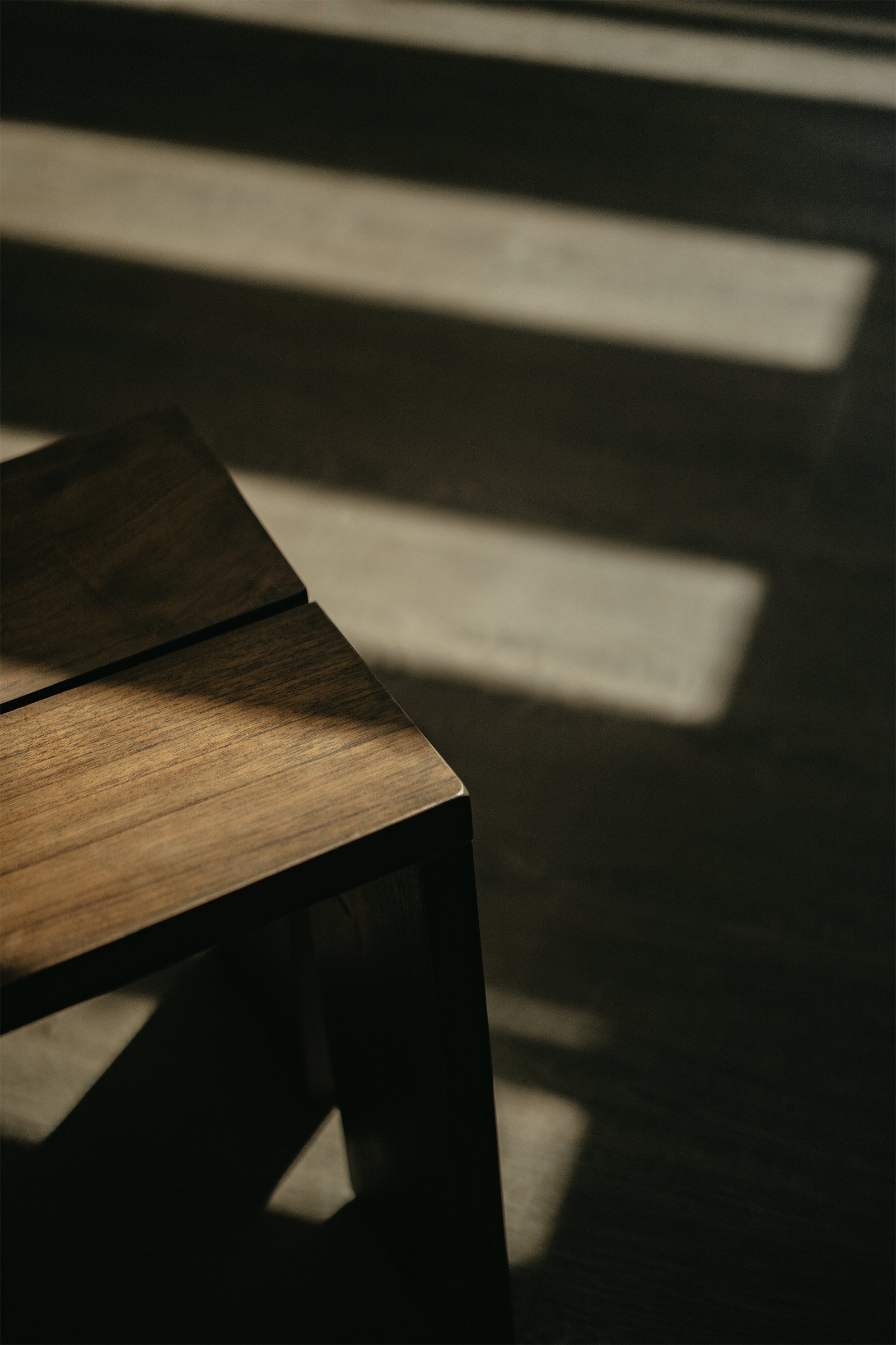
Ambience and atmosphere were another key focus of our design. We incorporated a glass ceiling above the mezzanine area to take advantage of the sunlight; as the day goes by, the space is filled with changing light and shadows, making it feel alive.
What other features are you most excited about?
ST: Our intent was always to create balance across the different spaces and keep a sense of harmony between the indoor and outdoor areas. In this day and age, where everything is fast-paced and everyone is seeking instant gratification, we wanted to achieve a modern and functional space with a timeless aesthetic.
Images / Krishna Pradana, _Room for One


