A Modern Family Home that Pays Homage to Indian Tradition
In Hyderabad’s Jubilee Hills, local multidisciplinary practice NaaV studio realised a striking family home that blends traditional Indian design elements with a contemporary aesthetic. Studio founders Niharika Veerabommala Didige and Varsha Reddy share more about the project
Design Anthology: How did you first meet the client?
Niharika Veerabommala Didige: The client saw our work showcased at one of his friends’ homes and developed a deep appreciation for the project’s meticulous details. After an initial meeting, he entrusted us with the design of his home.
Can you tell us about them and their lifestyle?
Varsha Reddy: Hailing from Hyderabad, the clients are a family of four that belong to a prominent business family. They live a simple life and share a passion for travel. They own an impressive collection of antiques, in particular brass artefacts.
What’s unique about the building and the location ?
Niharika Veerabommala Didige: The 943-square-metre house boasts a stunning park view from atop a rocky terrain in Jubilee Hills, providing a picturesque escape from the bustling city. Surrounded by a verdant landscape and positioned at the end of a cul-de-sac, it enjoys a serene ambience.
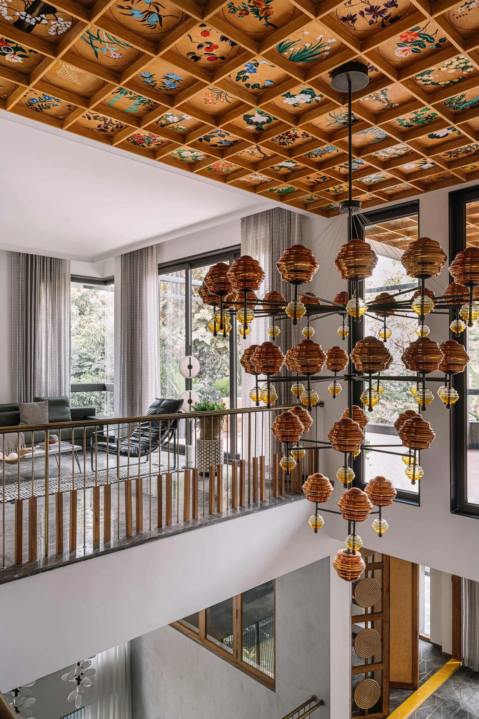
In terms of architecture, the house blends traditional Indian design elements with a contemporary aesthetic. The use of contrasting bursts of colour against a neutral backdrop creates a dynamic interplay of shapes, textures and materials. One of the unique characteristics of the house is that it was extended with two additional floors utilising the structure’s existing columns.
How did you approach the project? What design references did you try to incorporate?
Varsha Reddy: The house was undergoing renovation when we were tasked with the design, which presented some limitations and constraints. Our design approach was to pay tribute to Indian cultural elements while still maintaining a modern feel. We accomplished this by integrating traditional Indian design techniques, patterns and materials such as natural stones and fabrics with contemporary design elements such as sleek lines, simple shapes and modern furniture.
Tell us a little about the material choices.
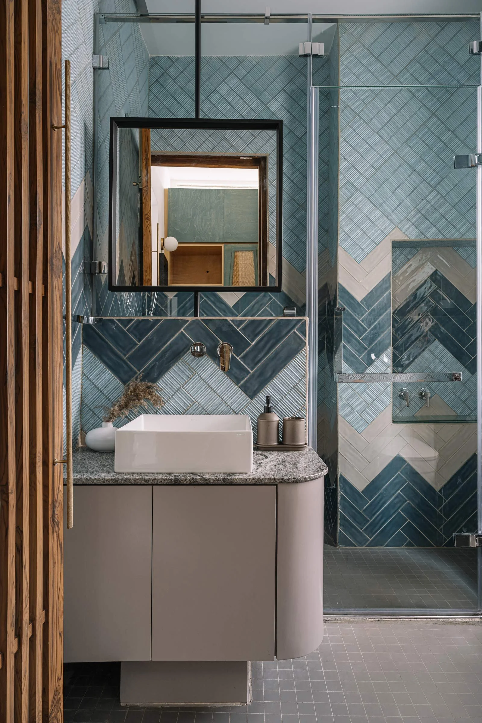
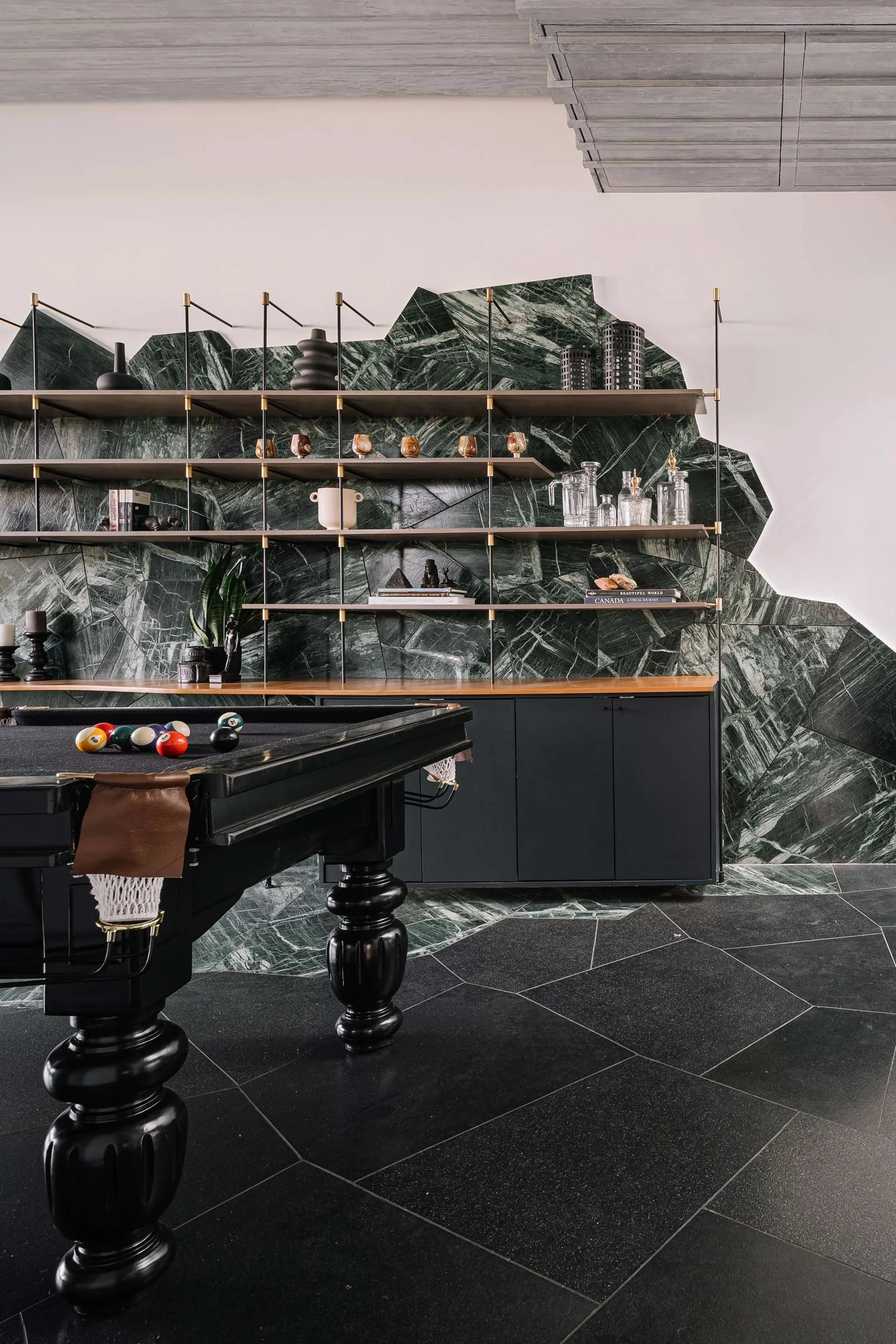
Niharika Veerabommala Didige: We selected a wide variety of materials, including various woods, metals and stones to act as the focal point of the spaces and showcase their unique characteristics. The flooring is made of Italian marble, which provides a luxurious and timeless look. We used a monolithic stone and intricate brass plates as wall art installations to add depth and texture to the space, and incorporated brass pipes for the railings. In specific areas, we used brass plates for column claddings, further enhancing the grandeur of the space.
We also incorporated wicker in different patterns to create unique shutters for the consoles, partitions and other elements. This provides a distinctive texture and warmth to the space, while also complementing the other materials used in the design.
Tell us about some of the custom pieces.
Varsha Reddy: The brass wall installation is a tribute to the ikat pattern. Taking inspiration from this pattern, we created a unique interpretation on brass sheets by manually drilling thousands of holes. The design for the home theatre door was inspired by the traditional Indian wicker weaving pattern commonly used in antique furniture.
One of the stand-out customisations is the statement wooden ceiling, which draws inspiration from the botanical world. Adding a pop of vibrant colour to an otherwise neutral space, the hand-painted ceiling art by Ram Kishan features close to 100 different flower compositions and took three months for the artist to complete.
Do you have a favourite element or design detail in the architecture or interiors?
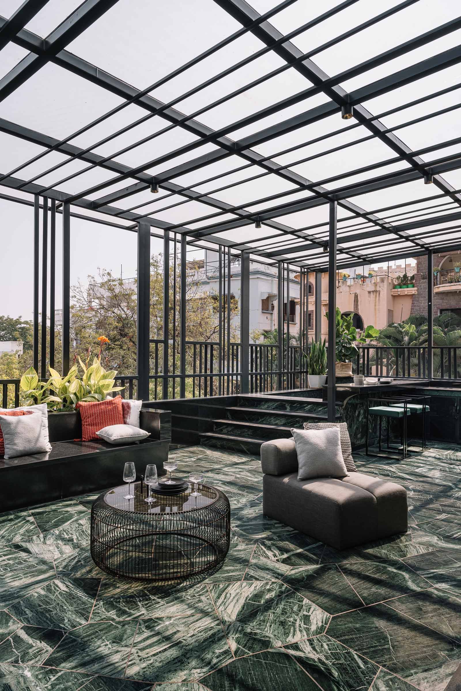
Varsha Reddy: The third and top level holds a special place in my heart. I’m particularly fond of the granite used for the flooring and its continuation onto the adjacent wall and bar unit, which seamlessly blends with the overall design. What makes it truly stand out is the granite’s unconventional laying pattern, which lends a whimsical charm to the space.
Niharika Veerabommala Didige:From an architectural standpoint, I love the double-height spaces, which give a sense of volume and grandeur to the house. The open-plan design and the rectangular openings allow light to filter through, creating a seamless connection between spaces.
Interior photography by Ishi Sitwala
Architecture photography by Sankeerth Jonnada


