Irreverent Cocktail Bar Nemesis Opens on Duxton Hill
Tucked away in a conservation shop house on Duxton Hill, cocktail bar Nemesis gives new meaning to the phrase ‘a cheeky drink’. Here, Leong Hon Kit of Wynk Collaborative tells us more about the project
Design Anthology: How did you first meet the client?
Leong Hon Kit: We’re big fans and friends of the clients, who are the same team behind Junior the Pocket Bar.
What was their brief to you for the project?
Their brief for the project was to create a modern and casual bar with an irreverent, punk spirit. As the budget was tight, we were asked to retain most of the existing infrastructure and finishes where possible.
Where is the bar located and what’s great about the neighbourhood?
It’s in Singapore’s Duxton Hill, taking over 90 square metres on the ground floor of a traditional shophouse. Lined with conserved shophouses that have become offices, bars and restaurants, the pedestrian street is quiet during the day and becomes more lively at night.
How did you approach the project — what design references did you incorporate into the space?
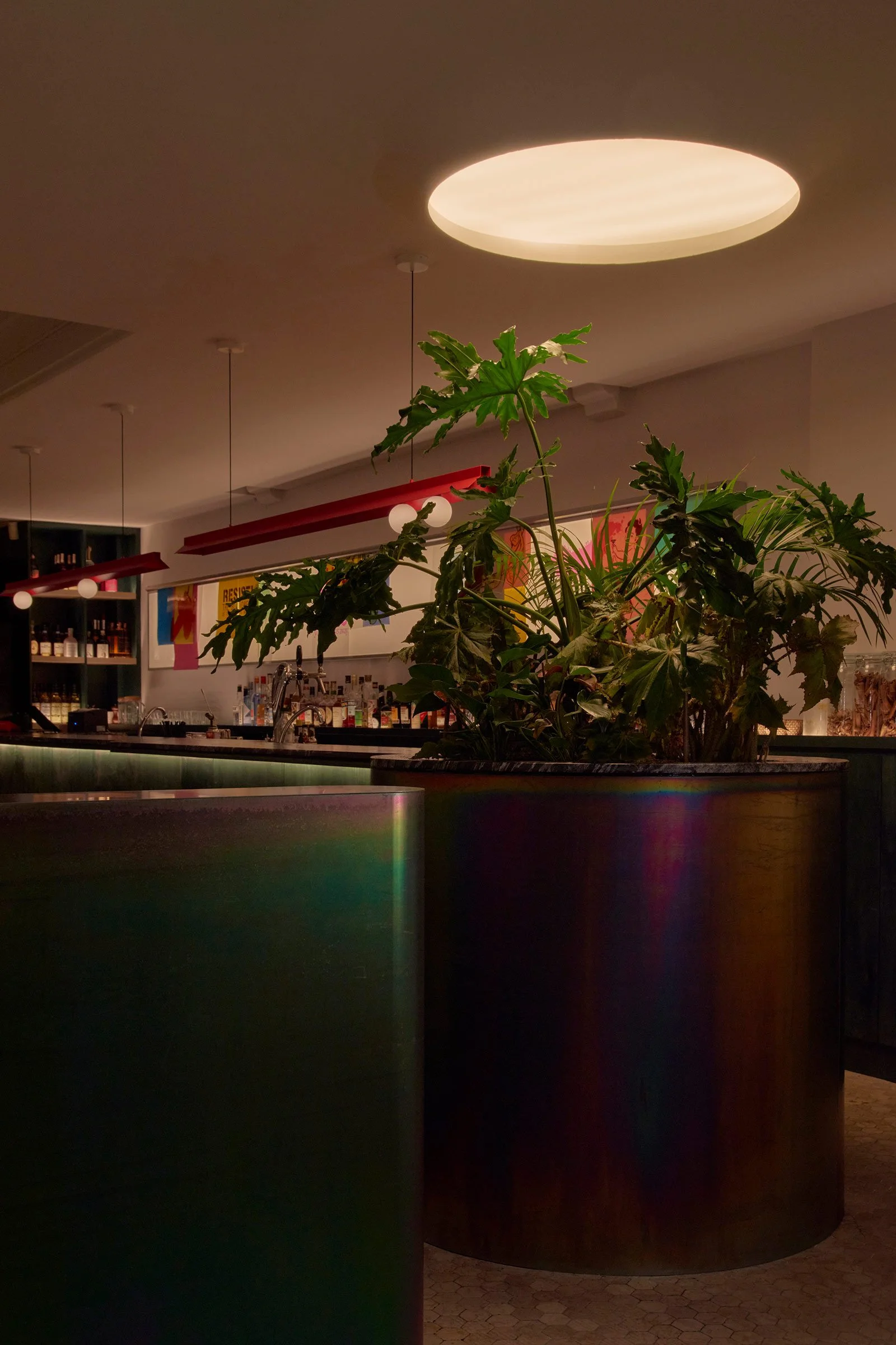
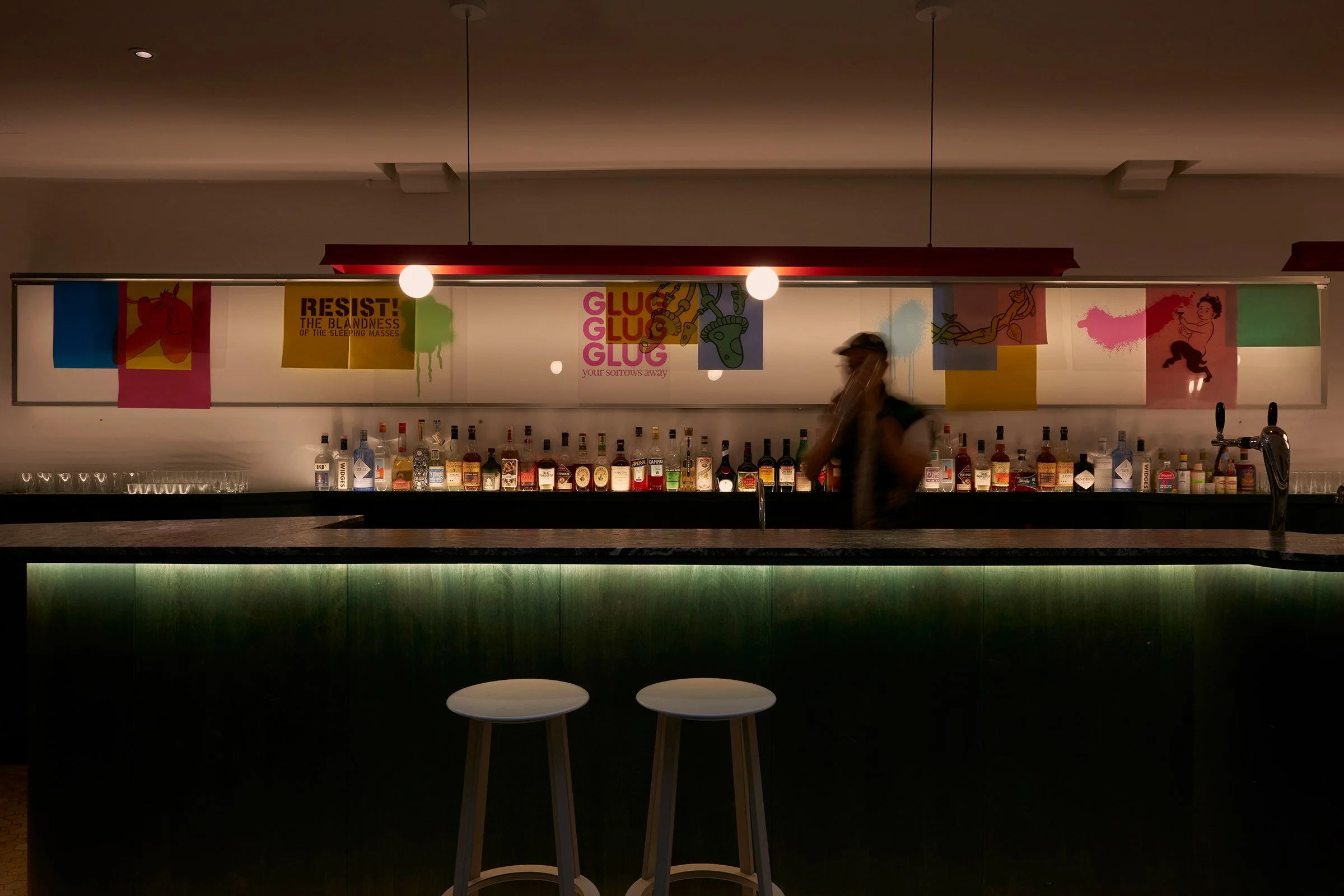
The design combines simple elements and clean lines with the bold use of colours and materials. We intentionally left the raw underlying layers of the wall exposed to add contrast and subtly reveal the history of the building. Anchoring the bar counter, a lush arrangement of plants in a cylindrical planter brings some freshness — we think it also evokes a kind of lab experiment or a scene from a villain’s lair. The series of ‘vandalised’ classical paintings that hang on the wall add to the attitude of irreverence and humour that characterise the bar. These, and all the other branding and graphic elements, were created in collaboration with Feral.
Please tell us a little about the material choices for the space.
The main materials used in space are wood, steel and granite, which all feature in somewhat unusual forms: the wooden bar counter was finished with a dark green stain; the various steel elements were treated with yellow chromate to give them an iridescent shine; and the granite bar countertop was textured with furrowed lines. We wanted the materials to be visually strong and have a tactile feel when encountered up close.
Please tell us about some of the custom pieces for the space.
We designed the two pendants that hang above the bar counter, which are inspired by the fluorescent light fixtures commonly found in factories and warehouses. We customised them with spherical bulbs positioned asymmetrically and gave them a hot-pink finish to add a pop of colour to the space.
On the wall behind the bar, we incorporated a custom-made lightbox with a built-in ticket holder. Evoking an X-ray lightbox, it’s a blank slate where prints can be hung to switch up the decor as desired.
What are your favourite design details in the interiors?
My favourite elements are the iridescent passivated steel cladding, the planter with its wild arrangement of live plants, and the swirls on the granite countertop.
What other features are you most excited about?
I love the custom art pieces that Feral created. The classical paintings were ‘vandalised’ with illustrations of botanicals, creatures and other comical elements that really add to the irreverent spirit of the bar.
Images / Jovian Lim


