A Home for Family Life
In designing this terrace house, Singaporean firm TE-EL reconfigured the spatial layout to emphasise and encourage connection between family members. We spoke with studio principal Ethan Lin to find out more about the project
Design Anthology: How did you first meet the client?
Ethan Lin: The couple was referred to us by a previous client, who is a friend of theirs. They liked what we did for their friend and engaged us to work on their new home.
Can you tell us about them and their lifestyle?
They’re a multigenerational household: a couple with three young children and one of the clients’ elderly mother. The husband works as a pilot and the wife is a scientist. Before the pandemic, the husband travelled most of the time, so he really treasures his time at home. Both of them are very family oriented and enjoy hosting their friends and family. They wanted a space that reflects this aspect and allows them to host large gatherings.
What was the brief to you for the project?
Besides the functional requirements, there wasn’t a strict brief per se. The conversation began by talking about the kind of lifestyle they want, the things they like and the reason that they bought the home — they were drawn to the internal void that visually connects the spaces and allows all family members to see each other from various areas.
What’s unique about the building and the location?
The 230-square-metre house is located in the north-east region of Singapore. Filled with cafes and low-rise condominiums and houses, this quaint residential neighbourhood is known for offering a slightly slower pace of life.
The terrace is one in a row that was built in the 1990s, and it has a large void that connects the internal spaces of the house. This is a unique quality, since a terrace house of this size would usually maximise the usable floor area.
How did you approach the project — what design references did you try to incorporate into the space?
When we first visited the house, it was dimly lit and had poor natural cross-ventilation. The small windows on the front facade couldn’t bring sufficient daylight and natural ventilation into the internal spaces, so it became our primary concern to improve the spatial comfort of the house.
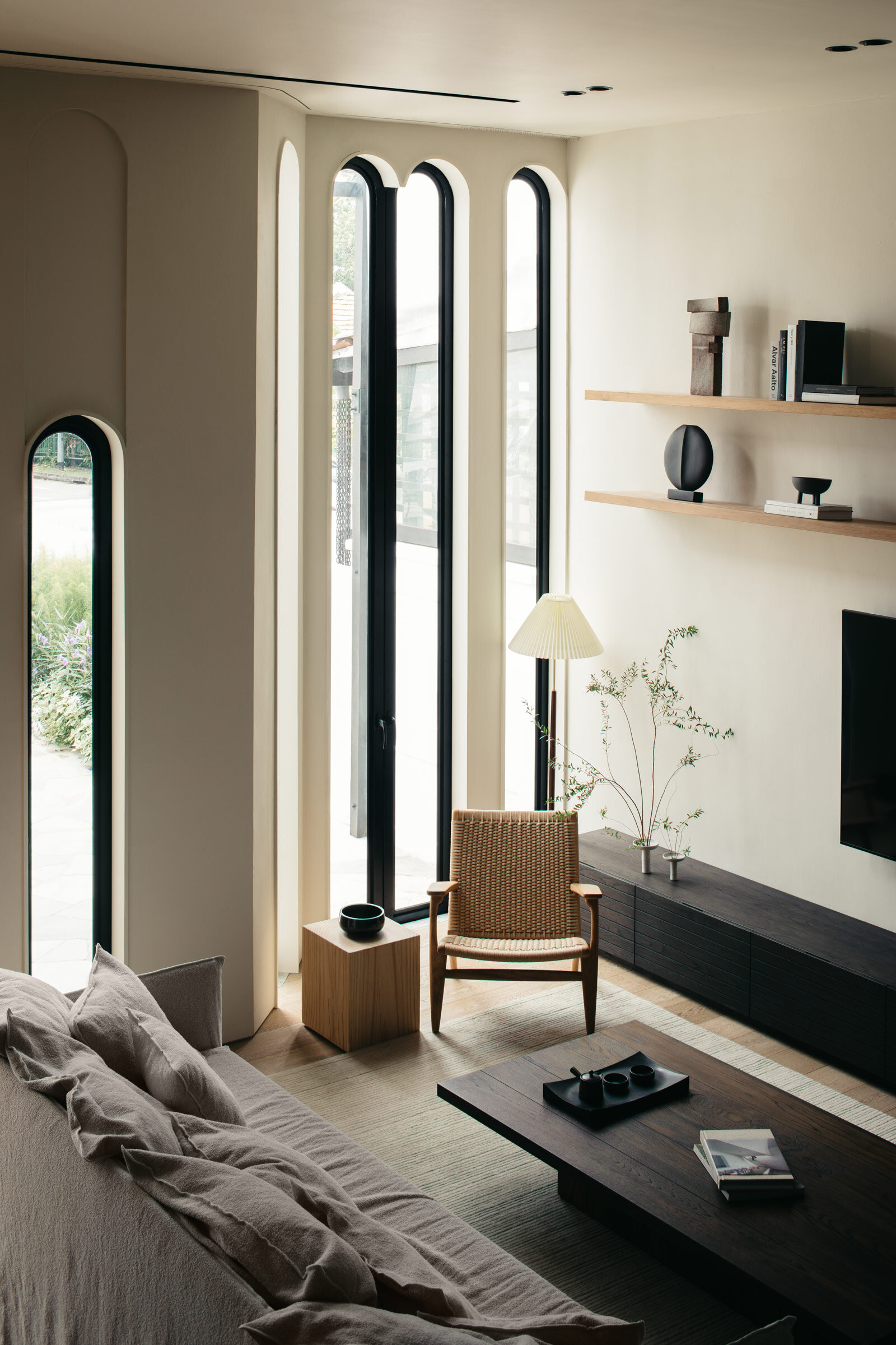
To address this, we opened up the first floor and introduced a series of tall arch windows to the facade, inspired by the existing architectural fenestration. These gestures allowed us to tap into both the front and the rear ends of the deep and narrow house for natural light and achieve cross-ventilation.
The new spatial arrangement also knits together various communal spaces, including the living and dining areas, kitchen and the herb garden. The family members are able to be aware of each other’s presence while going about their daily activities from their own spaces, which fosters a sense of connection.
Please tell us about the material choices for the space.
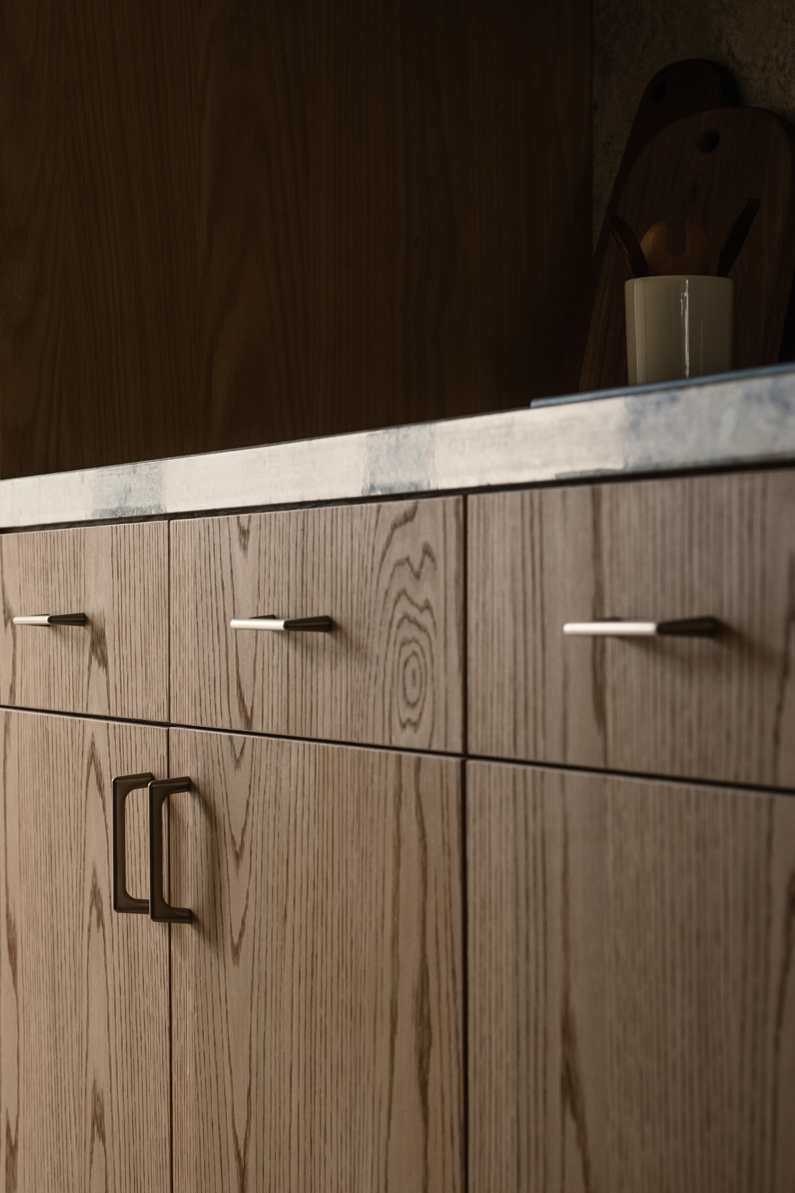
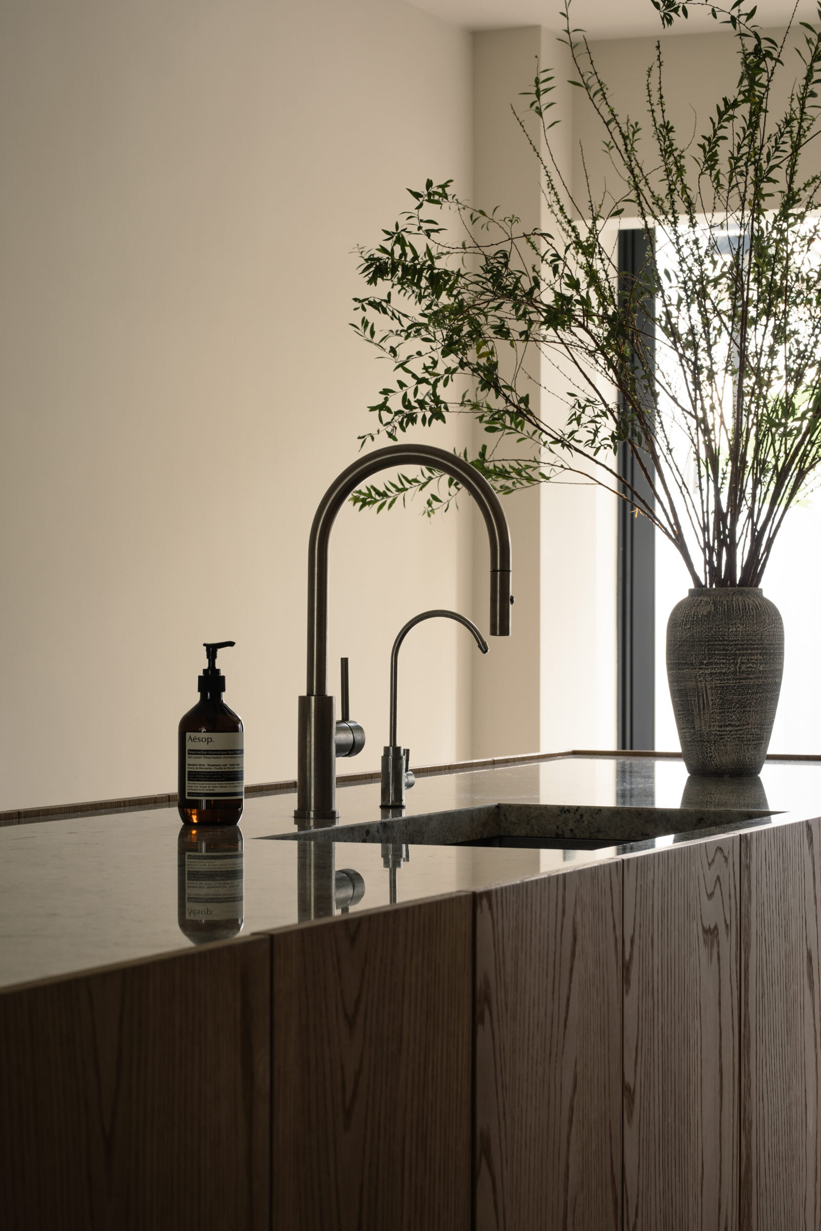
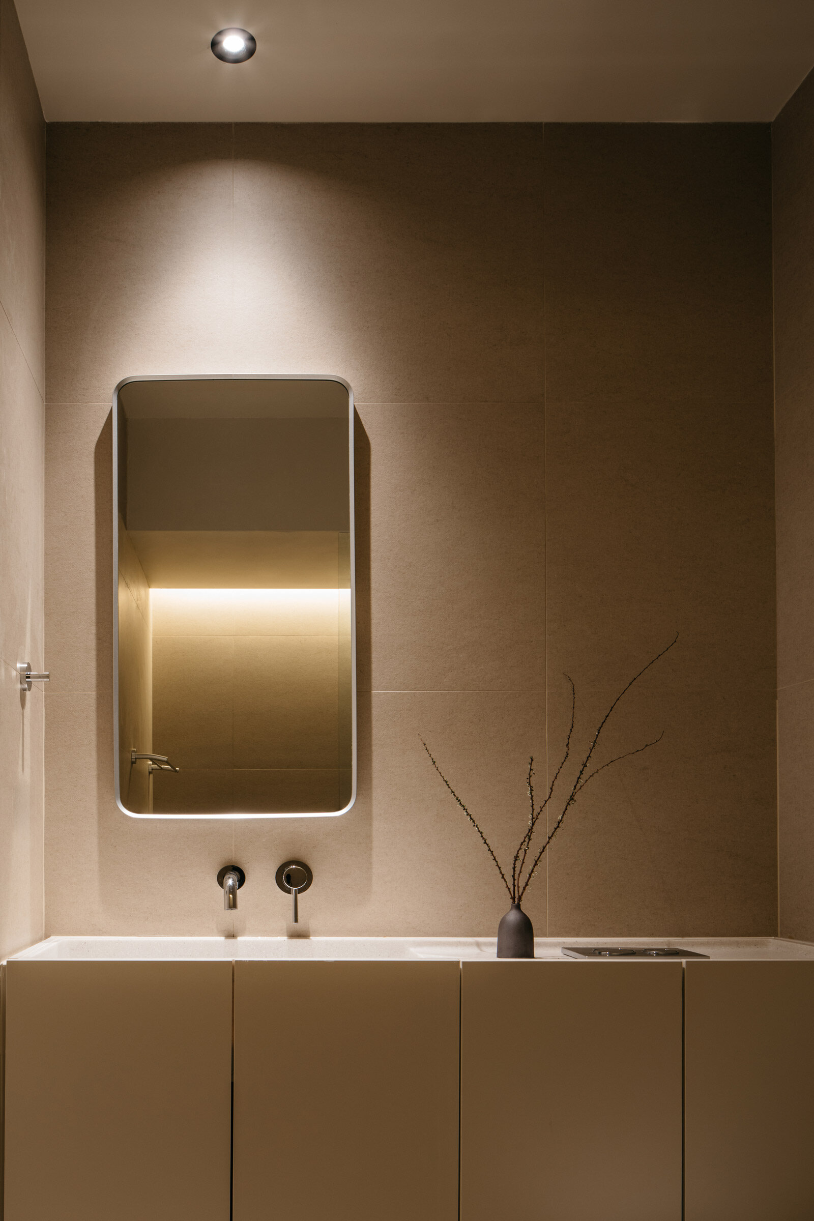
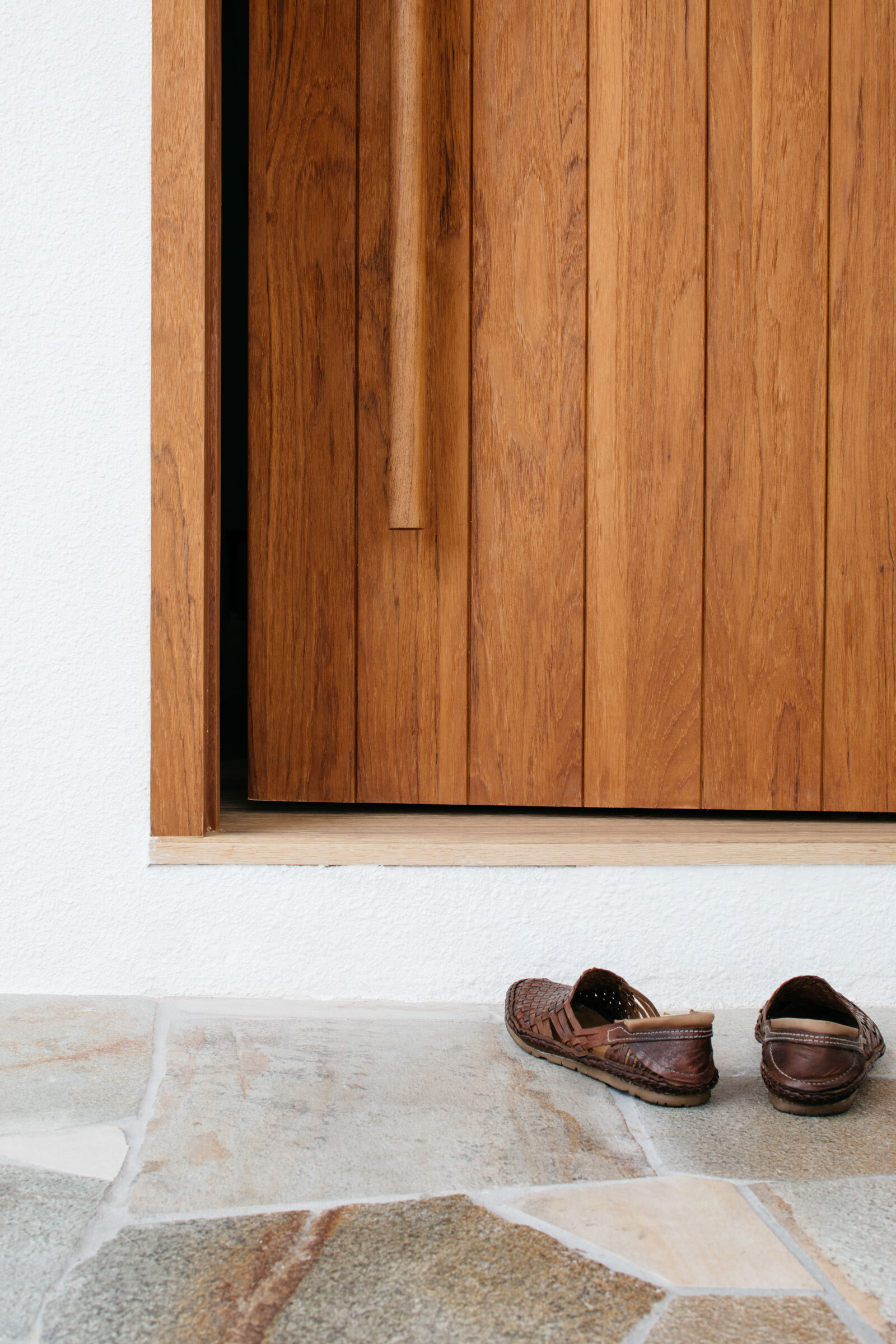
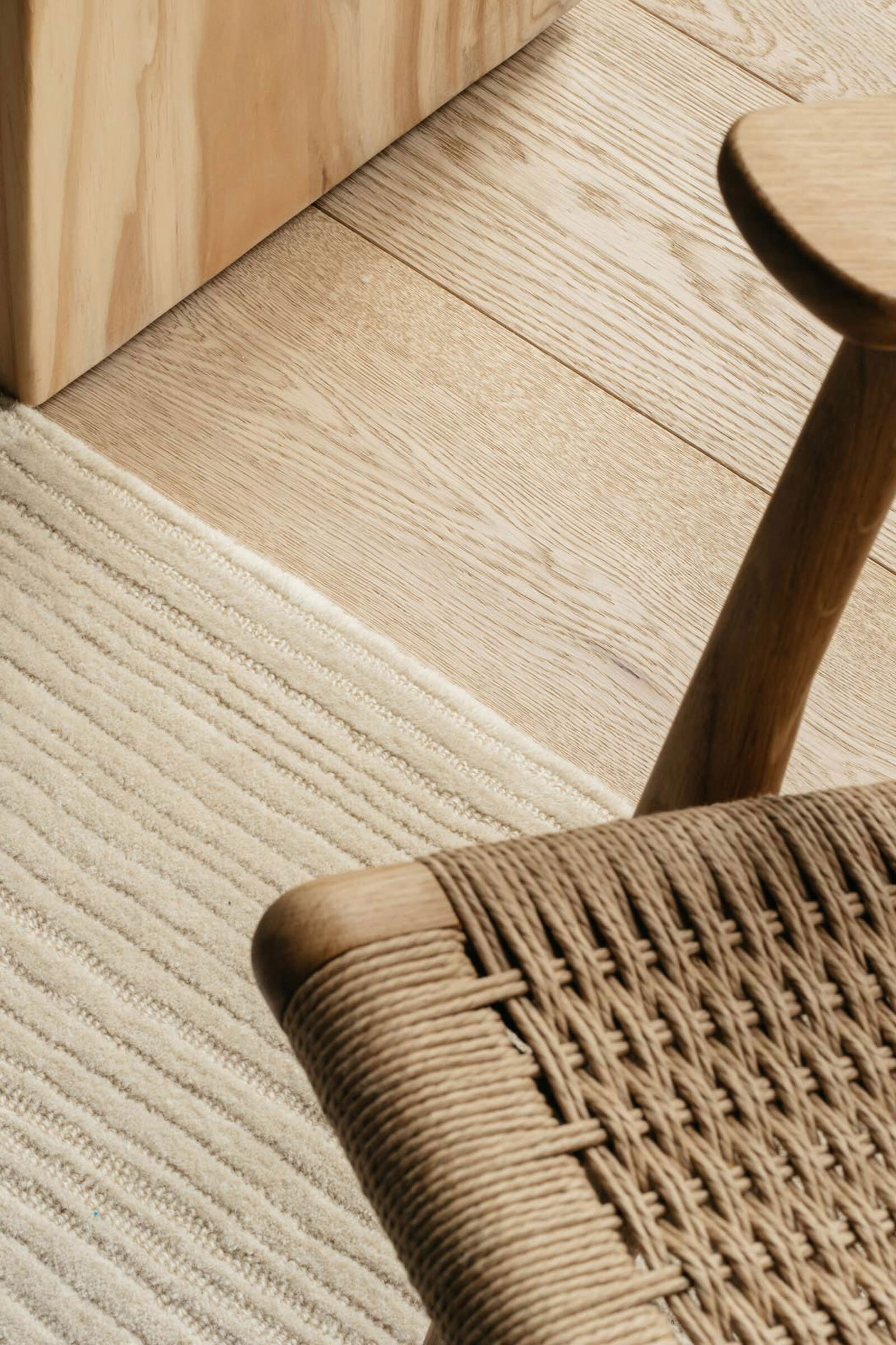
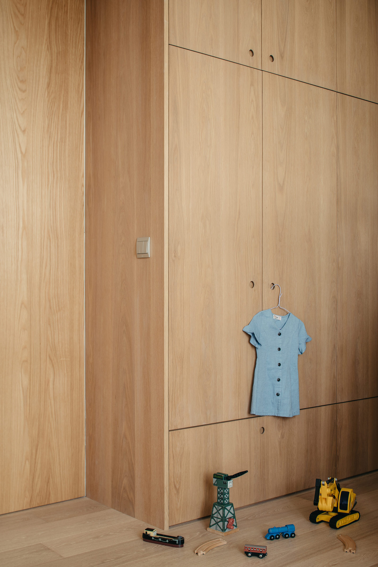
In selecting the materials for the house, we opted for a pared-down palette of various natural materials like brushed white oak flooring, stone counters, linen and wool. These subtle living surfaces bring a sense of calm and give the spaces an atmosphere of simplicity and comfort.
Which pieces are custom designed for the space?
For the custom furniture pieces, we worked with local carpenter Jonathan of Maker & Wolves. Part of the home’s charm was the original elements like the solid timber finishes that have aged overtime and the antique wall lights that were left by the previous owner. We went through a series of experiments with Jonathan to age the oak to echo the existing dark wood railing and internal timber window frames. Eventually, the oak was wire-brushed by hand and given a treatment to pre-age the timber.
Do you have a favourite element or design detail in the interiors?
I’d say that the outcome of our reconfiguration of the first floor layout was very meaningful and valuable to the project. We improved the spatial condition and at the same time seamlessly knitted together the various communal spaces. I remember witnessing a scene where the kids were gathered around the coffee table with their mum, their dad was watching them from the lounge chair and their granny was watching from the dining area. It was a heart-warming moment for us to see this intangible part of our work being experienced and enjoyed by the family.
Images / Studio Periphery


