Colour-Block Dreams at toggle hotel
Designed by Klein Dytham architecture (KDa), Tokyo’s toggle hotel suidobashi is a colour lover’s dream amid a quintessentially Tokyo cityscape
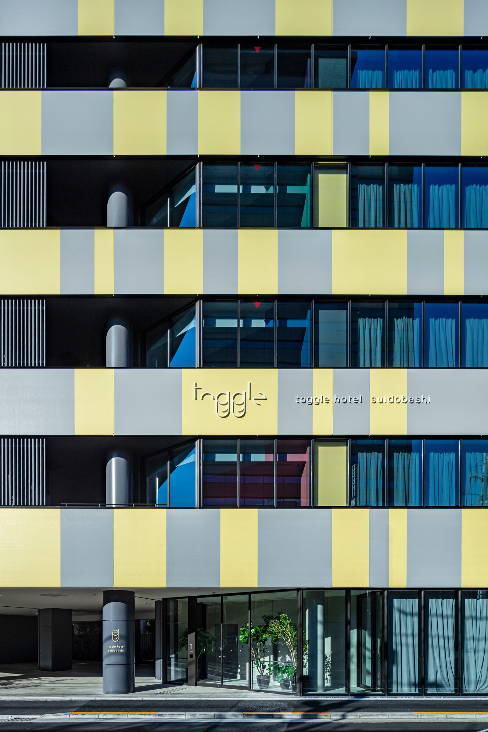
It’s a classic Tokyo view, but with a difference. Rising into a sea of concrete, wedged between a tangle of raised expressway and train lines, is a triangular tower with a traffic-stopping facade of yellow and grey stripes. Welcome to toggle hotel suidobashi. Designed by Klein Dytham architecture (KDa), the eye-catching hotel is located on a tight site in the Suidobashi district, amid a dense urban cityscape that feels quintessentially Tokyo.
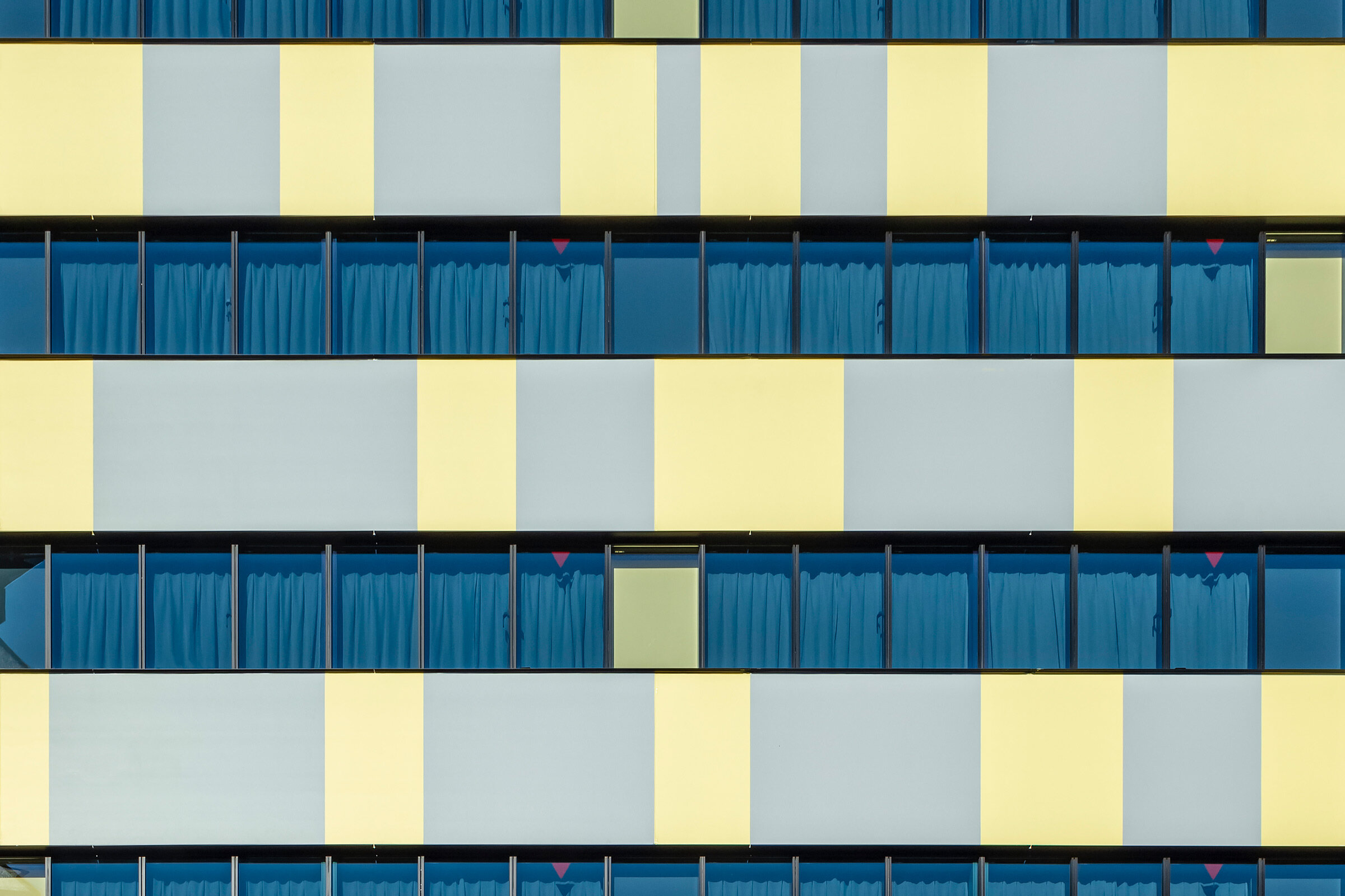
Colour is a scene-stealer from the start. The facade is covered with road sign-inspired graphics in yellow (the same colour as the trains that pass the hotel) and grey, reflecting the surrounding concrete. Coincidentally, the palette also matches the two 2021 Pantone Colours of the Year: Illuminating and Ultimate Grey.
‘We wanted the hotel to stand out like a billboard,’ explains KDa co-founder Astrid Klein, who worked alongside Irie Miyake Architects & Engineers (IMA) on the project. ‘This is the most urban site,’ adds Klein’s co-founder Mark Dytham. ‘So many people pass here on the expressway or the train. We didn’t want it to be yet another grey anonymous building in the city.’
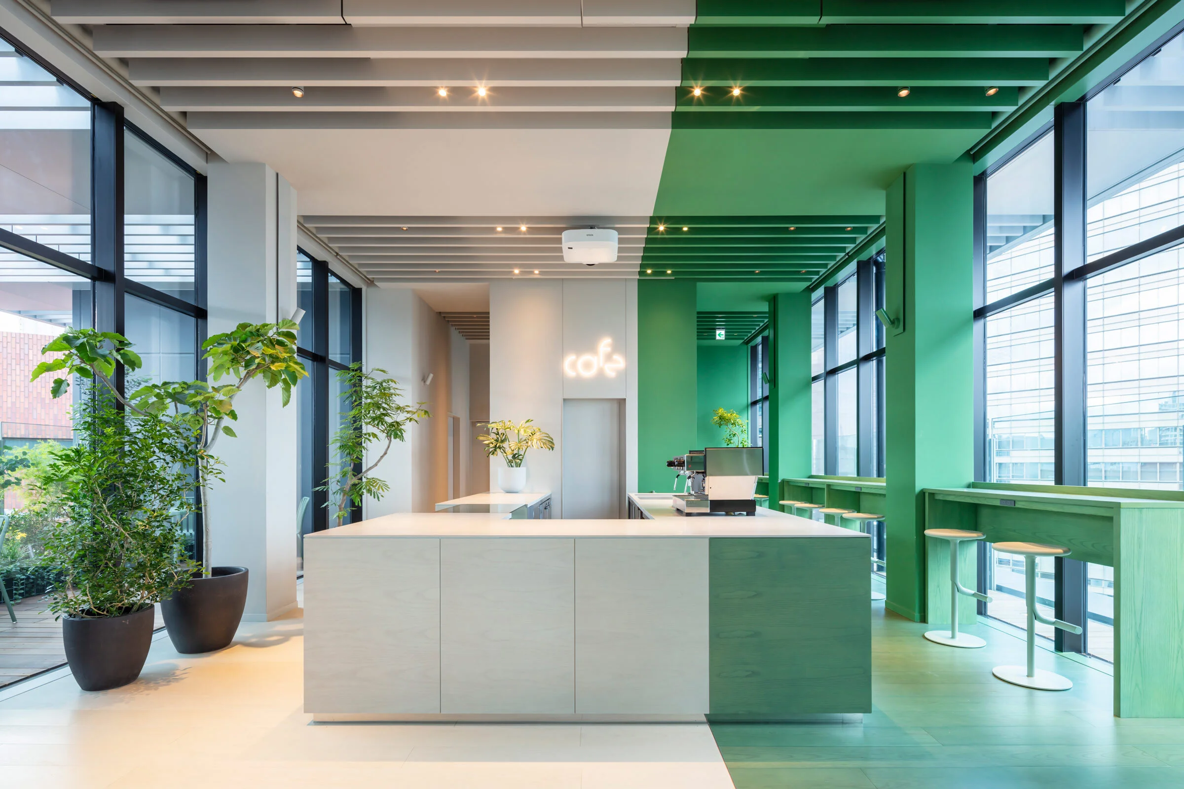
The colour-block concept flows throughout the interiors of the triangular new-build hotel, which spans nine floors and features 84 guestrooms, plus a reception — painted in soothing shades of fern green and grey — at its apex. Here at the top, natural light floods a restaurant and cafe, complete with an outdoor terrace with a green burst of city-resistant plants like olive trees and evergreens, with kumquat trees providing a pop of orange.
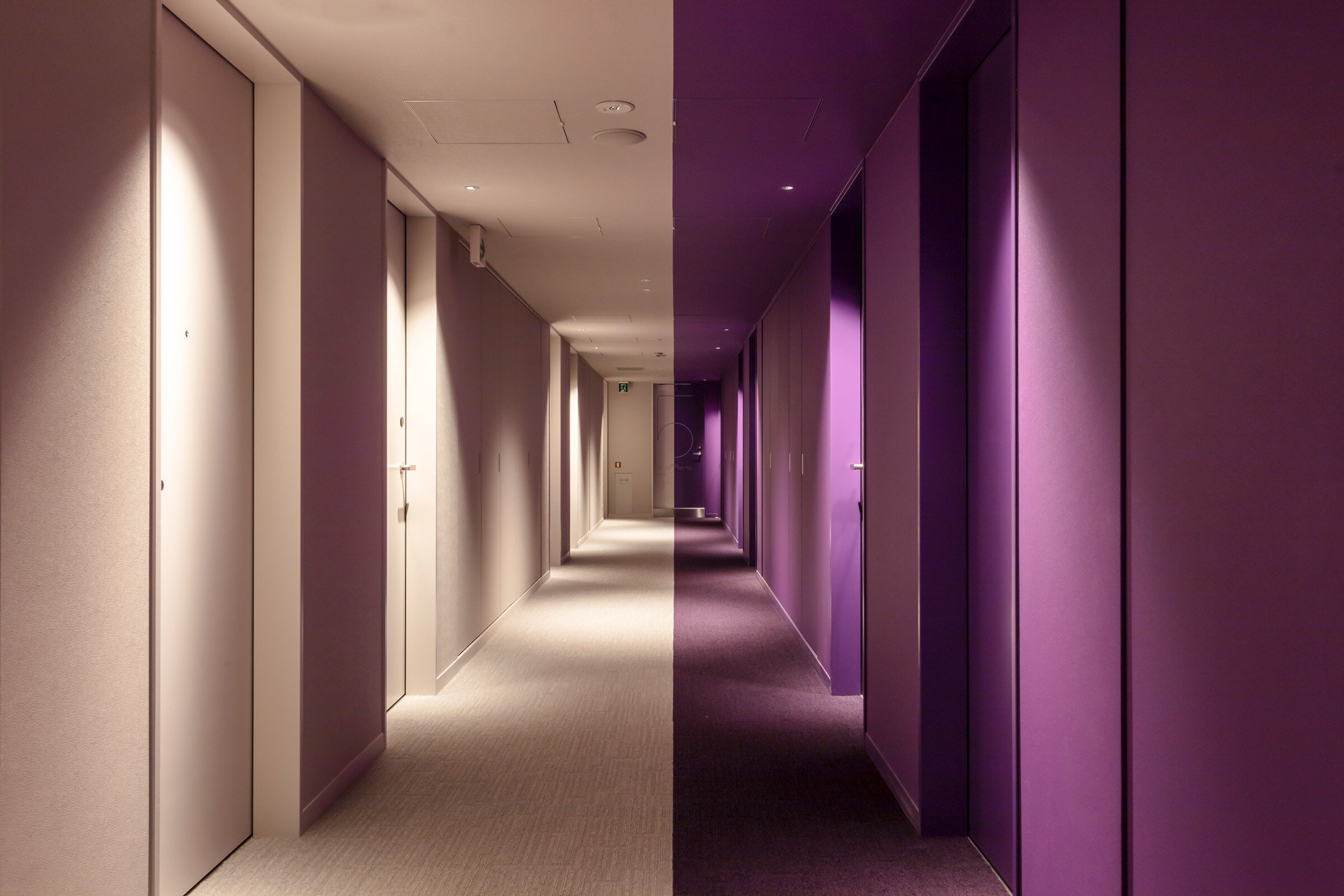
It’s impossible for guests to forget which level they’re staying on: each of the guestroom floors has a single identifying colour theme — pink, purple, light blue, dark blue or green — with the corridor split in a clean, graphic line between that shade and grey, complemented by playfully minimal signage by Tokyo studio artless Inc. Guests can choose from ten different room types in around 60 different colour combinations, from lower-level rooms in warm shades of pink with loft-style beds and views over the outer moat of the Imperial Palace, to the eighth-floor rooms with serene green walls, window-side bathtubs and cosy balconies with plants and white BoConcept table and chair sets.
The design also embraces the horizontal dynamism of the flow of cars and trains — to dramatic effect, in some cases. The all-purple Room 501 offers one particularly unique only-in-Tokyo experience: positioned in a triangular corner of the building, on the same level as the raised Metropolitan Expressway, cars zoom, computer game-style, past the bed.
In contrast with the deeply urban location, the atmosphere throughout most of the hotel — the ninth floor in particular — is surprisingly calm, not simply because of the double-glazing on three sides plus sound-insulated frames, but also due to the colour impact. ‘Colour has an effect on your emotions,’ Klein says. ‘But people don’t often have much of a chance to experience colour in their lives in this way.’
Text / Danielle Demetriou
Images / Shingo Nakashima


