Victor Churchill Opens a New-Age Butcher in Melbourne
Australian butcher Victor Churchill elevates the craft into theatre with a luxurious design experience conceived by loopcreative
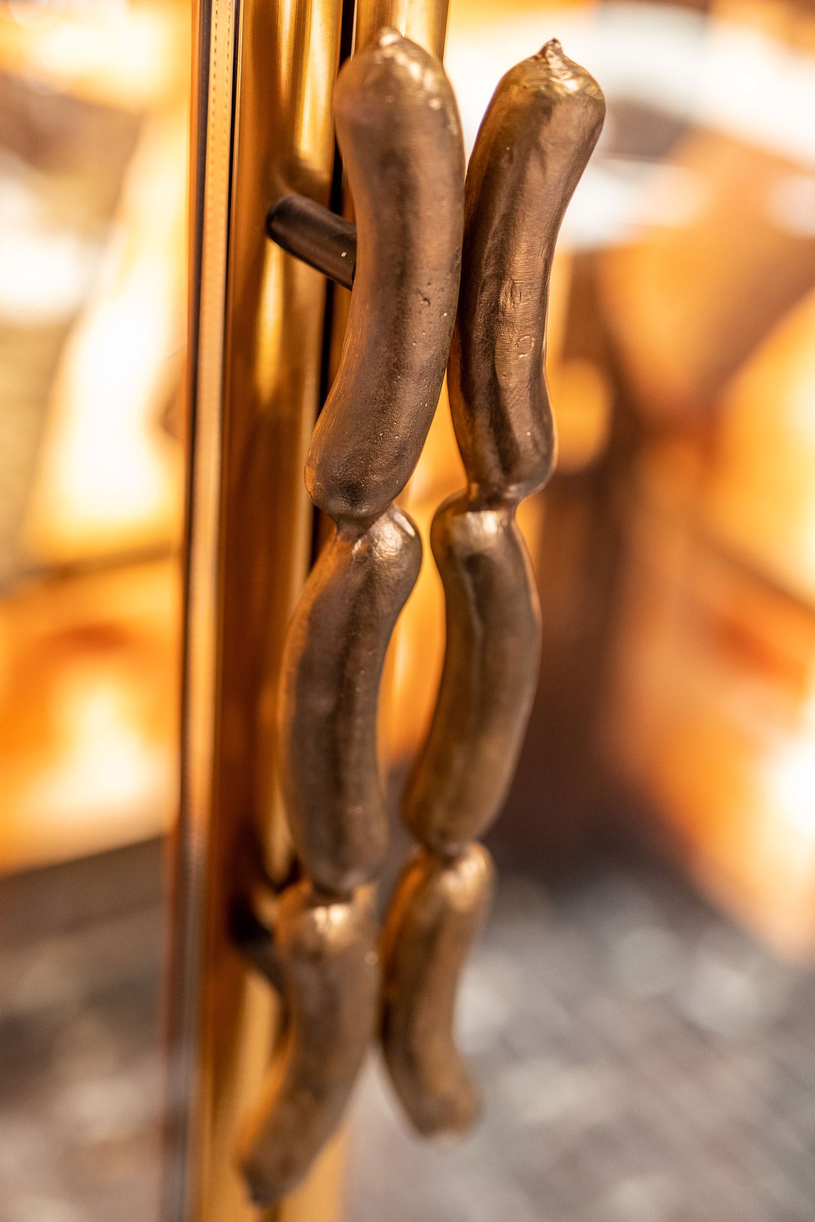
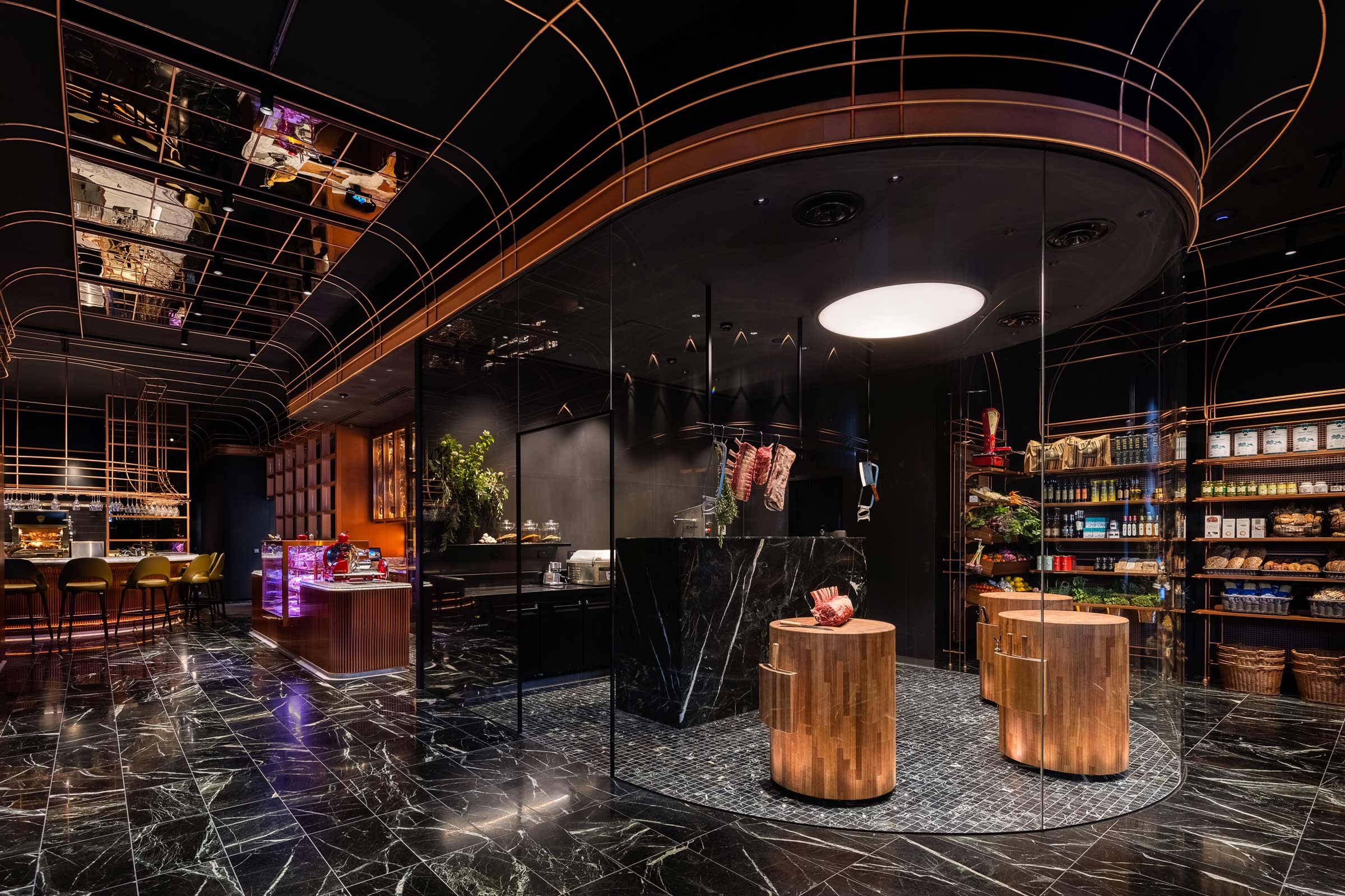
At Victor Churchill’s new Melbourne location, bronze-cast sausage-shaped handles are fitted onto the door that opens into the generous and ultra-opulent butcher, where patrons are greeted by three timber butcher’s block podiums shielded by a curved glass screen. Designer Rod Faucheux of loopcreative describes the solid timber pieces as ‘working altars’ that minimise the barrier between counter and customer to facilitate a more intimate connection.
While Faucheux took visual cues from Victor Churchill’s Sydney store, the new Melbourne flagship — housed in a former bank — has its own DNA that’s in line with the local landscape and village-like shopping strip on Armadale’s High Street. The multisensory concept is the result of lengthy conversations between Faucheux and the owners, who have a strong allegiance to craft, character, family and legacy.
Anthony Puharich and his father Victor, a fourth-generation butcher, established Vic’s Premium Quality Meat in 1996, and the success of Vic’s Meat led Anthony to launch Victor Churchill in 2009. Both concepts are rooted in tradition and heritage, values communicated to Faucheux early on in the process. The Puharichs’ brief was to interpret these values in a modern, elevated way.
‘We talked at length about travel, about European and American restaurants and bars, and about ambience and service,’ says Faucheux. ‘It was evident that Anthony had a strong affinity and connection to buildings and spaces that have significant character. Being aware of his fondness for heritage and history, we set about creating something that sits as much in the traditional space as in the contemporary environment.’
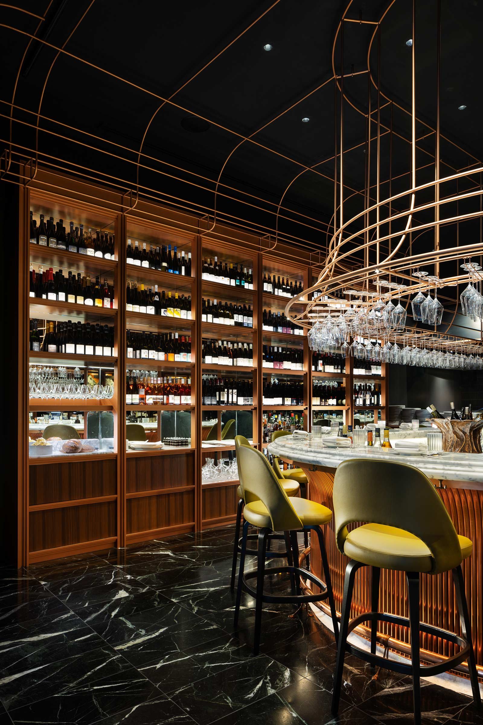
Floor-to-ceiling Himalayan salt bricks line the dry-aging room, illuminating the premium cuts that hang from the ceiling and creating a gallery-like effect. Elsewhere, refrigerated storage units frame a collection of artisanal charcuterie, cheeses and pastries, while The Pantry showcases Australia’s best produce on finely articulated cabinetry. To the back is a wine library and The Bar, an intimate horseshoe-shaped marble dining counter that looks onto a rotisserie, charcoal oven and grill.
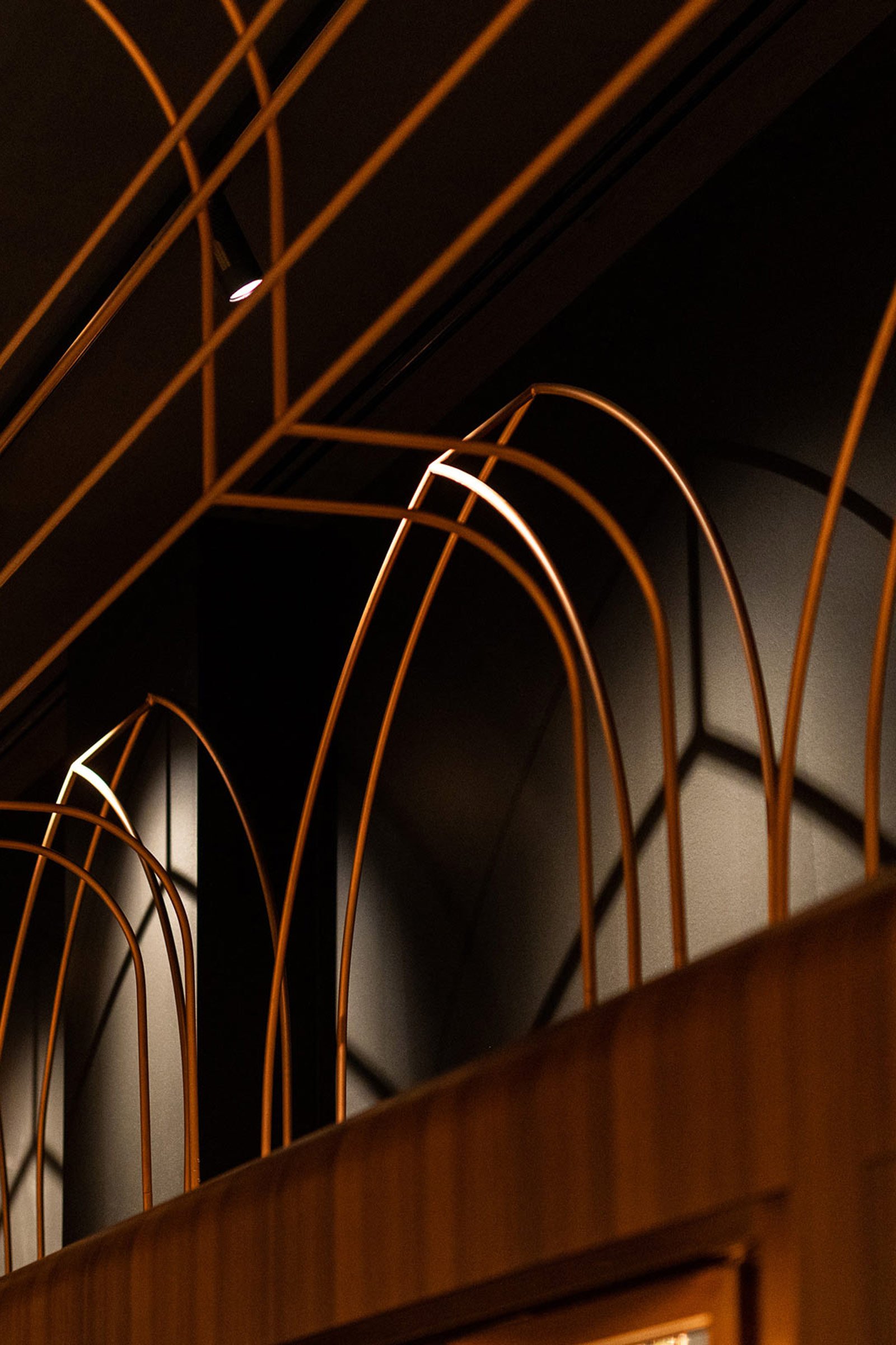
The rich material palette is dominated by copper, which figures across all metalwork, bar fronts and shelving, while the veined green Verde marble flooring echoes the texture of the protein. Although Faucheux crafted a lavish and dramatic scheme, he remained mindful of authenticity, giving an original 1930s cherry-red Berkel meat slicer ‘pride of place’ as ‘a relic of respect to an age-old profession’. On a wider scale, the interiors are delineated by fine copper arches that subtly evoke the grandeur of Baroque cathedrals, a nod to the family’s Croatian background.
Text / Carli Philips


