A Home Office with Room for Restoration
Jay and Alex Liu of Singapore’s Right Angle Studio transformed this petite home office into a four-part space conducive to both mental well-being and productivity. We spoke to the designers to find out more about this unique response to the new norm of living and working from home
Design Anthology: How did you first meet the client?
Jay Liu (JL): The client is a close friend of ours. Prolonged periods of working from home were taking their toll on his mental health, so he approached us to design a new spatial identity for his home workspace.
What was his brief to you for the project?
Alex Liu (AL): We had the luxury of an open brief, with no restrictions on the concept, materials or spatial planning. The client had only one key objective for the new space: improve the overall mental wellness of whoever’s spending time there.
What was your initial inspiration was for the design?
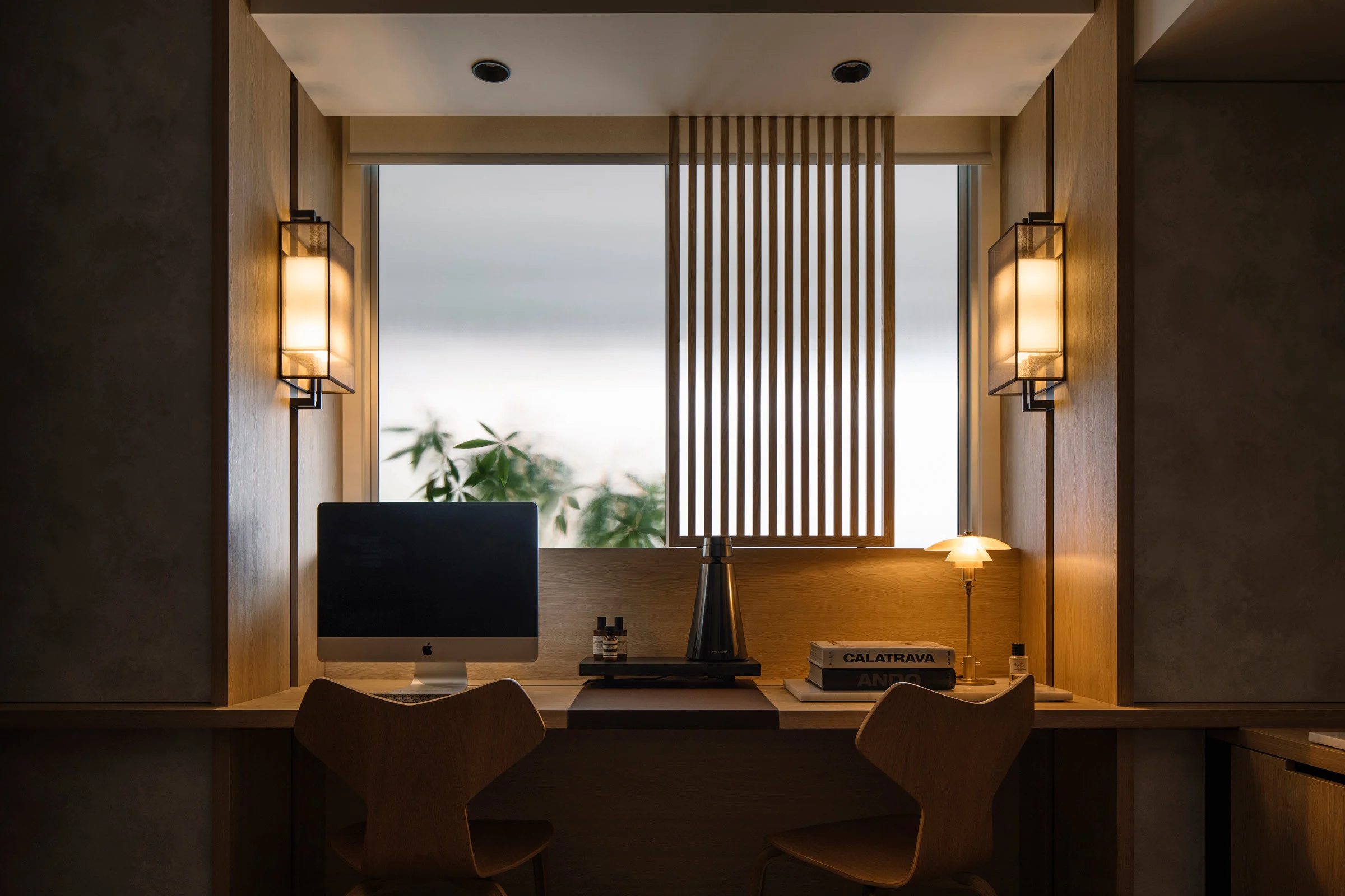
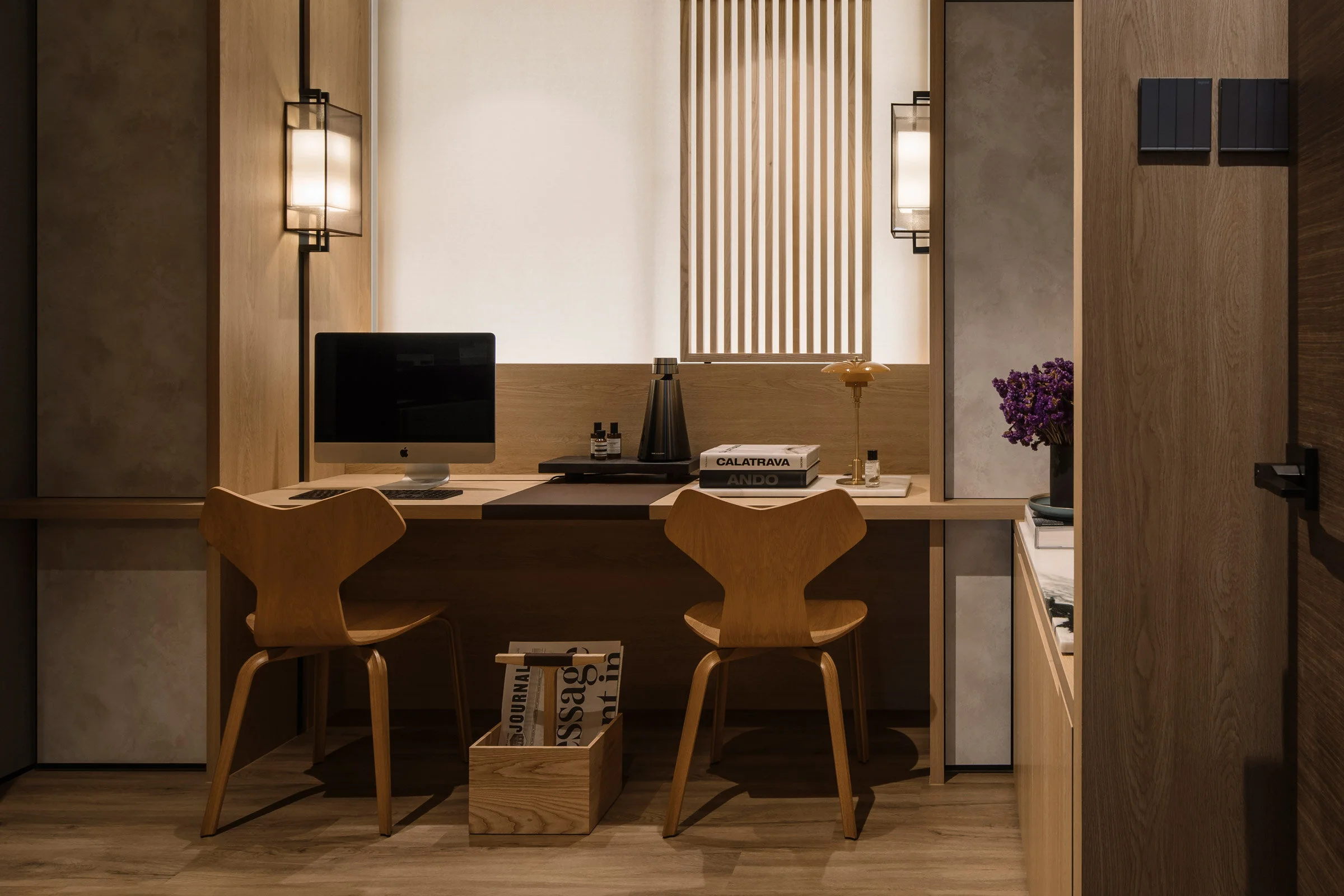
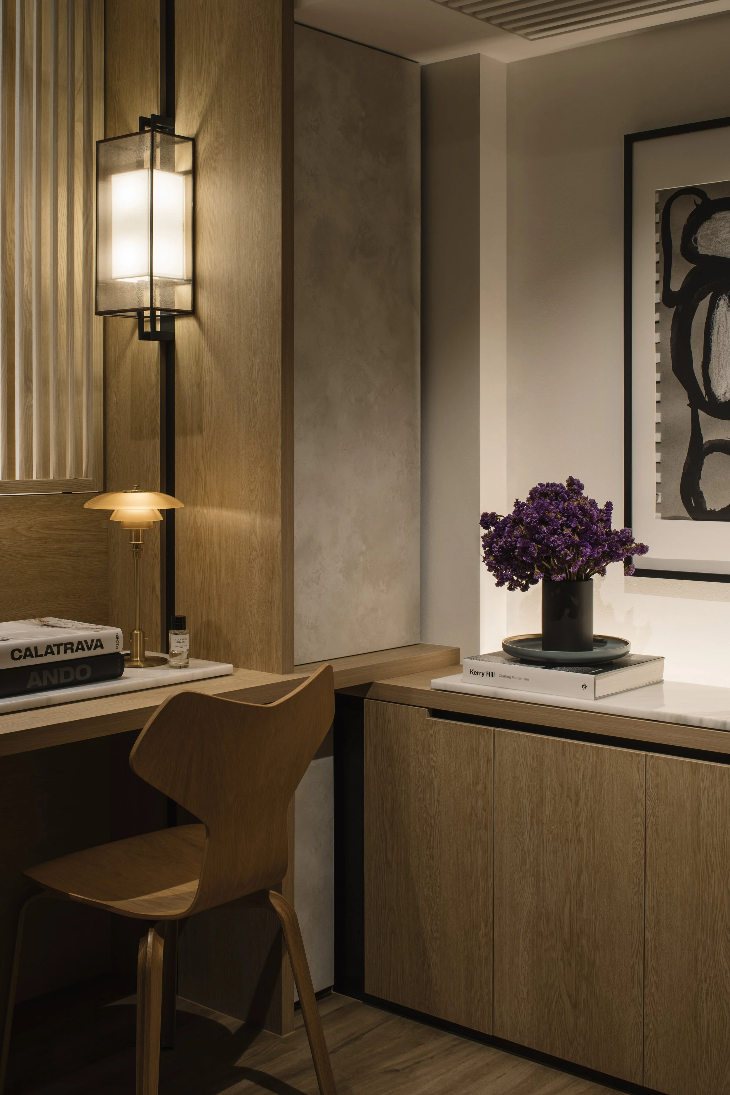
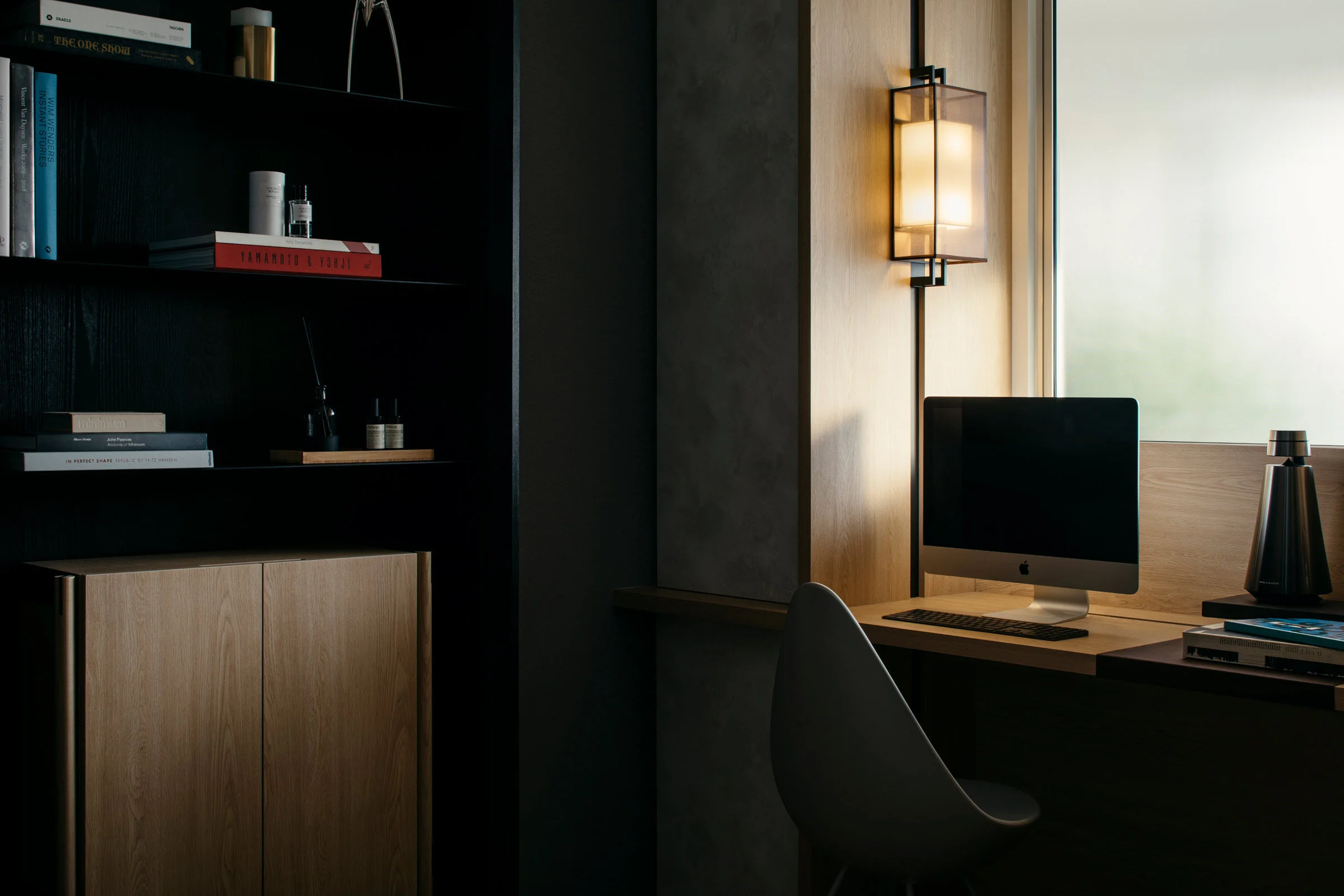
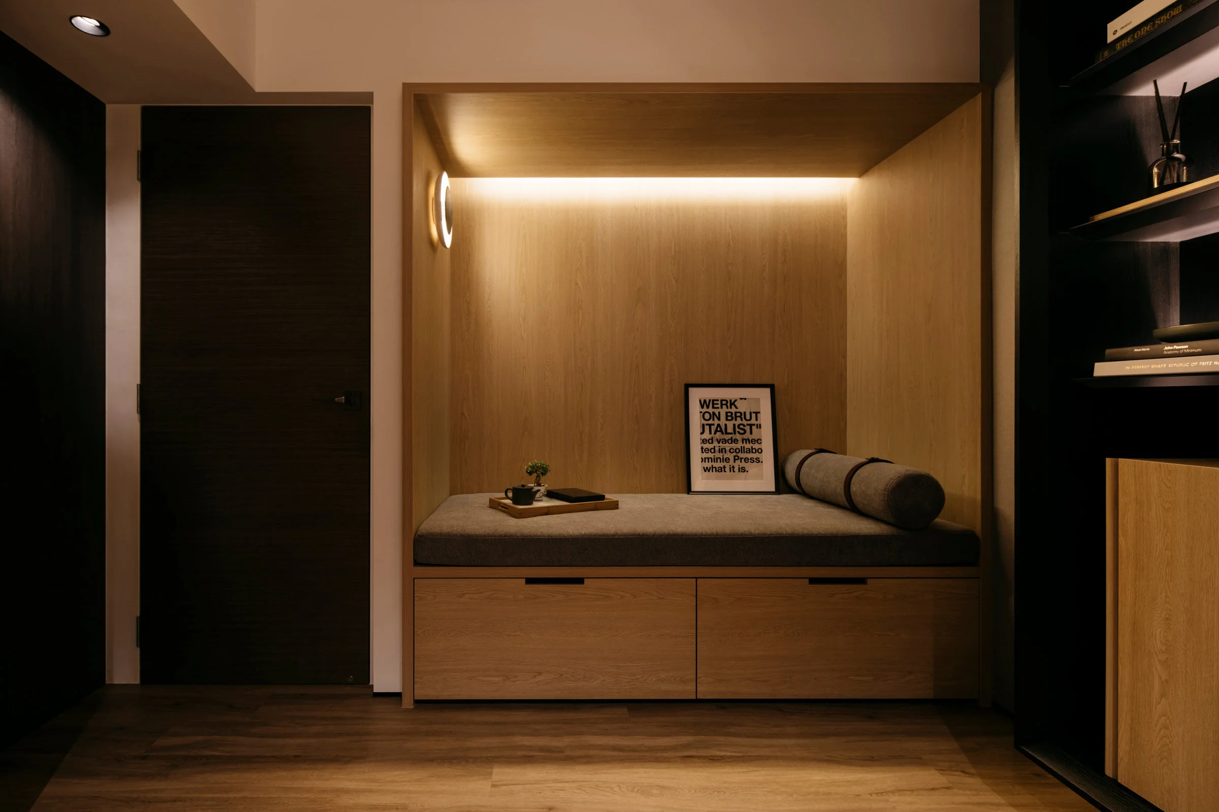
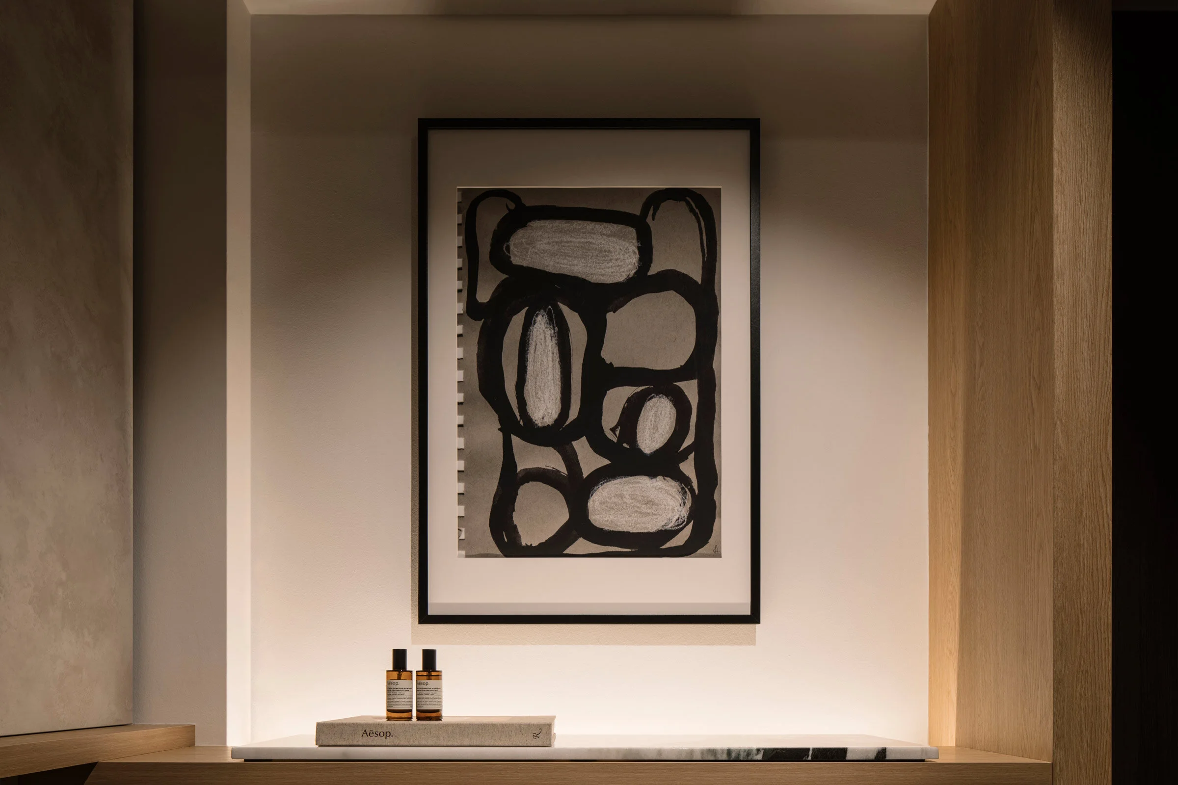
JL: We drew inspiration from metropolitan cities like Hong Kong and New York, conceptualising the 10-square-metre space to be a cosy sanctuary that allows one to be escape the chaos outside. Our approach was to distil the space into four distinc zones: a fully functioning workspace, a library, a lounge area and a gallery.
Can you tell us about the colour palette?
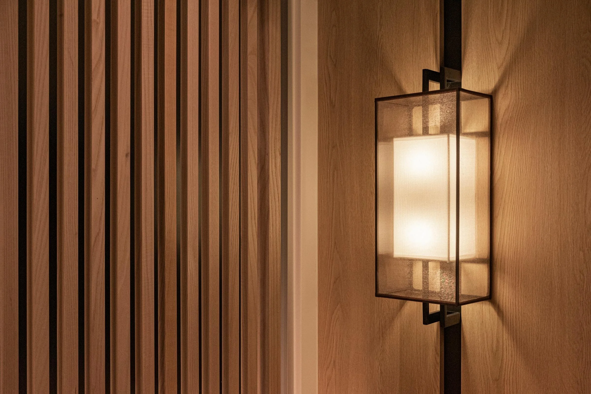
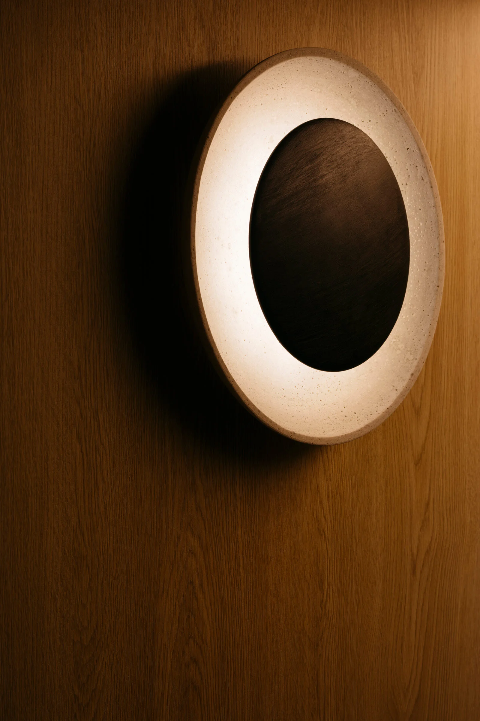
AL: We selected natural and warm colours to establish an understated and welcoming mood, which is then balanced with black and white tones.
Were there any particular challenges or constraints to do with renovating the existing space?
AL: As the project was conceptualised and built right after Singapore lifted its circuit breaker measures, a significant amount of time was spent on coordinating the project, with each component’s construction meticulously planned so that all elements were completed and installed to schedule.
Can you tell us about the materiality and design detailing?
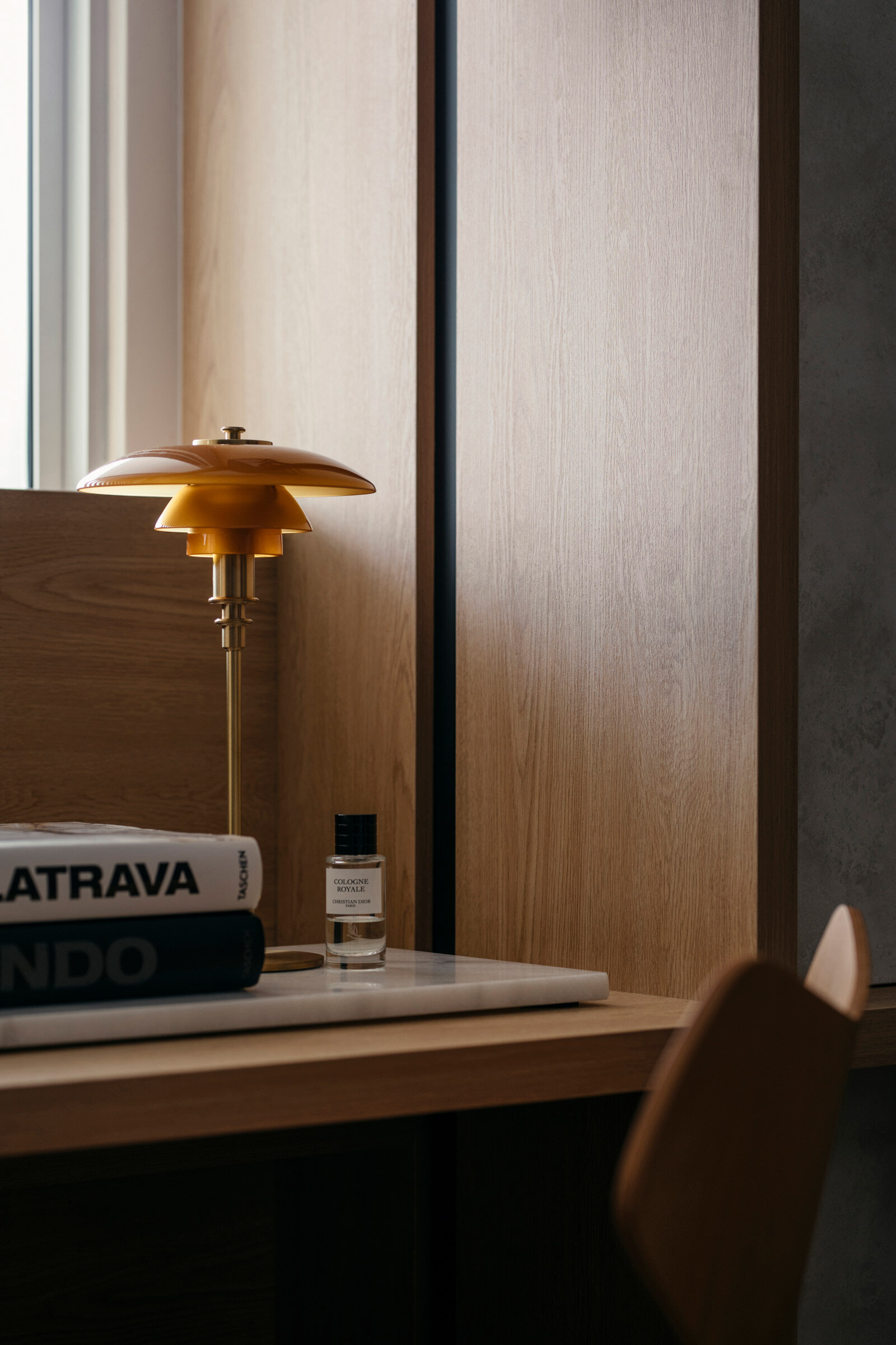
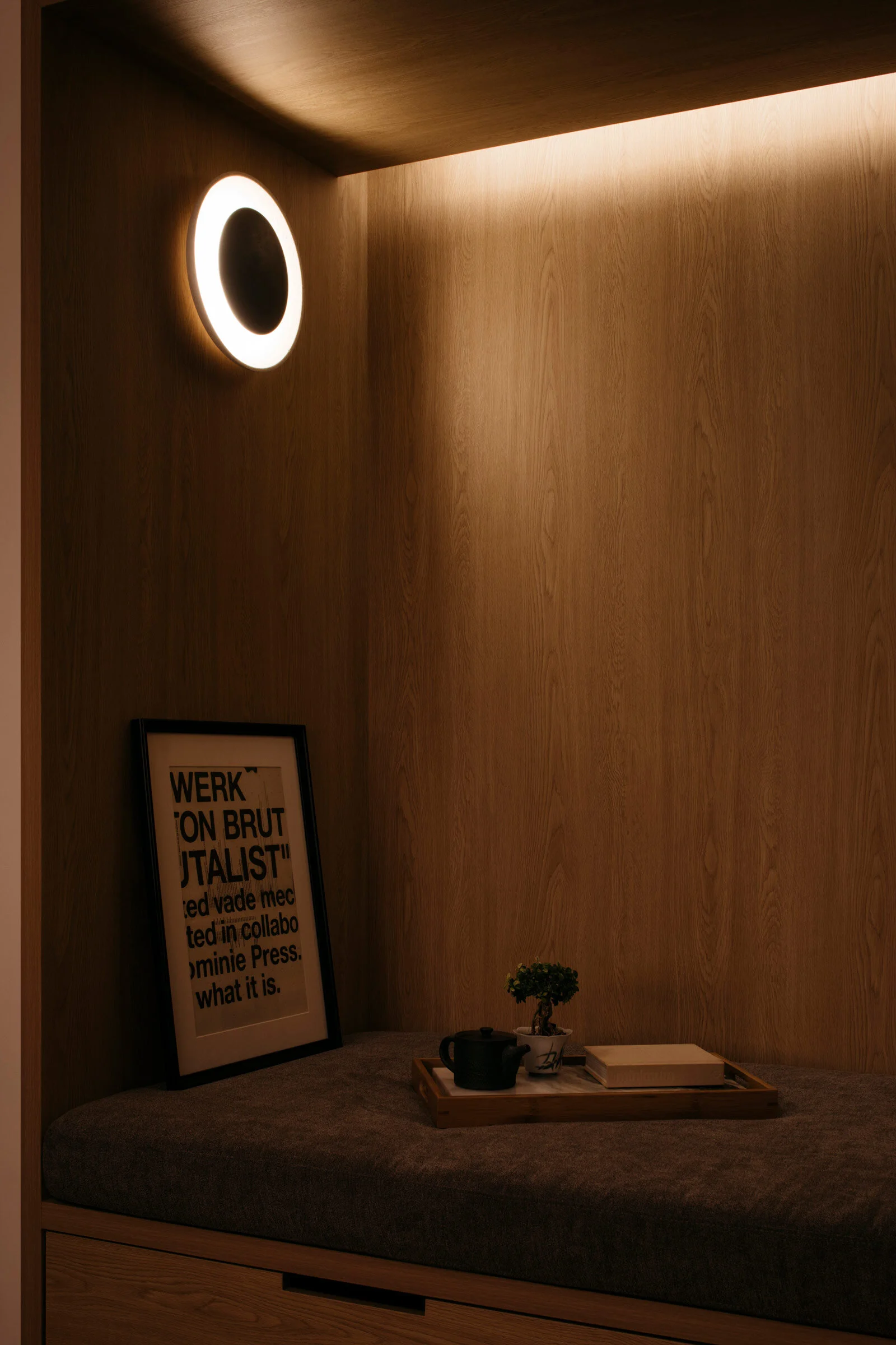
AL: We had the luxury of being able to explore all the materials before the design was finalised, and so we were able to select fine materials like solid ash wood and marble slabs. Given the limited space, we really paid attention to tailoring and curating every structure and element to perfection.
Images / Studio Periphery

