A Home Designed for Connections
Architectural design and construction firm S&K Group conceived the layout and materiality of this Melbourne home to better suit the family’s lifestyle and improve the connection to the outdoors. Director Paul Kegen shares more about his team’s approach to the renovation
Design Anthology: Can you tell us about the clients and their lifestyle?
Paul Kegen: The family of five loves spending time together, both indoors and outdoors. Also, the clients’ work allows them to work from home or the office
What was their brief to you for the project?
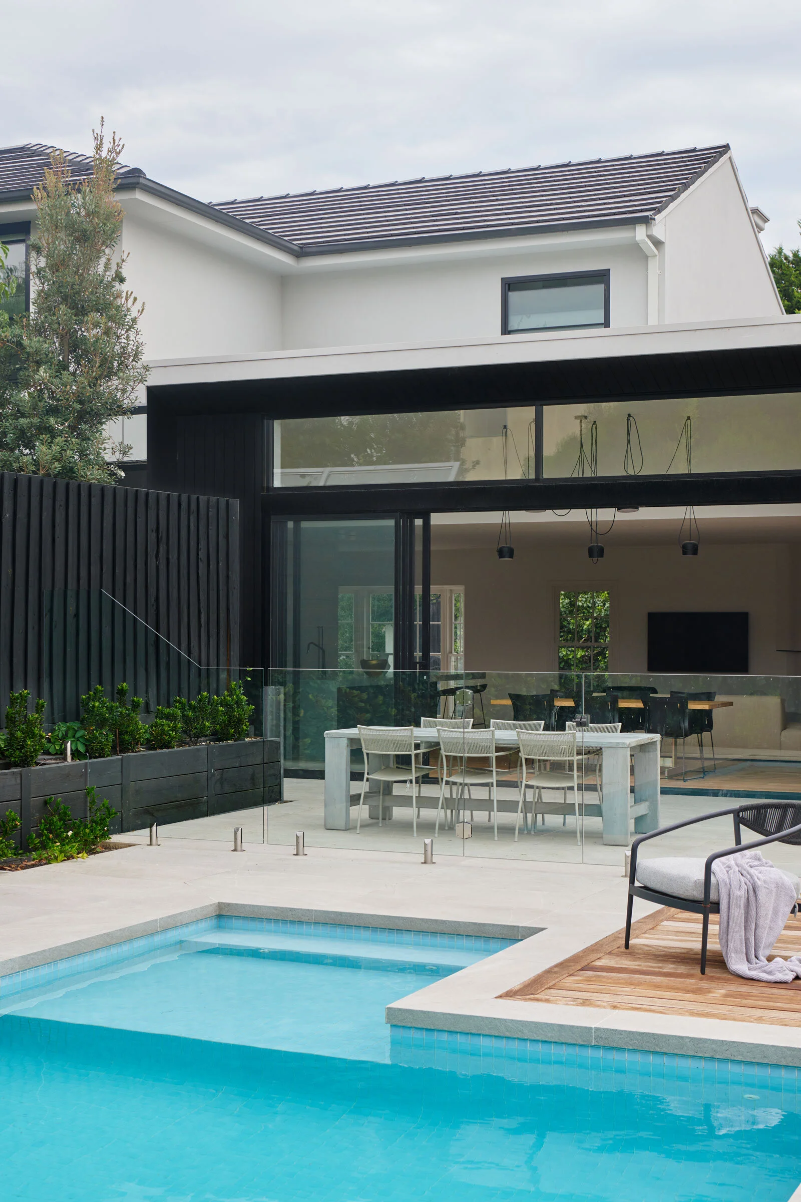
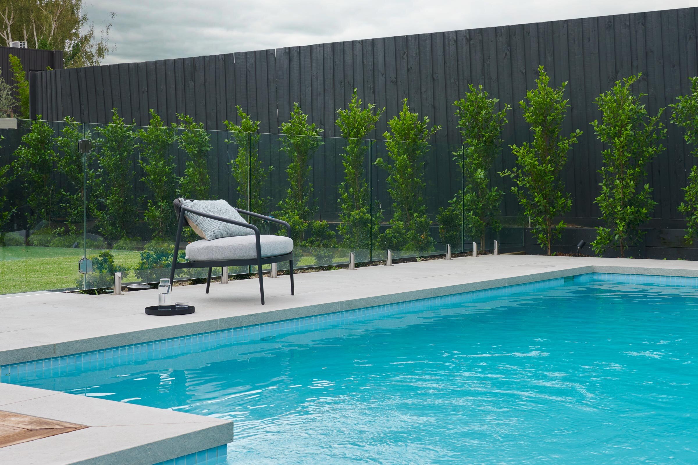
The brief was to renovate the existing home on a triangular block at the end of a court. The original home was big enough, but the spaces, orientation, flow and connectivity were all misaligned and didn’t allow the family to live cohesively. They asked us to create indoor-outdoor connections to the northern yard, and to enlarge the view and useable space. Taking the living and dining space as the centre of the home was important in creating that meeting space or moment for the family to connect. Along with this, we reprogrammed the ground-floor spaces to accommodate the master suite and study, as well as other ancillary spaces, leaving the upper level mainly for the children.
How did you approach the project — what design references did you try to incorporate into the space?
The long rear facade of the building faces due north, and in an increasingly densified area of Melbourne (Caulfield North), being able to bring in that natural light is a key feature. We approached the renovation by prioritising function over form. Sorting out and refining the connection and flow of the 400-square-metre home was paramount, while also creating a welcoming environment through warm and natural materials.
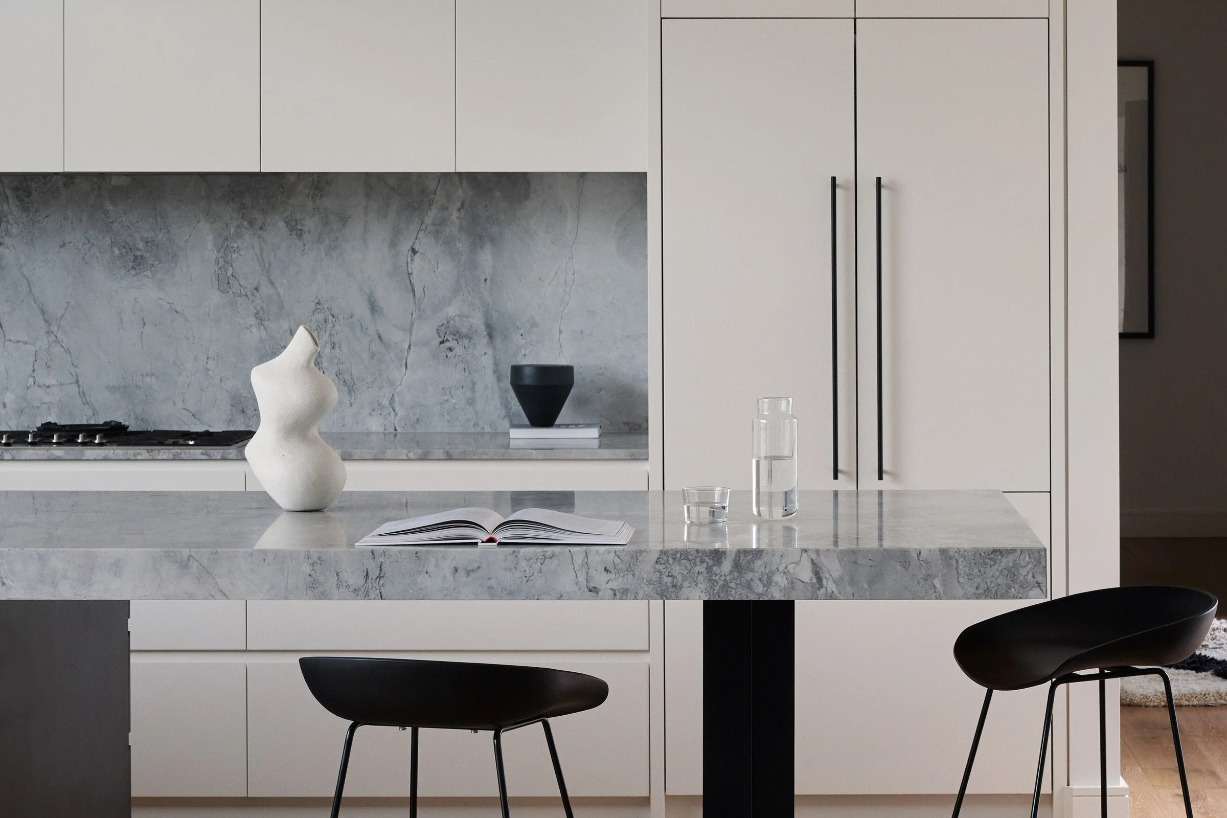
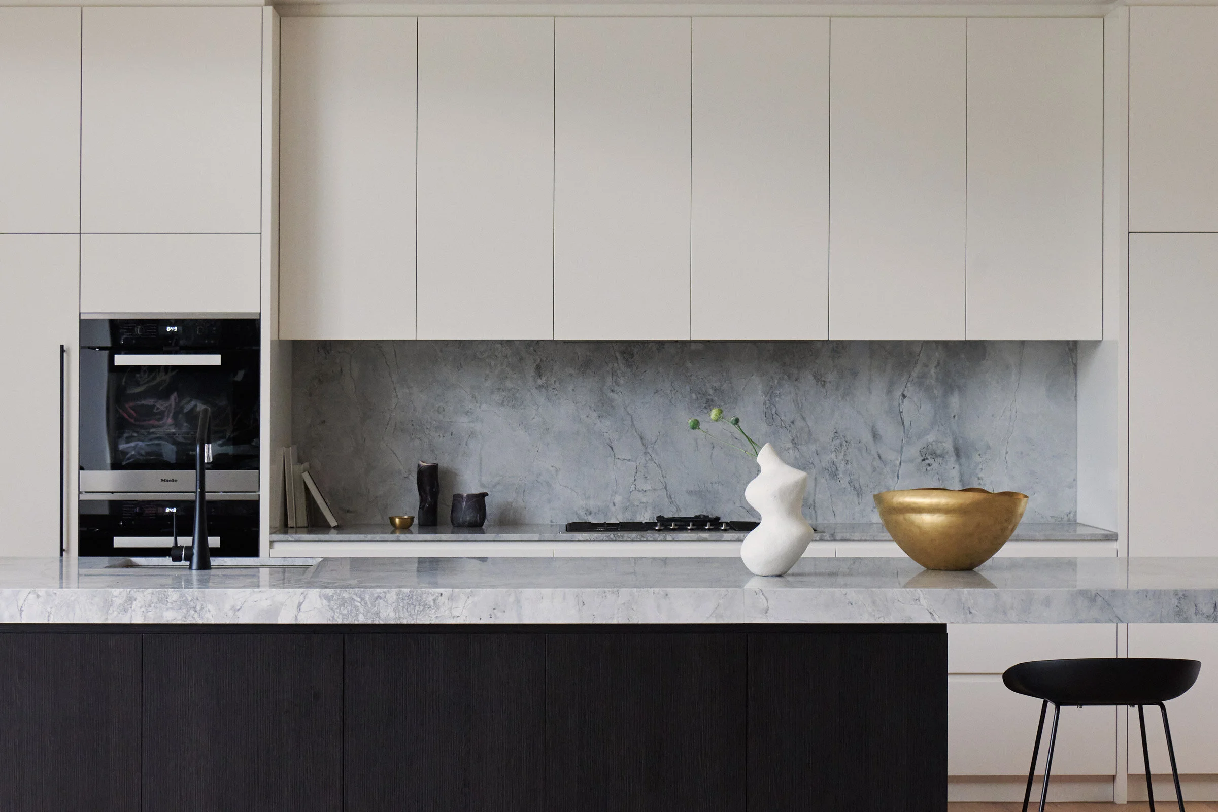
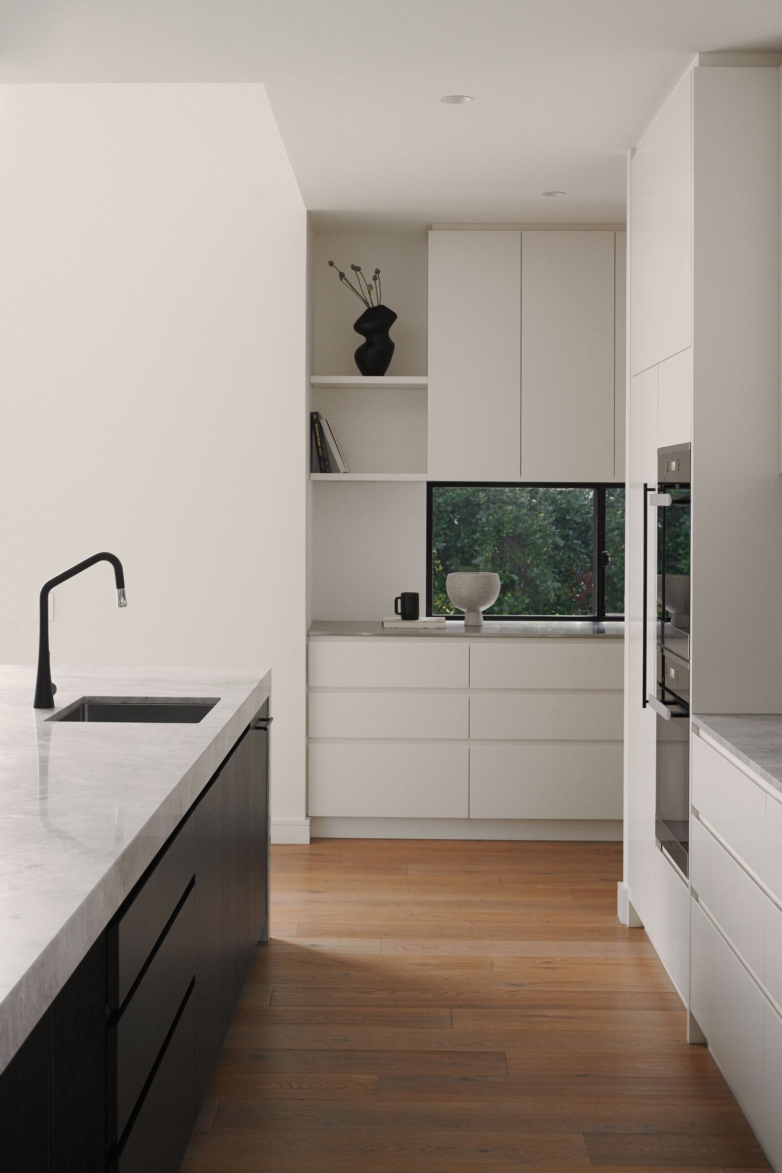
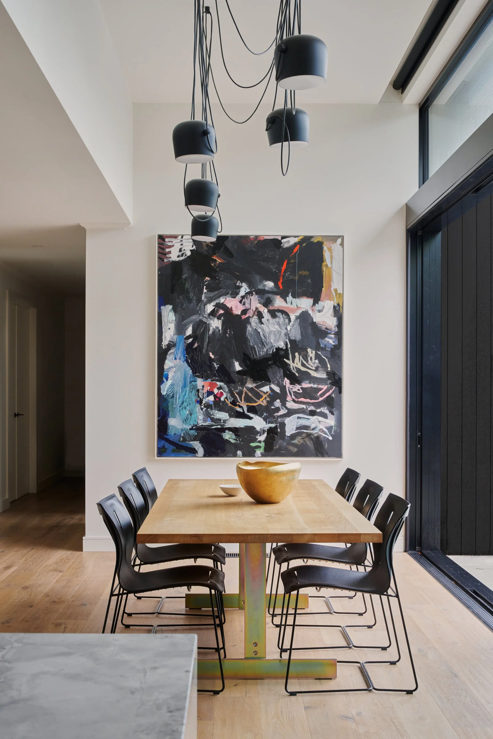
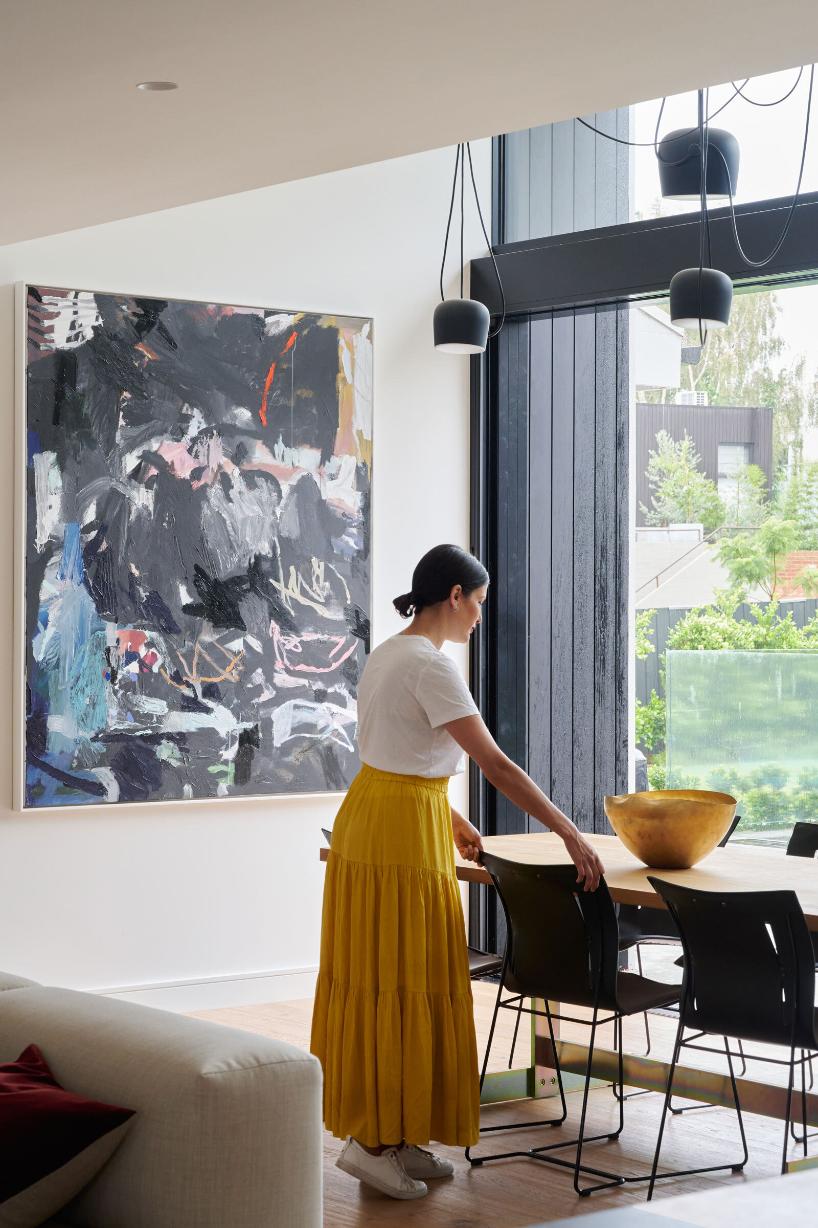
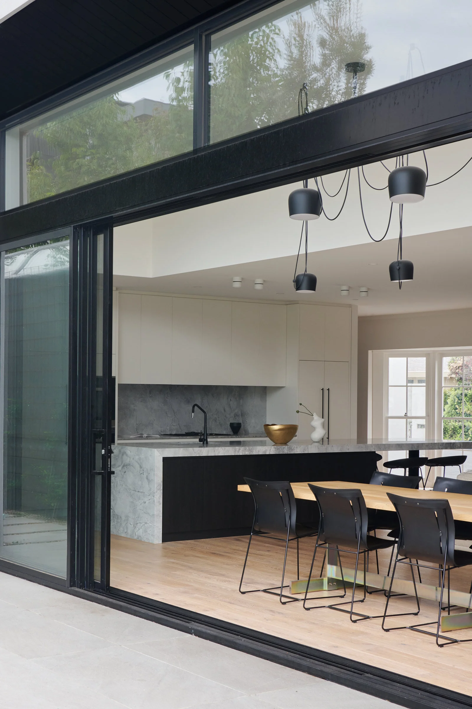
The new double-height void above the dining space accentuates the penetration of light into the home, and we designed a five-metre-long kitchen island to be the core around which home life now pivots — a monolithic island isn’t a new idea, but in this big, open-plan living and dining space it works perfectly
Please tell us about the material choices for the space.
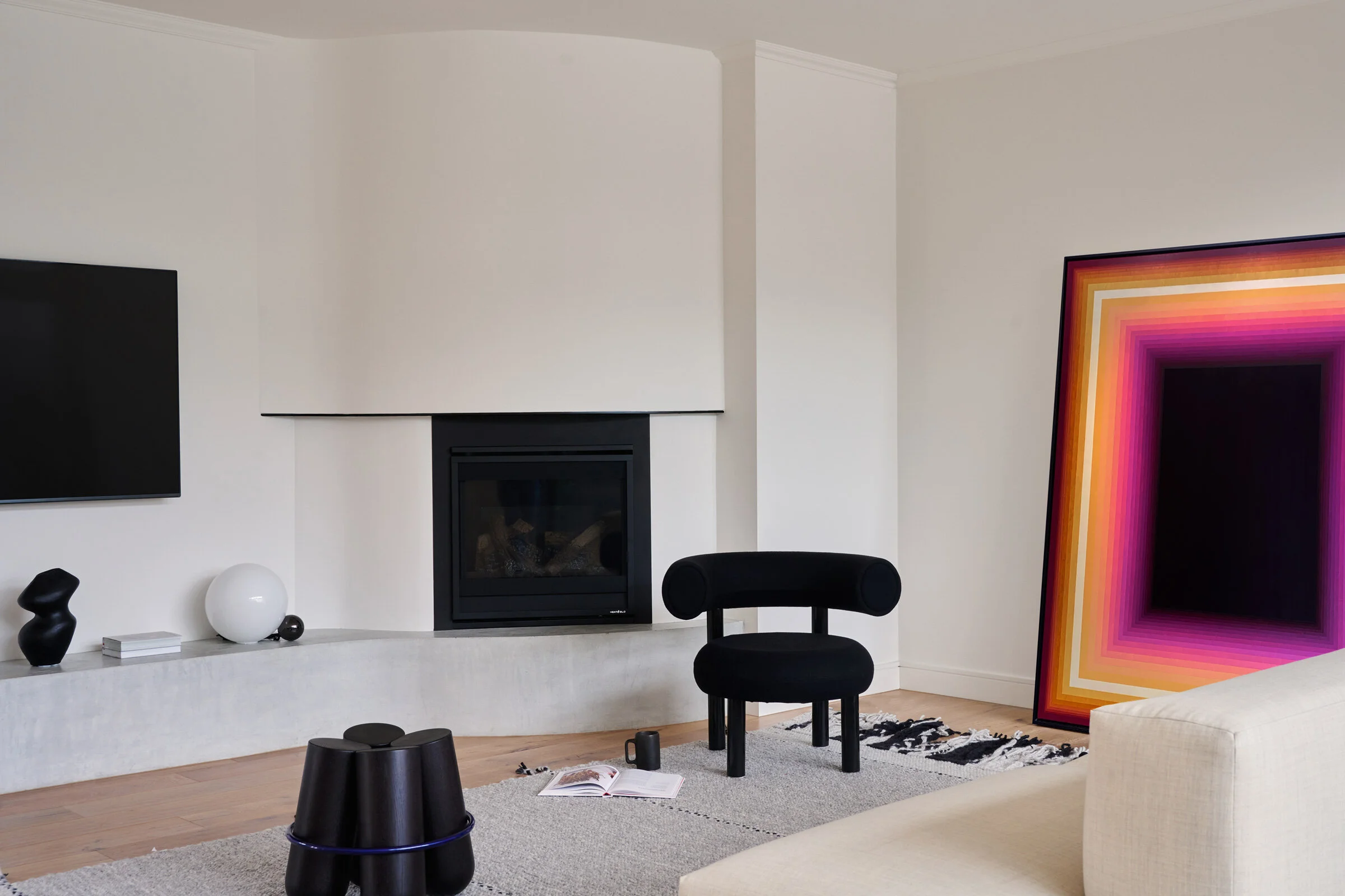
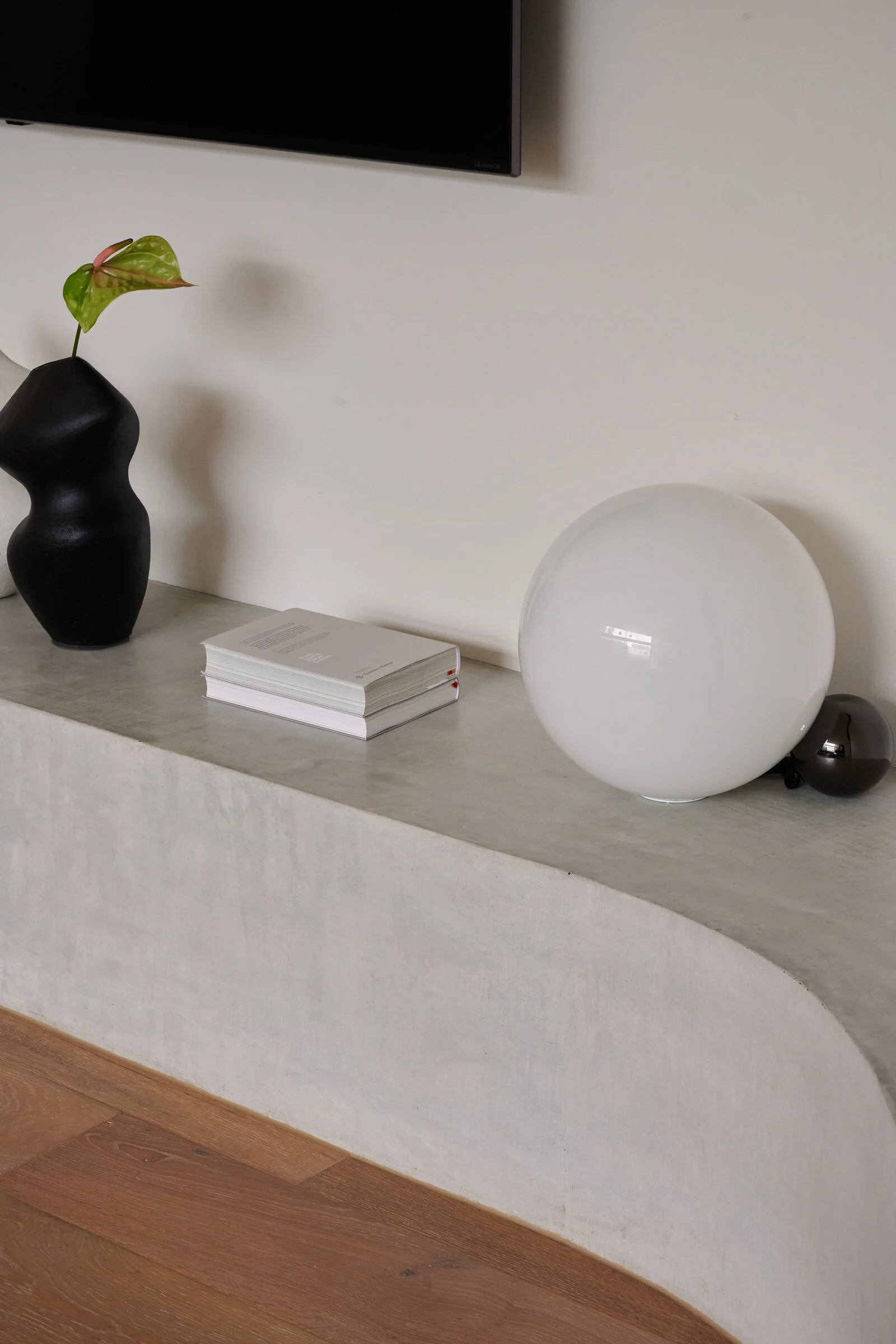
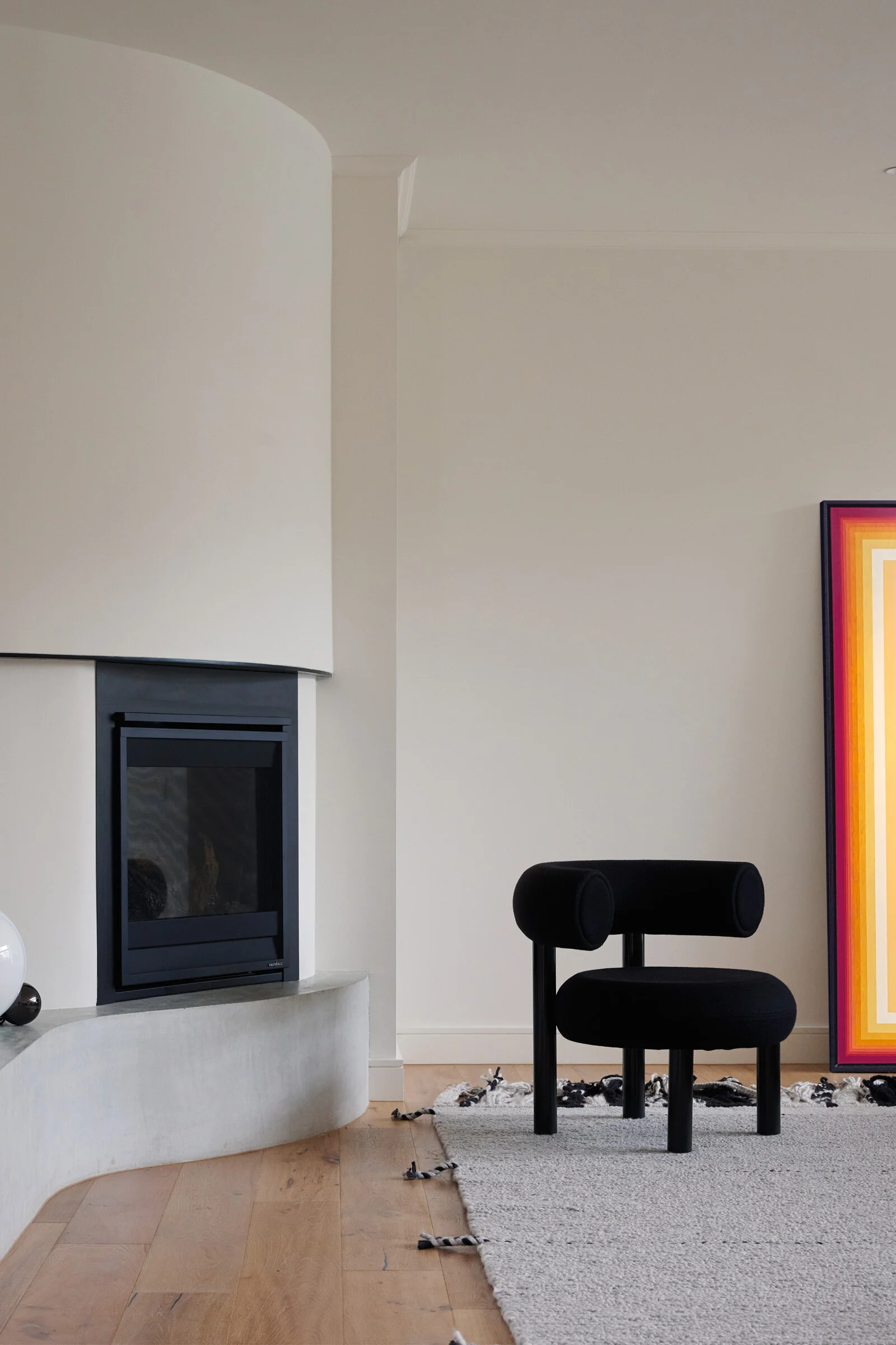
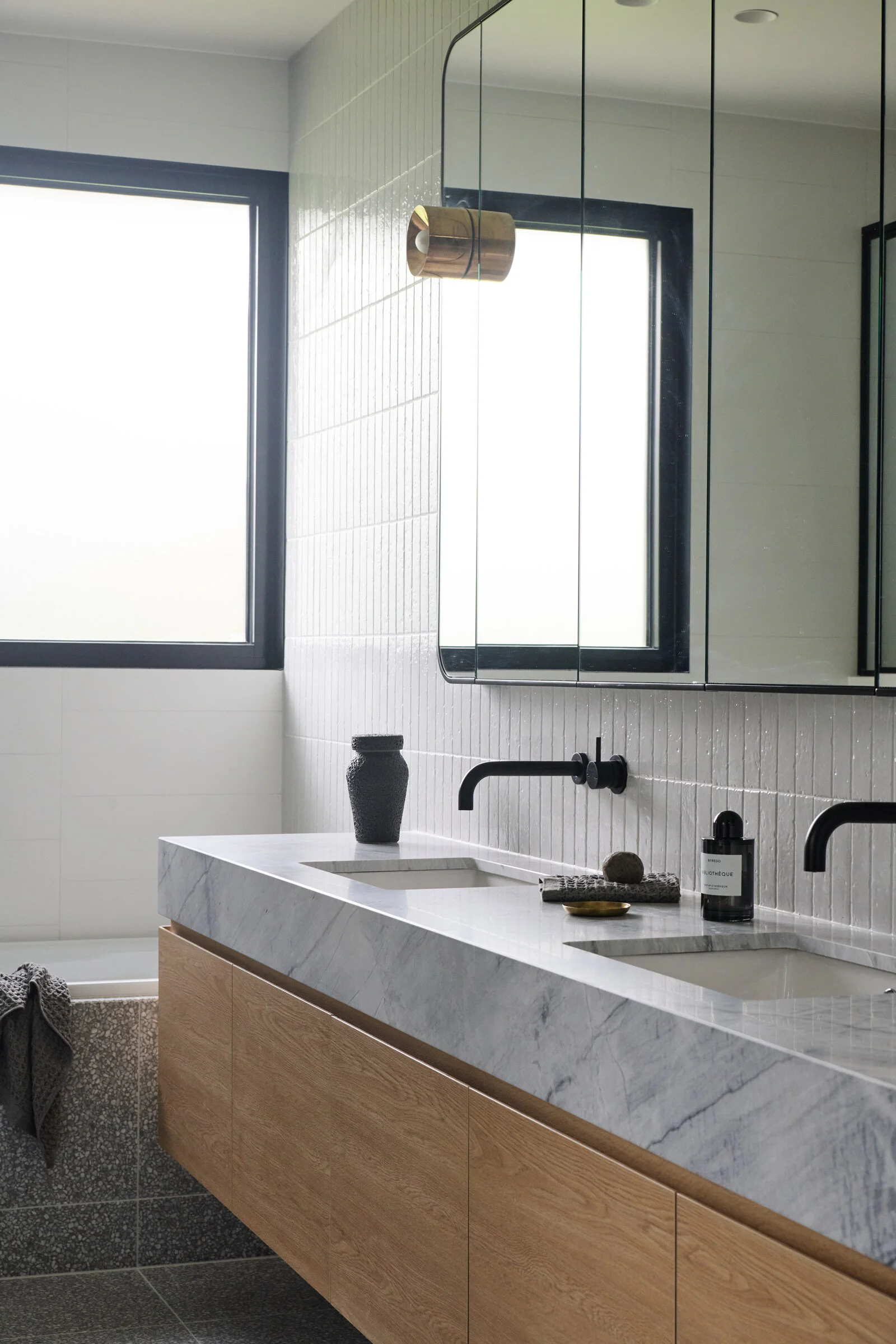
Timber flooring and clean, neutral whites and creams have been used throughout to provide a sense of openness. We designed an off-form concrete fireplace and joinery plinth as a feature in the living area. We selected white marble and stainless steel in the kitchen, and a combination of black and stainless-steel tap ware is used throughout.
Do you have a favourite element or design detail in the architecture?
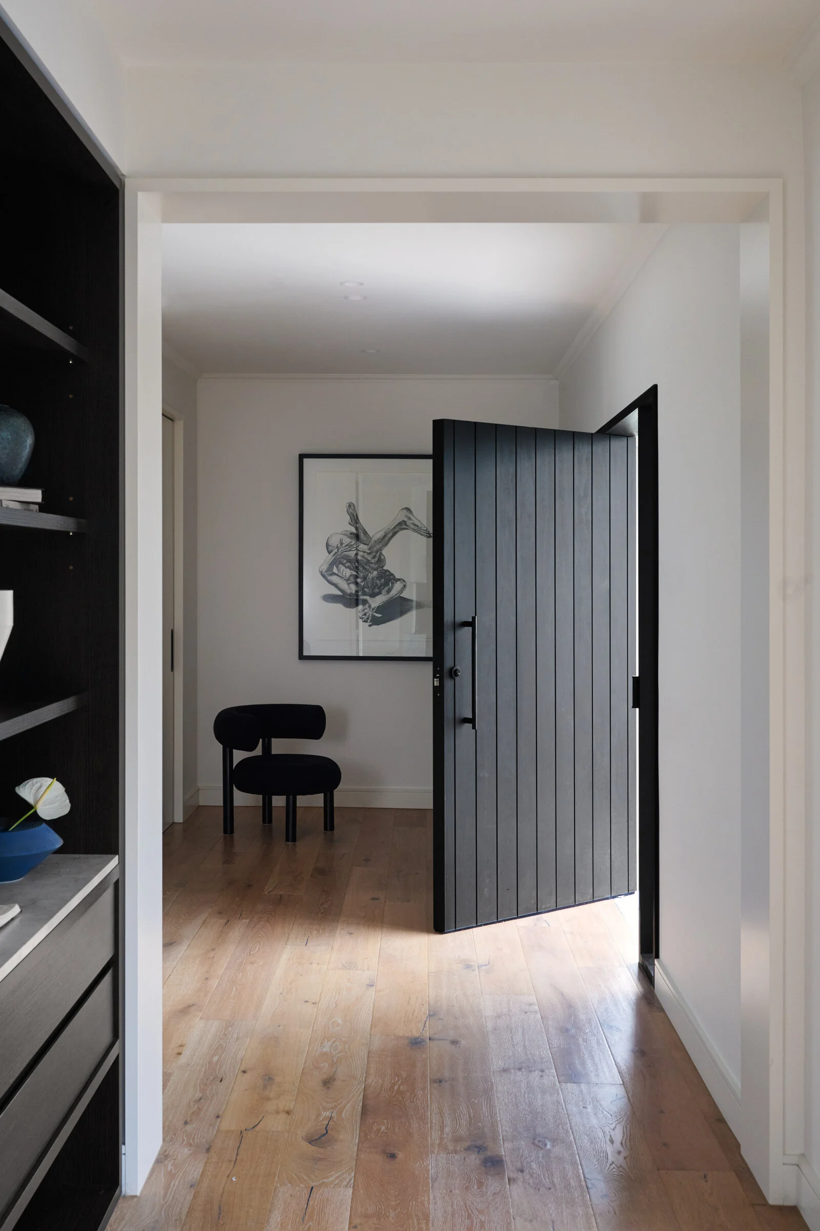
The entry door is one of my favourite elements. It’s simple but makes a big impression — it’s the first and last thing you see when arriving or leaving, so it’s a critical detail!
Images / Veeral Patel


