A Century-Old Antique Store Gets a Modern Update
To celebrate its 100th anniversary, Phillips Antiques called on TCG Studio to renovate its Indo-Gothic heritage building. Here TCG founders Sanna Daya Hasan and Ashni Tapuriah Shah tell us more about the project
Design Anthology: How did you first meet the client?
Sanna Daya Hasan (SDH): I’m actually part of the fifth generation of the family that owns the store, so I instinctively understood their vision, and with the help of my partner Ashni we brought that vision to life.
What was their brief for the project?
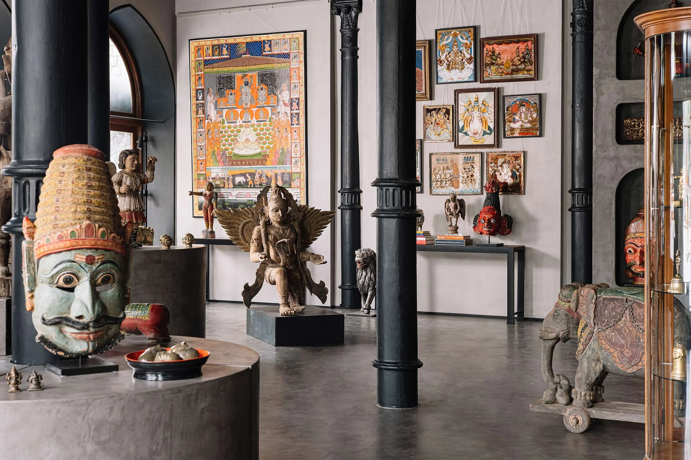
Ashni Tapuriah Shah (ATS): Phillips has always been a treasure trove and prides itself in being able to showcase a wide variety of artefacts and antiquities. But with changing design aesthetics and ideologies, they recognised the need to update the store's core shopping experience. They wanted to curate the space in a more focused manner, almost like a gallery, presenting the pieces to clients in a way that would allow them to visualise them in their own homes. There were certain elements and antique furniture pieces that the clients wanted to retain and weave into the design. Also listed as priorities for the reimagined space were a smart storage system and versatile yet focused lighting.
What is the overall size of the space?
SDH: The space is about 280 square metres and includes the main shop floor, a cabin and a mezzanine staff office.
Where is the store located and what makes the location unique?
SDH: Located opposite the Prince of Wales Museum and in front of the Wellington Fountain, Waterloo Mansions is an impressive gothic-style building with turrets, pointed arches and a black stone facade. It was one of the most photographed areas in Mumbai during the early 20th century, and the precinct has recently been designated a UNESCO World Heritage Site.
How did you approach the project — what design references or narrative did you try to incorporate into the space?
ATS: We referenced international galleries and researched spaces that allow art and antiques to shine. We also investigated different types of lighting systems used in well-designed museums to find a comprehensive solution for the client’s requirements. As for the narrative, we stayed true to the history of the space, using the inherent architectural elements as inspiration and guiding principles.
Please tell us a little about the material choices.
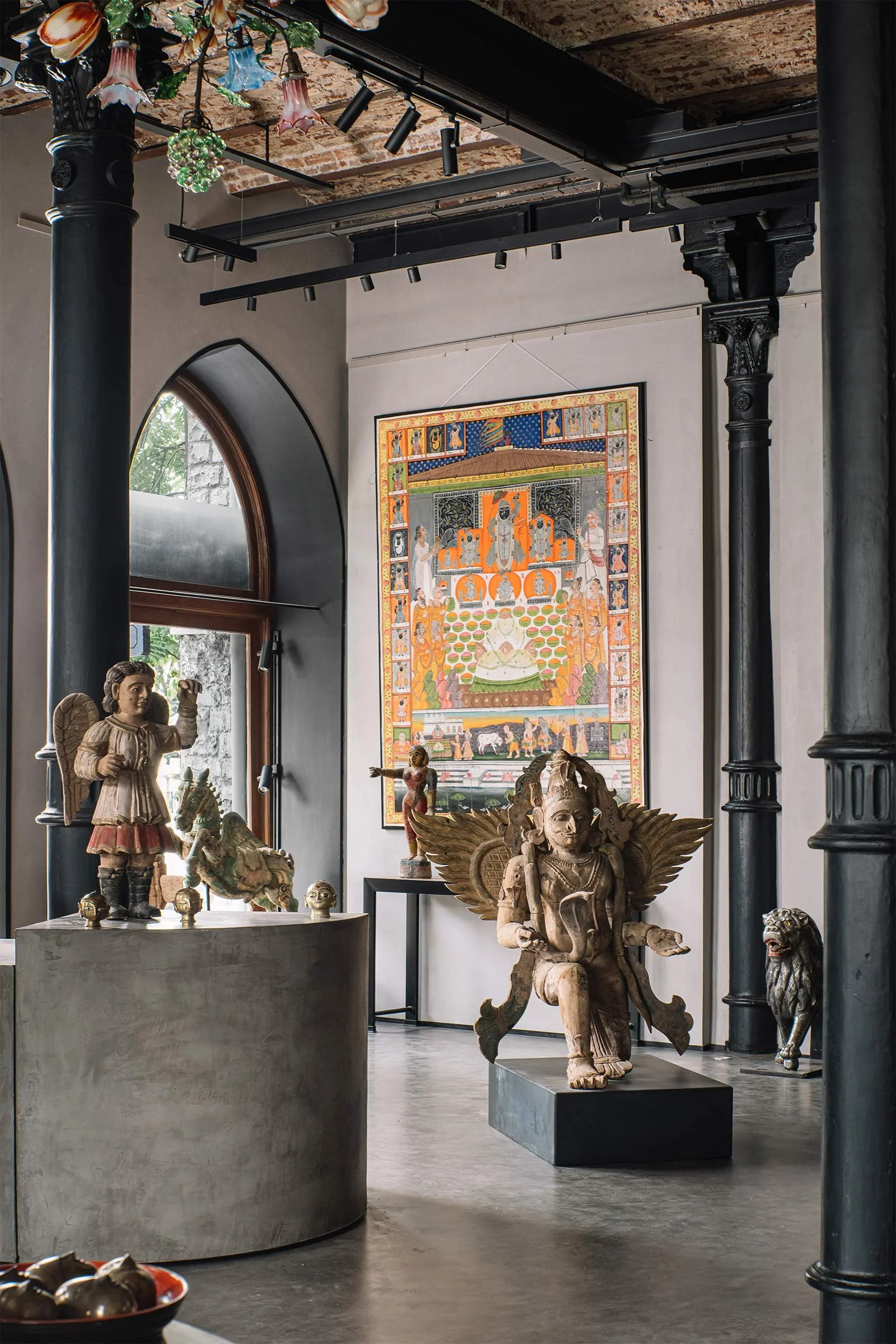
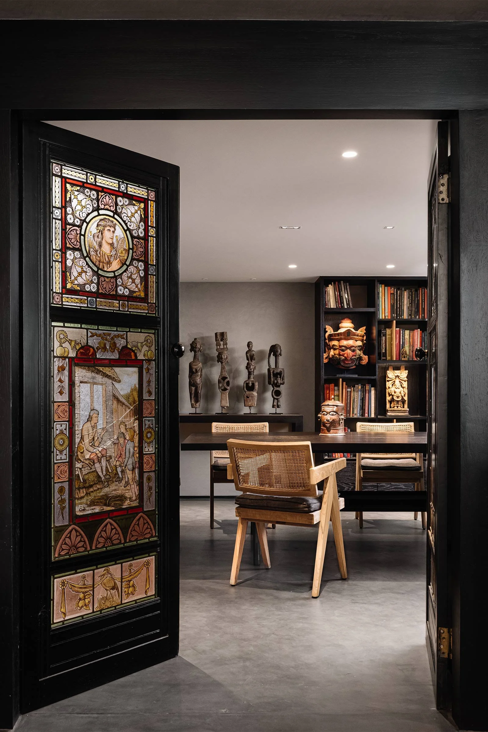
SDH: We wanted the space to be a canvas for the pieces. The lime-plastered walls and concrete flooring add a sense of age, echoing the history of the space. The reception desk handcrafted in acid-etched brass is one of our favourite elements and stands out against a backdrop of fluted wood. Each console and display stand is designed to complement the space and the pieces displayed. We used black accents to highlight elements in the architecture, such as the chevron pattern in the beams, the cast iron columns and the windows. For the private office space, we combined black-stained joinery with jute cabinetry and bleached Pierre Jeanneret chairs to add a warm, intimate feel to the space.
Do you have a favourite element or design detail in the architecture or interiors?
SDH: The impressive gothic architecture was our key inspiration. We stripped the space down to its bones, exposing the original arches, which we chose to feature as a key design element of the space. We used the inherent chevron pattern of the beams and columns to guide the zoning and display.
Images / Ishita Sitwala
Styling / Samir Wadekar


