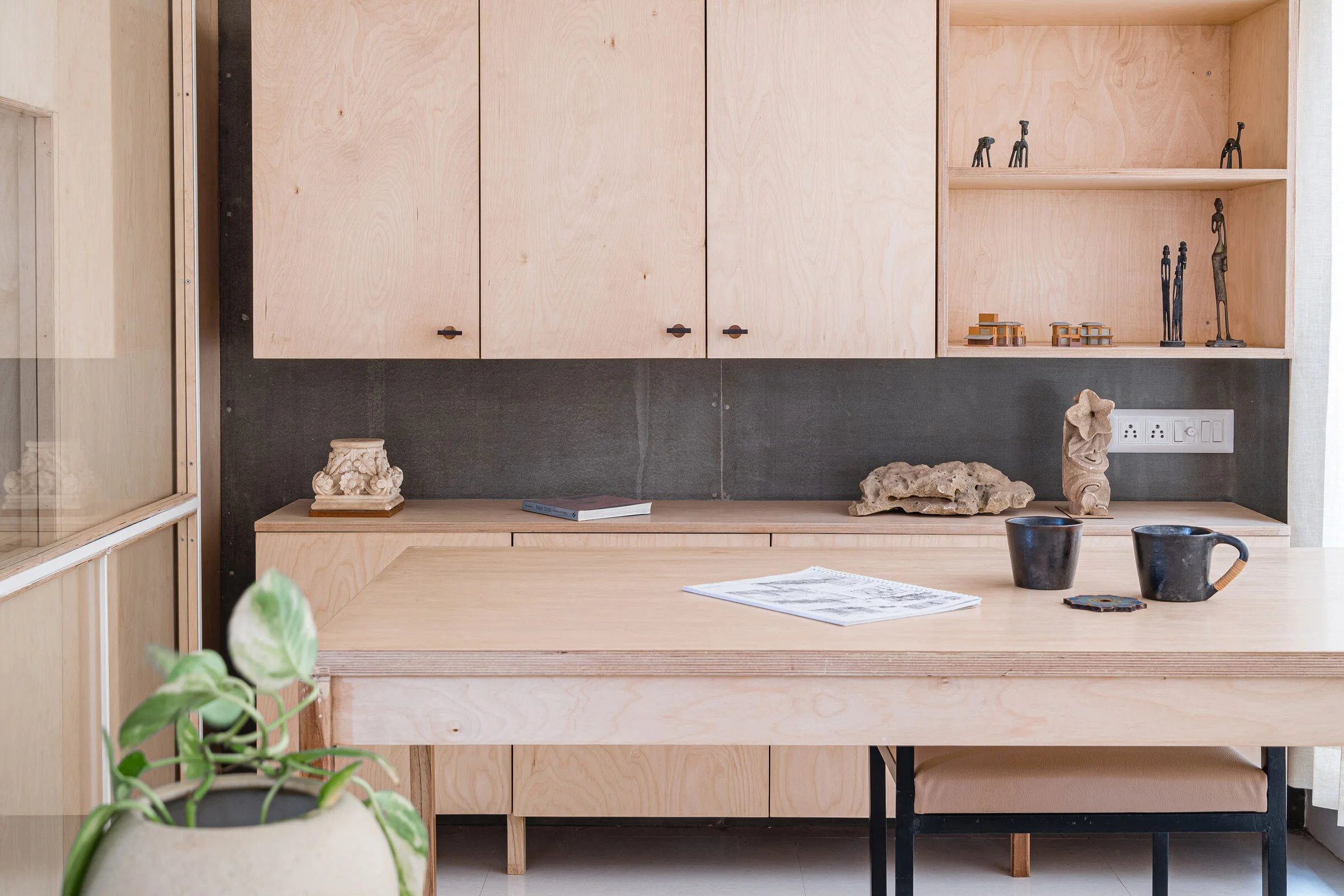
A Minimalist Studio with Maximum Effect
Multidisciplinary design studio UA Lab’s new studio is designed to be a calming, uniform space, where a minimal material and colour palette forms a backdrop for interaction. Studio co-founders Vipuja and Krushnakant Parmar share more about their new space
Design Anthology: Why did you decide you needed a new studio space?
Krushnakant Parmar (KP): We decided we needed a bigger studio, and wanted an open-plan space that enhances interaction between our team. The new studio space, which we’ve named Placid hues, is 35 square metres big.
What was your initial inspiration for the design?
Vipuja Parmar (VP): Conceptually, Placid Hues is an extension of our practise. The key idea was to create an open-plan layout within a singular monolithic space, designed to enhance our interaction while working.
We used the language of cuboids and planes to create and envelope spaces, and used only one material throughout, to give that uniform character. The studio has a larger opening towards the north side, which lets in an abundance of natural light throughout the day. The neutral surfaces bounce back maximum light, so every part of the space appears to be naturally lit throughout the day. It makes the space feel calm, fresh and energising.
What was the inspiration behind the colour palette and materiality?
KP: The colour palette is also guided by this concept of a uniform, almost monolithic space. All the surfaces are kept in neutral tones, as is the upholstery. We were very clear about using a single material and similar joinery details for the entire layout. Spatially, this minimalist attitude towards materiality combined with an open-plan layout helps us to achieve the tranquil studio space we wanted.
Images / Maulik Patel / Inclined Studio


